


The Dogs – Spring Clean Challenge 2026

Recommendations: 231
About the Project
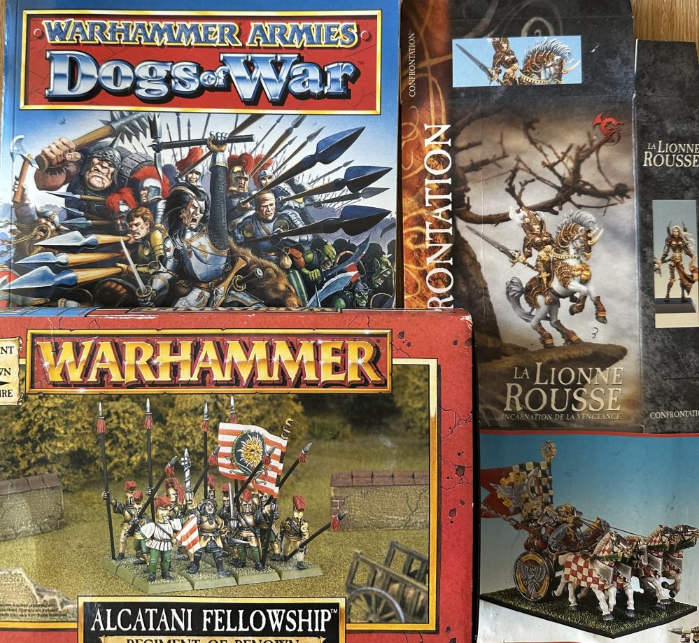
It all started with the mother load of early Regiments of Renown on Vinted. Should I? Oh, go on then :). After that I've had to be sensible and trim down to something that can actually get finished and works with the rest of my collection. Its time to realise a long held ambition, since around 1985, to get an army of Regiments of Renown onto the table.
Related Game: Midgard Heroic Battles
Related Genre: Fantasy
Related Contest: Spring Clean Hobby Challenge 2026
This Project is Active
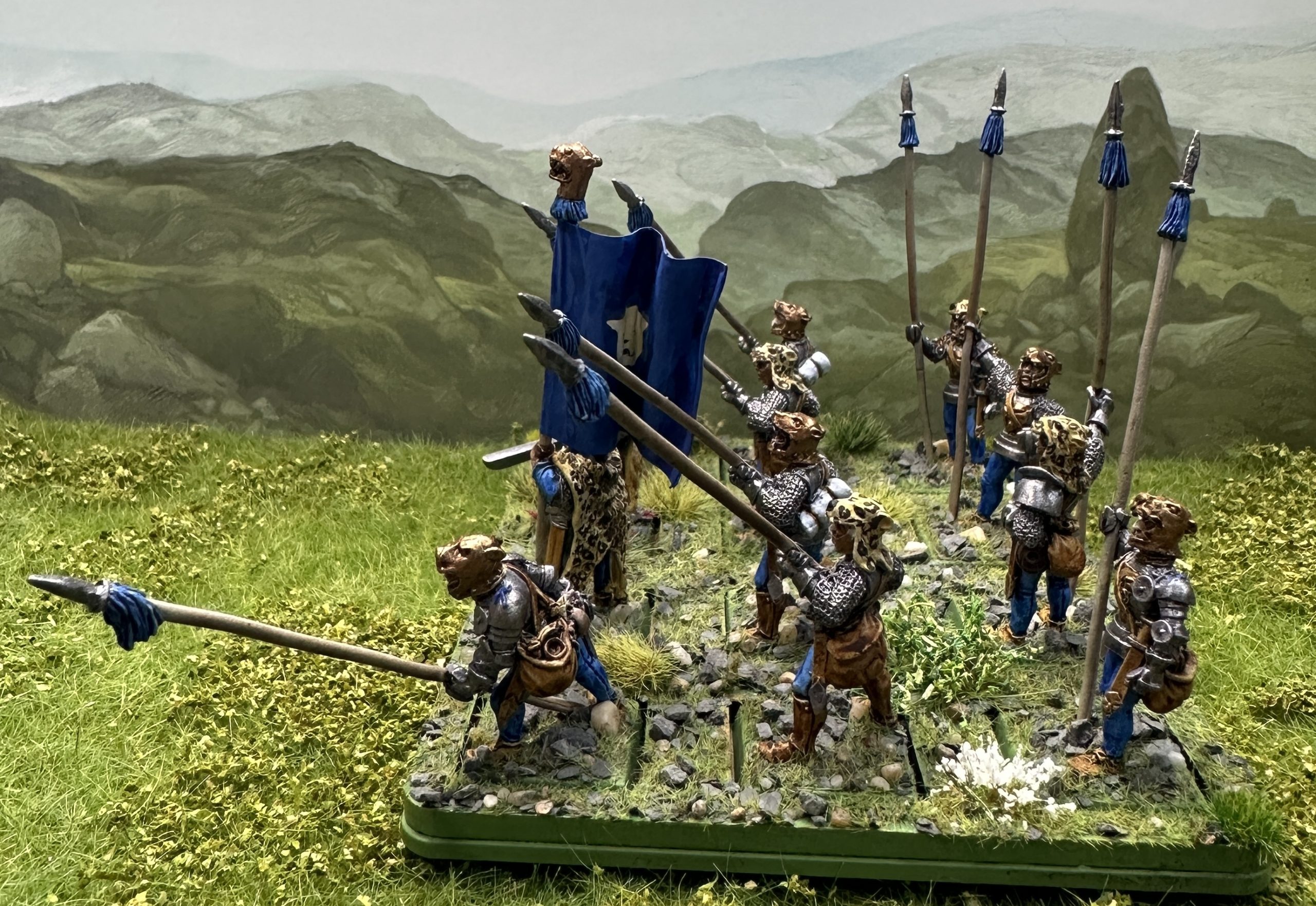
Leopold's Leopard Company - the last unit is finished!
I’m not a fan of the studio paint job for this unit. They went with plain black and white beneath the leopard skins. Having used red and blue as the main focus colours throughout the project, and with the other pike unit having had a red focus, this unit would have blue. Highlord Blue was used on hose and the pike tassels. I like the orangey shade of leather with blue so Hardened Leather was used on shoes, belts and scabbards. Aged Hide for the skin. Broadsword Silver for the armour and weapon basecoat. The Leopard skins aren’t present on all of the miniatures so I decided to do the plain metal helmets bronze so there wasn’t such a sharp contrast between those with and those without the leopard skins. Hoard Bronze was painted onto the helmets and the gorgets. Finally the leopard skins were base coated in a mix of 80% Howling Sand, 10% Sand Golem, 10% Pallid Bone. Bases were rimmed in Goblin Green.
After a coat of matt varnish spray (Mr Hobby Super Clear matt) they are ready for highlights and metallics.
The shine was restored to the armour and weapons with Darkstar Baroque. The bronze elements were highlighted with AP Emperor Gold. Teeth on helmets and skins were painted white.
Painting Leopard pattern
Before starting the skin colour had to be improved. Leopard skins have a darker brown colour along the spine and a a bit paler around the stomach. I used AP Strong Tone Wash with a drop of Dark Oak Speedpaint in for the darker section and a light drybrush of Vallejo Bonewhit around the edge that would have been the underside.
The leopard pattern was Vallejo German Camouflage Brown thinned with a dot of Dark Oak Speedpaint and a bit of water. I have to keep this mix at a good consistency, thin enough to flow well from a very thin brush (000) but not as thin as Speedpaint as I needed to control where it went on models with fur texture sculpted on. The pattern is made by putting four dots in a very tight square or diamond and then joining three or all four dots together with a rounded line. This leaves a very small amount of the plain fur colour in the centre of the spot/arc. I had to remember to not always join the same three dots so the gap ended up pointing in the same direction, they need to be randomised. On the real animal there are slightly larger spots along the upper flanks, where the darker brown of the spine blends back into the lighter fur colour. I did some slightly bigger ones there. My pattern is oversized. If I did it true to scale they would just be very small brown dots. I want it to look like a leopard pattern so the dots have to be upscaled so they are visible. Once all of the spots were on I checked for any gaps and added some smaller brown dots to fill in empty areas where there wasn’t enough room for a new spot. I added tiny dots of Vallejo Air Sand into spots where I’d covered up the central gap.
The eyes and noses were painted black. Done!
The final detail was adding a banner. I didn’t have the original printed flag for this unit so drew a 30mm x 60mm rectangle on a piece of white paper and painted it very loosely with Highlord Blue. I wanted this to look streaky, with darker and lighter areas to mimic the light across a fluttering flag. I have some Veni Vidi Vici waterslide shield transfer sets that have a white leopard head. These were applied to the centre of the flags and then matt varnish was applied. The transfers are very old and didn’t like the varnish and crinkled a bit, but did settle down again once dry. A piece of tomato paste tube was cut to size, flattened and stuck onto one side and the flag was stuck in place around the flagpole with PVA. When everything was fully dry the flag was edged with Vallejo Flat Blue and then bent around a paintbrush to get the folds nice and round. Highlights were painted onto the blue with Flat Blue and white acrylic was used to highlight the leopard head design.
That’s it for the painting 🙂
This is what we have now
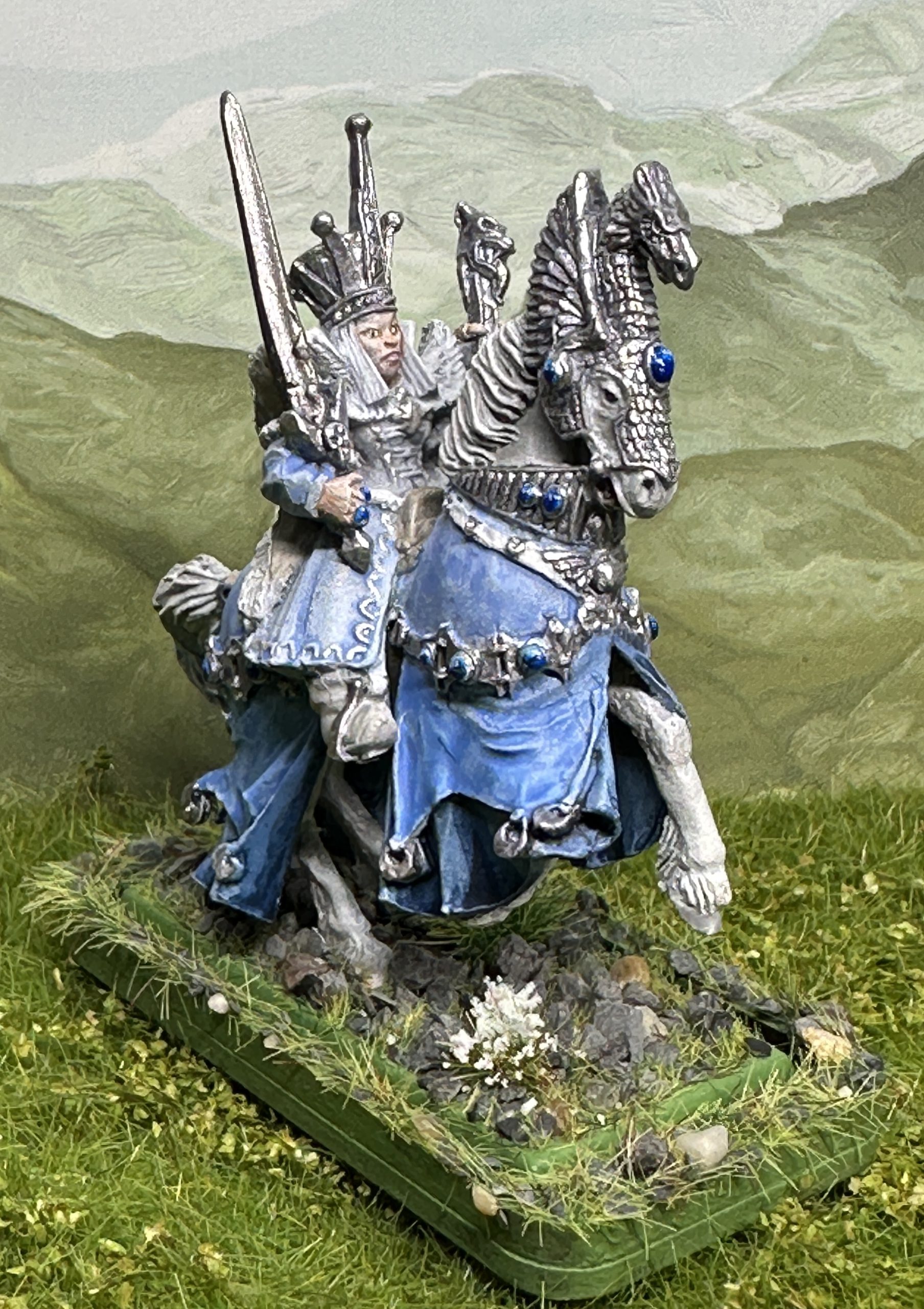
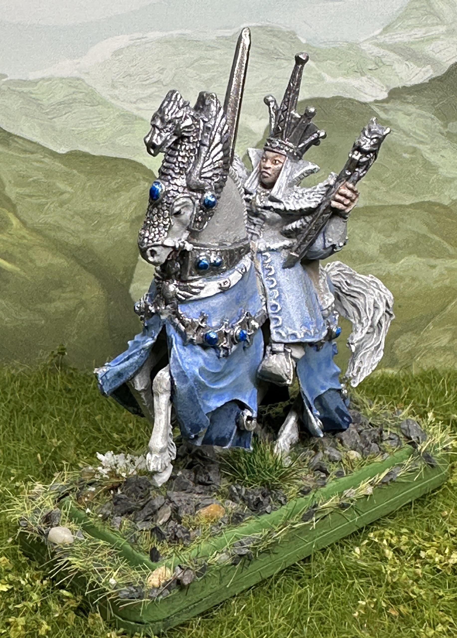
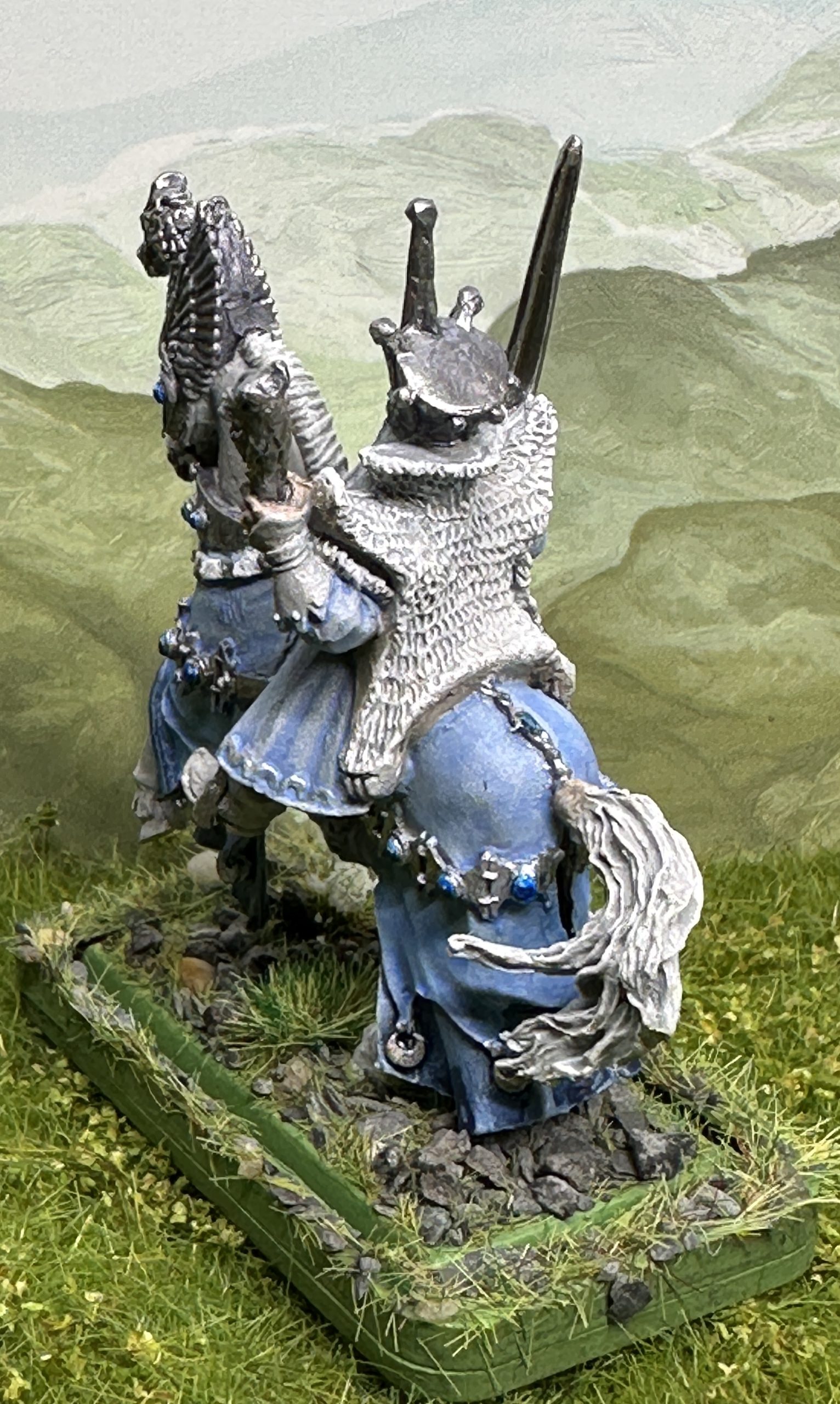
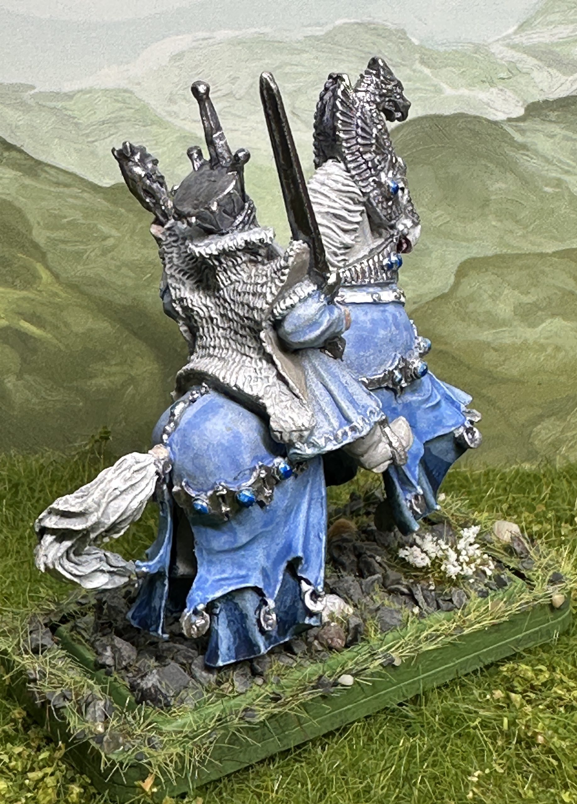
Ice Queen of the Northlands
The Ice Queen is done. I went for a fairly simple finish on this one. White horse and a range of blended blues for the caparison and the Snow Queen’s coat. I used the pale indigo pastel colour and it gives a slightly patchy finish, even when mixed with other colours. I rather like the effect for this miniature as she is an exile and has been forced to keep using everything even though it is getting a bit worn and faded.
The silver effect is Darkstar Shining Steel over Enchanted Steel. I then added some spot highlights with Darkstar Baroque and then edge and top highlights with Vallejo Pale Burnt Metal. Putting spot highlights on in a different shade helps to make the metal surface more interesting to look at and helps to sell the light glinting off metal effect.
Jewels were painted white then had Magic Blue Speedpaint in a single thin coat with a second heavier focus coat on the bottom 2/3. A tiny dot or two of white was added as a light glint in the pale area, top right corner or thereabouts. They are finished with gloss varnish which makes them look great irl but isn’t so helpful for the photography. Should have remembered to take the photos before putting the varnish on.
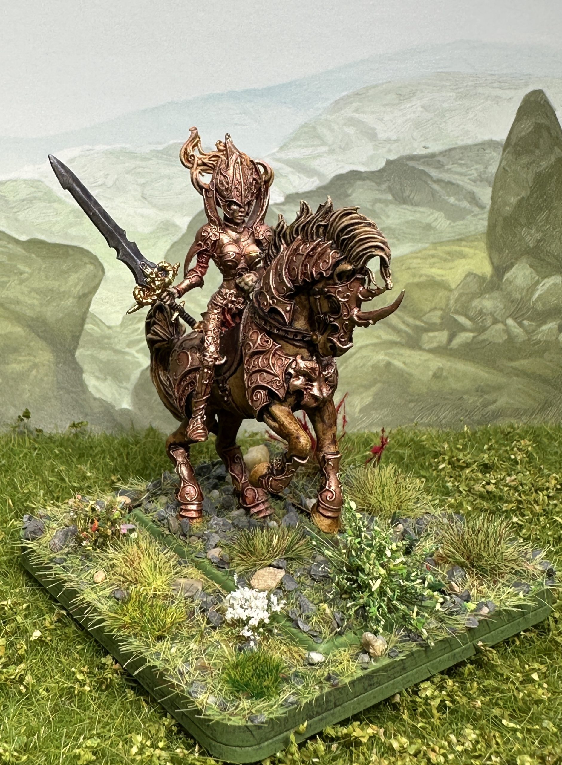
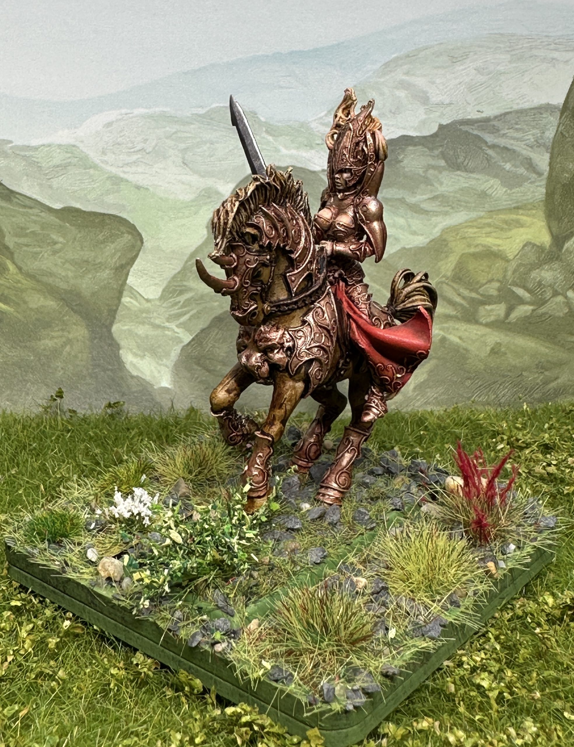
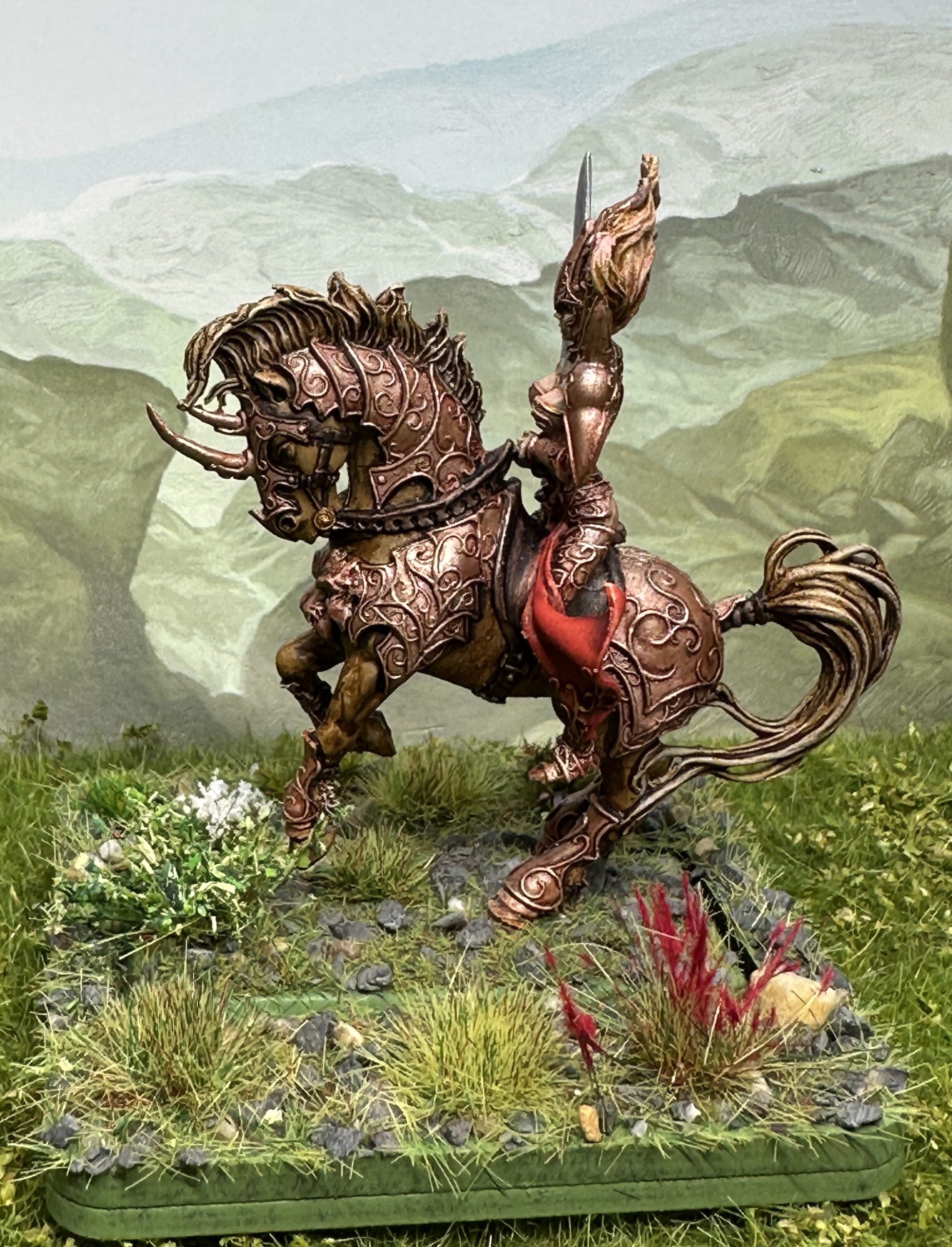
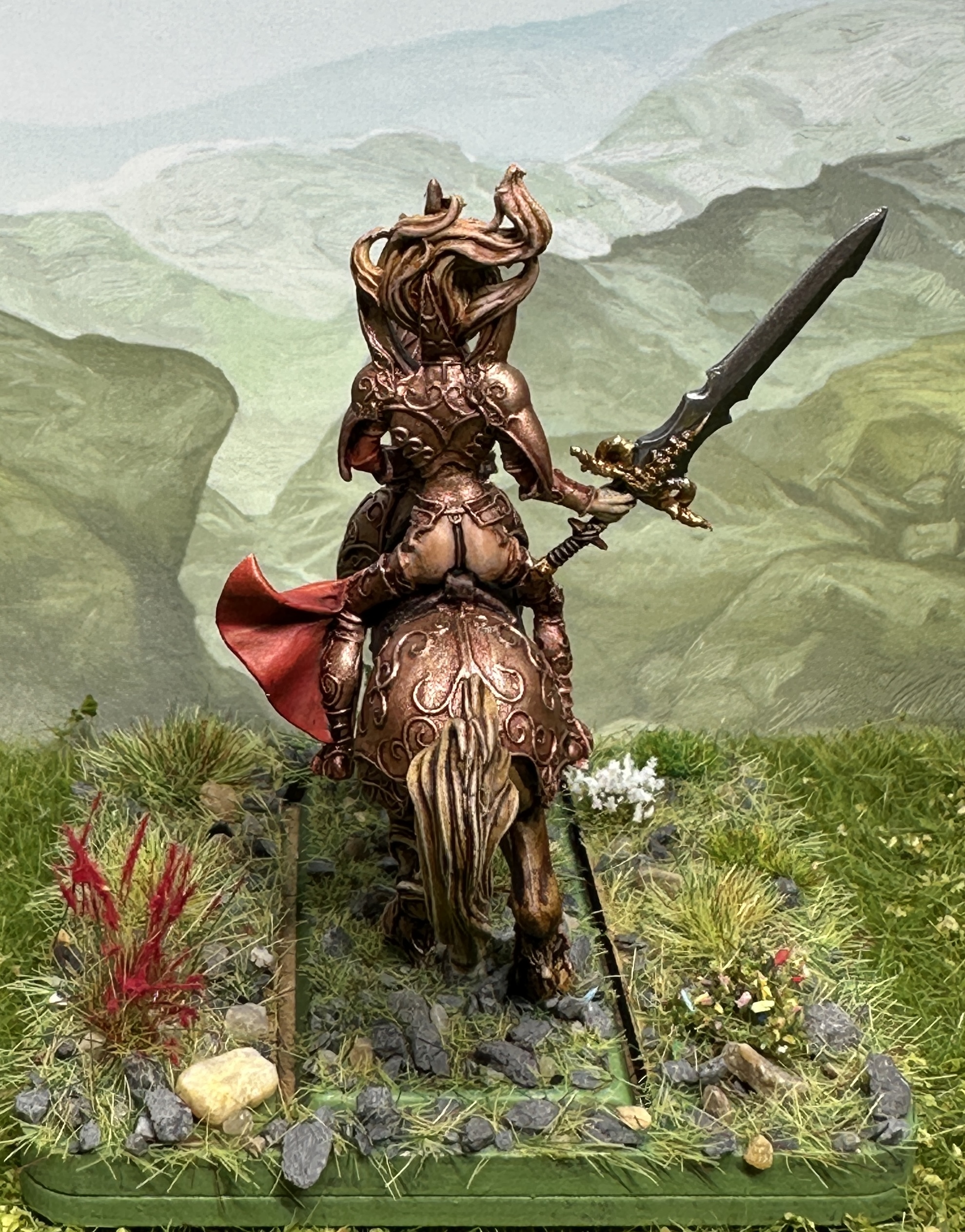
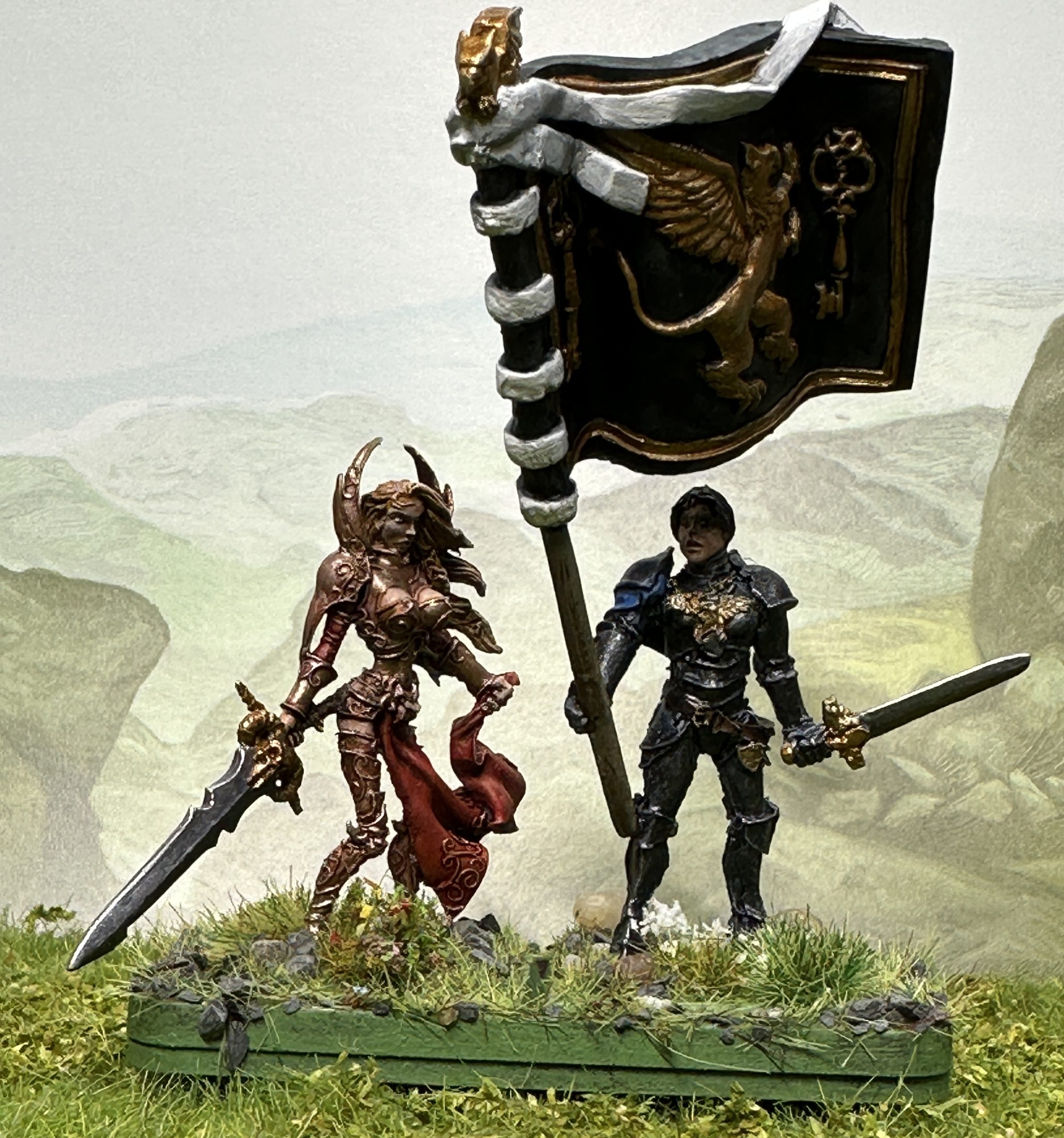
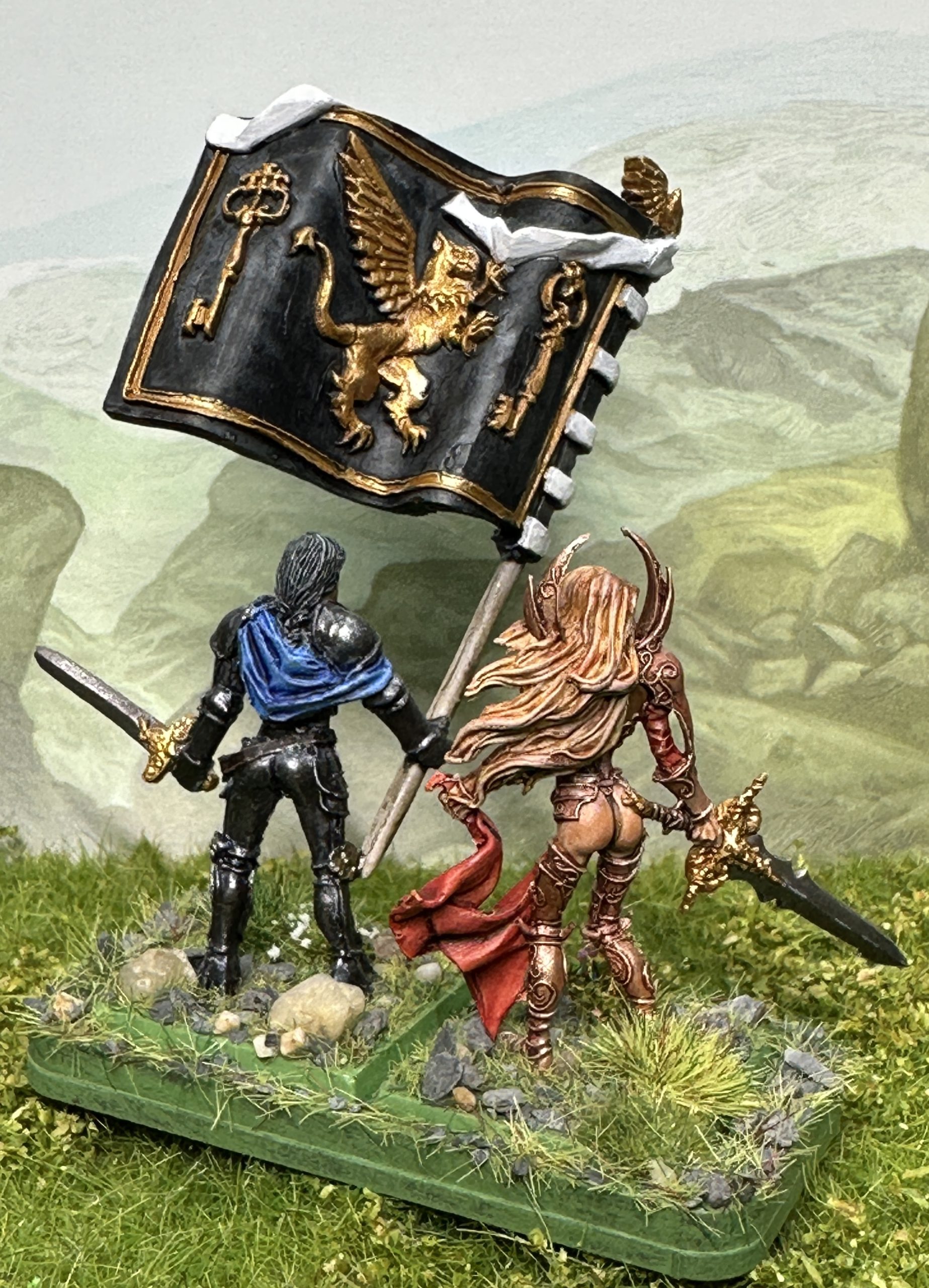
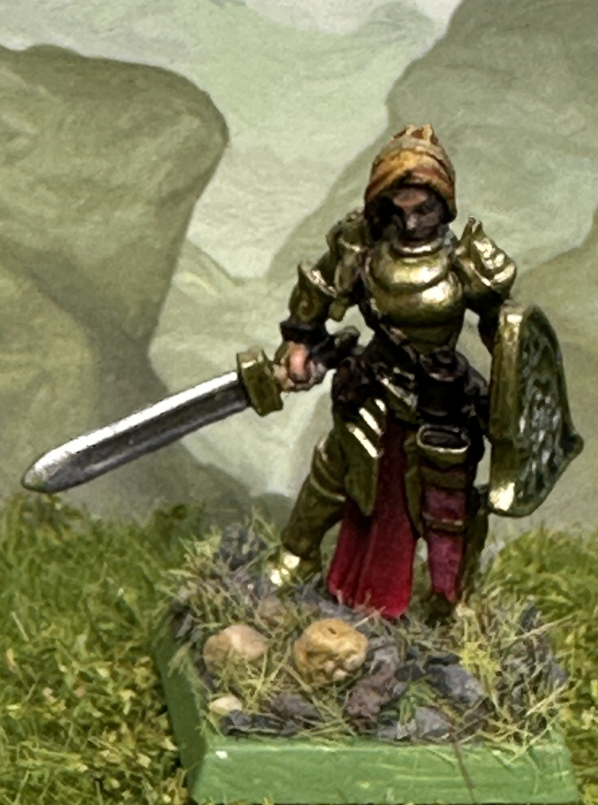
La Lionne Rousse and Sister Standard command stands
I’ve finished the army general, La Lionne Rousse and the command stand that features her sister and the army standard.
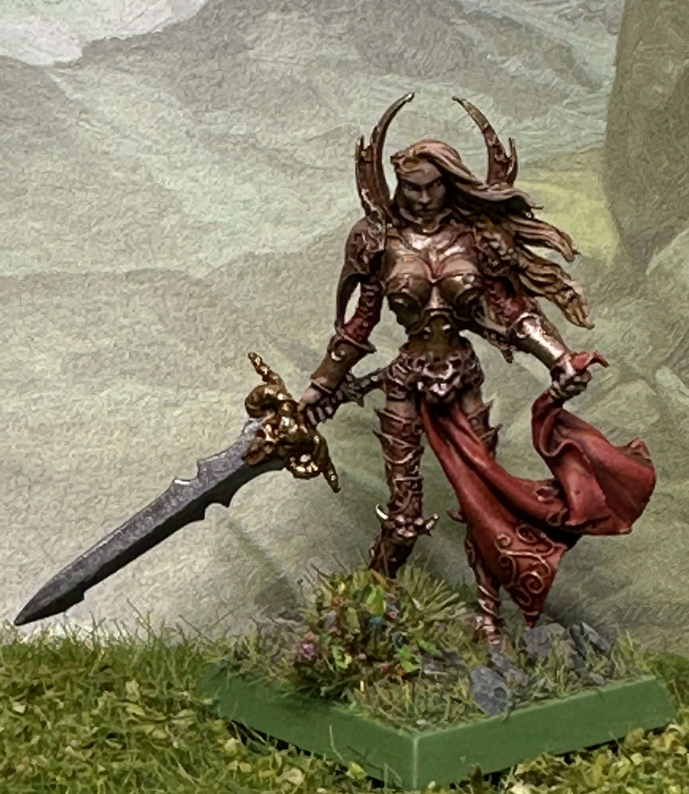
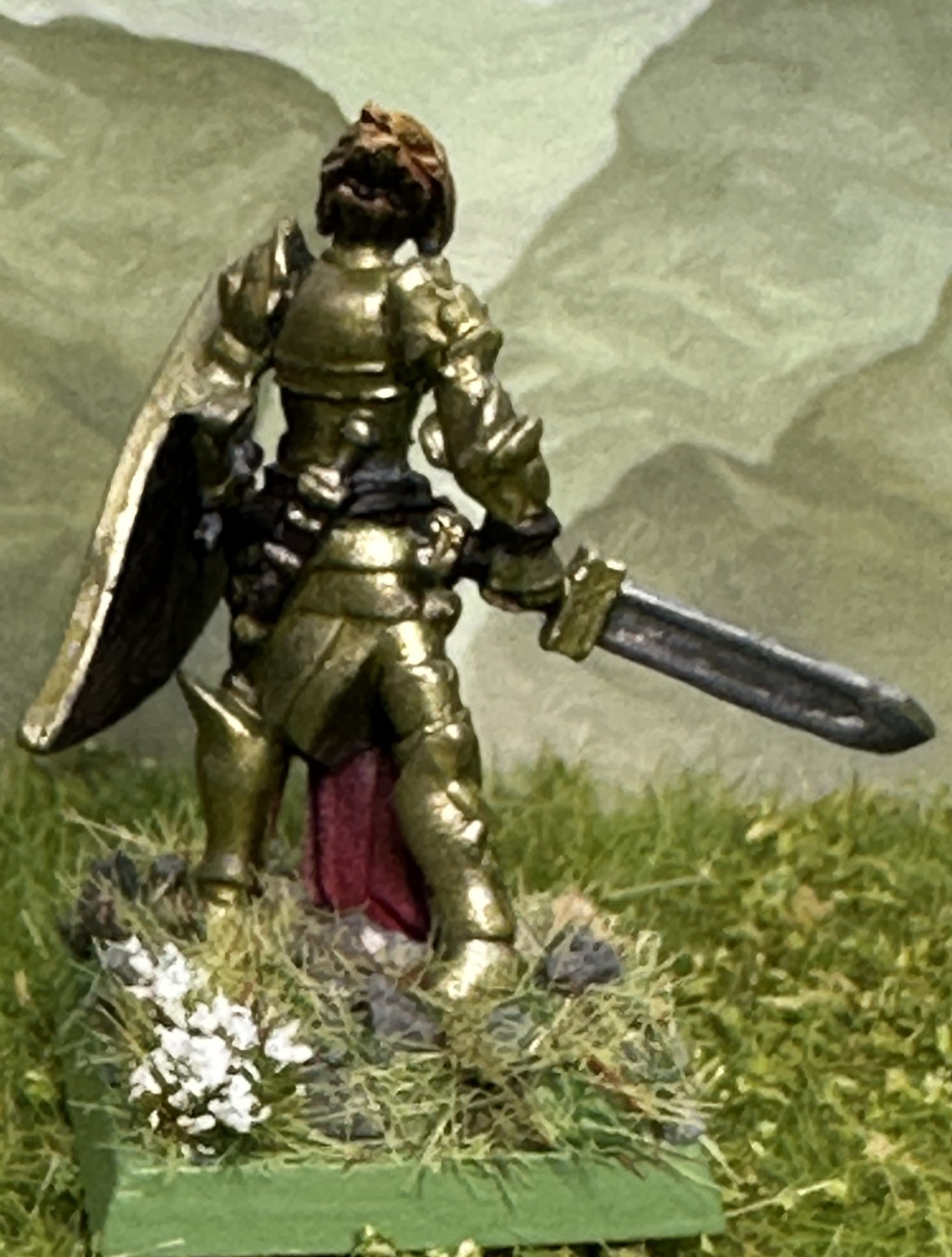
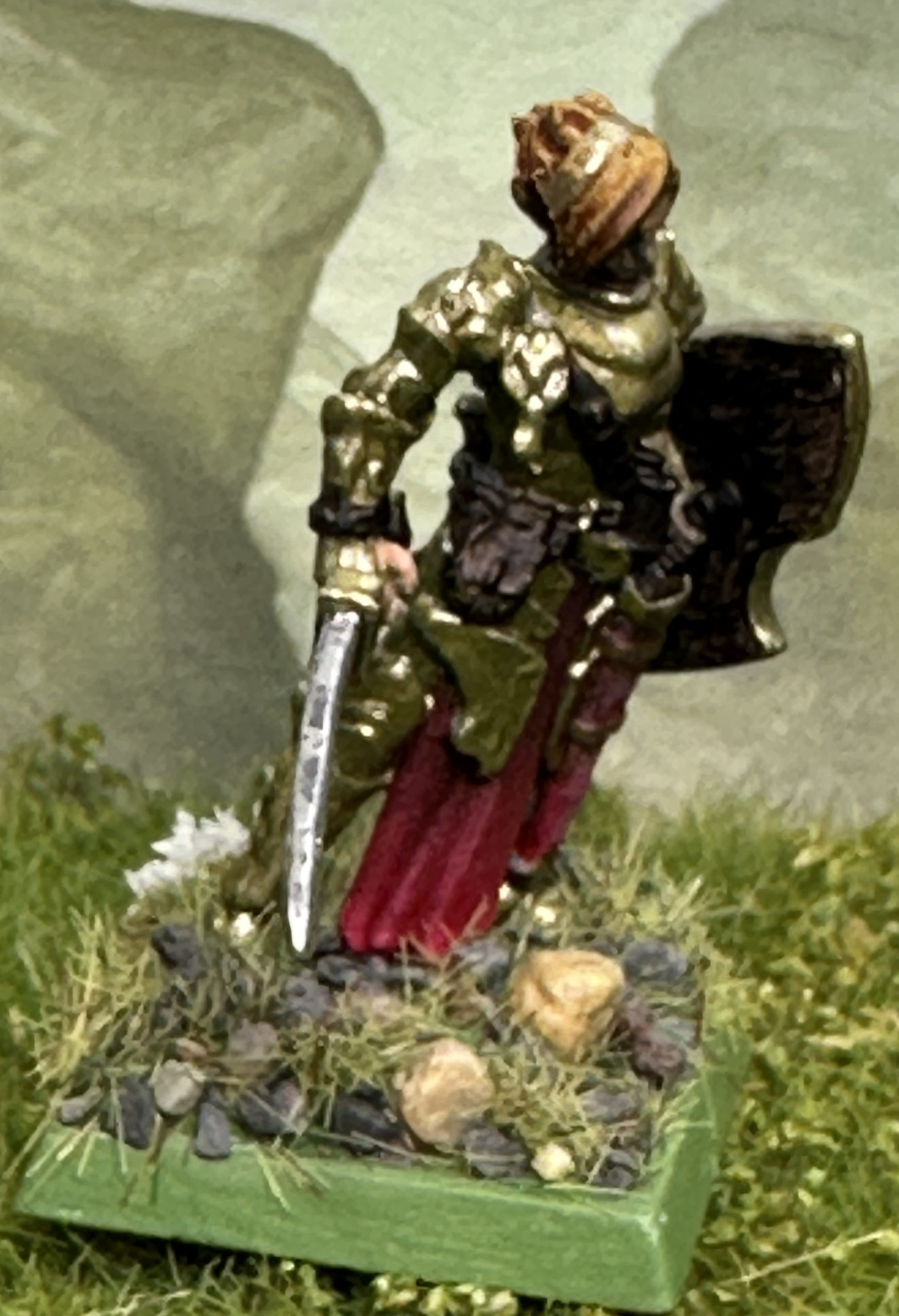
La Lionne Rousse is a Confrontation miniature from the first releases for the game by Rackham. In line with the French design aesthetic her armour accentuates her assets in a very unbattleworthy way but I’ve painted her as she was intended to look by the designer. The sculpting on the mounted miniature particularly is absolutely flawless, probably the best hand sculpted miniature I own.
I didn’t paint with the box art in front of me. I’m neither a good enough painter to get close to that quality nor is that necessary for this army. I wanted her to look nice and to try to match the image in my head which was with much redder/coppery bronze metallic armour, rather than the brown that the studio went for. She is supposed to be the Red Lioness after all.
Base Coats
I went for Talos Bronze Speedpaint for the armour, Peachy Flesh for the skin and one of the Blanche Speedpaints, Blood Moon for the loincloth. The hair is a blend of a drop of that red, Sand Golem and Bony Matter with some medium added and the colours barely mixed together to give a variety of colours and depth of tones. The horse was painted with a mixture of Hardened Leather and Ruddy Fur again with some medium added. Leatherwork was Satchel Brown. Gold elements were undercoated with Hoplite Bronze. The sword was undercoated with Enchanted Steel. At this point everything got a coat of matt varnish.
Highlights
Each colour was highlighted with at least two colours or blends used, sometimes three. This sounds timeconsuming but I tend to put all the colours on the palette at once and then work quickly starting with a deeper tone in the recesses and then moving to the highlight tone and then possibly swapping back or blending the two to tint or change an area of midtone. Speedpaints can be a bit uneven and the dried colour isn’t always the same on the model as it looks on the palette or on a test patch.
This was the case with the red. It went on nicely and looked exactly right but when it dried it had an orangey edge that I didn’t like. I therefore tackled it with Flat Red and Vermilion acrylics. The Flat Red was thinned and used in the recesses where a very dark brown had formed when the Speedpaint pooled. I then switched to Vermilion for the highlight areas, changing the tone of the upper highlights from a pale orange to a brighter red. Then some swapping between the two with some mixing to help blend out some sharp looking transitions and add a clearer red colour. Overall there is probably about 60% of the original Speedpaint showing with the remainder either tinted with thin glazes or painted over completely.
Similar work went into the armour with a range of metallic paints from Darkstar, AP and Vallejo. The top highlights always had Vallejo Metal in them as these give the brightest highlights. A blend of Copper, Gold and Pale Burnt Metal were used at various points. I have tried to vary the metal colour and tone to give the piece more visual interest.
The sword blade had Vallejo Metal Steel painted onto the lower half, Darkstar Baroque on the upper half and then Vallejo Pale Burnt Metal edge highlighted onto the upper half. The application was quite thin to allow some of the light and shadow from the Speedpaint basecoat to show through.
Here she is:
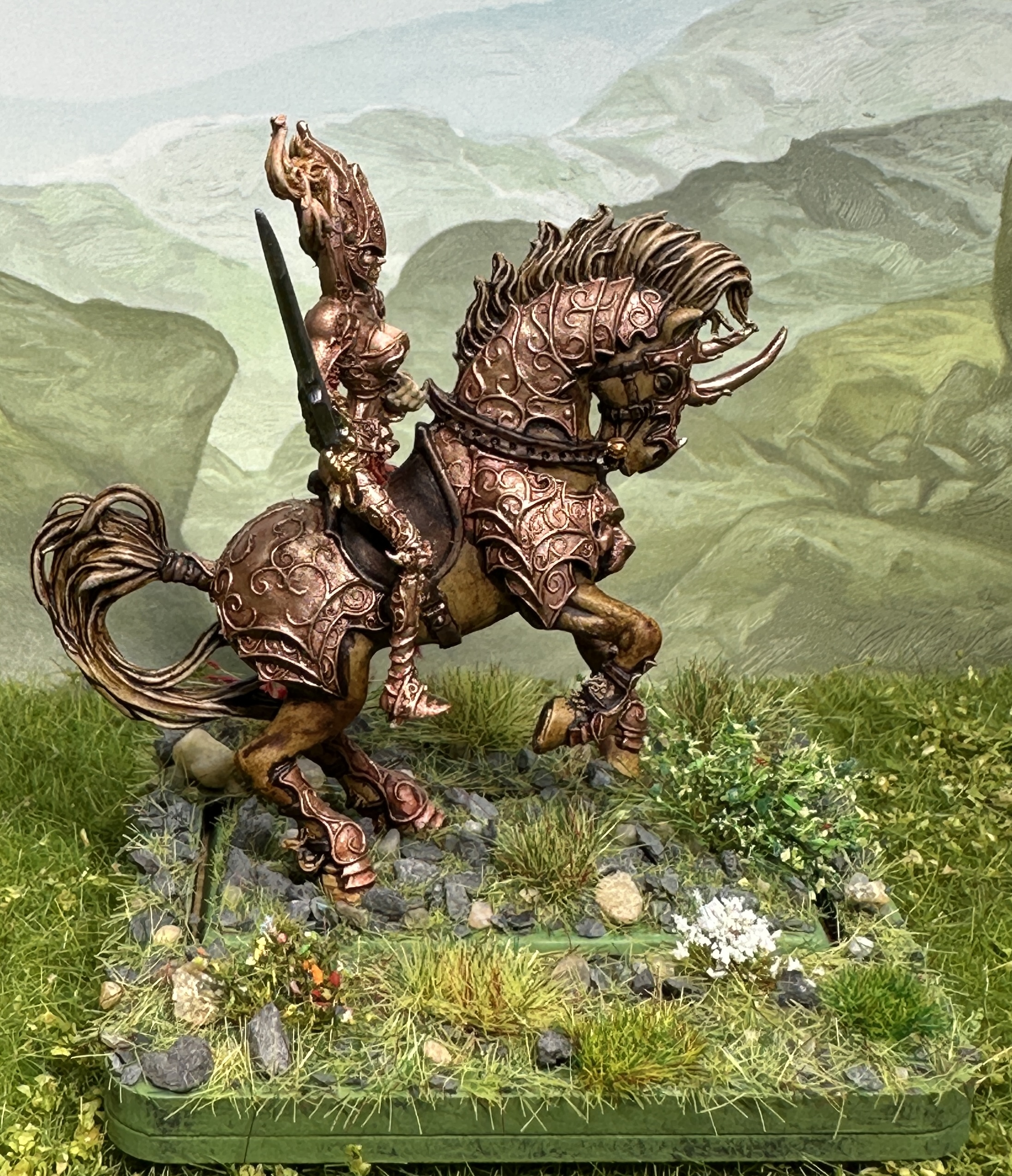
The foot version was painted at the same time using the same techniques. As you can see I even did the eyes. They are character models after all but the subtle sculpting didn’t help at all.
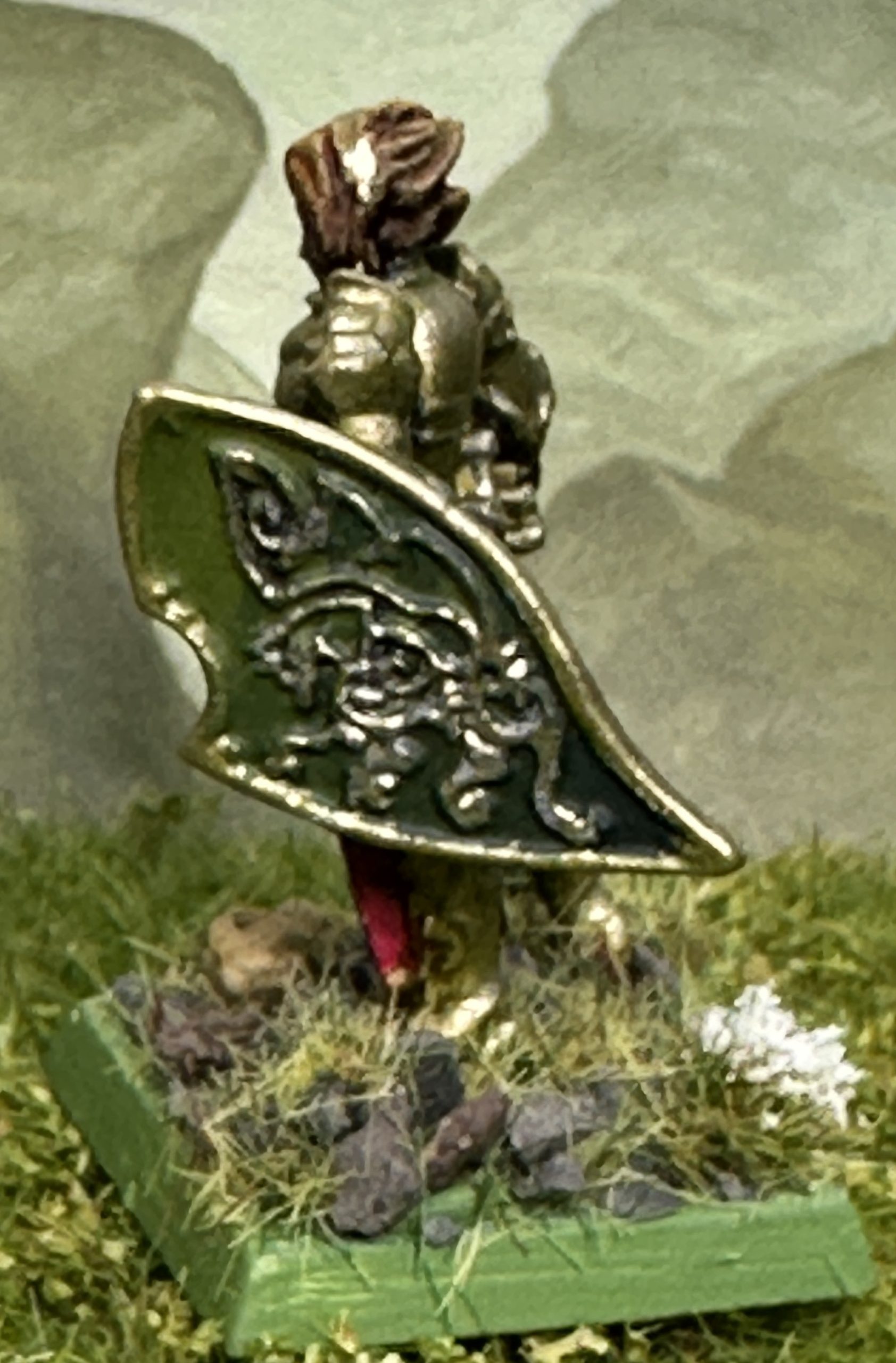
The standard suffers from being very thick because it is a resin cast piece being early Titan Forge. I love the detail on the banner so am prepared to put up with its rather clunky design. I painted the field black to try to hide this a bit. The standard bearer has ‘blued’ armour which was done using the technique shown for the Firstbord Iron Guard regiment earlier.
On the home straight now. I’ve got the Ice Queen and then Leopold’s Leopard Company left and I’m done. I was also working on the army supplement today. I’ve got about half of it written and all of the unit stats were transferred out of Excel. Should get it done on time too.
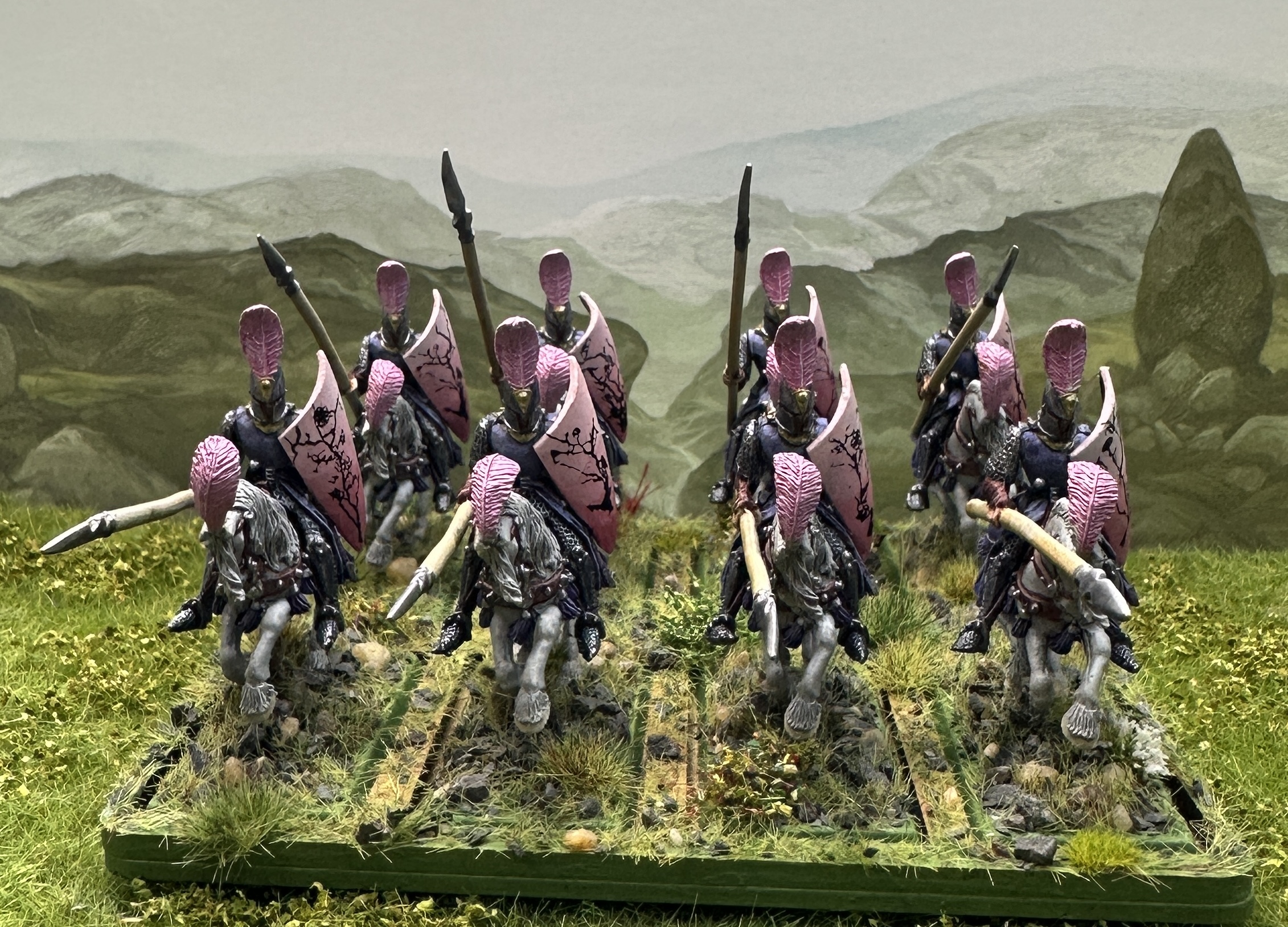
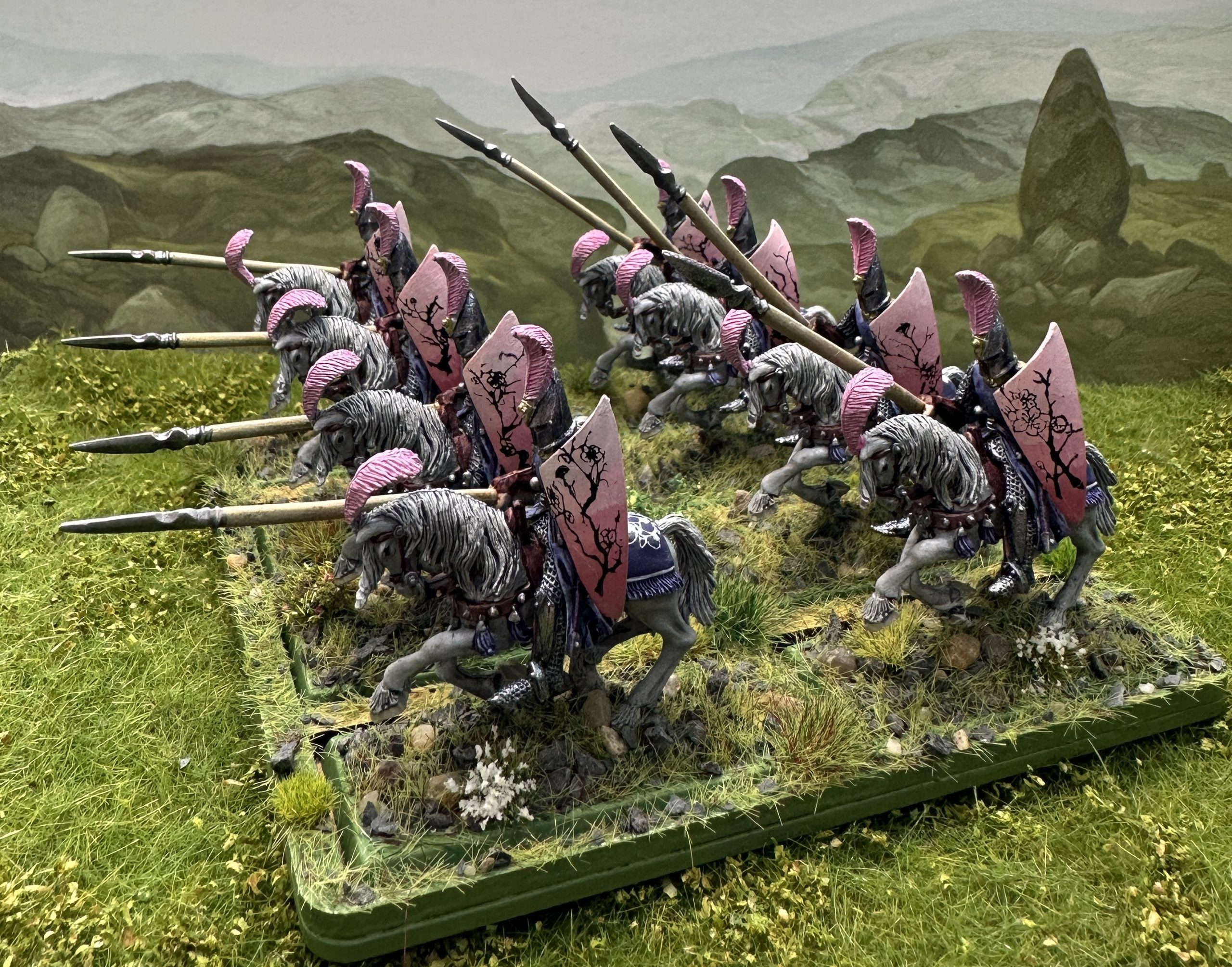
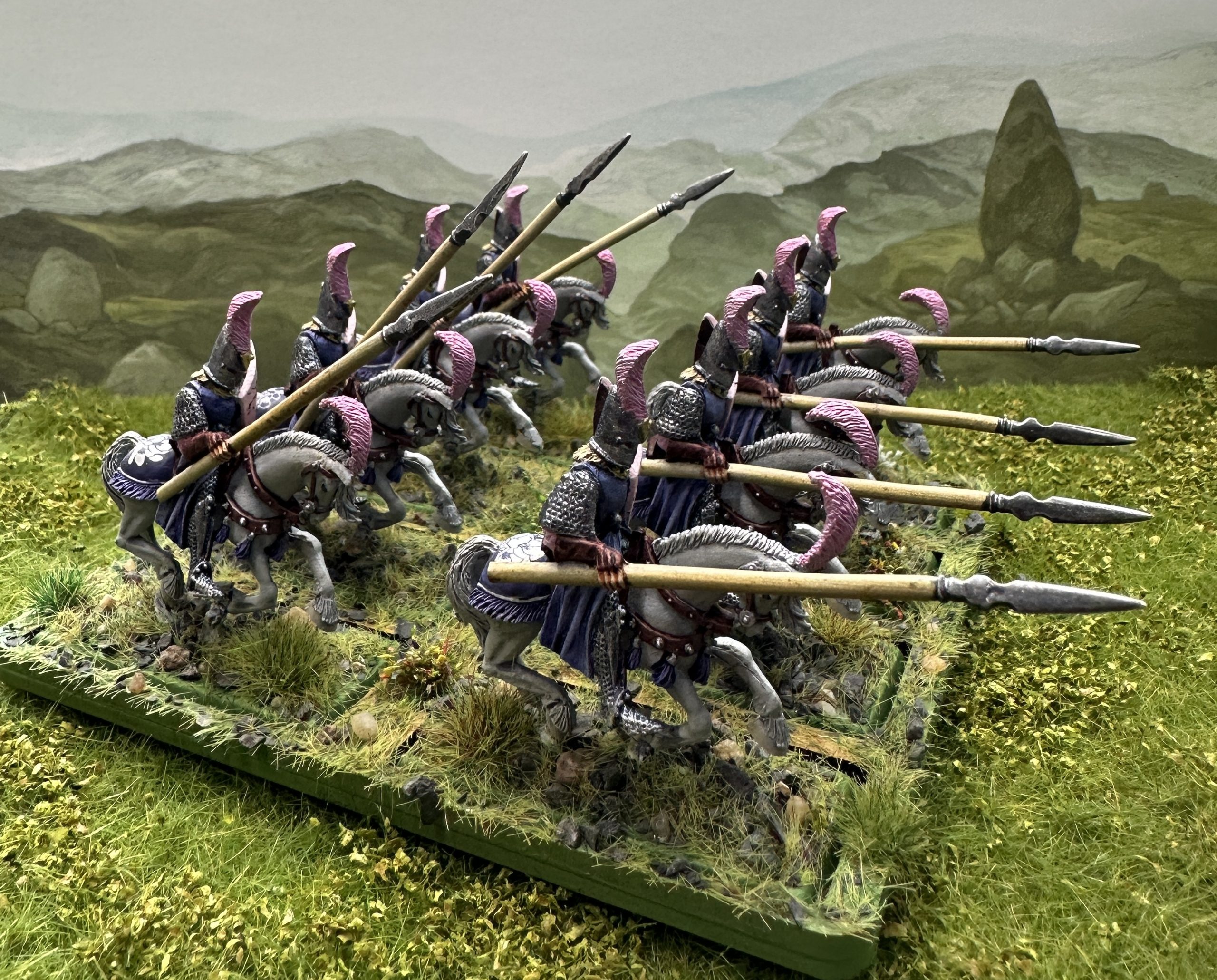
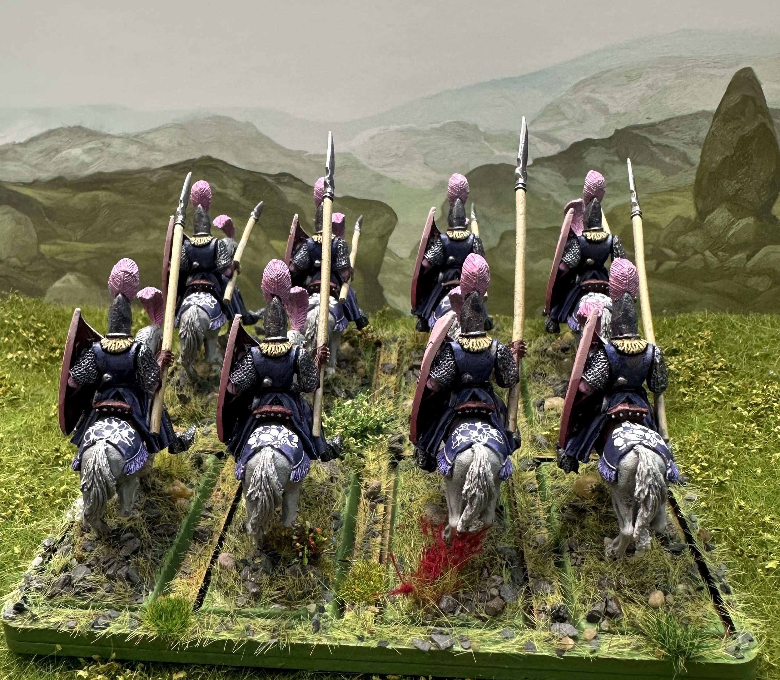
Glamgalion's Exiled Elven Lancers
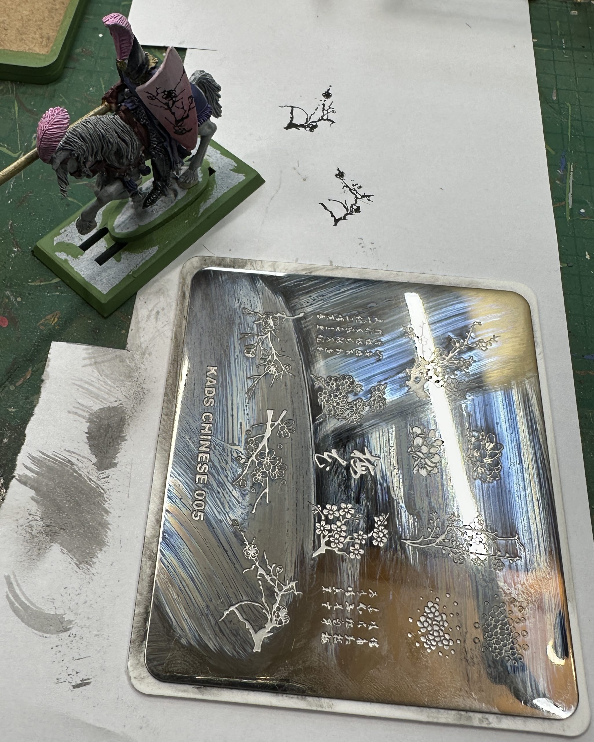
These are ex-Grenadier High Elf cavalry sculpted by Mark Copplestone and still available from Battlezone and Folorn Hope in the UK. The fluff for this unit has helped guide how they have been painted. I knew that I wanted to do some nail art stamping onto the shields and needed some better quality plates with deeper engraving than the Goblin Hobbies ones I used on the Sea Elf infantry. I was looking on Amazon for some diffferent designs and settled on a plate of Chinese flowers and flowering branches. It reminded me of Japanese cherry blossom patterns and that was probably what I was searching for when I found it. The flowers aren’t cherry blossom though, probably a Chinese plant called tan hua or Queen of the Night. Interesting plant and I’ll use some information about it in the fluff for this unit.
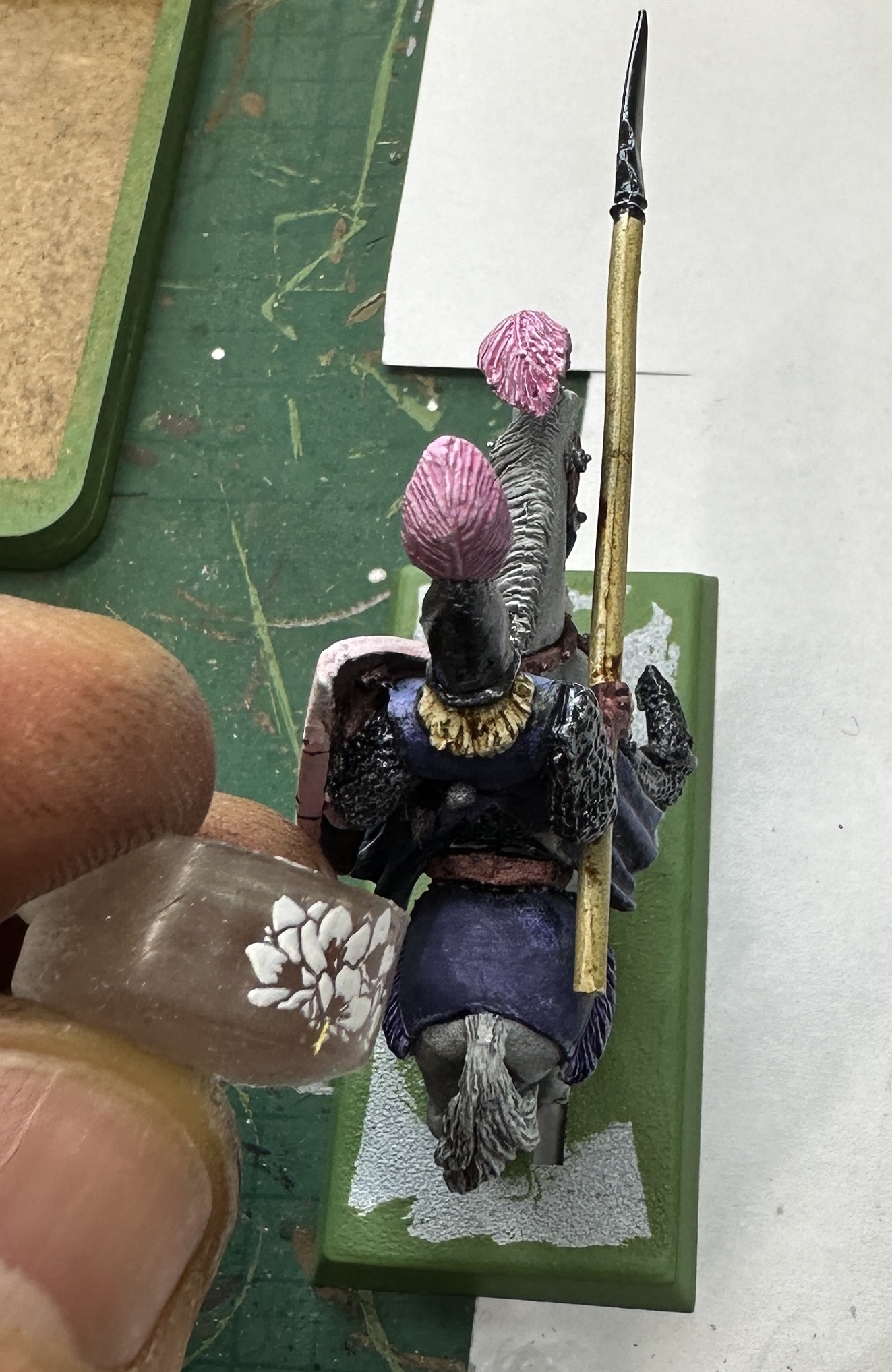
On to painting then. I’ve gone with pink as the main colour and blueish purple as the complementary colour. Here’s the main choices:
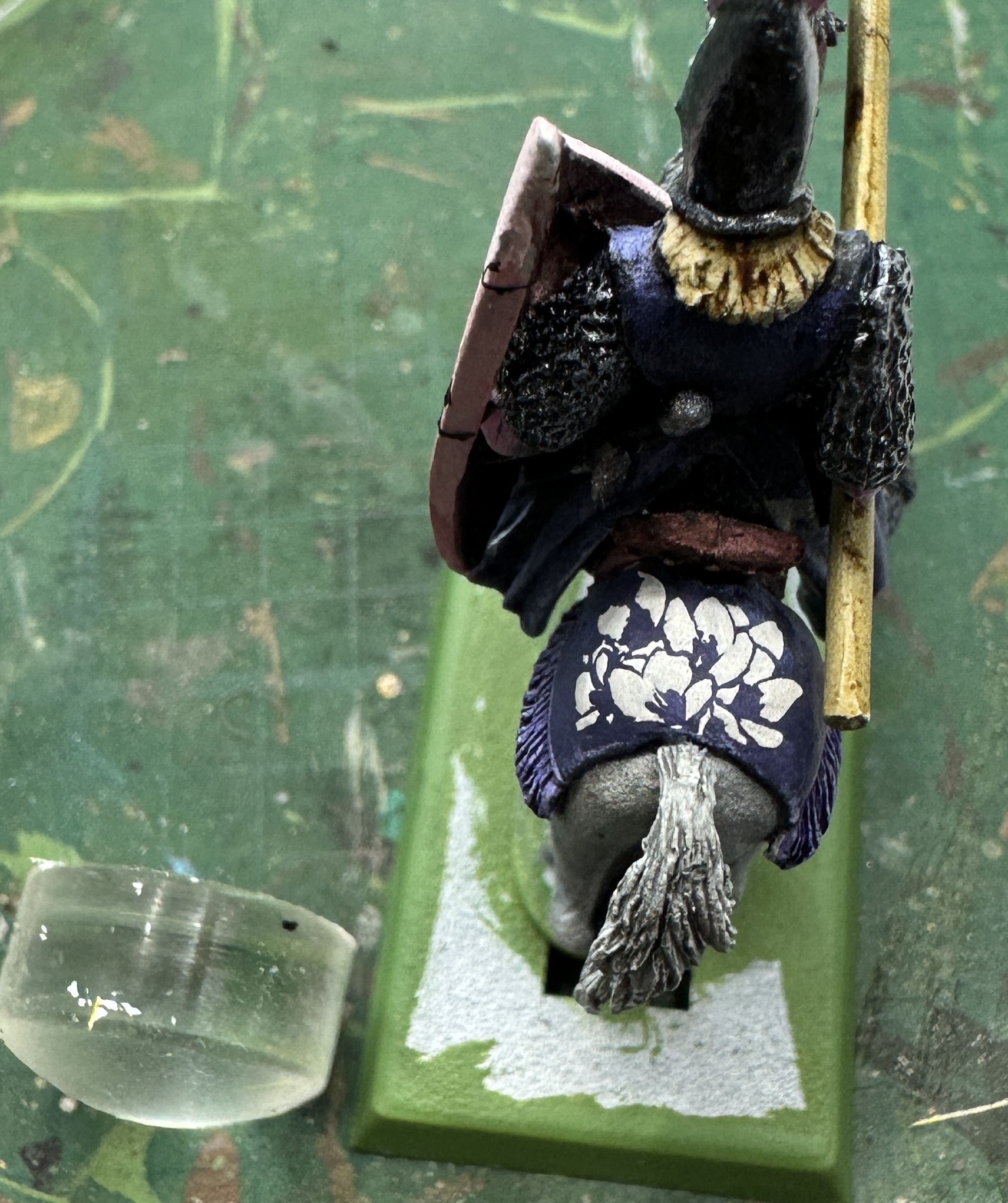
The pink acrylics were used to get a transitional background on the shields, dark at the bottom and light at the top. This wasn’t very smooth but that didn’t matter as the very high contrast of the black stamp pattern would make any minor unevenness invisible. The Oxford Blue acrylic was used to even out the colour on the cloth covering the horses’ rumps. The darker purple went onto smaller details like the belt and scabbards.
I’ve used a pinkish shade of brown for the saddles and leather work which blends in nicely with what is a bold scheme. The skintone used was a blend of Pastel Salmon and Peachy Flesh. This creates a more opaque colour that doesn’t look too washed-out.
Nail Art Stamping again
I used what I had learned from the first time with this technique and bought a plate with deeper engraving. This would mean that I had more chance of achieving a good quality pick-up and the design wouldn’t have dried out before it got transferred into place (below left).
The shield transfers worked well. Where there was a minor issue with either pick-up or transfer there was a gap in the design. These were filled in with black Speedpaint and a 000 brush, this allowed a bit of extra extemporising which meant that all 8 of the patterns are unique, even though I only used 4 different patterns from the plate.
I had been looking longingly at the rear cloths on the back of the horses and then spotted two flower patterns that looked about the right size on my plate. I decided to try to put these patterns on the cloths. I knew the standard domed bit of even the smaller stamper was too big to fit onto the space. I therefore used the side. I had to make sure I lined it up with the flat edge along the back of the saddle so the dome didn’t catch it and mess up the transfer. The images below shows the pick-up onto the silicone (centre) and the resulting transfer after rolling the silicone gently over the cloth (below right).
Stamping complete they got a thorough spray of matt varnish and the the shine was restored to the metal with Darkstar Silver and we have this:
I’ve been working on the fluff for this unit for the army supplement. I’m really enjoying writing these entries and this unit was a particular favourite. The work I had to do getting the stamp plate has led directly to some interesting things I’d never have thought of on my own that I’ve now worked into the fluff. It is great to see this evolve and the ideas feel much more grounded when they work closely with what the final paint job on the finished models actually look like.
Two weeks left and I’ve got started on the final characters including La Lionne herself. Only one unit of pikemen left after that and should be onto those by the end of the week.
Big, Green and Angry - the secret miniature revealed
Despite this army having all of my favourite units in it, and collected over 20+ years, there was still a nagging suspicion in the back of my mind that it was somehow incomplete. But how could that be? I ignored that thought and pressed on but then one day when I was flicking through the Dogs of War supplement again it hit me.
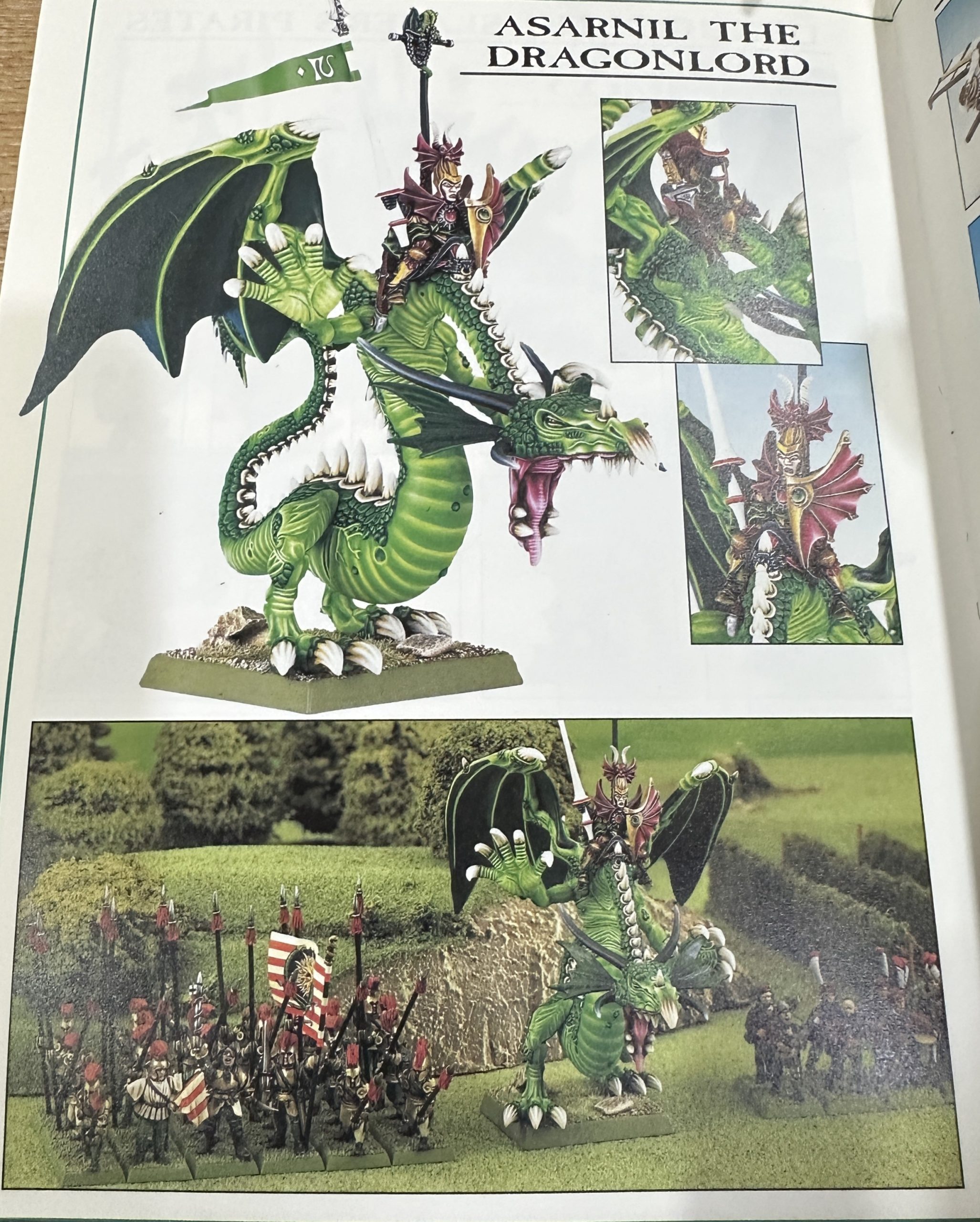
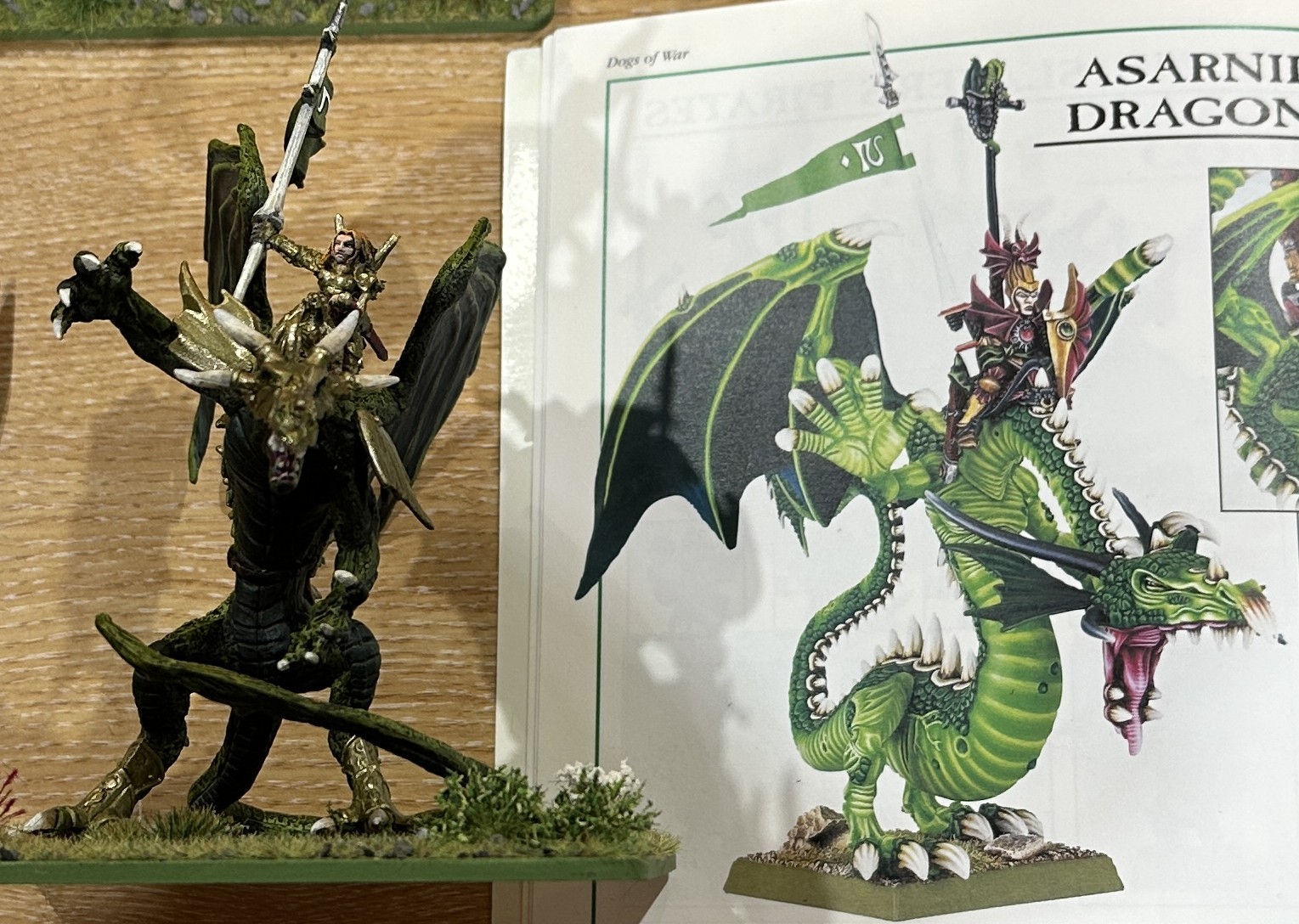
Of course! I’m missing a massive dragon to swoop across the battlefield and spoil the day of my opponent’s favourite character or most menacing looking war engine. Asarnil the Dragon Prince and his Green Dragon Deathfang fulfilled this role in the original book. Now a trawl online to see if you can still get this miniature. Indeed you can. The TrollTrader has one, NIB too, for £400! To borrow a favourite phrase from one of our fellow OTTers, Ow Much!!! Even by the standards of original Citadel miniature collecting that feels a bit strong, considering that’s what I paid for the 11 Regiments of Renown that got this project started.
As an aside Asarnil was a absolute badass in the game. He had a magic item that reduced any enemy in base contact to WS1! So basically if you didn’t shoot him or magic him off the table he was totally unbeatable in hand to hand. Hero Hammer indeed 🙂
On to cheaper alternatives. Did I remember seeing a dragon rider in the Reaper range? Indeed I did, Kyra and Lavanath Reaper Bones 77557. Reaper availability is a bit patchy in the UK but an extensive trawl online dredged up SnM Stuff (!) who had one with a 20% discount so I paid £11.32 about 3% of the original miniature. Whatever this miniature looked like it wasn’t going to be 30 times worse than the original.
When she arrived they had chucked in a free armoured female foot figure too, Merowyn Lightstar 77675 who looked like a fairly close match to the rider to me so would get painted up as the foot version of this character.
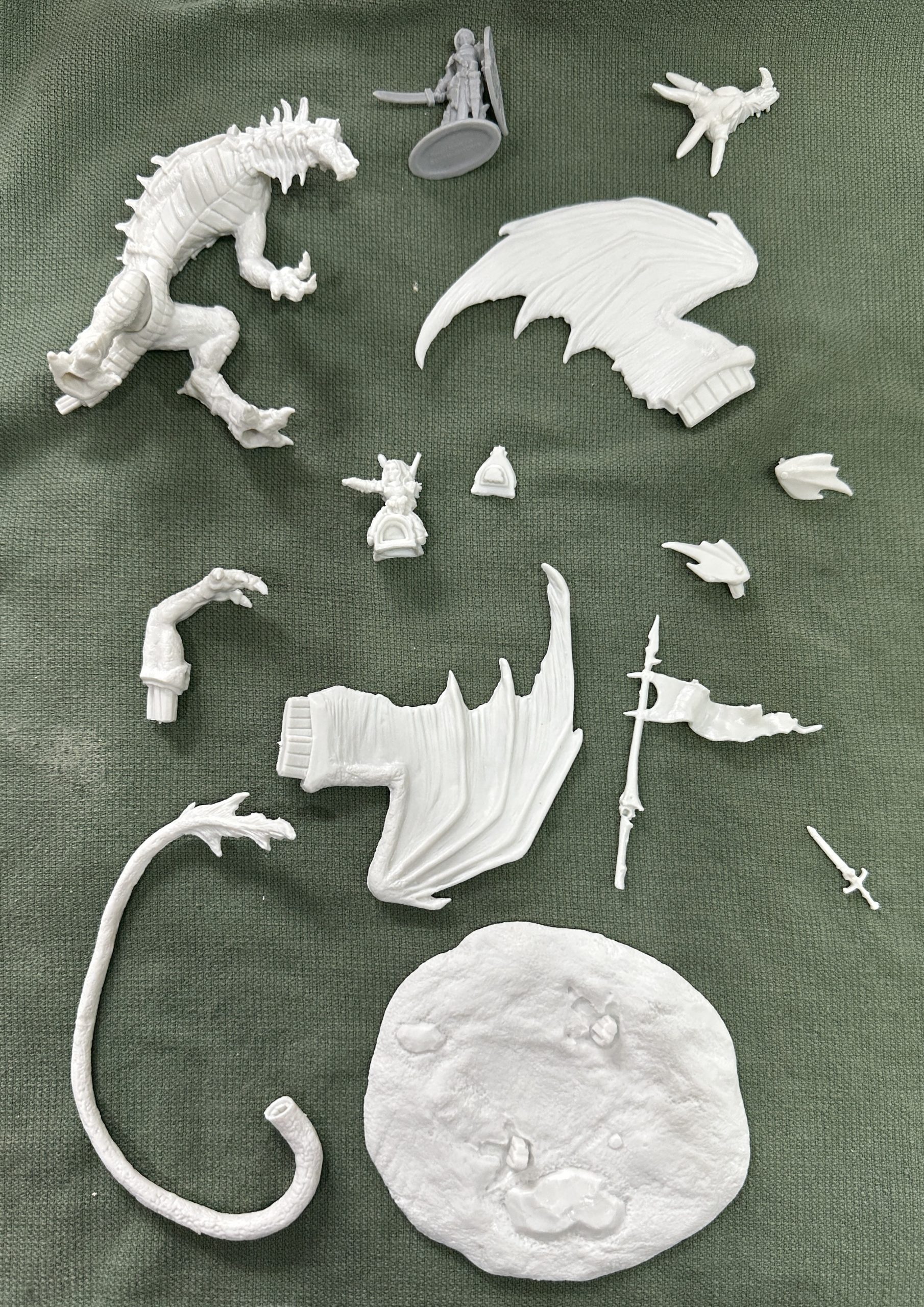
Being a Reaper Bones miniature it is white PVC. This often means slightly softer details and some nasty mould lines. This one wasn’t too bad although got some attention from the scalpel. Then a wash to remove the mould release agent and hot water to straighten out some bendy bits. It assembled easily with superglue. I’m not using the cast base which is just as well because there was absolutely no way to get the feet to fit onto both of the cast lugs which were too close together.
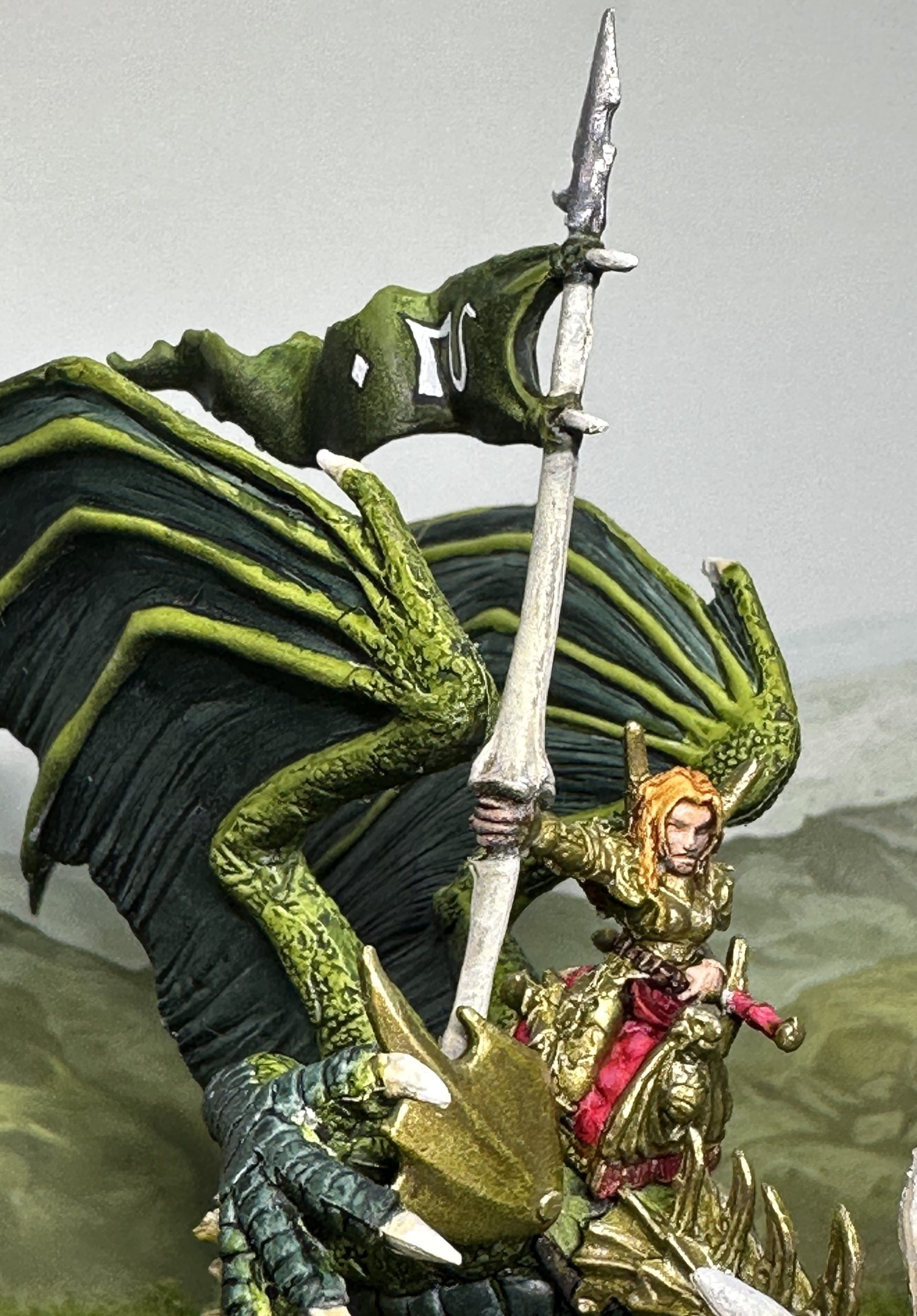
I’m going for the same sort of colour scheme in homage to the original. A green dragon with blingy elf rider. I’ve decided on a Forest Dragon scheme rather than the Green Dragon of the original but we are sticking with the gold armour and magenta cloth.
Here are the colours:
A zenithed undercoat in Halford’s white over grey was used. It is recommended to use a specialist plastic undercoat but I didn’t have one to hand and this usually works fine for me. The undercoat highlighted a few areas of mouldline and gaps in the assembly which were addressed with the scalpel/greenstuff and then a final squirt of white spray.
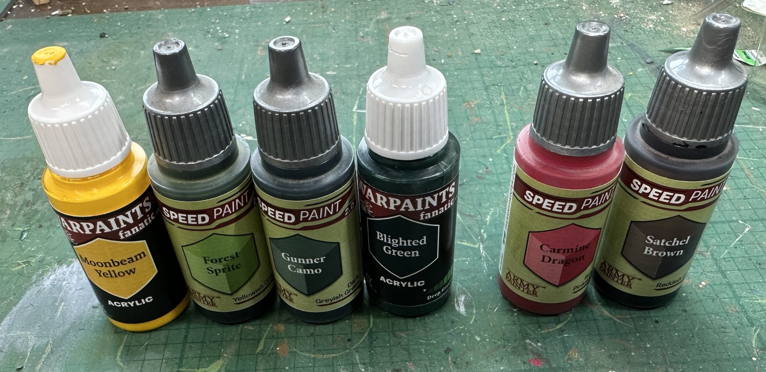
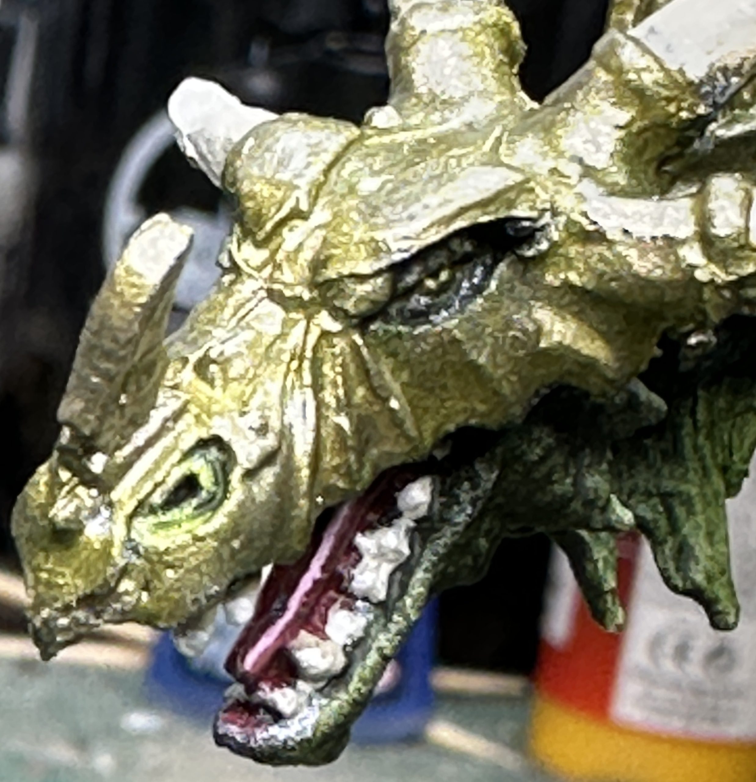
The dragon was painted first, Forest Sprite for the brighter skin and Gunner Camo for the darker scales and wing membranes. The yellow and Blighted Green were blended to provide patches and highlights for the Forest Sprite and the Blighted Green was used neat to highlight the darker green. The same colours were used in a wet blend to get the colour shift blend on the face of the shield from dark green bottom to light green at the top.
Magenta cloth was Carmine Dragon and the leather straps were Satchel Brown.
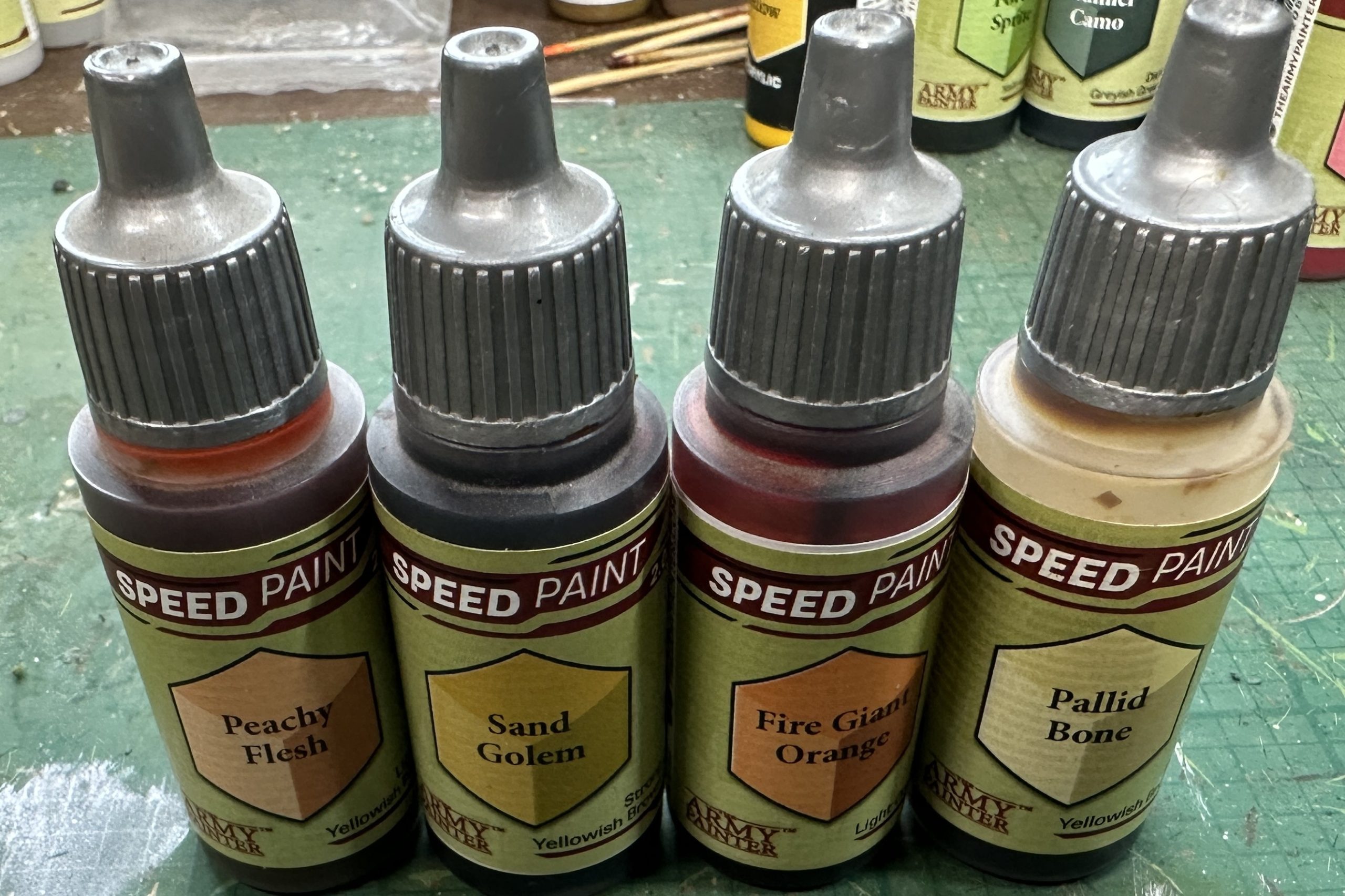
The rider is an elf so Peachy Flesh was used for her and her hair was a mix of 1 drop Sand Golem, 1 drop Fire Giant Orange and 2 drops of Pallid Bone. Red hair stands out better than blonde against all the green. Teeth, claws and the dragon bone lance were undercoated in Pallid Bone and then layers of Bonewhite, Ivory and White decreasingly toward a focus on the top/tip.
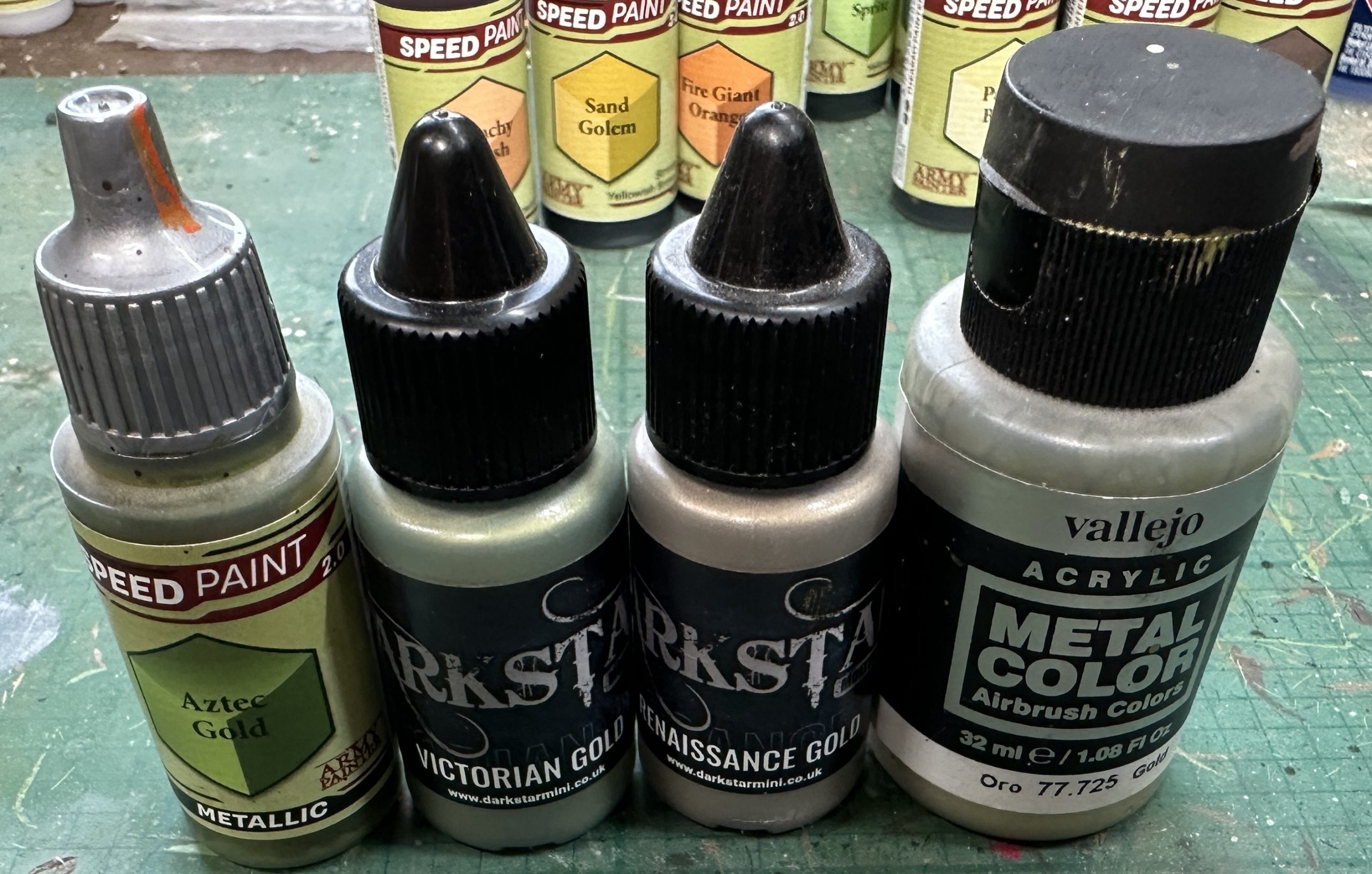
Finally metal was undercoated in the green tinted Aztec Gold.
At this point everything got a coat of matt varnish. Once dry I started to restore the shine on the metal with Victorian Gold on the upper surfaces and edges and Renaissance Gold on the lower/under areas. Final highlights on top edges and tips using Vallejo Metal Gold.
And they are done:
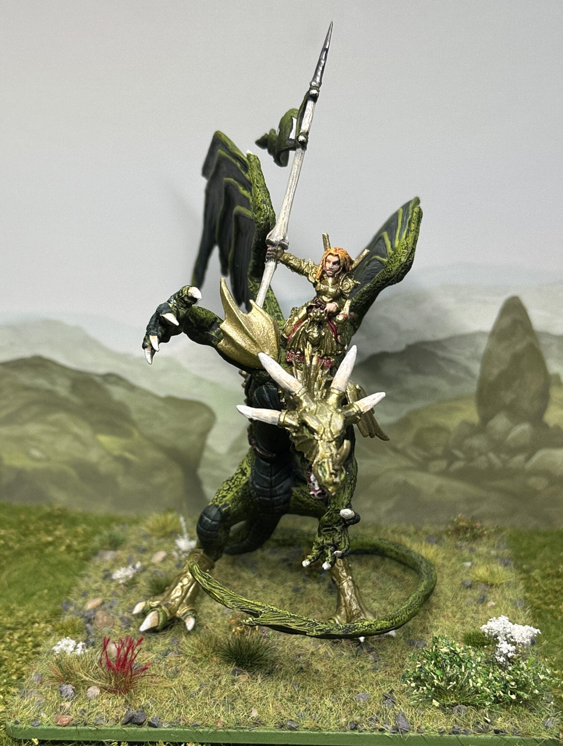
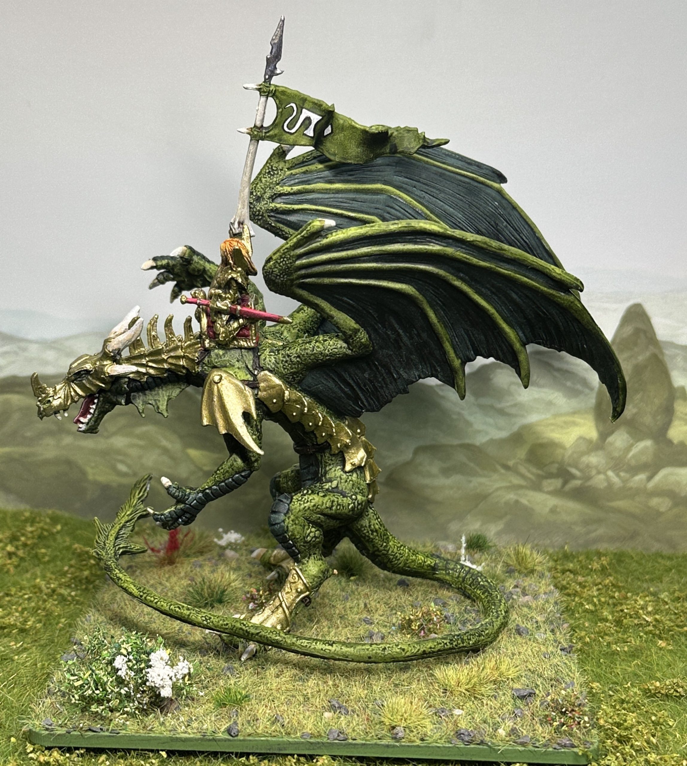
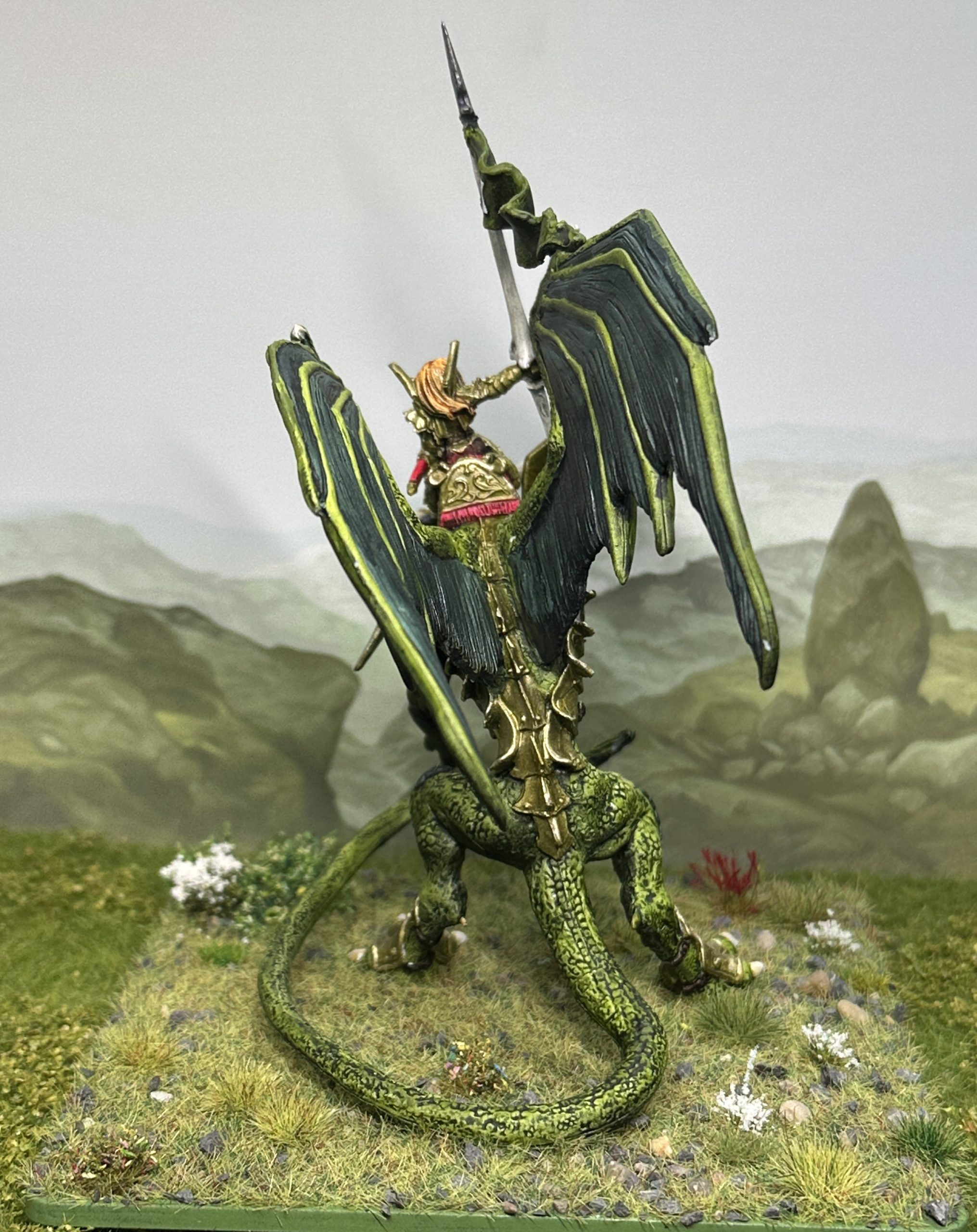
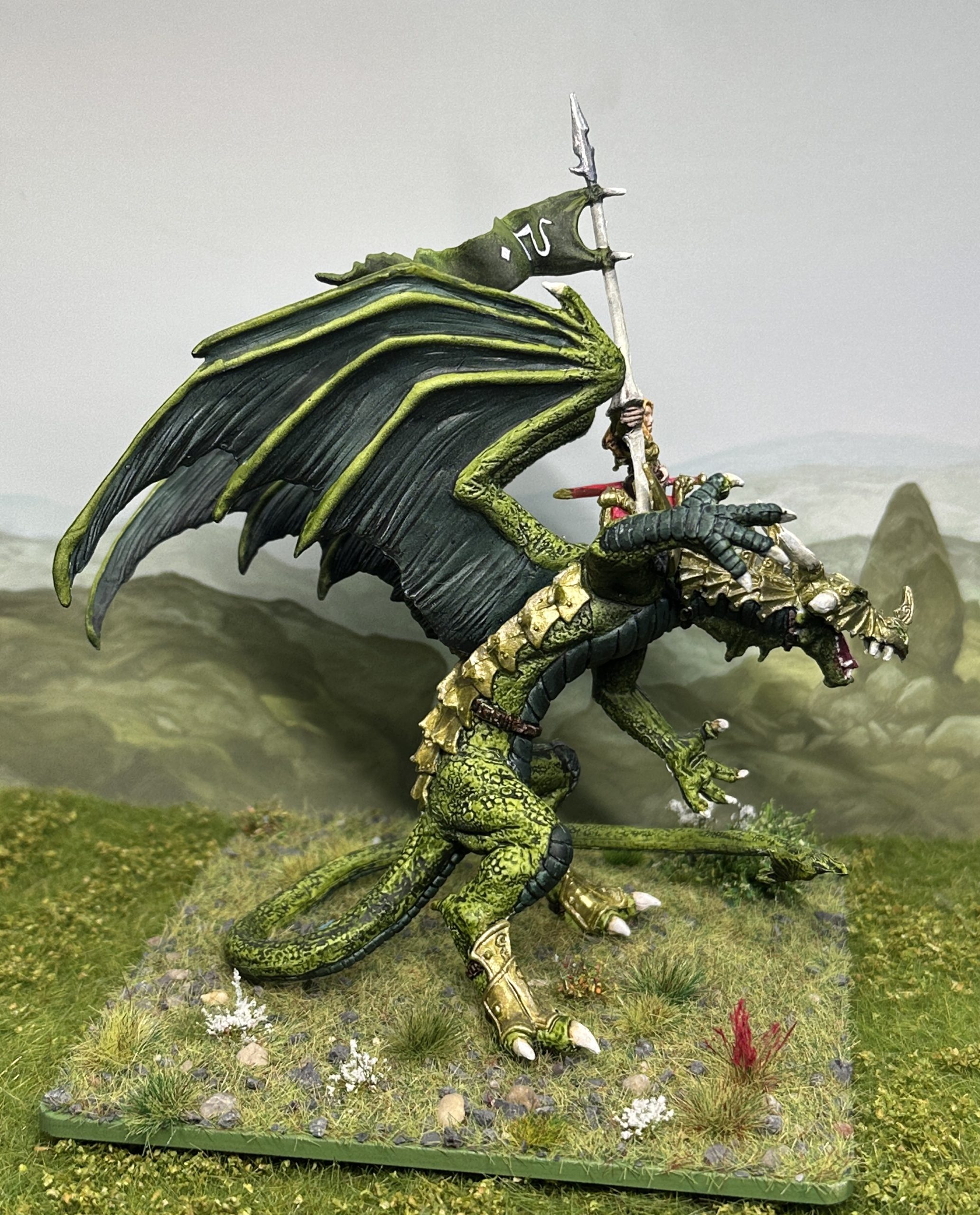
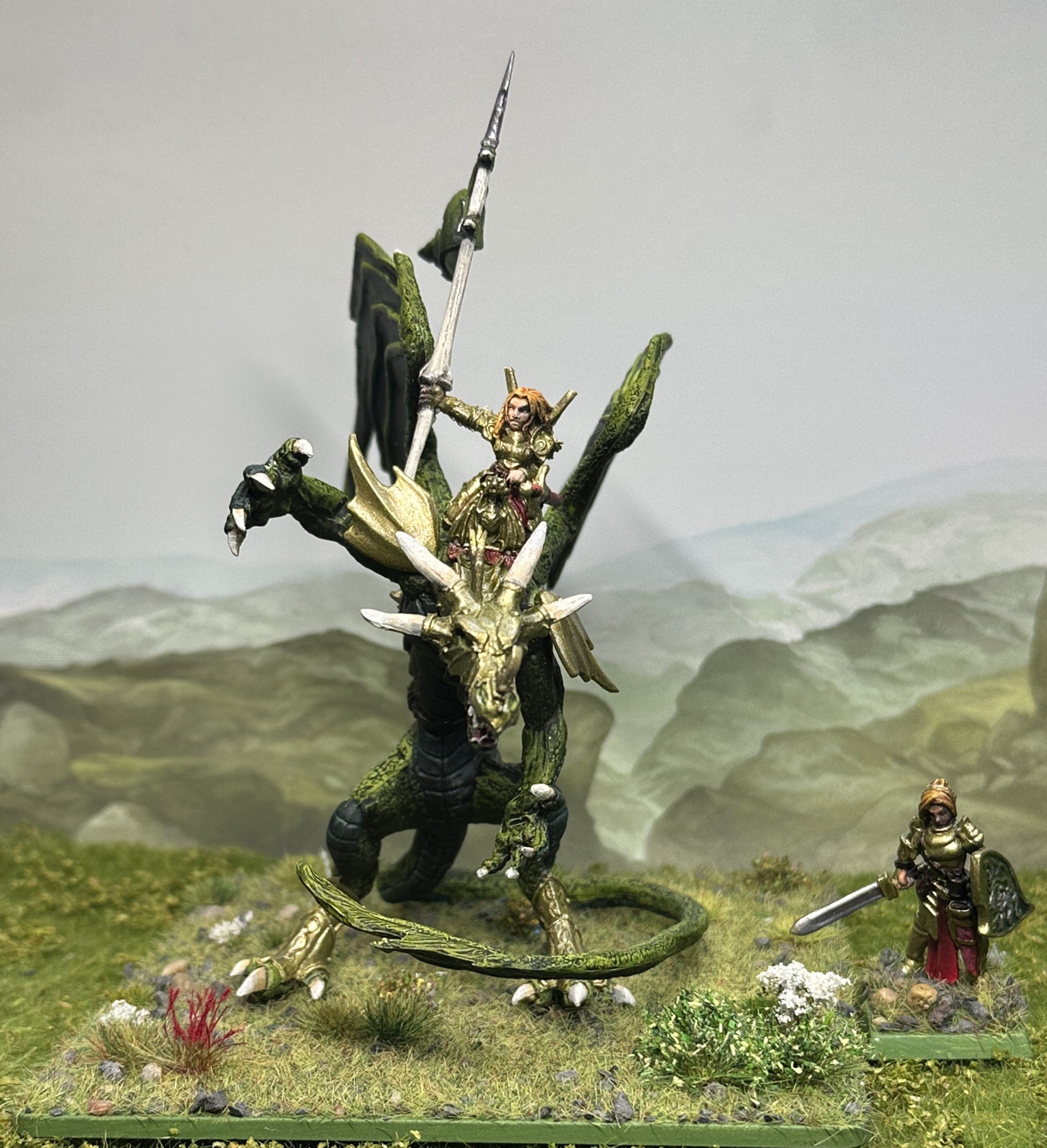
As you can see I got some nice blingy shine on the armour. Elves – never knowingly under-blinged. The scale shot shows that this is a big model. It certainly has the desired table presence.
I even had a go at the sigil on the standard with a bit of freehand. Not my favourite thing to do but sometimes its the right technique for the end result I’m after. Pencil first to sketch on the design and check positioning. Black acrylic thinned with black ink over the pencil to block out the design. White acrylic thinned with white ink to put the design on. Make sure to leave a very thin black line around the edge so the image stands out properly against the green background. Lots of patience, strong glasses and a 10/0 brush needed 😀
I’ve gone with the same sigil. The fluff behind this is that this is the daughter of Asarnil so carries the same family emblem. Now as a football fan I can spot a Gooner influence a mile off and “Asarnil” is a clear minor letter rejig and vowel transposition of someone’s favourite football team. Well two can play at that game so meet ‘Tesphar the Dragon Princess’, Tess to her friends. Her dragon is a daughter of her father’s and goes by the typically dragony name of Fearfang. Every animal had a stable name and Fearfang is called Muffin by her rider, from her habit of sneaking off and eating a mule or two from the merchant convoys that they used to escort early in their mercenary career. You’d have to have a death wish to call her Muffin to her face if you aren’t accepted as family though. Dragon’s can be very touchy about that sort of thing and have infamously short tempers.
You can see from the comparison shot that the sculpt of the Reaper model is “significantly inspired” by the Citadel model 😀
Finally reviewing the pictures I noticed that I’d forgotten to do the dragon’s eyes. A dot of white onto the eyeball. Then Vivid Yellow ink over that and a thin back line. Finally a dot of Fluro Yellow on the upper side of the eye above the pupil.
What’s that flying across from the mercenary horde Captain?
I’m not sure General. Is it a bird? Is it a plane? No! It’s big, green and looks very angry!
– The reported last words of High General Gemeraldo at the Battle of Neat’s Pass.
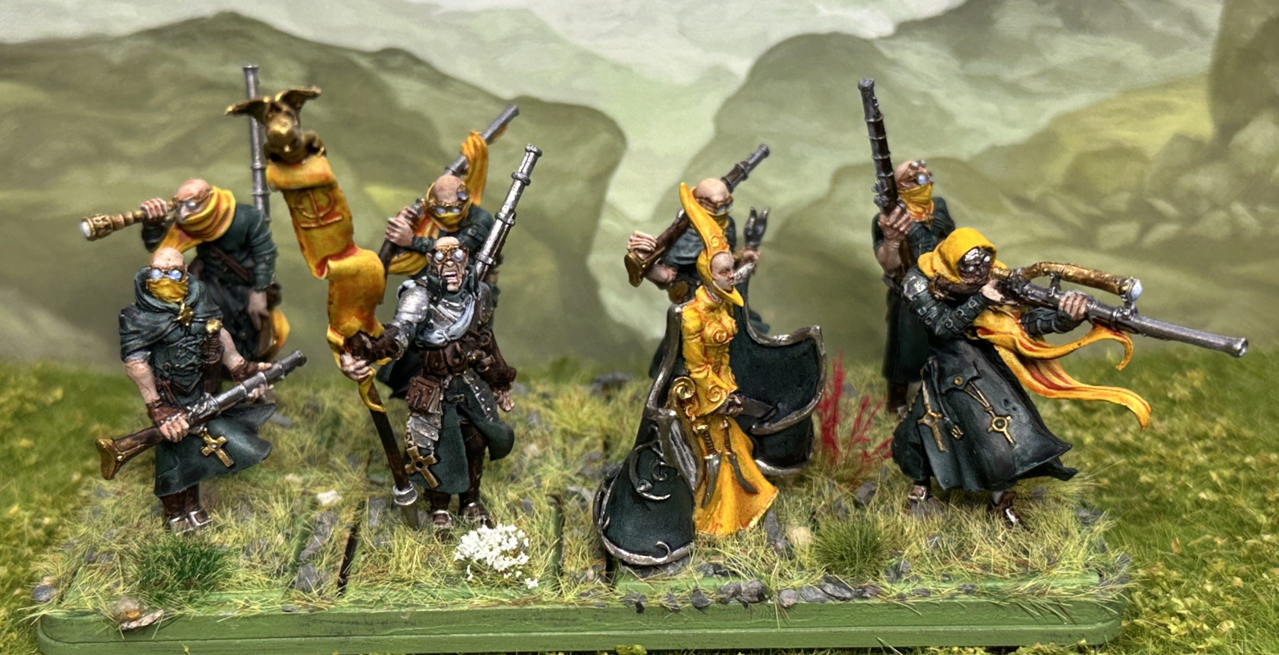
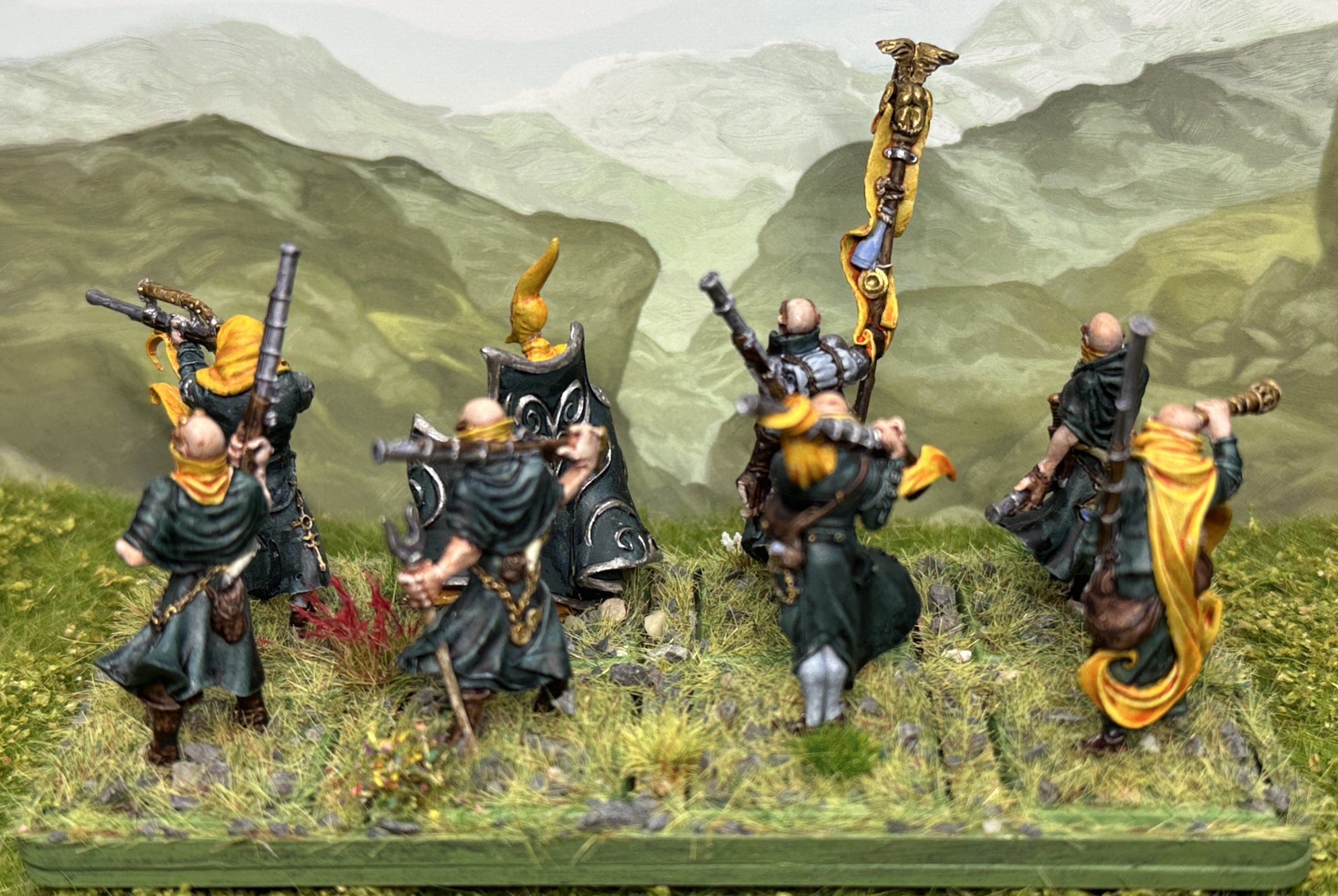
Marksmen of the Lady in Yellow
A small unit of marksmen to add a bit of extra pop to the shooting phase. These are Griffin Fusiliers by Confrontation with two Griffin character miniatures added to take them up to a unit of eight.
Painting
I used A mixed Speedpaint to get the dark green colour, 4 parts Turnbull Turquoise to 1 part Absolution Green. Then a nice high contrast from the Honey Yellow. Satchel brown for the leather and Runic Grey for inner clothing. Metal work as per previous units. The usual matt varnish stage after the first colour application before putting the metallic highlights on.
Glasses and lenses
The marksmen all use glasses and telescopes so I brightened the lenses with white acrylic before a brush or Pastel Indigo Speedpaint into the bottom half working up from the lower left segment. I have found doing glasses tricky in the past but I was very happy with the results of this experiment and will do glasses like this from now on.
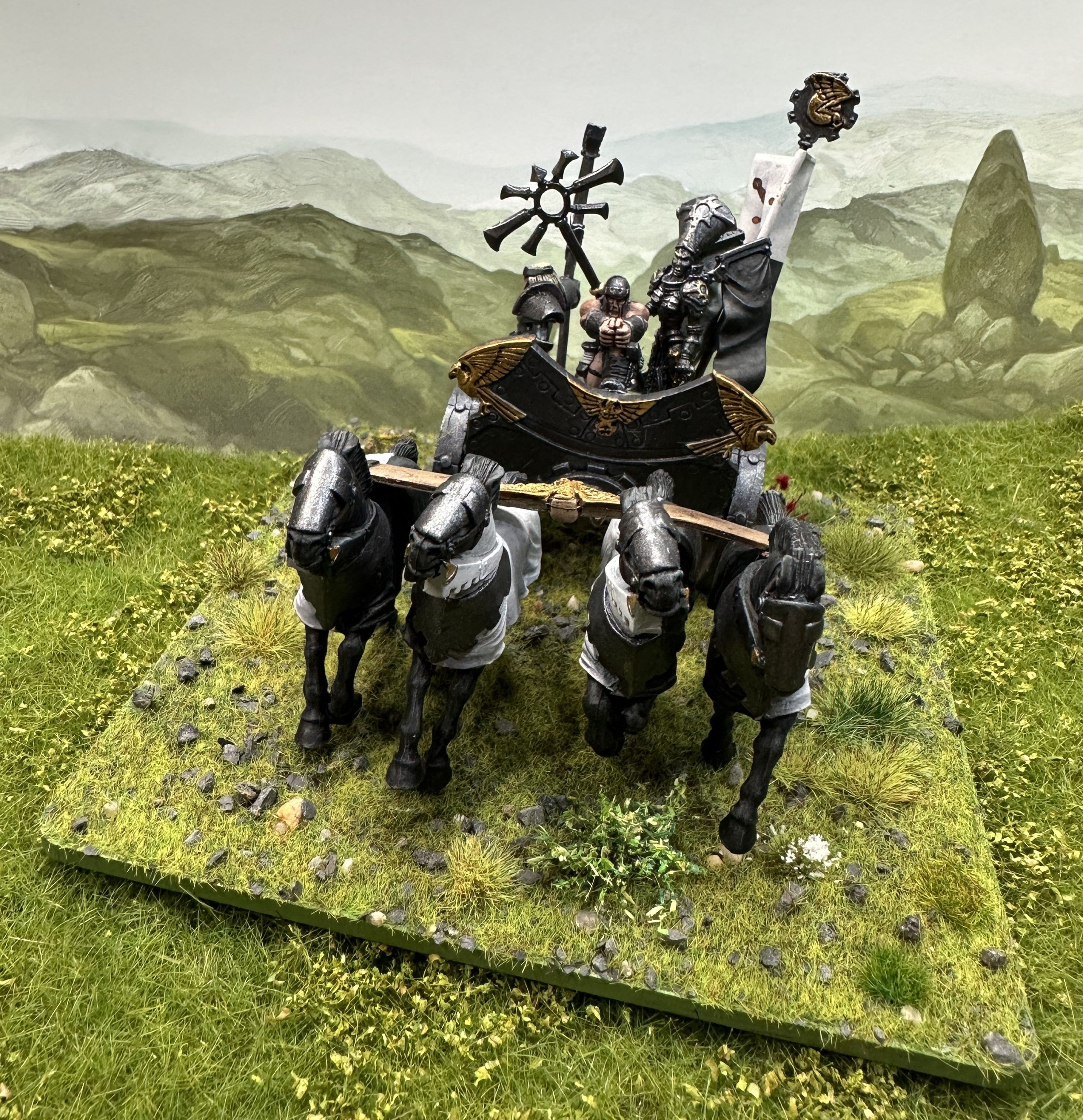
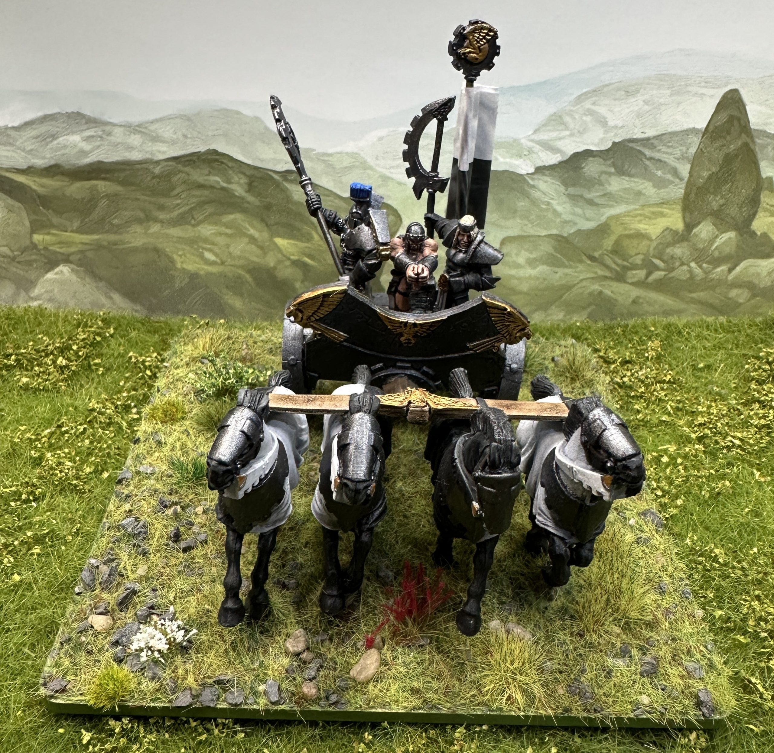
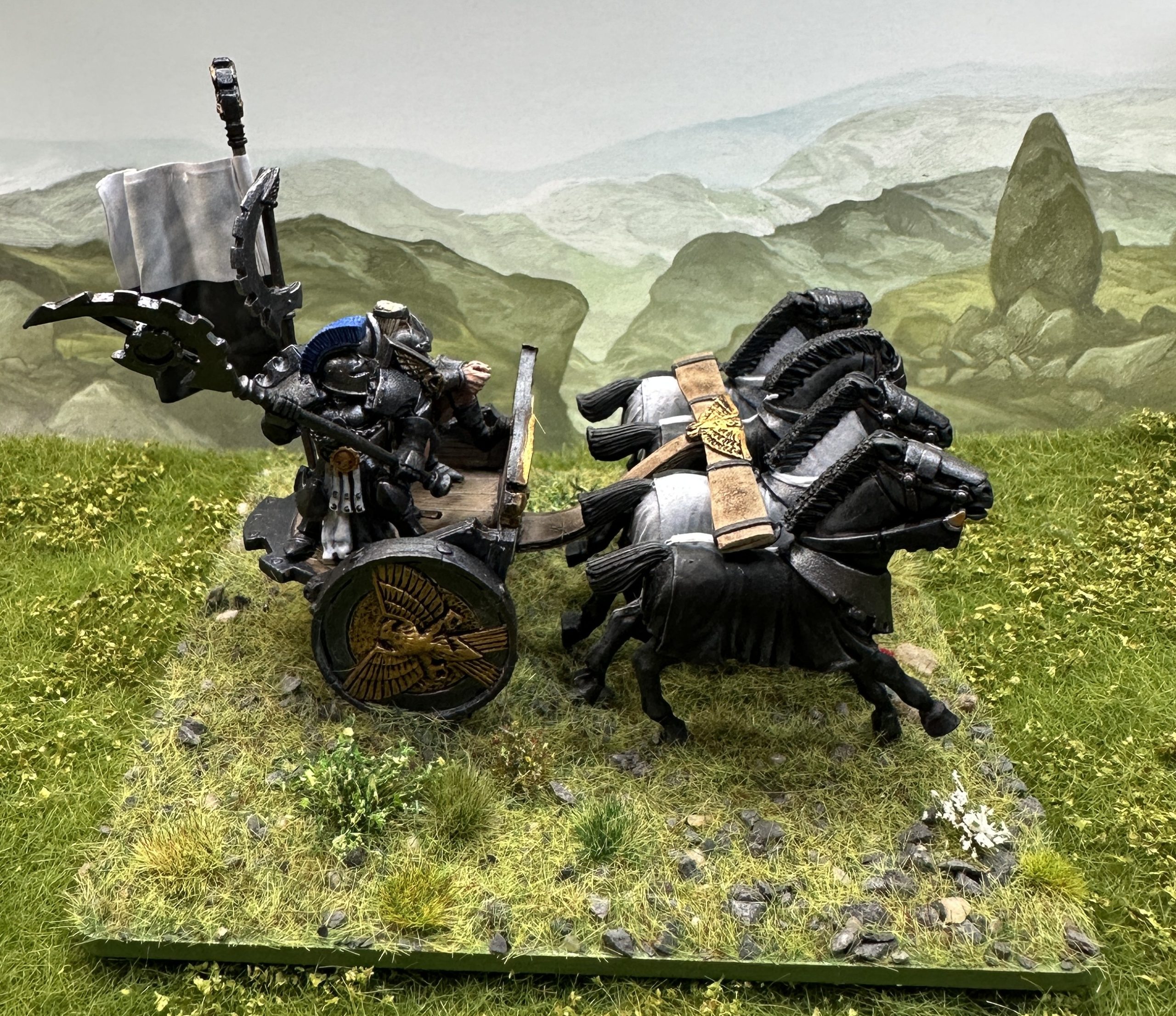
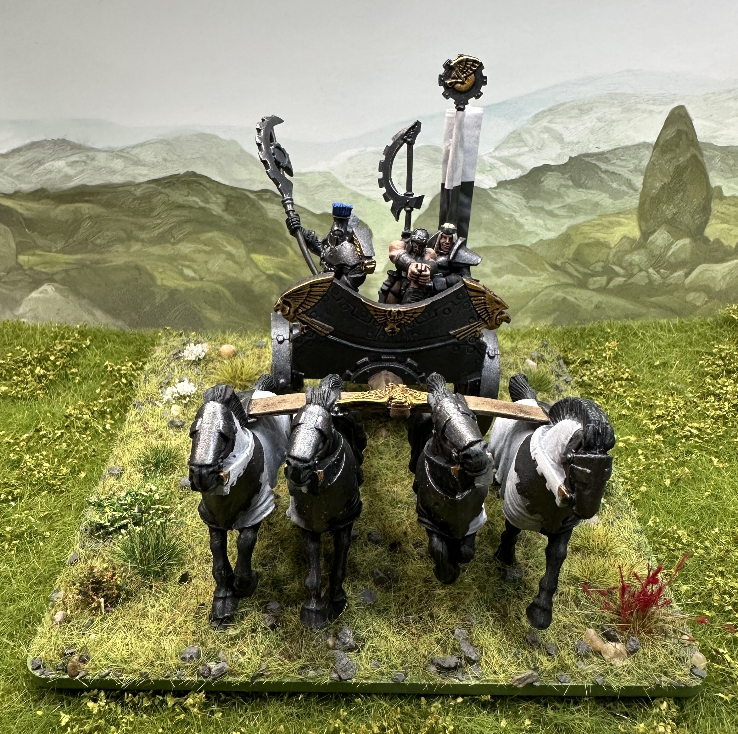
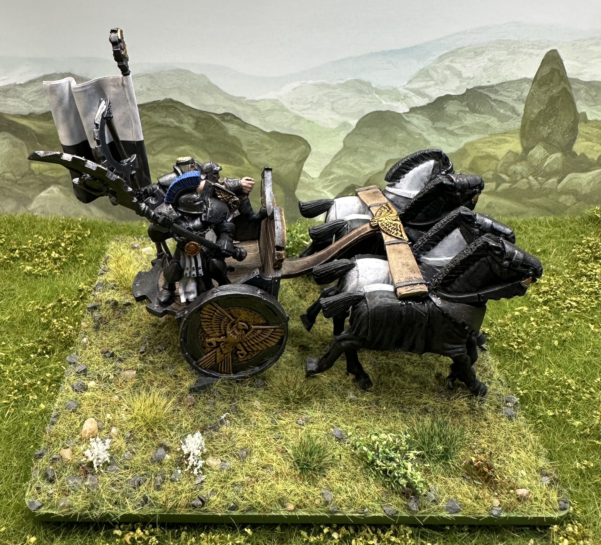
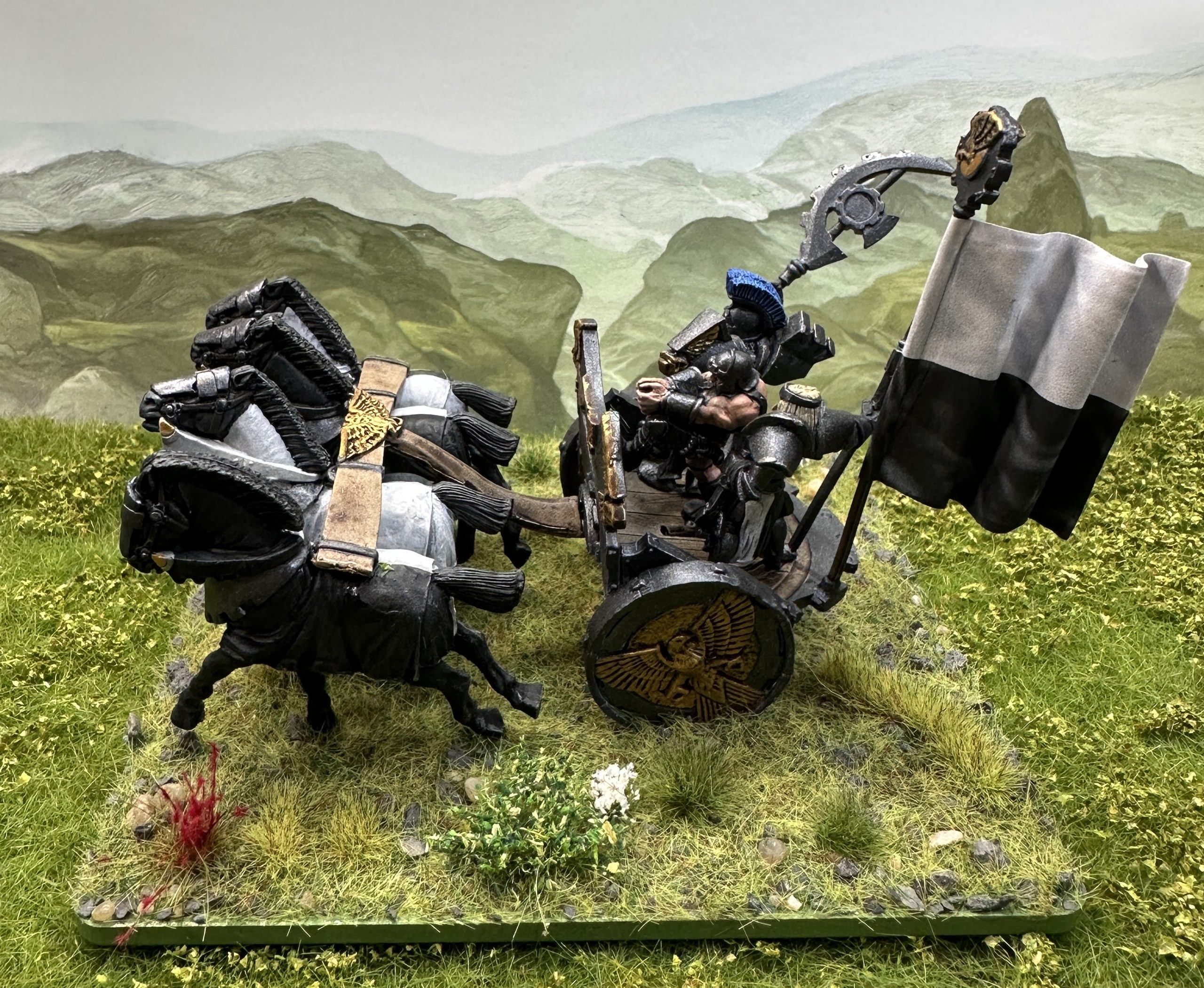
Firstborn Chariots and the 2/3 review
The three Firstborn chariots are finished. Beautiful full metal kits from the Target Games era of Chronopia in the late 1990s. I had a priestess figure so swapped her in for one of the Repulsar knights.
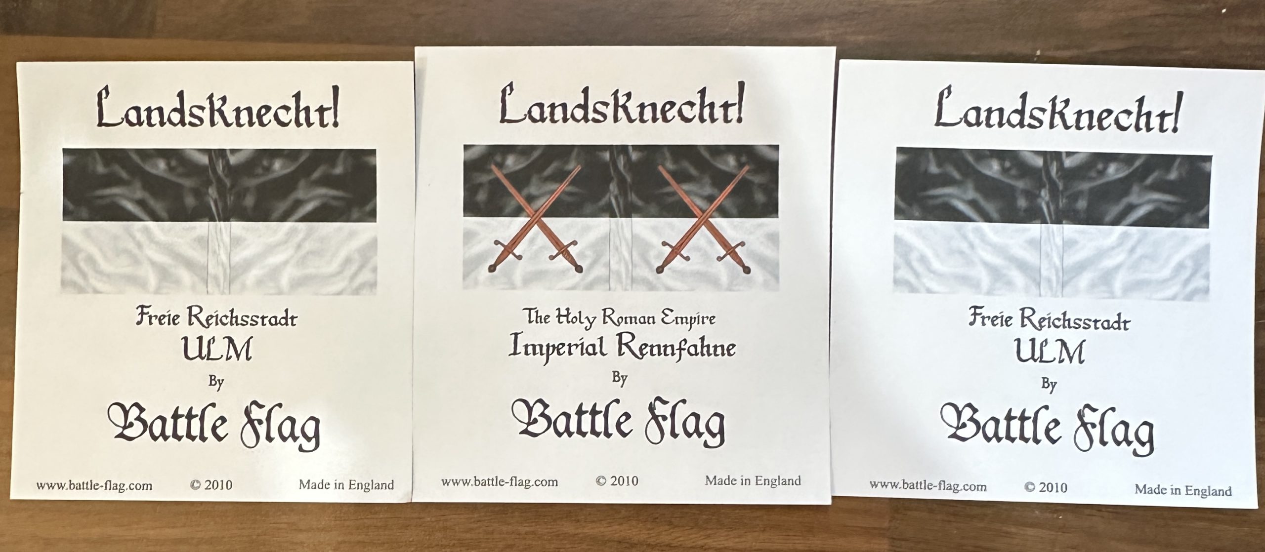
These kits come with a banner pole at the back of the chariot. I wanted to use ready made banners so looked online and Battle Flag do some nice ones in their Landesknecht range. The banner of Ulm and the “Imperial Rennfahne” or more properly Reichsrennfahne, the Imperial War Banner of the Holy Roman Empire. Historical purists (and possibly some people from Ulm) will be disturbed by my intention to use them upside down. I prefer the white over black as a look and the Rennfahne looks better to me with the swords the other way up too.
This unit took longer than I expected but perhaps I should have been aware that with 24 models combining to make the three chariots and crew it would take a while. Just getting the dozen horses sorted took ages. I played about with how to organise them as half have caparisons that are white on the left and half are the reverse. In the end I went with alternating sides in each team and with the leader’s team being the reverse order of the other two.
All painting and modelling techniques were as previously described.
First the Iron Priestess:
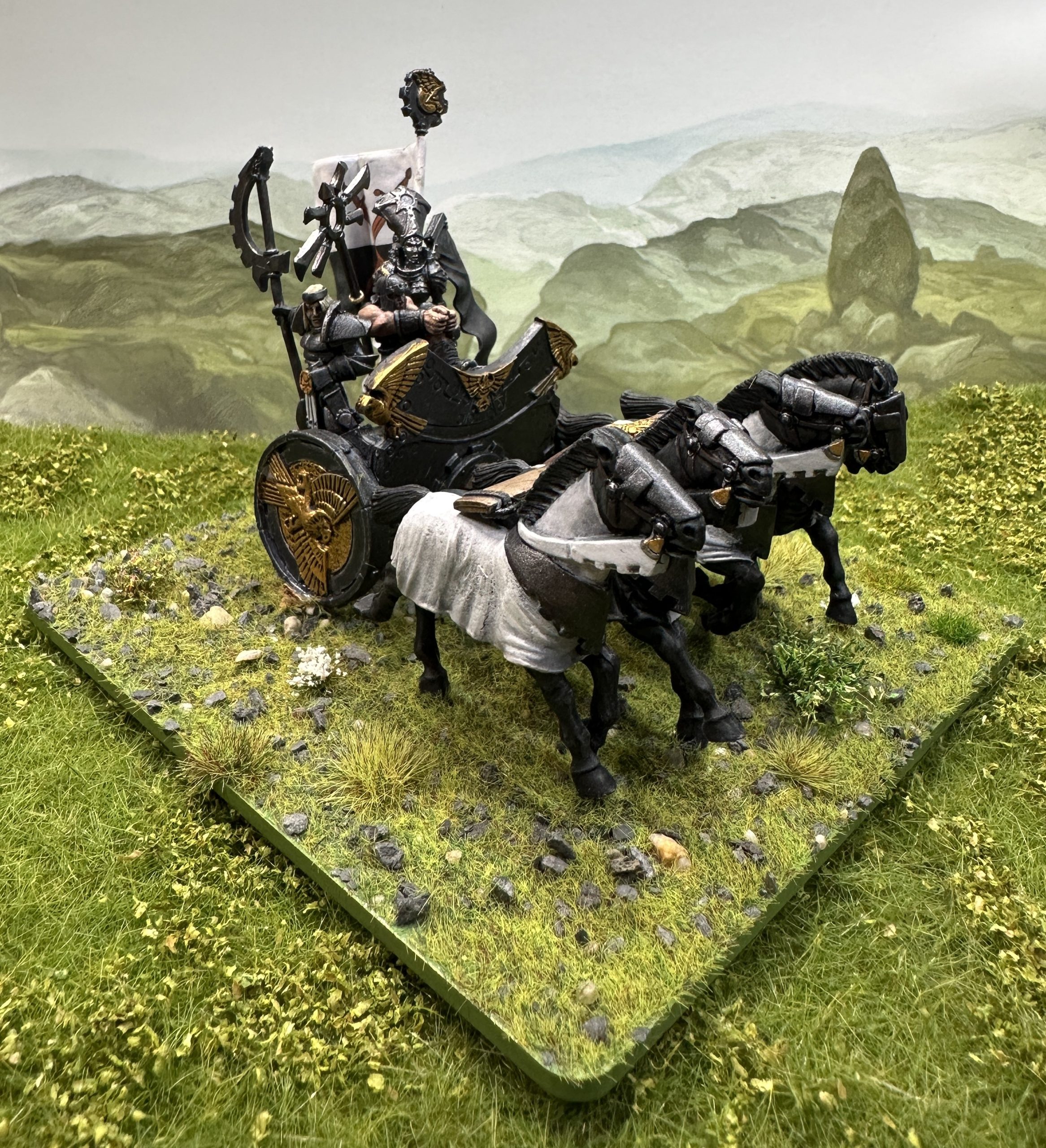
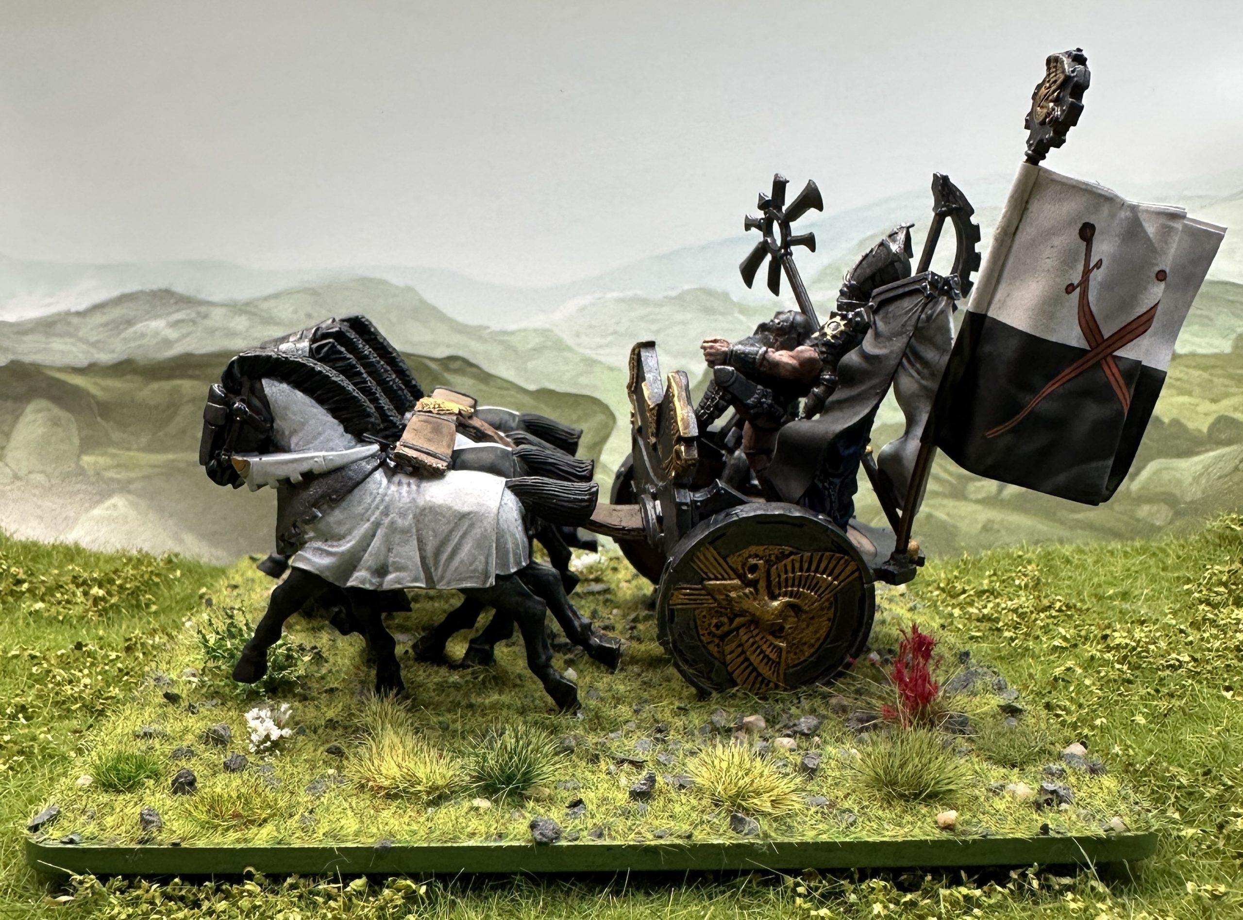
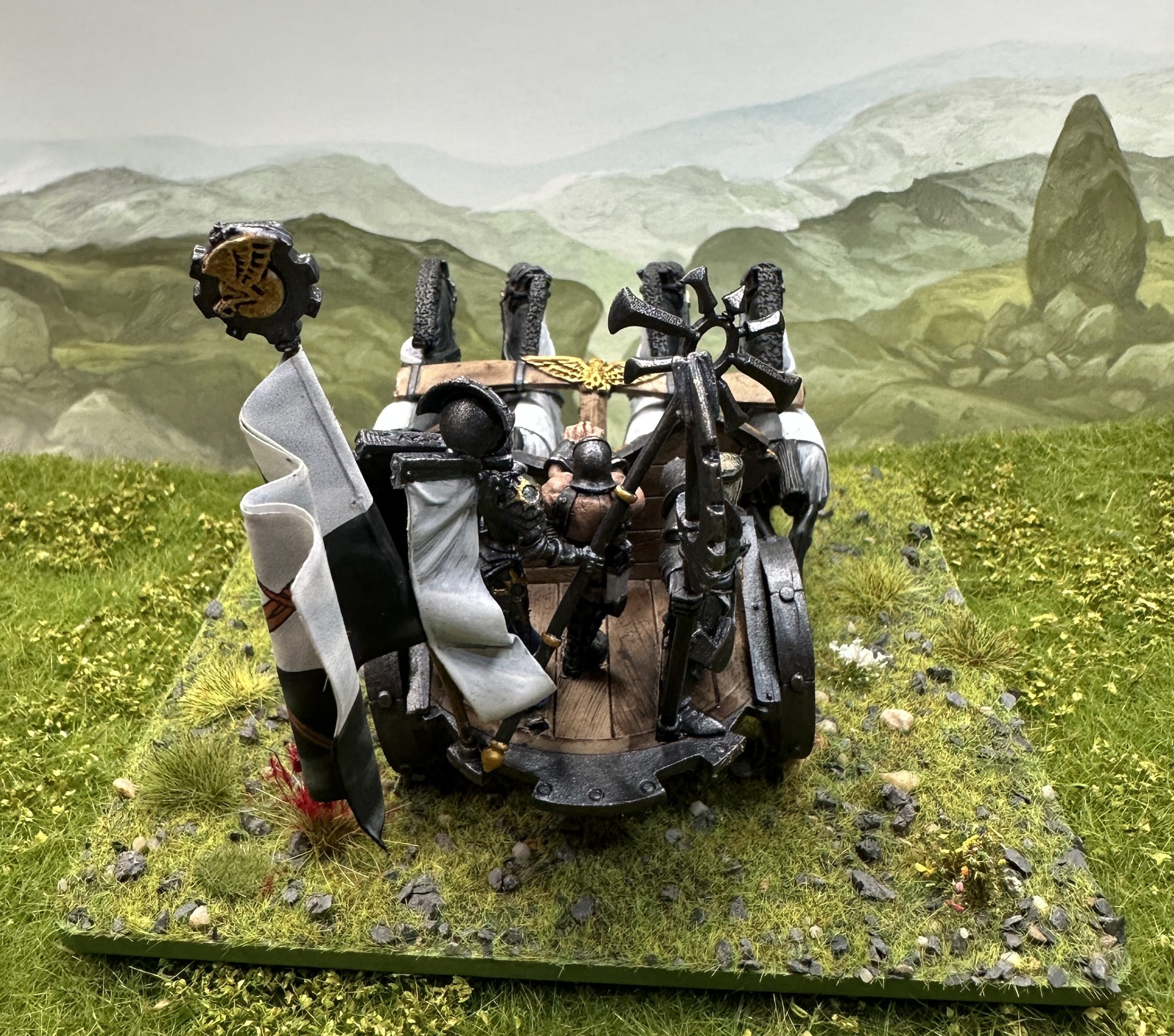
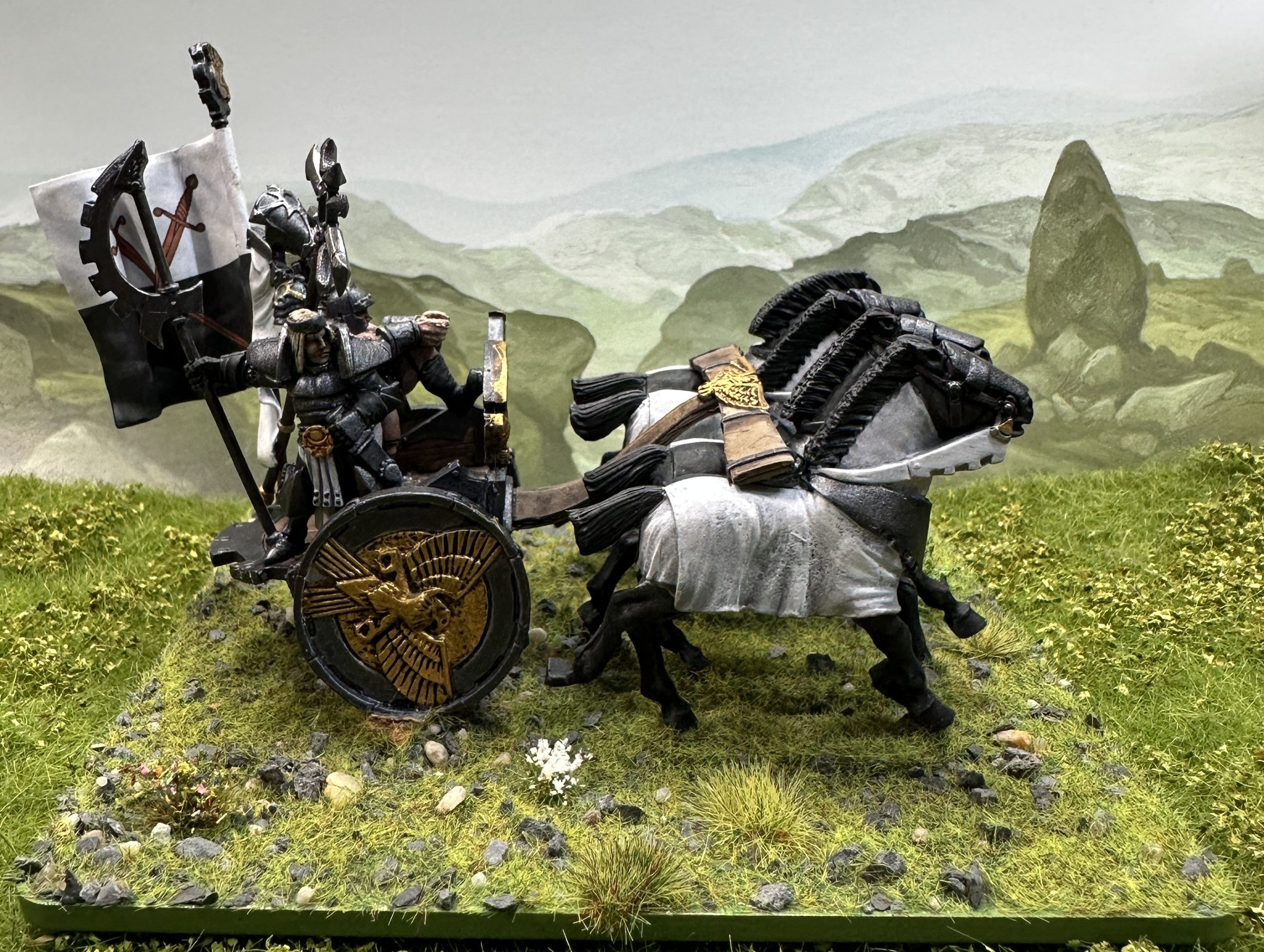
And some shots of the other two with the knight crew.
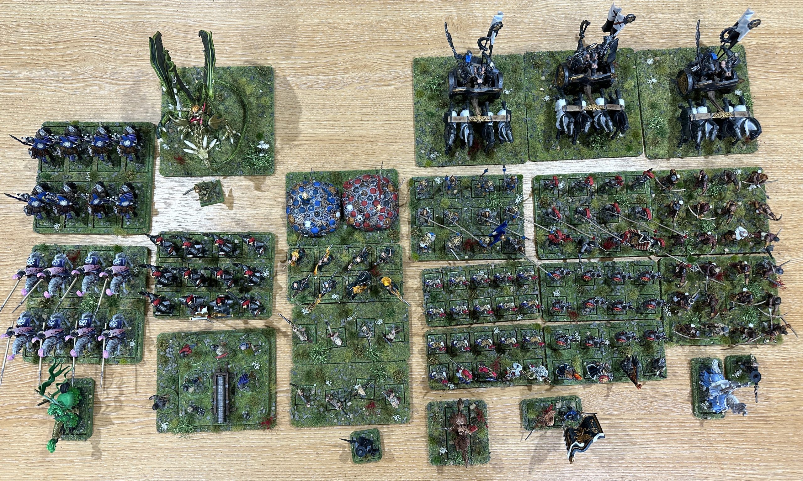
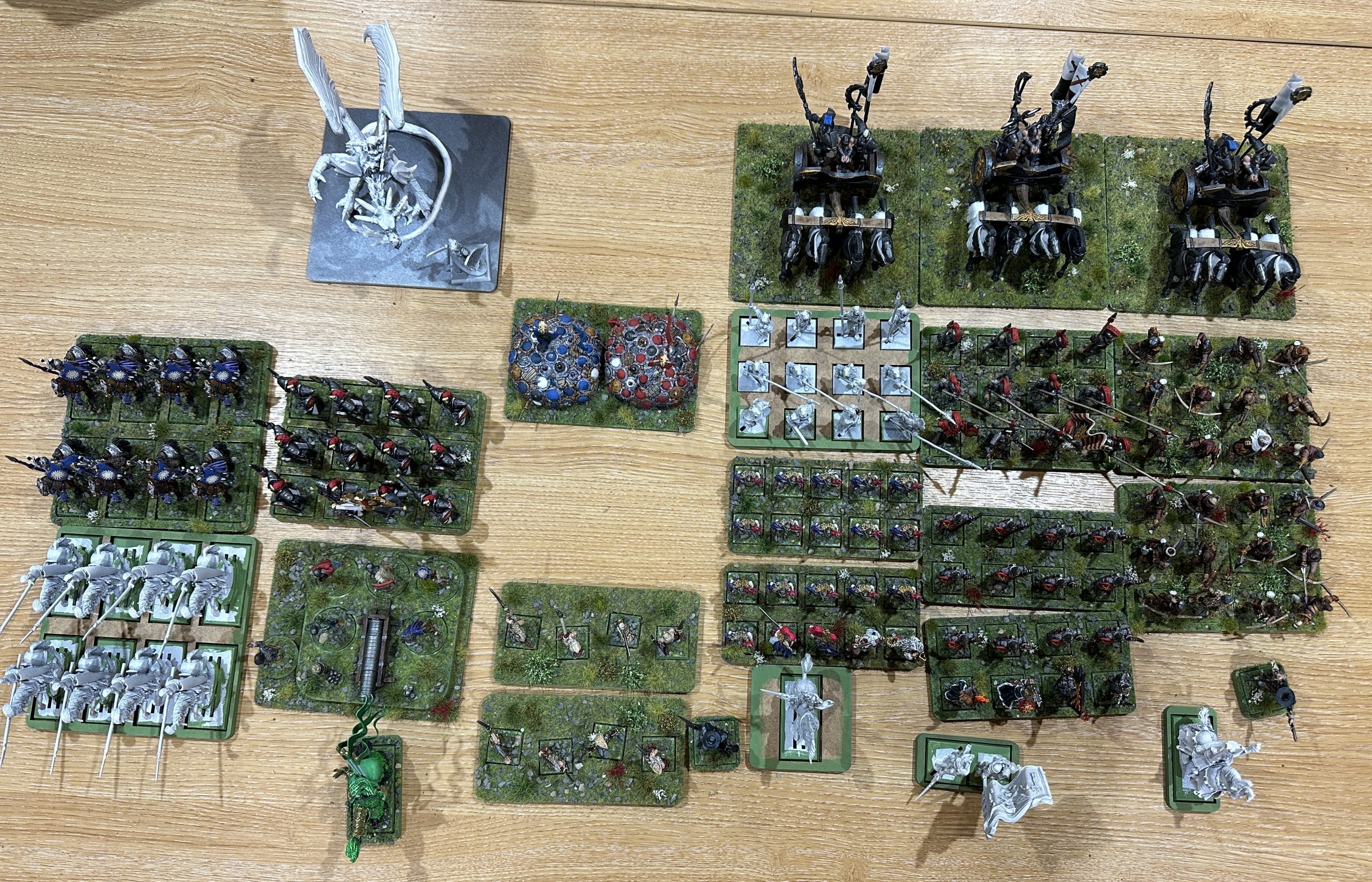
Time is racing away and the SCC is past the 2/3 point. The army book is still being worked on. A quick review of where the army has got to. There are ten completed units and three character bases are done. With one unit currently on the painting desk there are still two more to do and three character bases. There is also a surprise new unit in the picture. More on that one shortly.
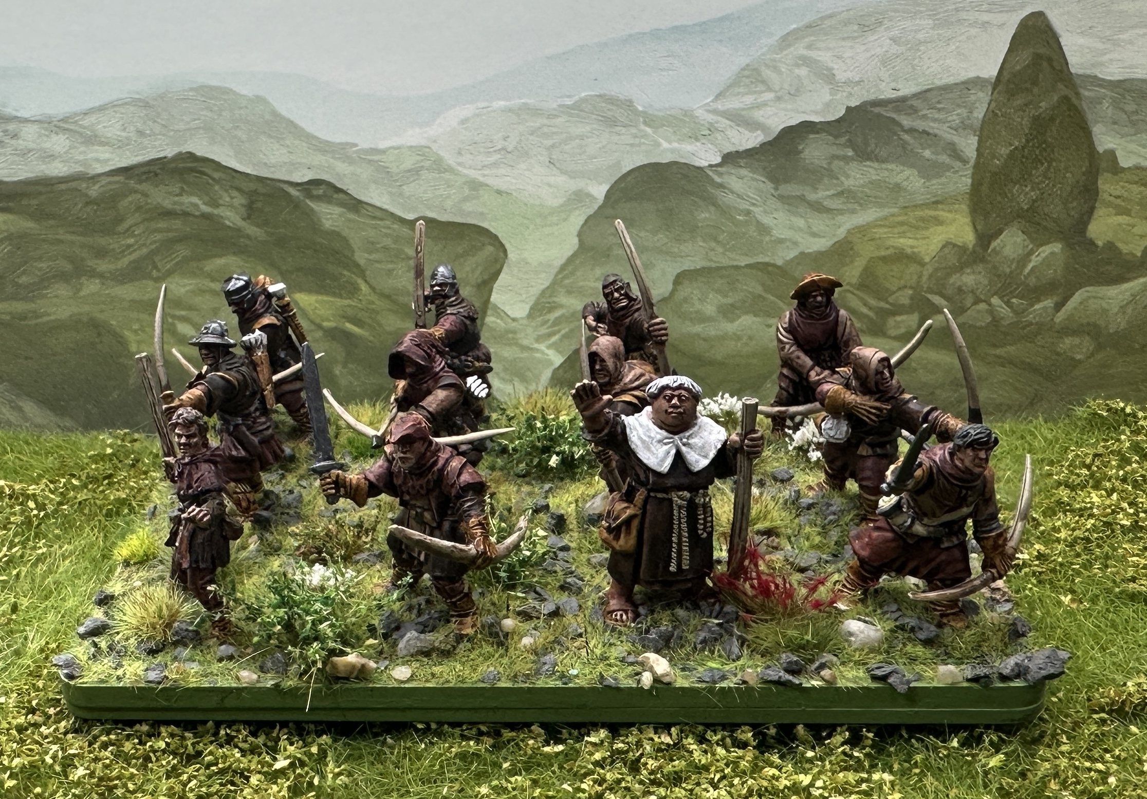
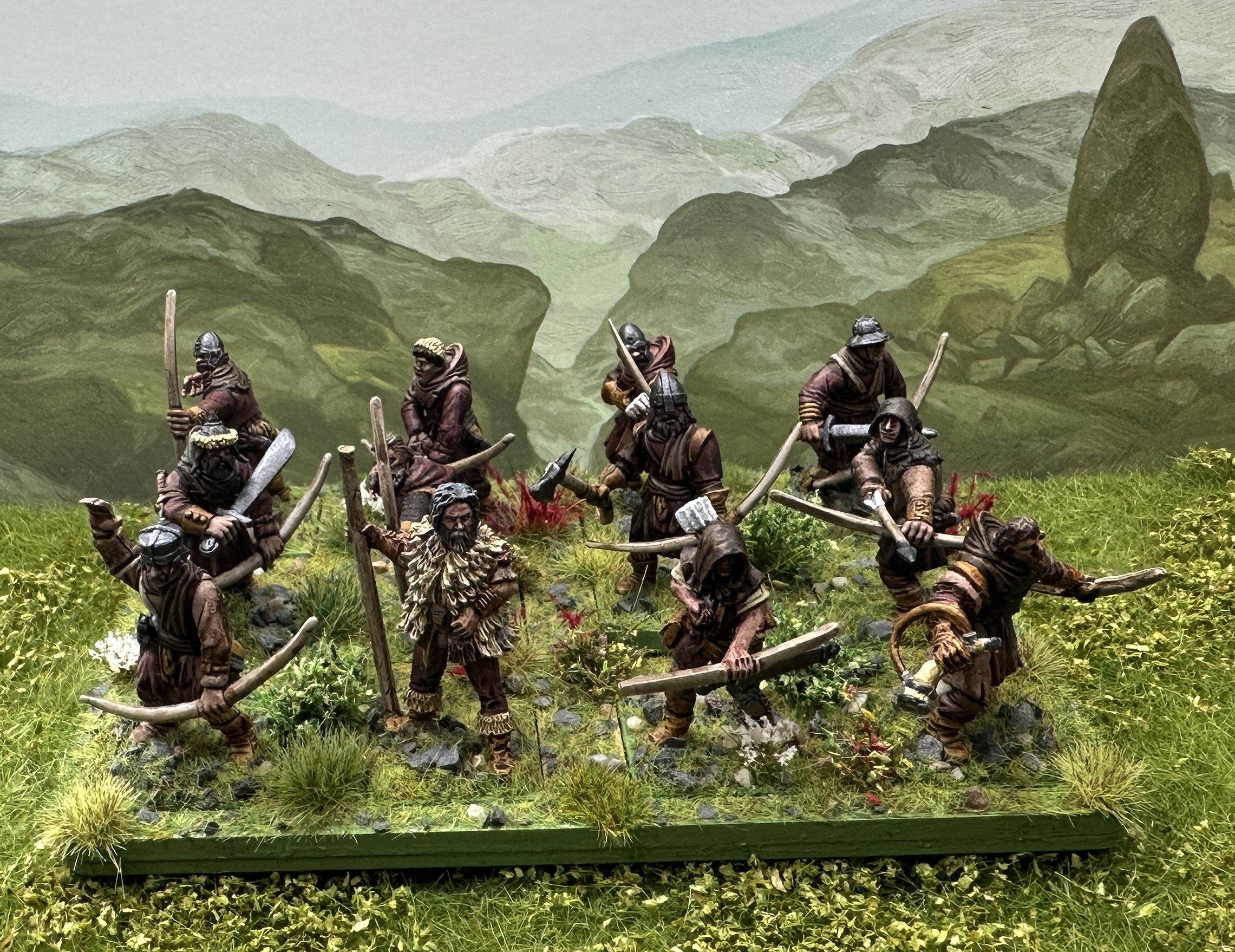
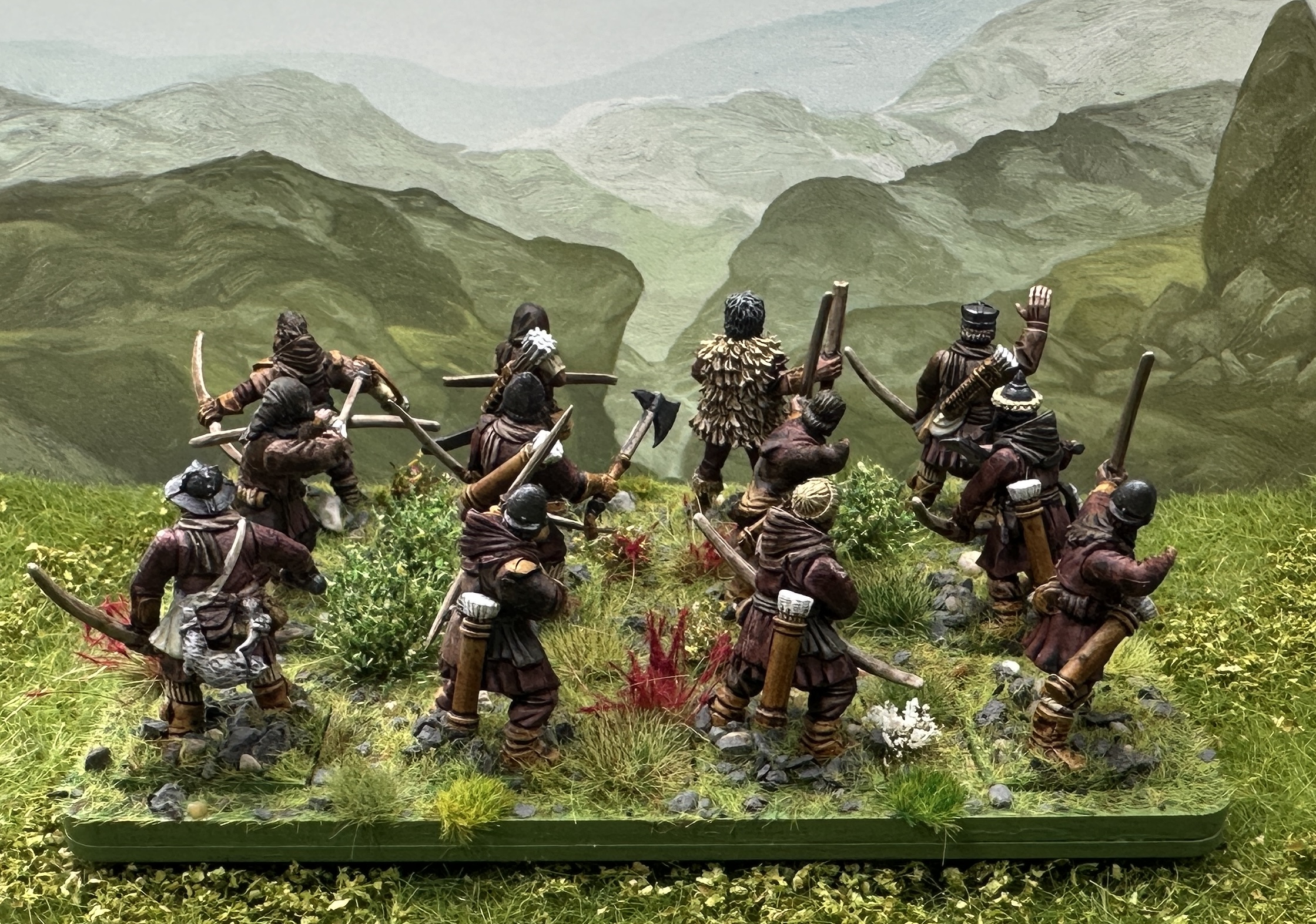
Herbstwald Brigands, stuck then unstuck and another trip to the great outdoors
The largest regiment left were the Brigands. 24 archers on two big bases to make Formed Archers. The reason for doing that rather than having them as skirmishers is that in Midgard the only effective shooting comes from Formed Archers. Skirmishers don’t do any significant damage so can’t be much more than a speed bump.
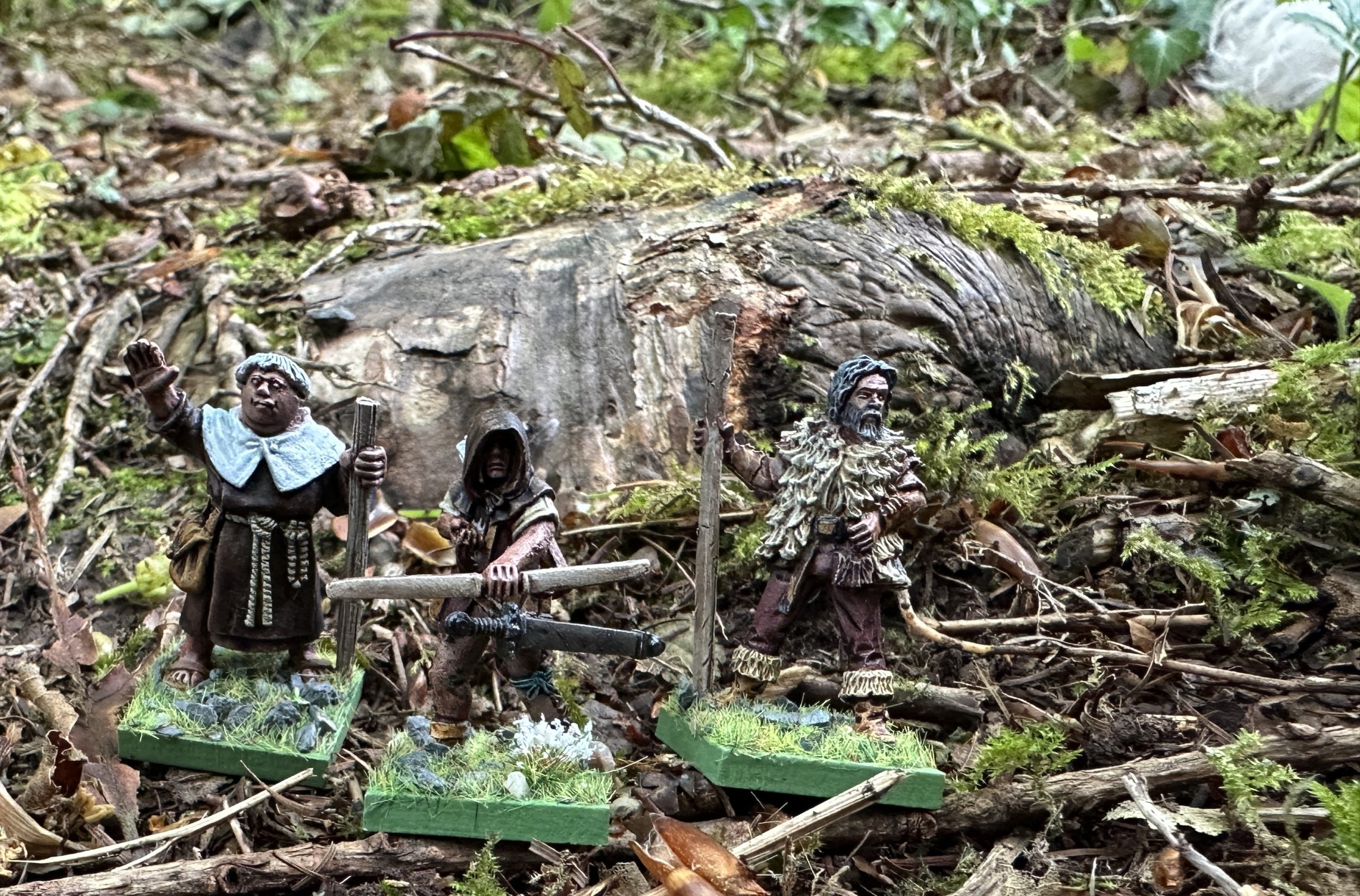
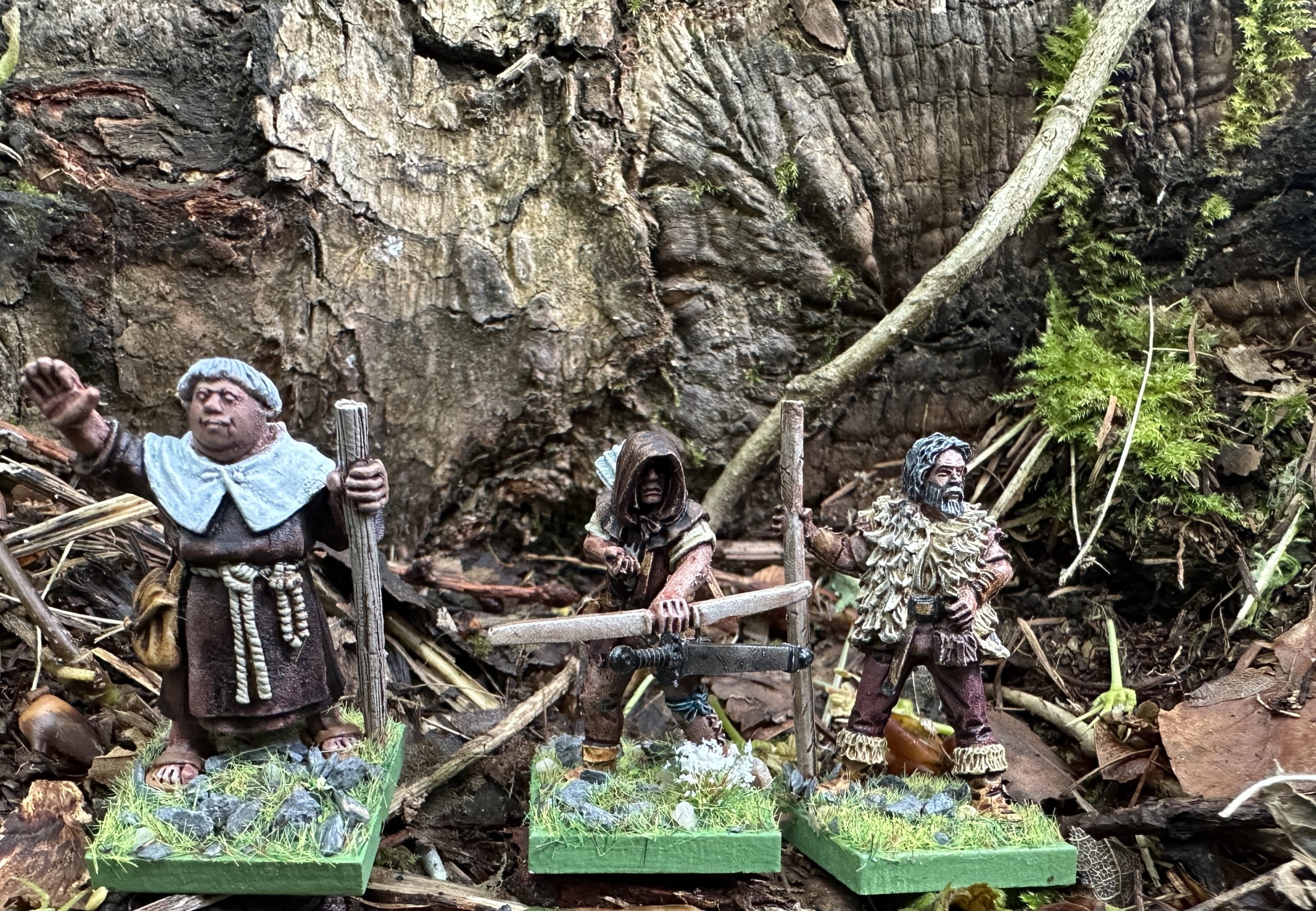
The basis minis are kitbashed from some random sprues of Frostgrave soldiers and barbarians that came with something from North Star, probably the first Cultist Nickstarter. I ordered the Forset Outlaws conversion kit to get a few more bow arms and some useful stuff like the horns. The concept was Robin Hood and his outlaws so I wanted a leader and main characters that channeled that. I already had a Friar Tuck – unusually I don’t recognise who made him. Please comment below if you know. I was 3 miniatures short and needed Robin and Little John miniatures. I knew Crooked Dice did some nice ones and whilst there I saw a Much the Miller’s Son and that was everything needed. I had to wait for them to arrive so they fell down the painting queue a bit.
I started painting a couple of weeks ago. I like having a point of difference and was taken with the idea of them being brown rather than green. I always see these type of models in green and brown is just as effective for camouflage in woodland. However, I got cold feet and then ran out of steam when I tried to figure out how many shades of brown I’d need. There are so many gribbly bits on these guys – the “benefit” of more modern plastic sculpts than the older metals of the rest of the force. In the end I decided to just start and there are six main shades of brown in Speedpaints; (Noble Skin, Dark Wood, Dusk Red, Burnished Red, Ruddy Fur, Fire Drake). The two reds are quite similar reddish-brown shades. That leaves Hardened Leather and Satchel Brown for the leather and belt gubbins which should provide enough difference if I add a canvas colour for some of the larger fodder bags.
Once decided I got through them in a few days and this is what I’ve got:
The difficulty in deciding on the paint scheme and becoming ‘stuck’ is something I’ve experienced before. It can happen with a big project. I’m used to being able to push through most projects in a maximum of a month and anything that drags on further than that I often experience a dip in energy or creativeness. That’s okay and I resolve it by going and doing something else in the hobby for a bit. Eventually I’ll be able to sit down and get on with it again.
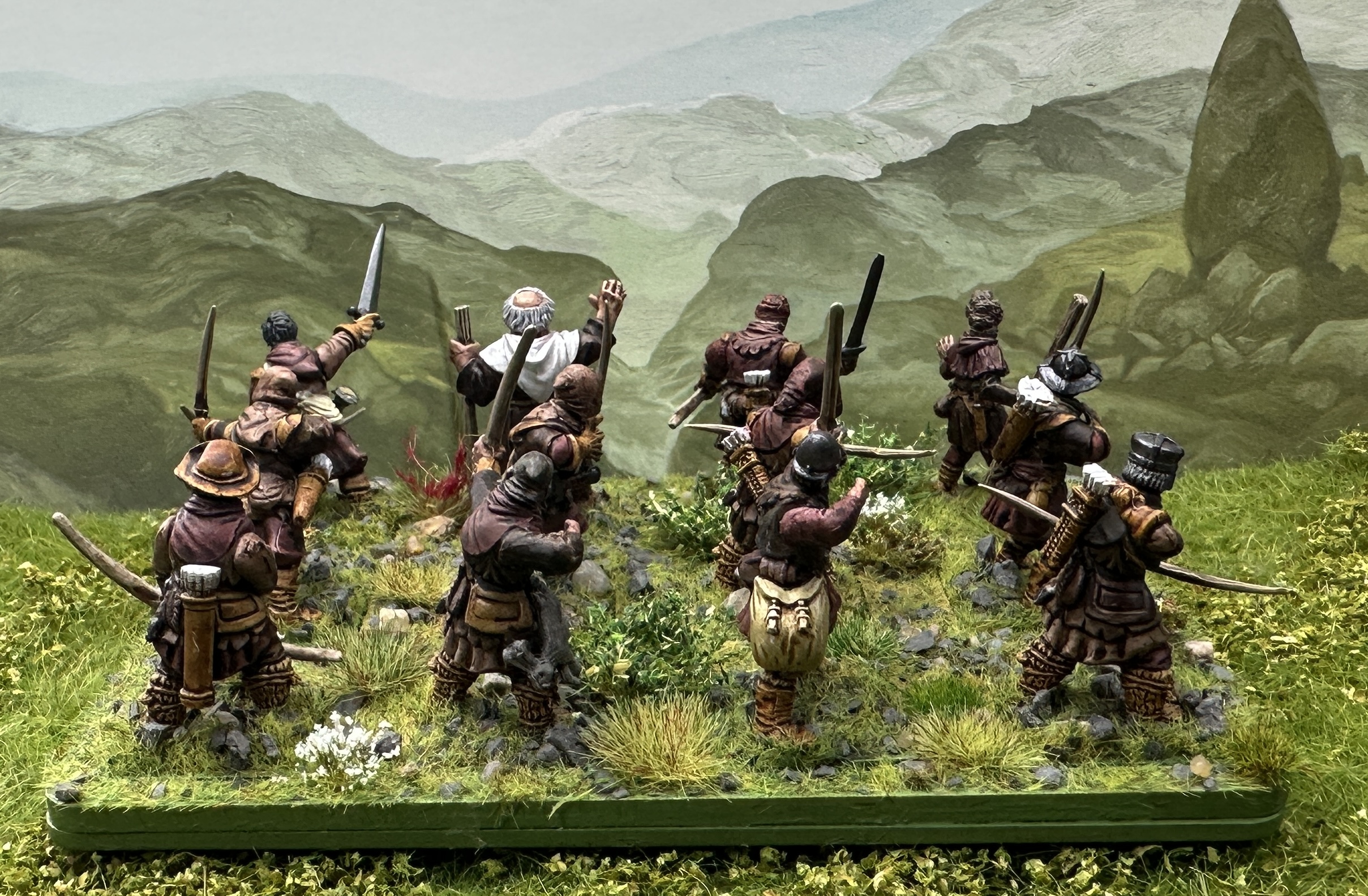
Having finished the brown scheme I was interested to see how it looks in an actual woodland. Time to go outside again 🙂
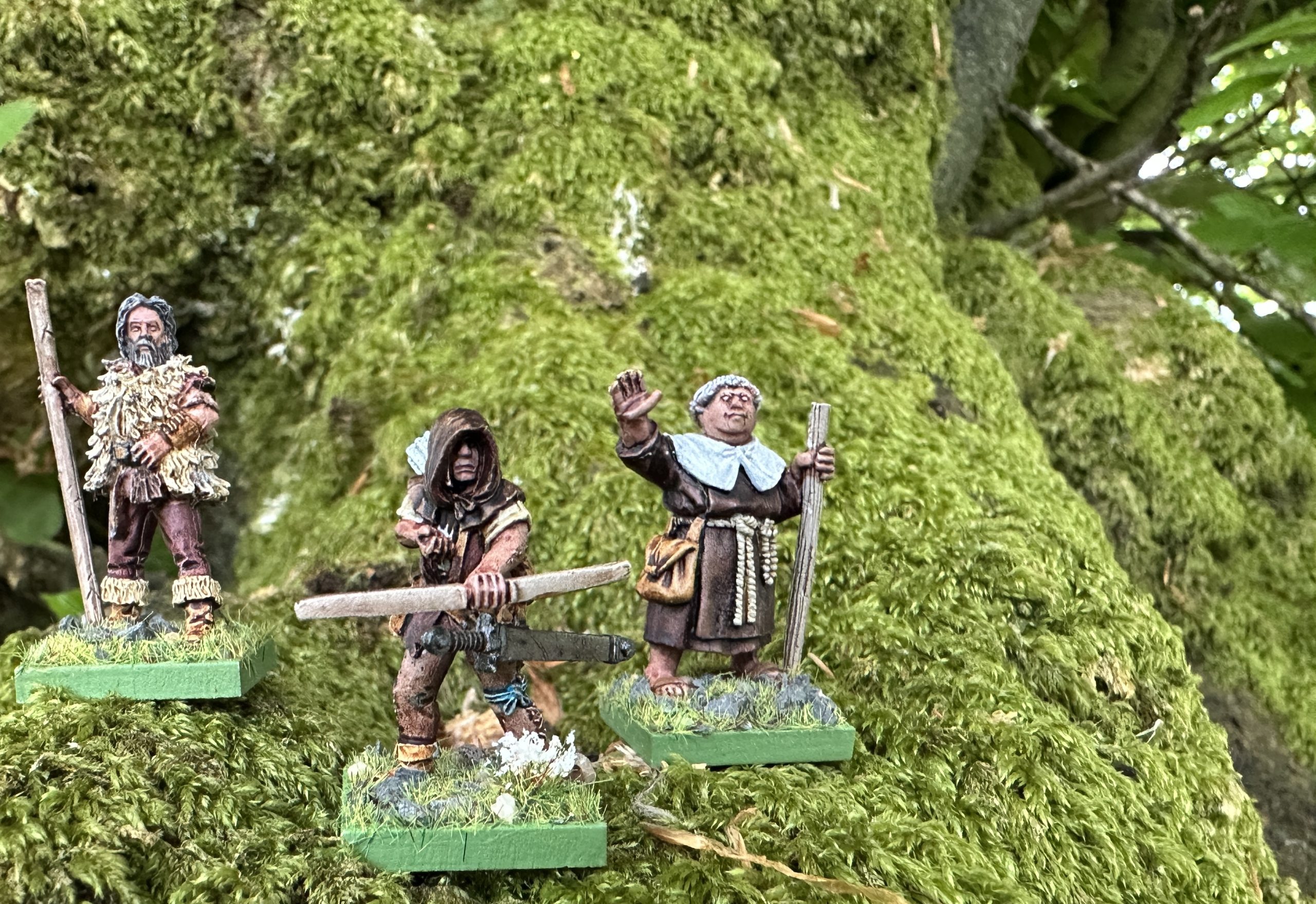
I think they look pretty convincing. Now I’m working on a decent name for the fulff. I think I’m going with German so these guys are the Herbstwald (Autumn Wood) Brigands.


![11th Edition Warhammer 40K Core Rules Now Available & More [Updated]](https://images.beastsofwar.com/2026/06/orks-new-cover-600-338.jpg)