





Marvel: Crisis Protocol


Recommendations: 3180
About the Project
I've moved my project to my Wordpress blog. For anyone interested, it is here: https://moriartisminis.wordpress.com/
Related Game: Marvel Crisis Protocol Miniatures Game
Related Company: Atomic Mass Games
Related Genre: General
This Project is Completed
"Before I am through with you, Thor, you will come crawling to me, begging for death's final embrace! And Hela will be revenged!"
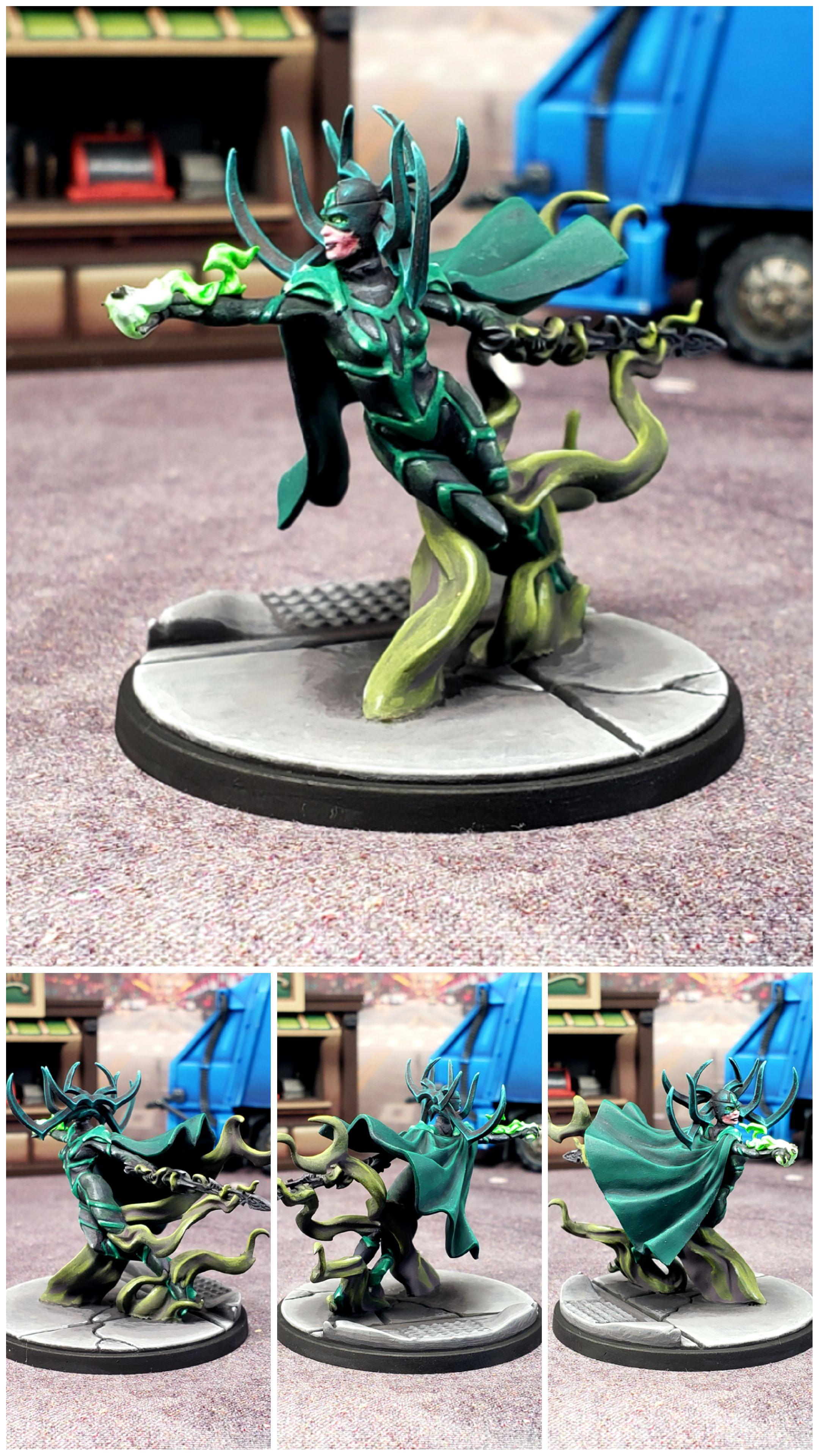
Painting Hela was a lot of fun. I had the fortune of being able to rely on a Sorastro PDF guide from his website and it made the whole process smooth, straightforward and fun. I’ve noticed that the more I learn about painting the more I notice when I’m getting lazy about a paint job and there are many little areas on her where I could’ve done so much more and just decided not to. I ended up with a second copy of her, so at some point I might just decide to give her a repaint, but honestly I’m really happy with how she came out and at the moment I don’t really see much value in repainting her.
One of the things I love about what Sorastro did is his incorporation of all the different hues of green. It’s such a monochromatic model, generally speaking, but his decision to use very different kinds of greens for the different areas of the model really helps break it up and really gives the model a very dynamic and interesting look that I feel like it would otherwise lack. I don’t think I would’ve had the foresight to see this coming had I painted it according to my own recipe and I think the model would’ve greatly suffered for it. It really shows how differently Sorastro perceives miniature painting than I do. It’s quite humbling. I’m really looking forward to keeping this in mind when I go to take on a model that is similarly monochromatic and see if I can replicate this on my own to similar success.
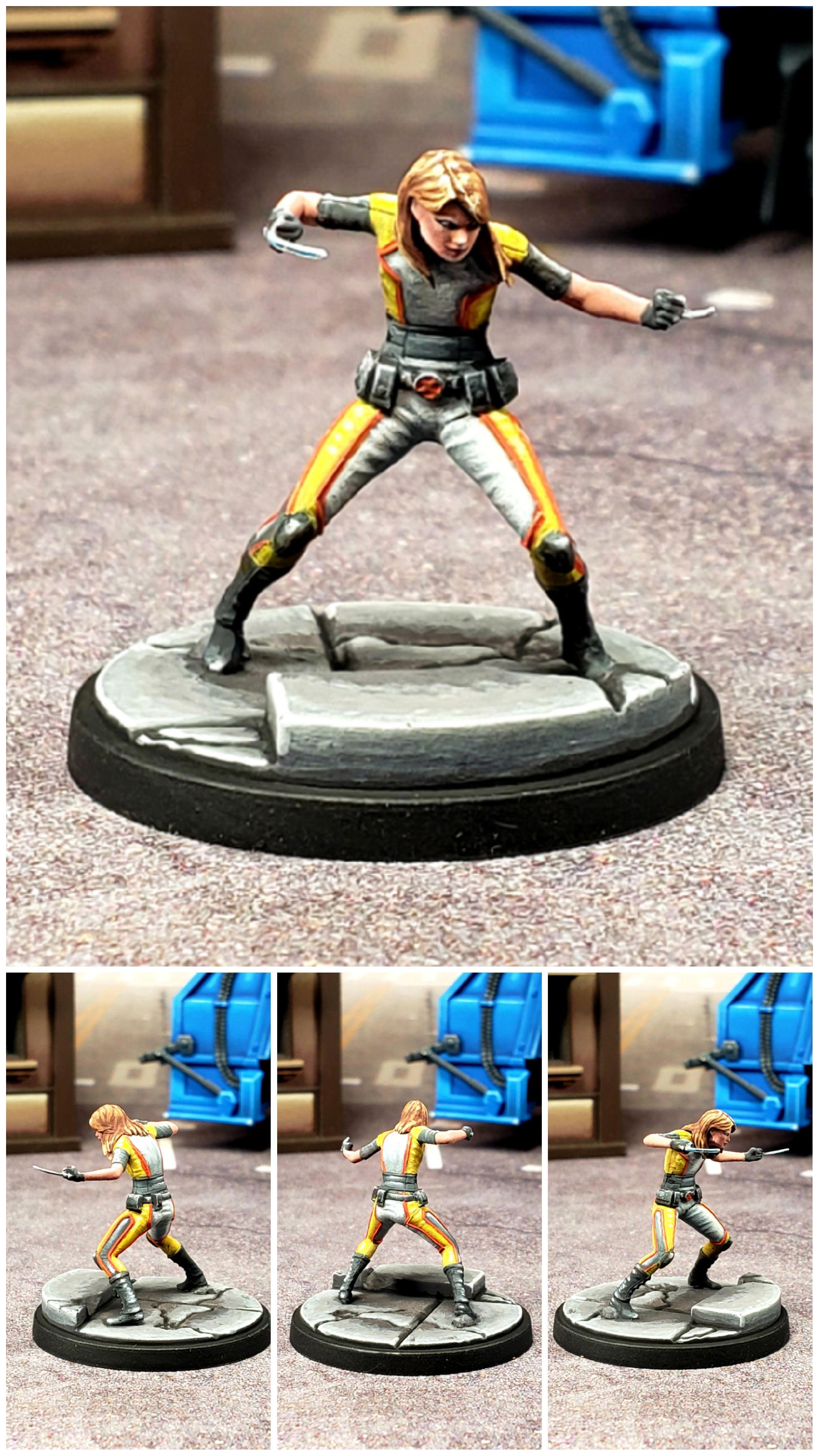
Honey Badger don't give a damn.
 Honey Badger
Painting Honey Badger was one of those experiences that makes me feel like I’ve really come a long way as a painter because she’s a bunch of white, black, grey and yellow, which are colors that can be really difficult to paint and I’ve had to grapple with those so many times now and finally gotten to a place of comfort doing so that I just approached painting her with a color by numbers, knock out the steps mindset. I think had I done that same thing with her a couple years ago she’d be a pretty horrendous paint job, but instead I think she looks pretty good. Nothing to win a competition with or anything, but a very suitable paint job that I will be happy to play with. I was also able to knock her out the same time I painted X-23, so in the course of like 6 or so hours I knocked out two models to a good tabletop quality, all while binging some good TV. Not a bad day.
The photos didn’t capture it, but she is one of my better faces, which I’m especially proud of because of how unbelievably tiny her model is. The amount of detail I was able to fit in was really impressive to me. The only thing I look at while I write this and think “it’s not quite there yet” is her blades. I tried to do a general NMM with some sky reflection in them, but there’s so little blade to work with that I honestly have no idea how to effectively do that. I’m not certain what I did sells it correctly. That being said, it’s such a small area I’m not sure it matters.
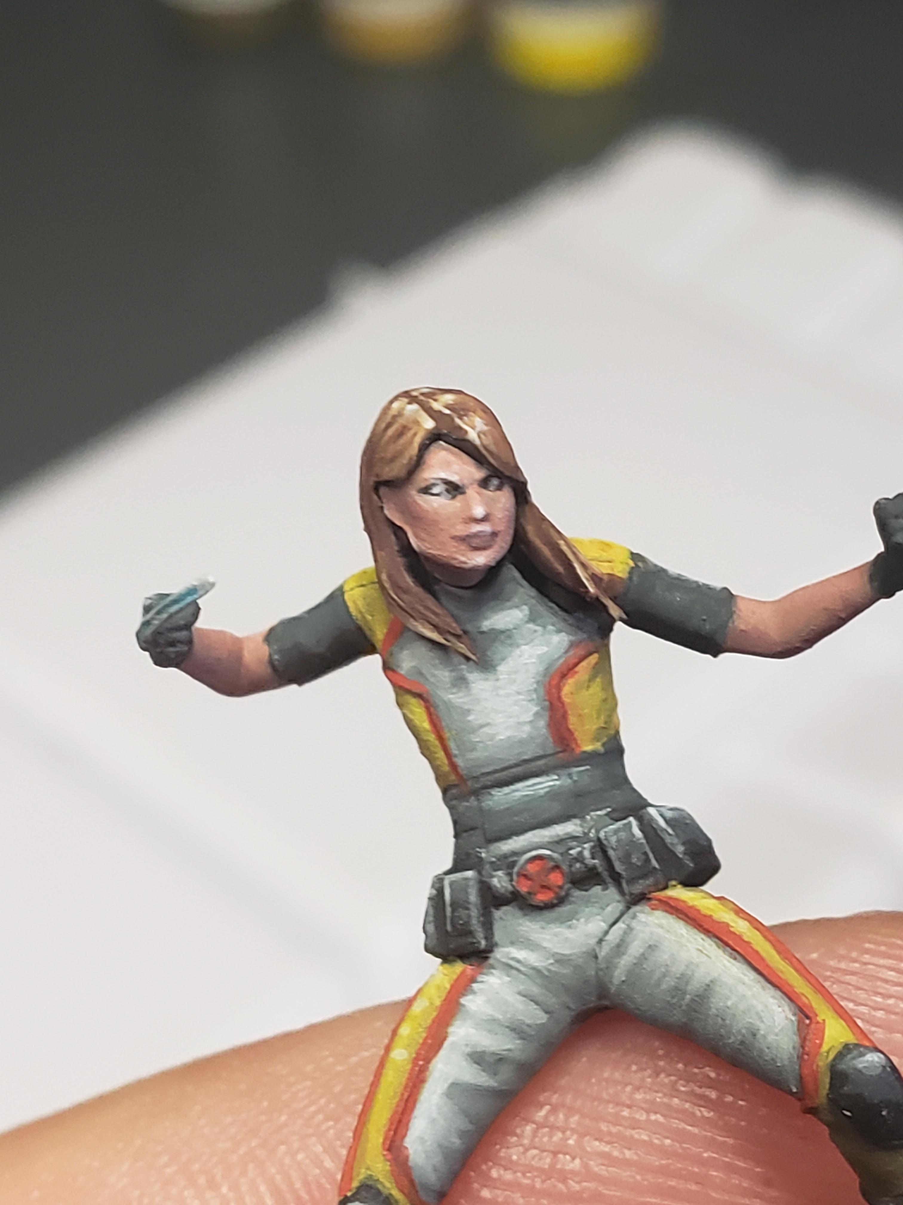
X-23. She seems bigger than I remember in the movie.
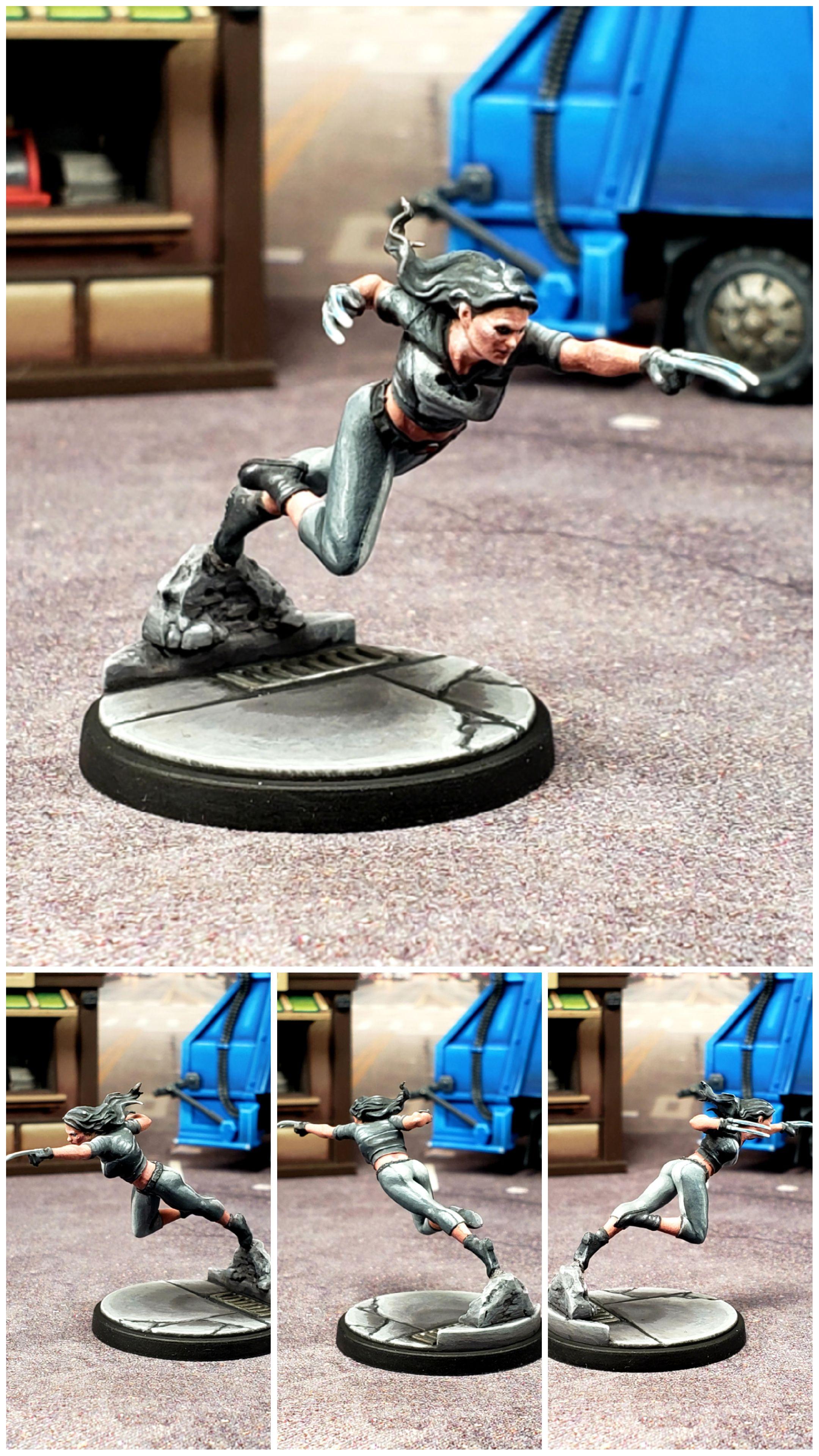 X-23
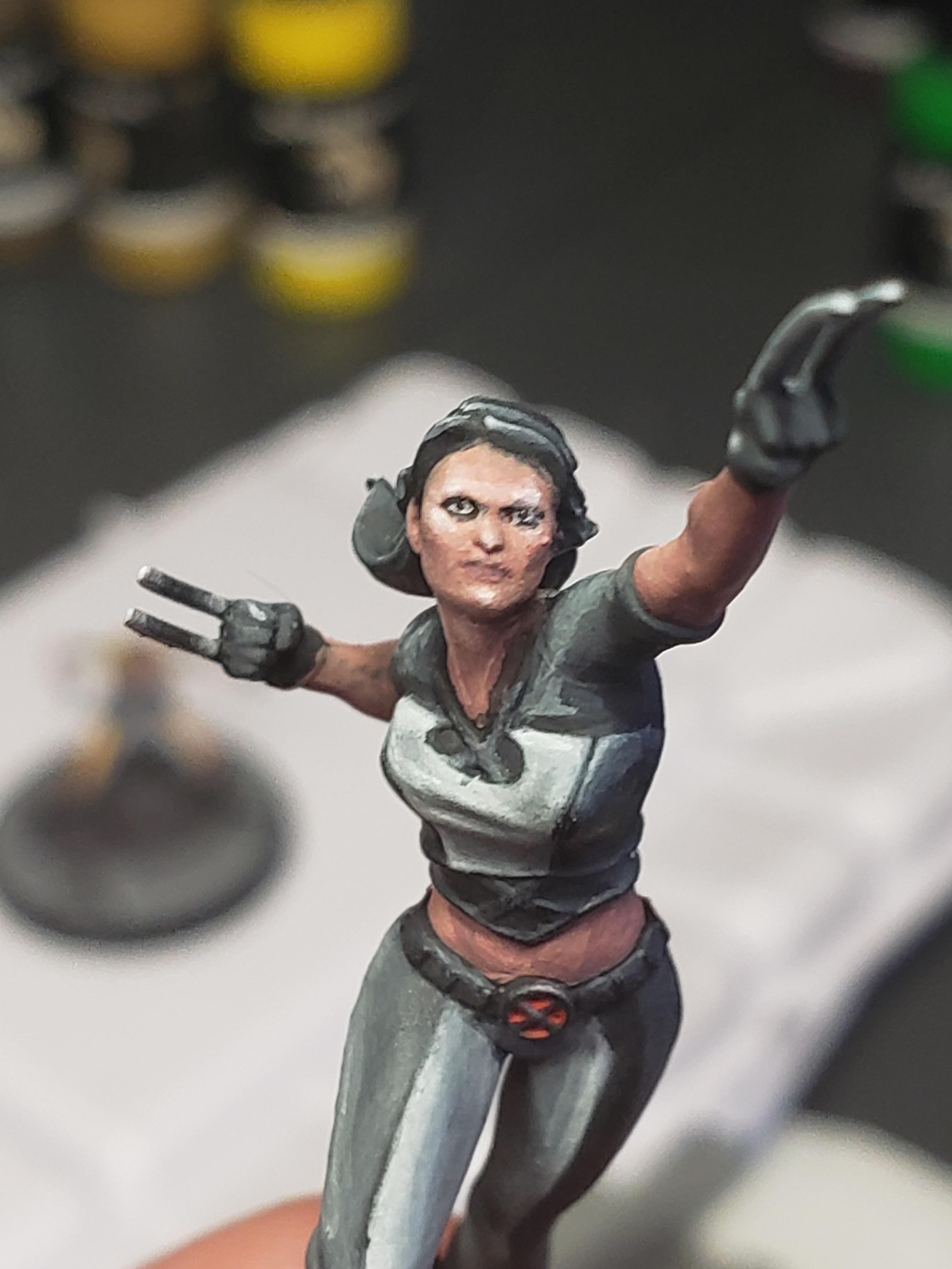
X-23I didn’t capture it in the photos at all, by X-23 marks the first time in my life where I actually put pupils in the eyes of a model. Which now that I type that I realize I probably need to revisit Lockjaw and Hulk. In the past I’ve tried like crazy to ignore eyes for a number of reasons. 1. I actually think it’s a level of detail you don’t really see on a person until they are fairly close to you, so when working with models that are this scale I don’t think it makes sense to go into that kind of detail on their eyes unless the model has enlarged eyes at that scale (like Lockjaw and Hulk). 2. It’s a massive pain trying to make it look right and who wants to spend a bunch of time trying to do that? So I’ve always taken the lazy way out and done some kind of shading in the eye area and left it at that. Later when I was following a guide on painting Enchantress they did this clever trick of painting black in the eye area, cleaning up with flesh around it, then putting in a dot of white. It worked really well for Enchantress because having her eyes glow works really well for her character.
It works less well for a character like X-23 and that became obvious when my wife pointed out that her eyes looked like they were glowing. My wife is very tactful about giving feedback because when I’m proud of finishing a model I can be a big baby about negative feedback (she really is a saint for putting up with me). but she was right. I needed to do something about the eyes now that they had the black “eyeshadow” and the white dot in the middle. So I decided to break my rule and put in pupils. It was my first attempt and honestly I think I nailed it. I should probably gets pics taken of it to add to the blog. Here’s a closeup pic of her to see what I’m talking about. Not bad for a first time.
"I do not give my word... unless I mean to keep it."
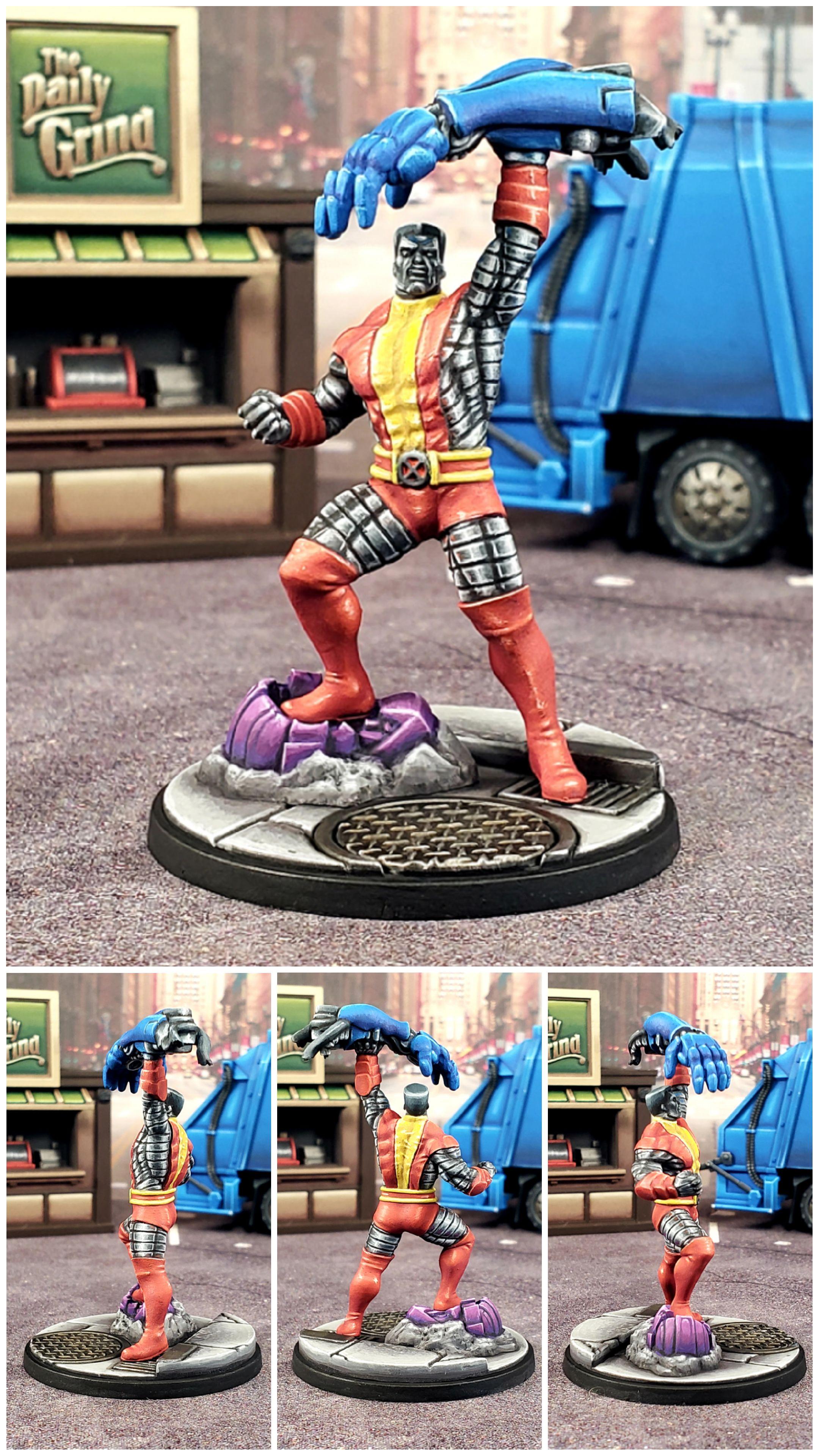
Colossus was such a blast to paint. I’m so glad I cut my teeth on NMM several times before I had a chance to do Colossus, as he is one of my favorites and I’m so glad I was able to do him justice. Such a fun model to paint.
Ancient One.
 Ancient One
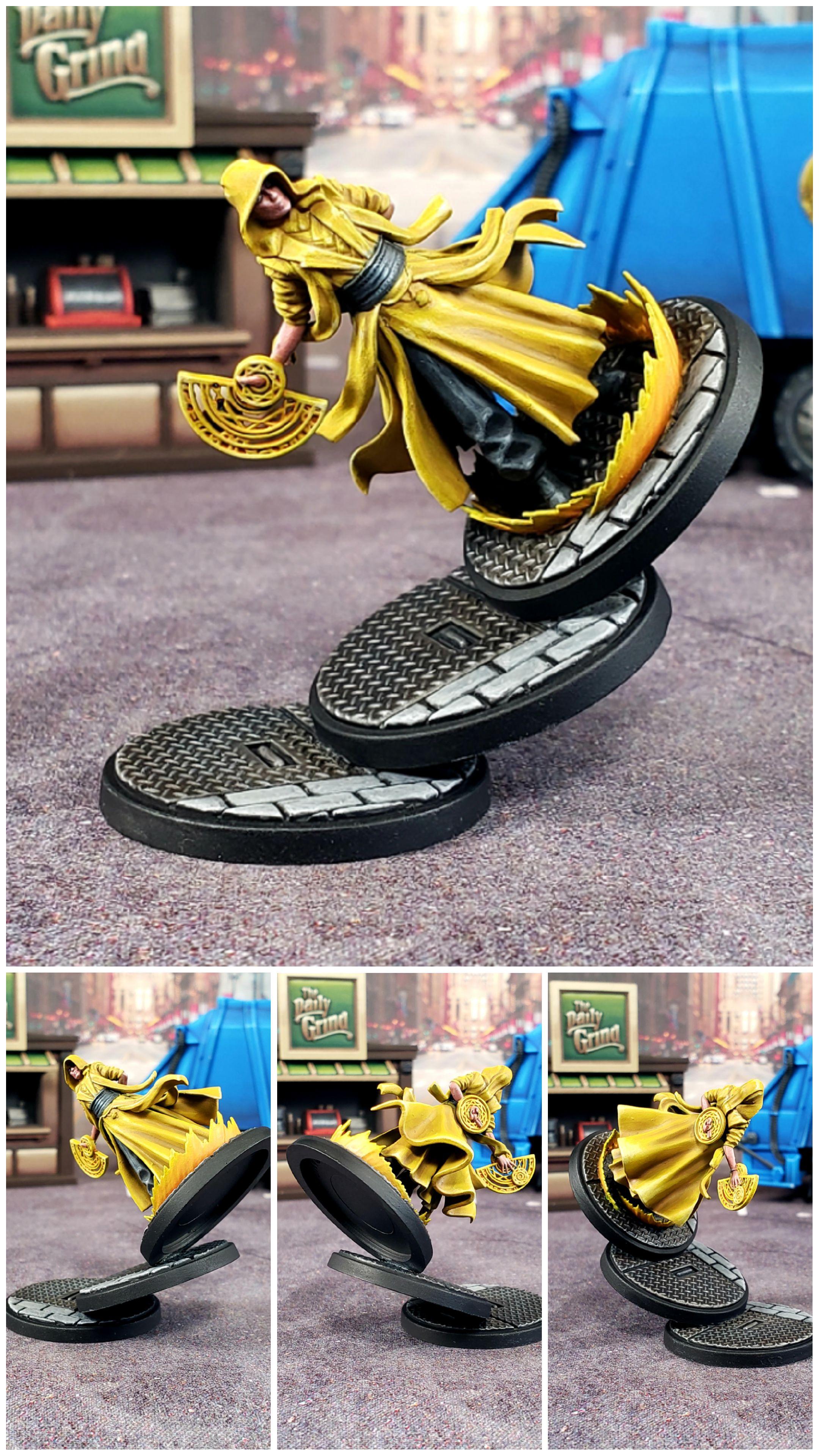
Ancient One was a pretty fun project. For starters, I saw someone do the base effect online and knew I had to steal it. It’s too good an idea. Also gives me a chance to use up some of the “metal plate” bases, which frankly I’m not the biggest fan of so I end up with tons of them. I ended up needing to use a metal washer in the base, which was a little tricky because I also use Magnaracks for transport, so I had to be careful to get it situated along with the magnet correctly.
As far as painting goes, she was fairly straight forward. I knew I wanted to use my normal yellow recipe, save for the energy effects, which I wanted to have more of a fiery feel to them, so I used oranges as shades for those. Highlighting black is feeling more and more natural. One of things I’ve learned in this project that I think is really counter-intuitive is that often to make something look more detailed you use less paint. Had I painted her at the start of this project the black would’ve had a ton more greys on it because I was trying to go “all the way to white” and I hadn’t yet figured out that to make a color like red, black, white or yellow look like those colors, you use your highlights sparingly and you can still take it to white and get the “pop” contrast effect without making it look like my first Black Widow model.
I’ve also noticed that as I paint more and more I care more about getting the face right. I’m now actively trying to do eyes whereas I used to just rely on a wash to make the eye socket area look shaded. I now try to plan out where I want the highlights to hit to emphasize certain sections of the checkbone or forehead depending on the model’s facial structure and where the lighting would fall on their face. I didn’t use to think about those things. So with Ancient One I explicitly tried to emphasize the lighting on the bottom right side of her face to make the shadow from her cowl look realistic.
Overall I’m really happy with her (I need to find another way to say that as I say it way too often). I painted her while kind of assembly line painting the most recent batch of my Convocation characters and this time around I don’t feel like the assembly line style of painting harmed the paint jobs like it did the first time I did it.
Baron Mordo.
 Baron Mordo
I don’t have a whole lot to say about Mordo. Not a character I’m very invested in or frankly interested in. Wanted to get him painted as part of my Convocation. I saw doing his staff as an opportunity to practice Gambit’s NMM staff I plan on doing, so it received much more attention than the rest of him did. I’ve noticed that doing chrome NMM is much easier when you have explicit borders like flat panels to work with. When doing it on a cylindrical surface it’s not nearly as straight forward. You don’t have the same border to accentuate to drive home the reflective look. Not sure how I can adjust what I did to get a better NMM chrome look. I’ll have to put some thought into this before I attempt Gambit’s staff.
Outside of that he was a relatively quick and straight forward paint job. I suspect he’s one of those models that when I look back on I’ll see all the things I could’ve done differently.
Clea.
 Clea
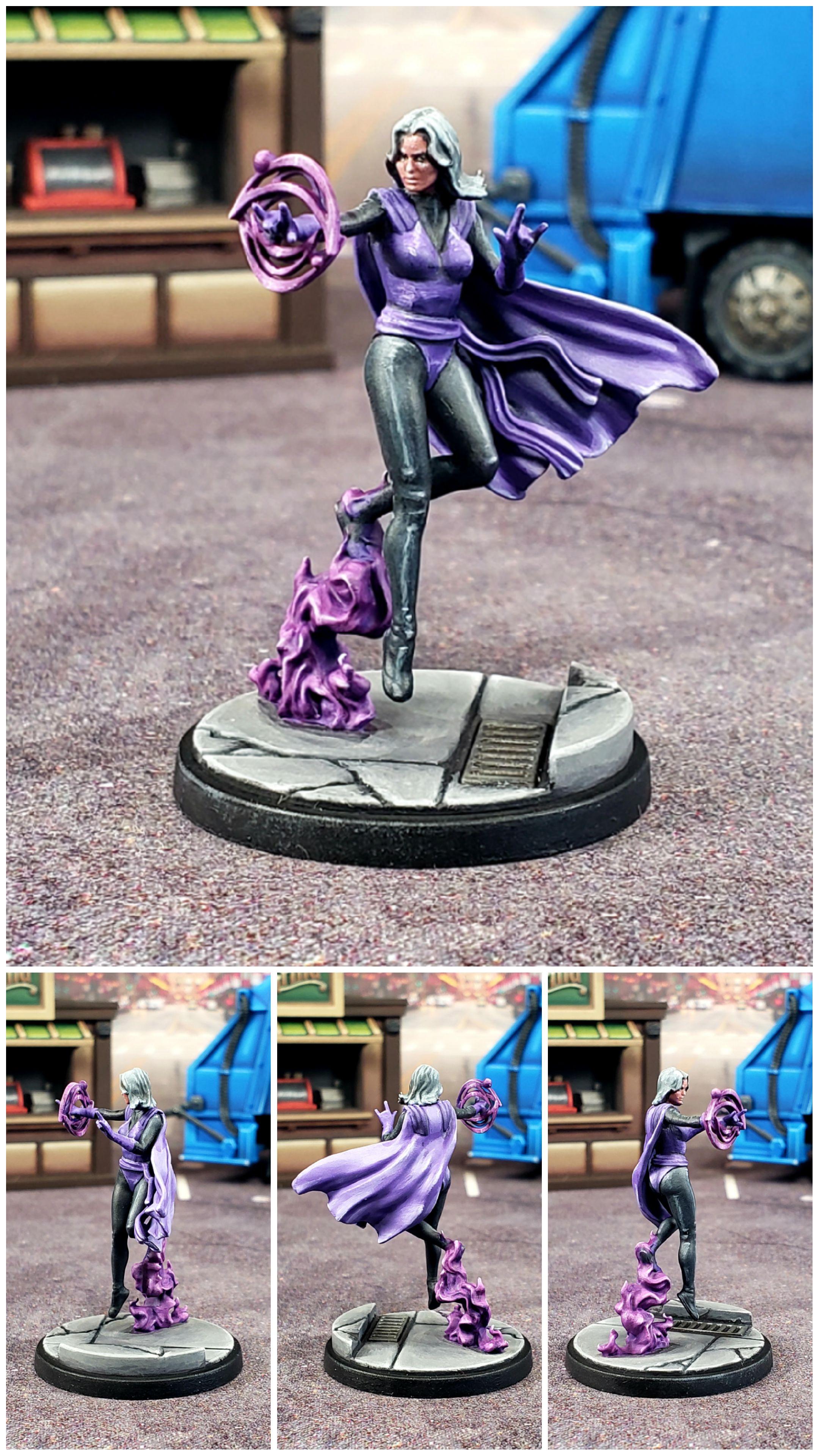
CleaWith Clea I feel rather mixed about her paint job. One one hand I like how a lot of it turned out. I think the purples have a lot of depth, I like how the black highlights land and I feel like the face at the very least doesn’t detract from the model. On the other hand I feel like none of it turned out how I was planning. I was trying to make the purples on her outfit look like two different purples, with the cape and belt sash being lighter than the purple on the main body. However, I didn’t use a different hue of purple, I just started with a lighter shade on those parts and as a result I can’t really tell that one was intended to be lighter. With the magic bits the effect worked better because I used different hues to begin with and in retrospect I should’ve done the same thing with the sash and cape, although I’m at a loss for what hues I would’ve use to distinguish them. Either way, I still think she came out well, so I suppose I should take the win on this one.
Doctor Strange, Sorcerer Supreme.
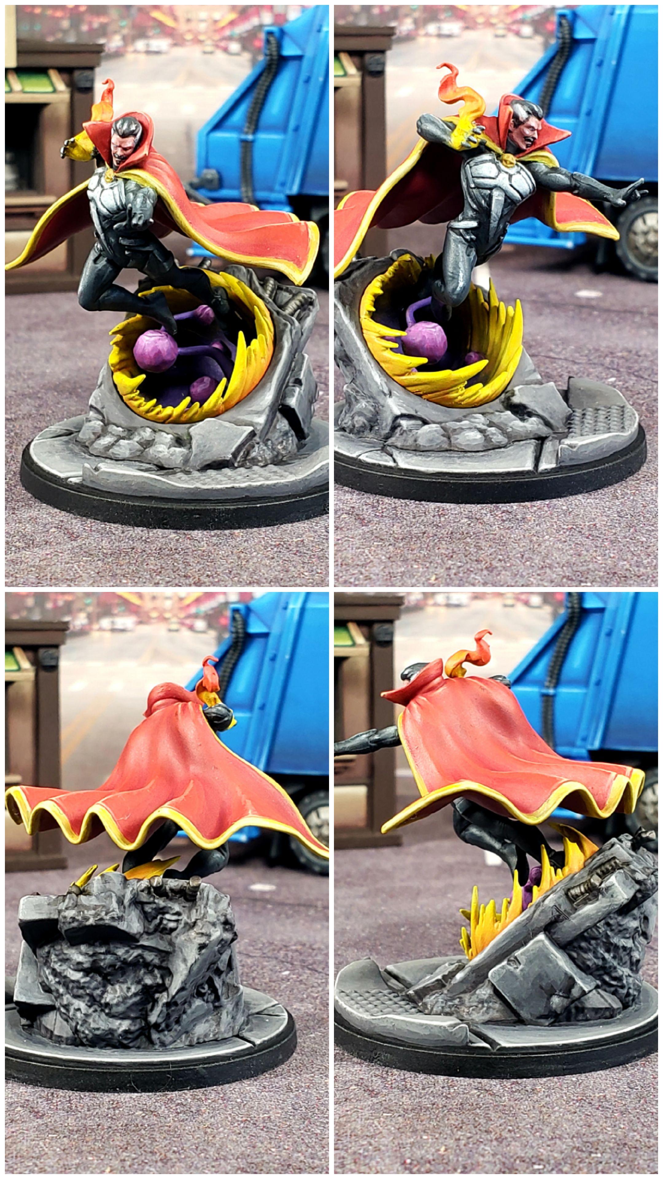 Doctor Strange, Sorcerer Supreme
Painting Doctor Strange this time around makes me realize how little I really understood painting yellow and red the first time I painted Doctor Strange. Which is weird (or perhaps I should say strange? ba-dum tiss), because at the time I painted the first Strange I felt like I had those colors down fairly well, so it’s not a lesson I thought I needed to learn. Makes me glad I have another copy of the first Strange so I can do a repaint.
Come to think of it, this model represents every “problem color” I’ve had to struggle through in this project. The list of models where I really didn’t know what I was doing while painting black is a long list and it’s only relatively recently that I feel like I’ve figured out how to do the color justice. Yellow is a recipe that I had a decent formula down when I was using GW paints, but I had to relearn it using different colors when I switched to Scalecolor. White was a color that I was entirely dependent on the GW base of Corax White until I learned about the Scalecolor NMM mixes of Black, Anthracite Grey and White Sands, which I now use to do all my whites, greys and blacks. Ever since then doing those colors is now so much less effort and far more fun. Finally red is a color that I really struggled with figuring out how to highlight as it’s really easy to accidentally make it pink or make it orange and just like with painting black, the key is less paint and very targeted, sparse highlights.
I shudder to think of how bad this model would look had it been in the core set and been one of the first models I painted on this project.
At the time of writing this, the only thing I look at and think “I could’ve done this better” is I didn’t even bother with an OSL effect for his flames and honestly it never even occurred to me while I was painting him. Same goes with the portal, which easily could’ve been used to make some cool underlighting effects. It makes me realize that despite my progress, I’m still not thinking about my paint jobs very deeply before I dig into them. However, this might be due to painting him in an assembly line manner while I painted my other Convocation characters. Perhaps that’s the real drawback to doing things assembly line; you spend less time thinking and planning out your paint jobs and even if what you paint is well executed, you miss out on paint choices that really could’ve elevated the paint job.