




Kali Yuga: The Age of Conflict



Recommendations: 587
About the Project
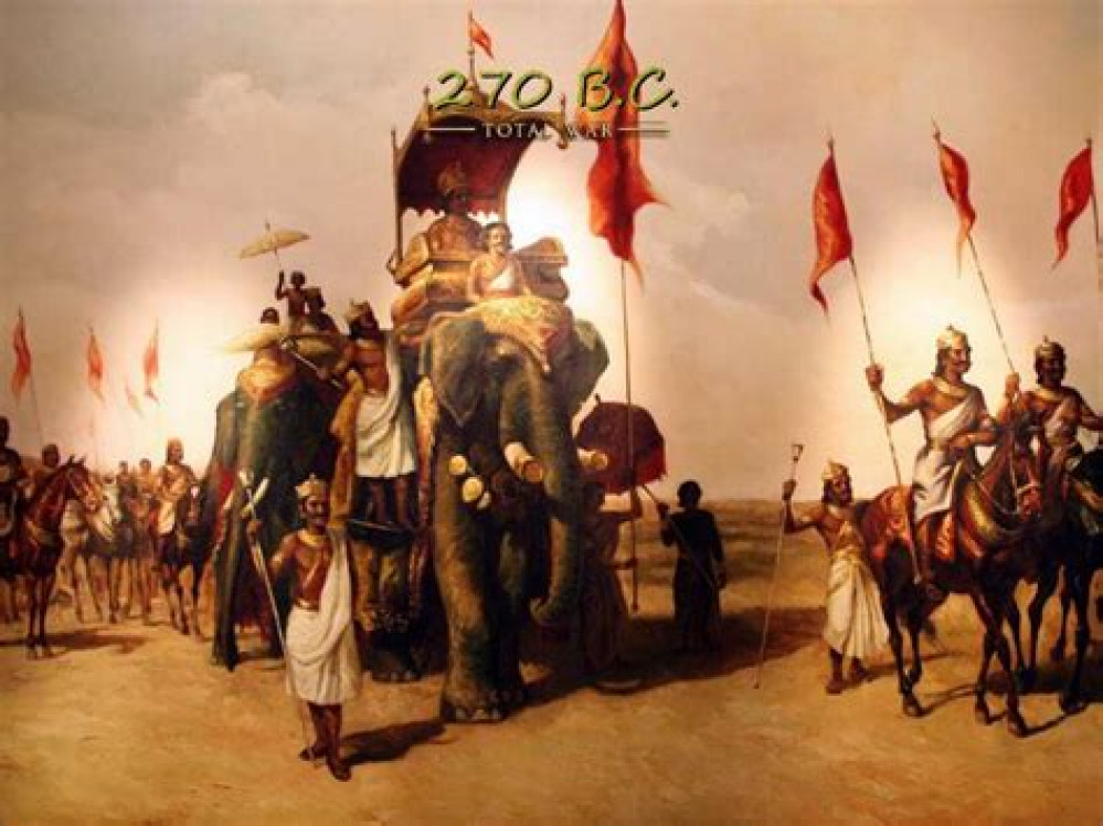
I'm working on an army of ancient Indians in the service of His Majesty Lord Ramasanjeet Jayant Manish Boobs (yes, an actually possible name). I have found my calling and it is again a cacophony of colors that catch the eye. There is no hope for my wallet.
Related Game: SAGA
Related Genre: Fantasy
Related Contest: Spring Clean Hobby Challenge 2026
This Project is Active
Passing on the karma as per my dharma
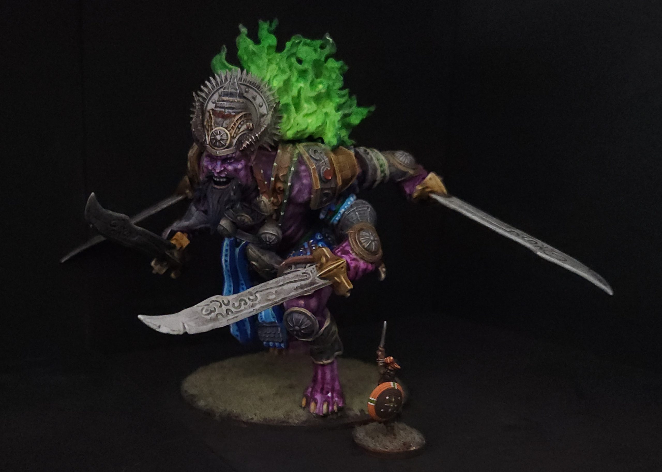
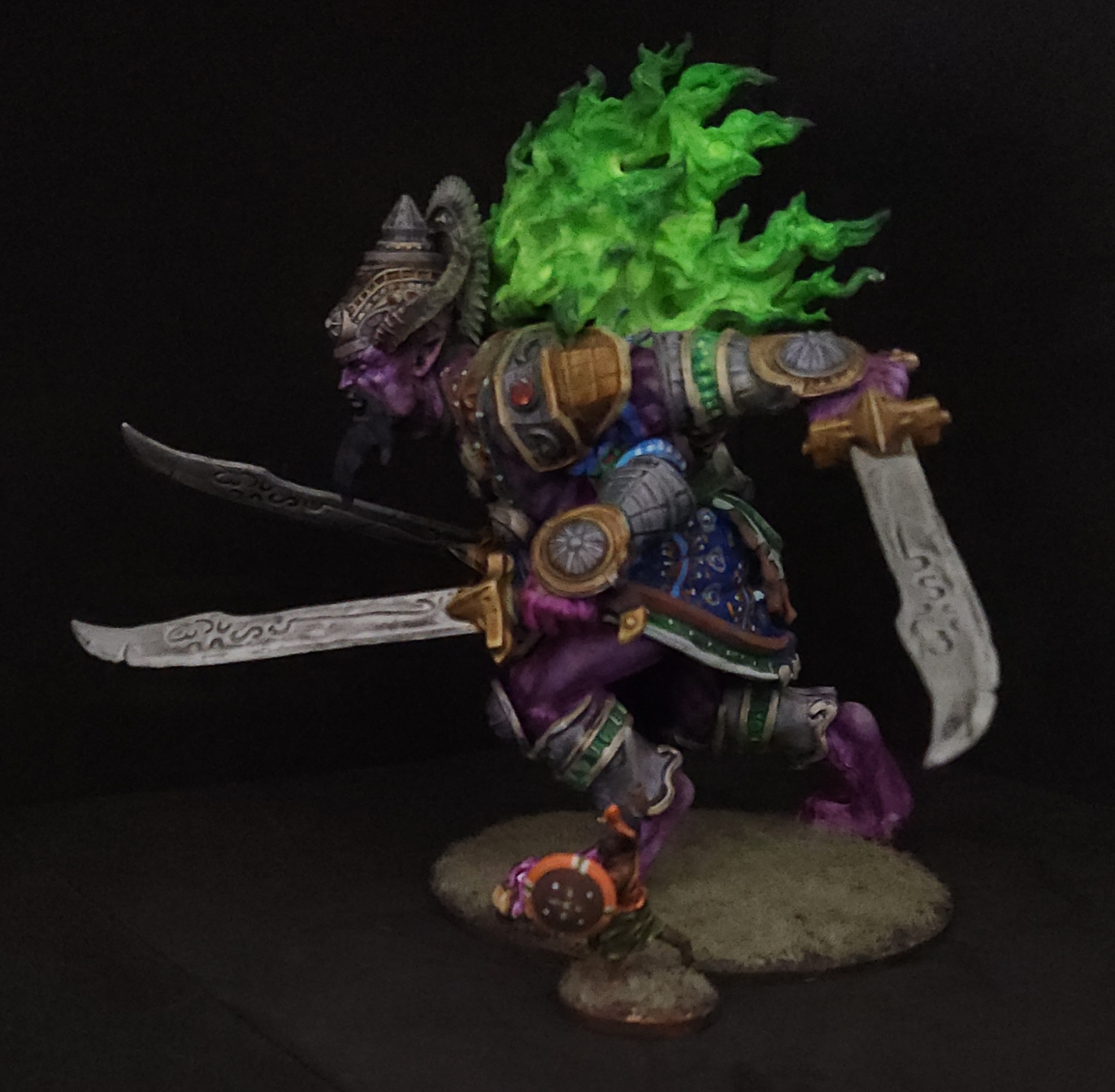
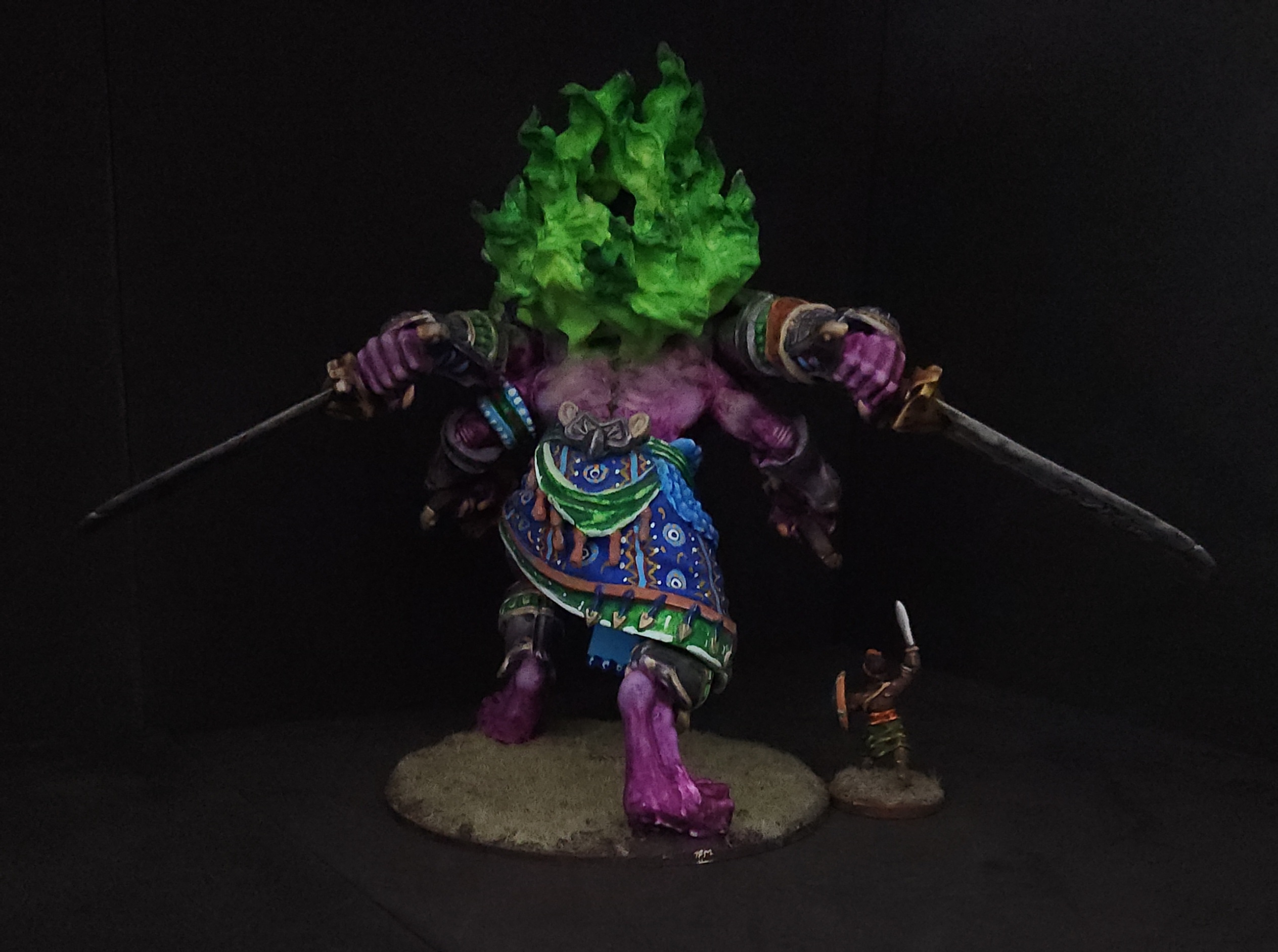
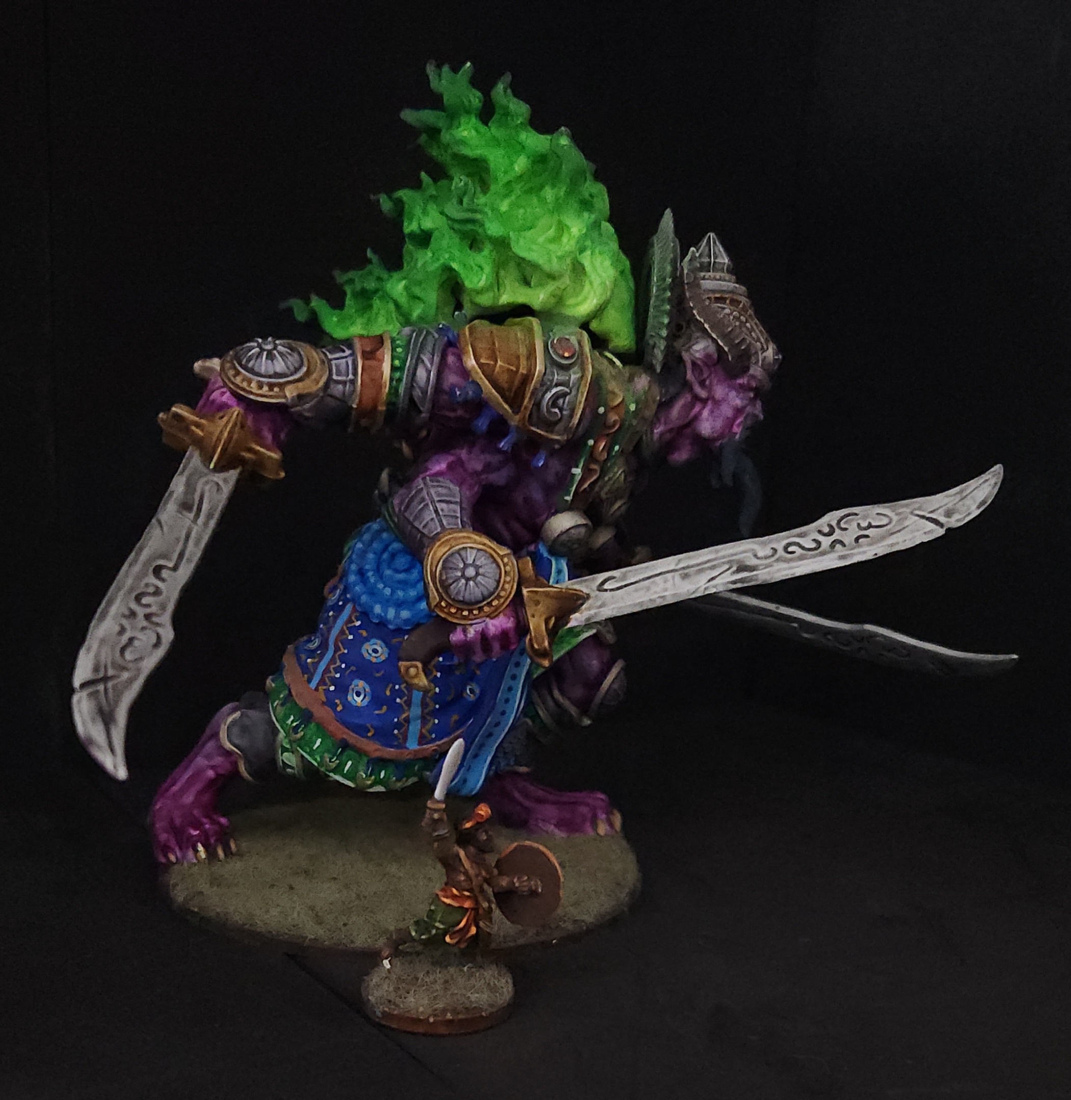
I’ve managed to make it into the good graces of my FLGS as a long term player and was gifted another rakshasa from Parabellum’s Conquest line. I have absolutely no need for this figure. I immediately decided to give it as a gift to another member of the group as the alternate build. Here is the good luck passed on to someone else as I got to play with more fabric design.
As per my wont I have gone a little nutty to try and make the thing visually complicated in order distract from my lack of skill in the arena of kick ass blending or greater color theory application. I have done my best and I will press on with the high end tabletop quality.
Meeting more of the illusory world
We have attained the means of presenting the existential illusion of reality, Maya, in Hindu philosophy. It is an odd convergence of technology, social commentary, and my hobby project subject that manages to still work.
I have found that my search for tiger models has been generally fruitless for what I have imagined and only came very close with MOM Miniatures and their panthers. I decided to follow the path of another member on the site and use ai to generate images I might get sculpted for the tiger mounts.
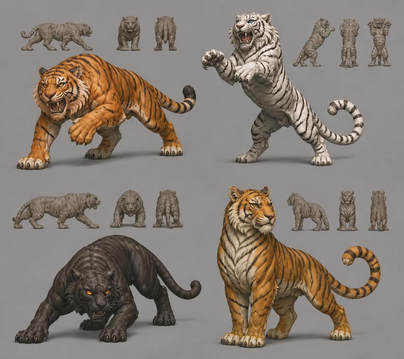 Good selection to vary the mounts
I was not at all disappointed by the results. I was frankly surprised at how far the technology and results varied from previous attempts to get here
I was also pleased as I had the program also edit out a second tail it had added to the black tiger. Then, being curious to see if it would work, I had a generation of images that might be used to create an stl of the attacking tiger.
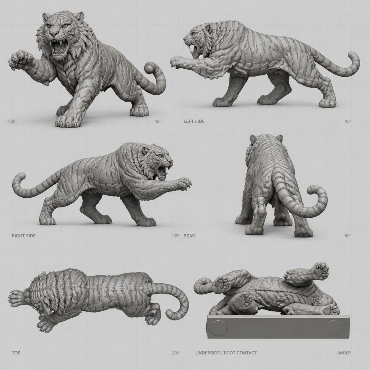 Not entirely right but good enough to work with
Once more I was astounded and I must staunchly stand with Gerry in the promotion of handmade things. The 1s and 0s are nice for when I want to have large objects printed as the material costs would be prohibitive otherwise. I will do my utmost to have real live people perform the effort to make the models if done digitally. I will stand by the artisinal metal manufacture of models otherwise since I want to experience and share play in real life.
Gaze upon glorious Boobs and Dropapu
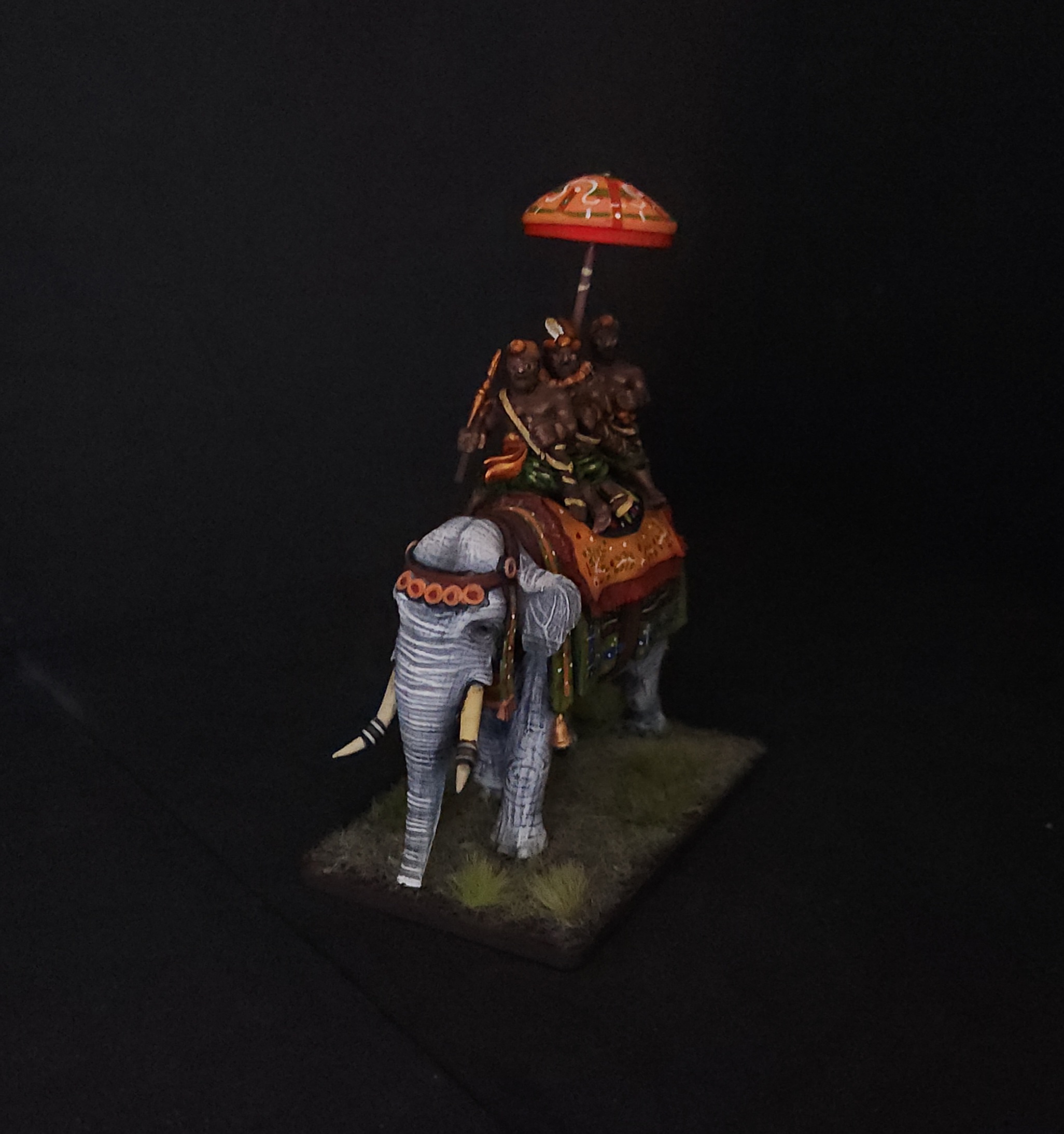
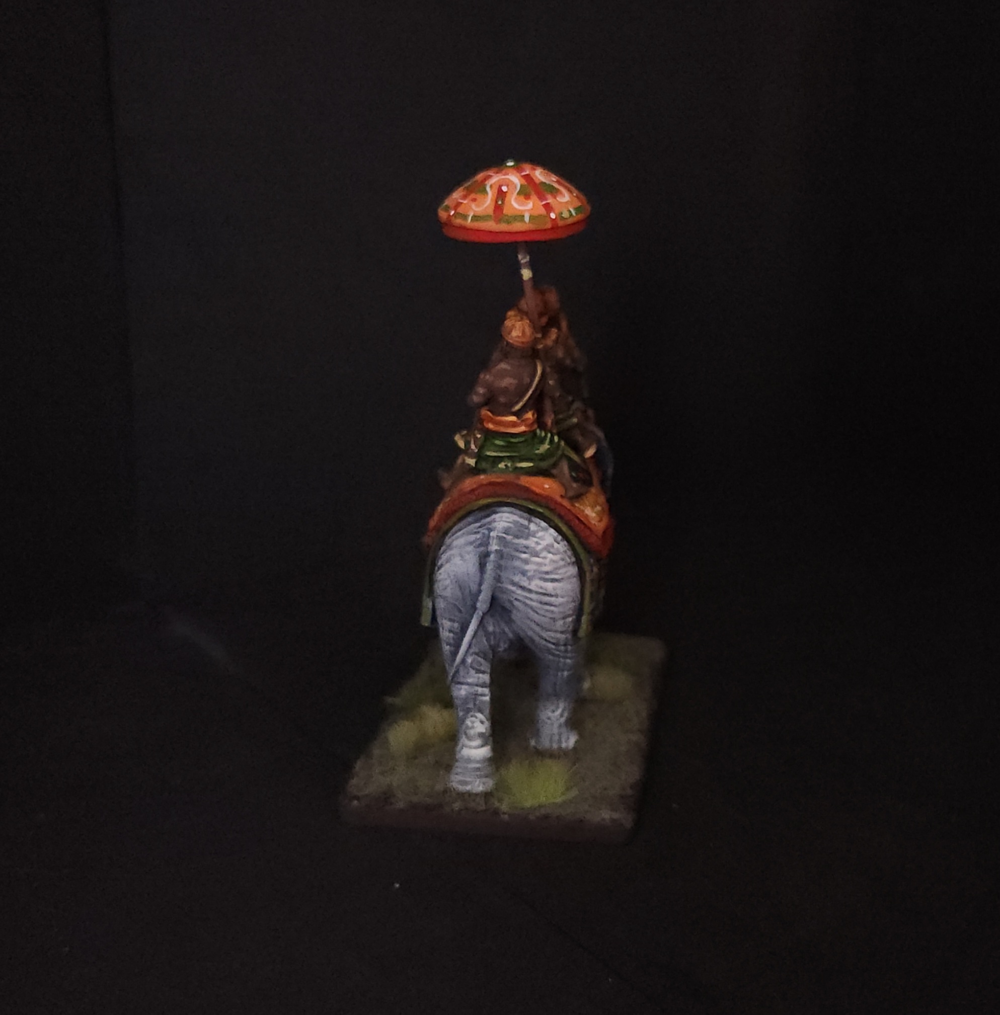
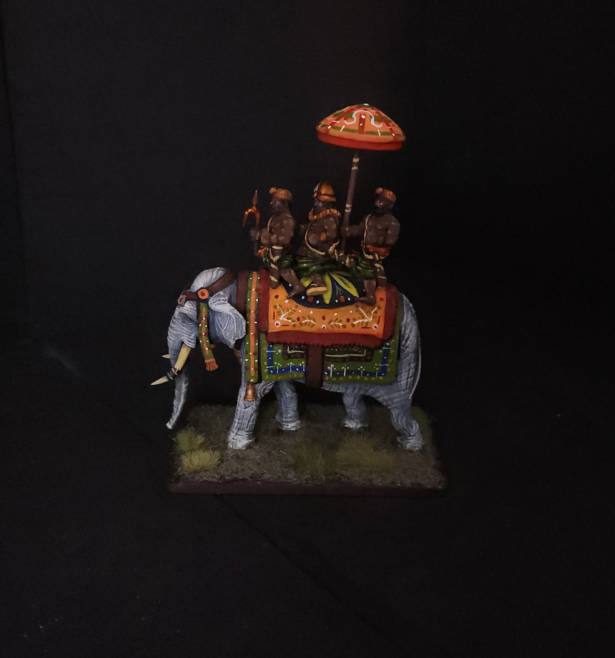
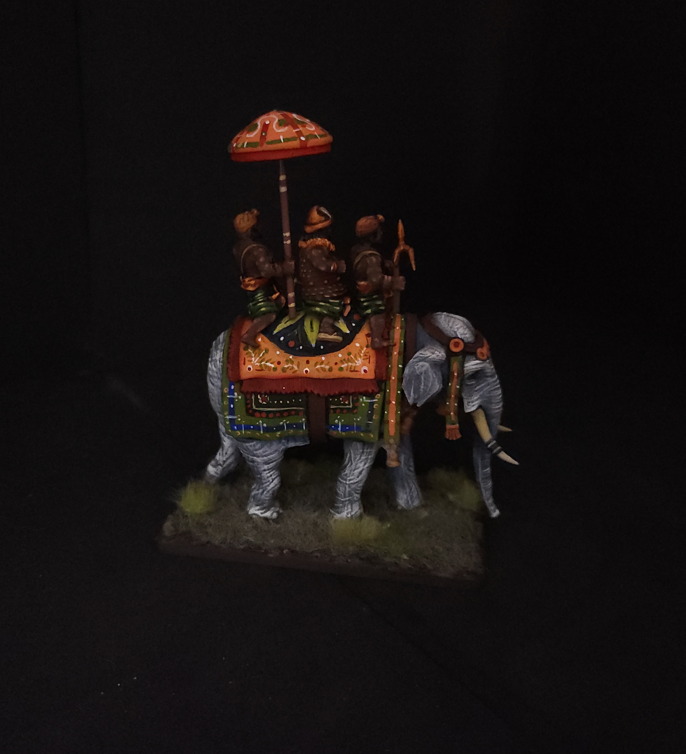
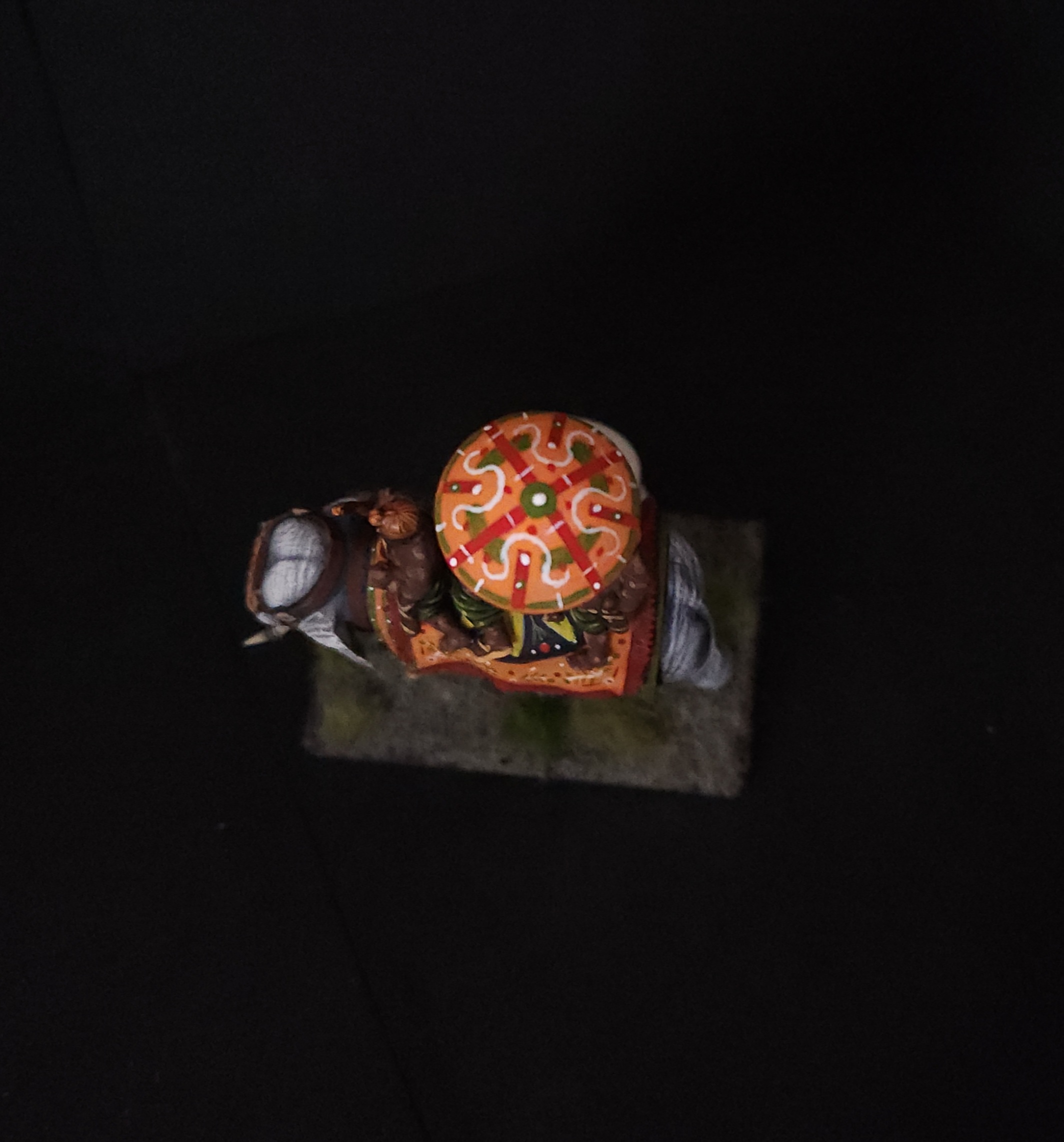 View from above, easy peasy
Lord Boobs on Dropapu is now properly painted up. A downside of working on this model was getting the legs of the riders to all properly fit on the back of the elephant but it worked in the end. I also managed to get them aligned using the drains of the model in the back using short lengths of toothpick.
An issue I also had was kitbashing the umbrella carrier in the rear so that he was carrying the parasol. He started out as an archer and a second mahout before slicing both in half and then merging the bits with greenstuff (that rare and nearly mythical material). I won’t complain about the goad for the mahout as it was a simple kitbash from spear bits I had on hand. All I did was take a heat gun with a reducer nozzle to aim at the haft and then curve the end before taking the pointed end of another and melting it to place.
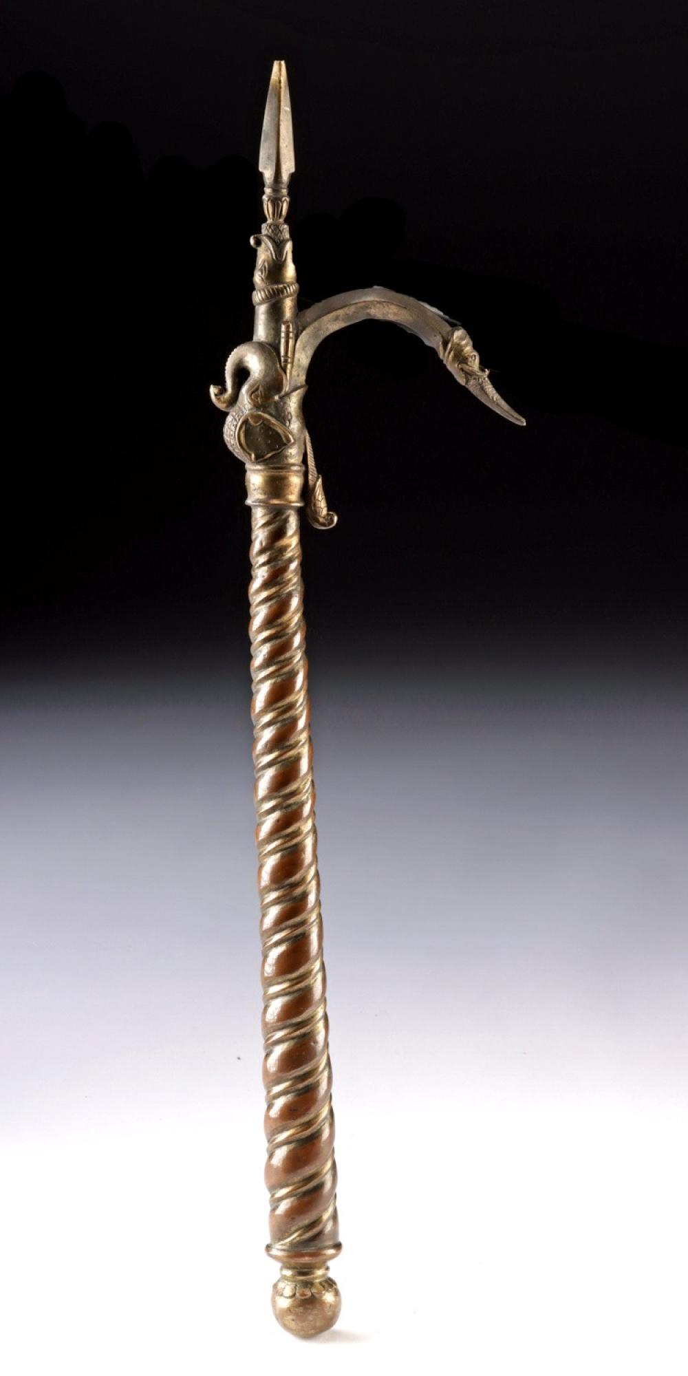
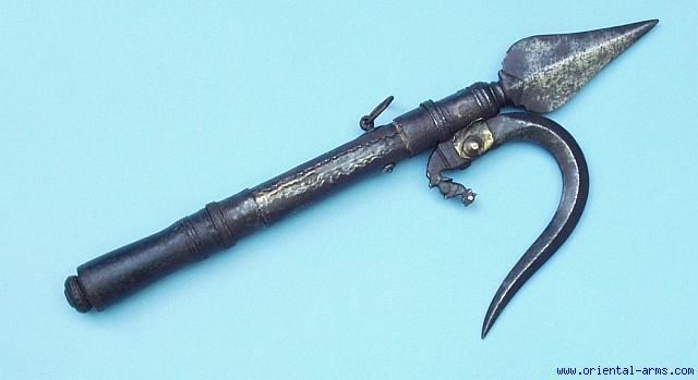
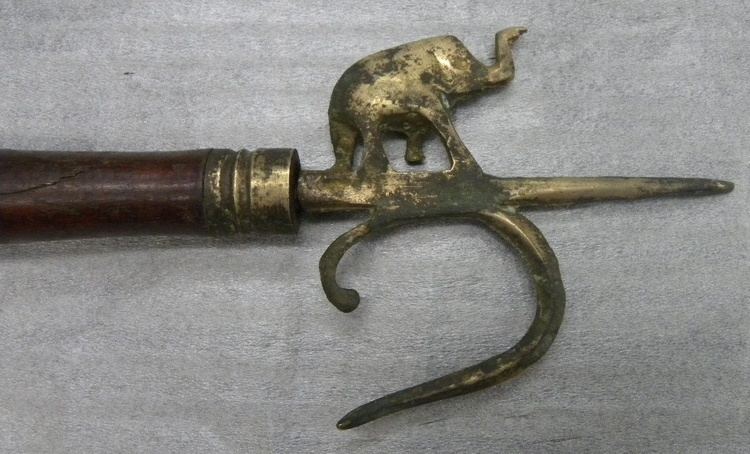
The goad resembles historical pieces to a point. I am only so skilled in sculpting and thought this was good enough. If it were a resin part it would easily snap and I’d be more than a little irritated.
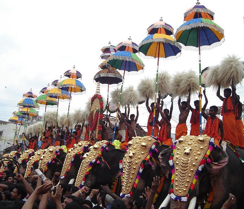
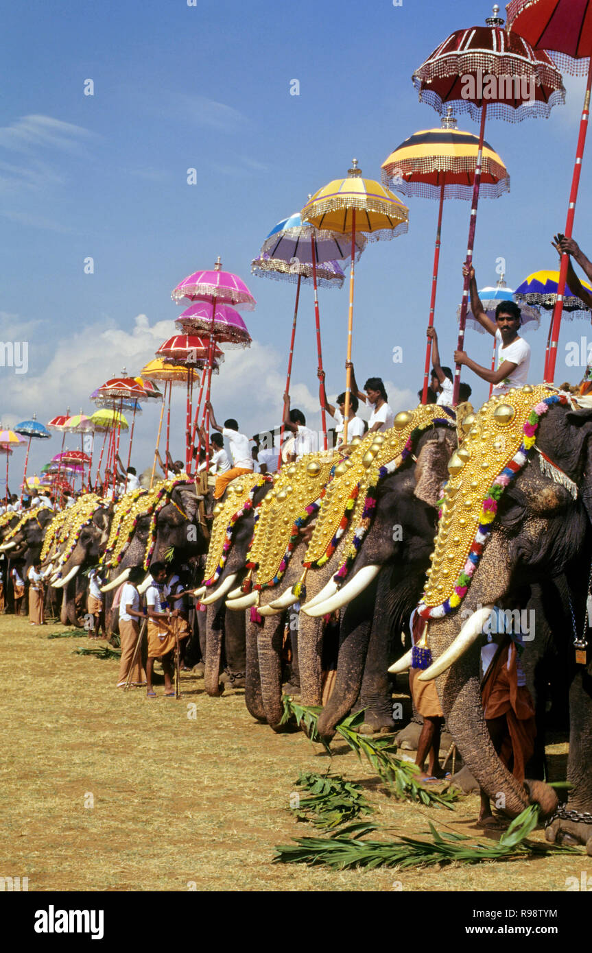
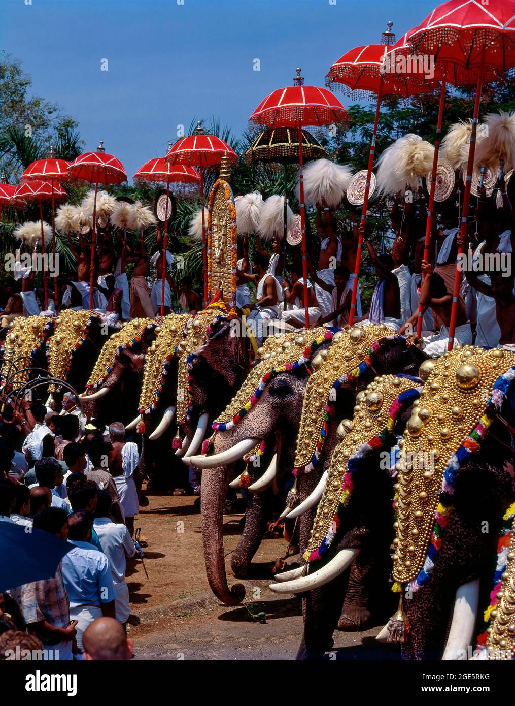
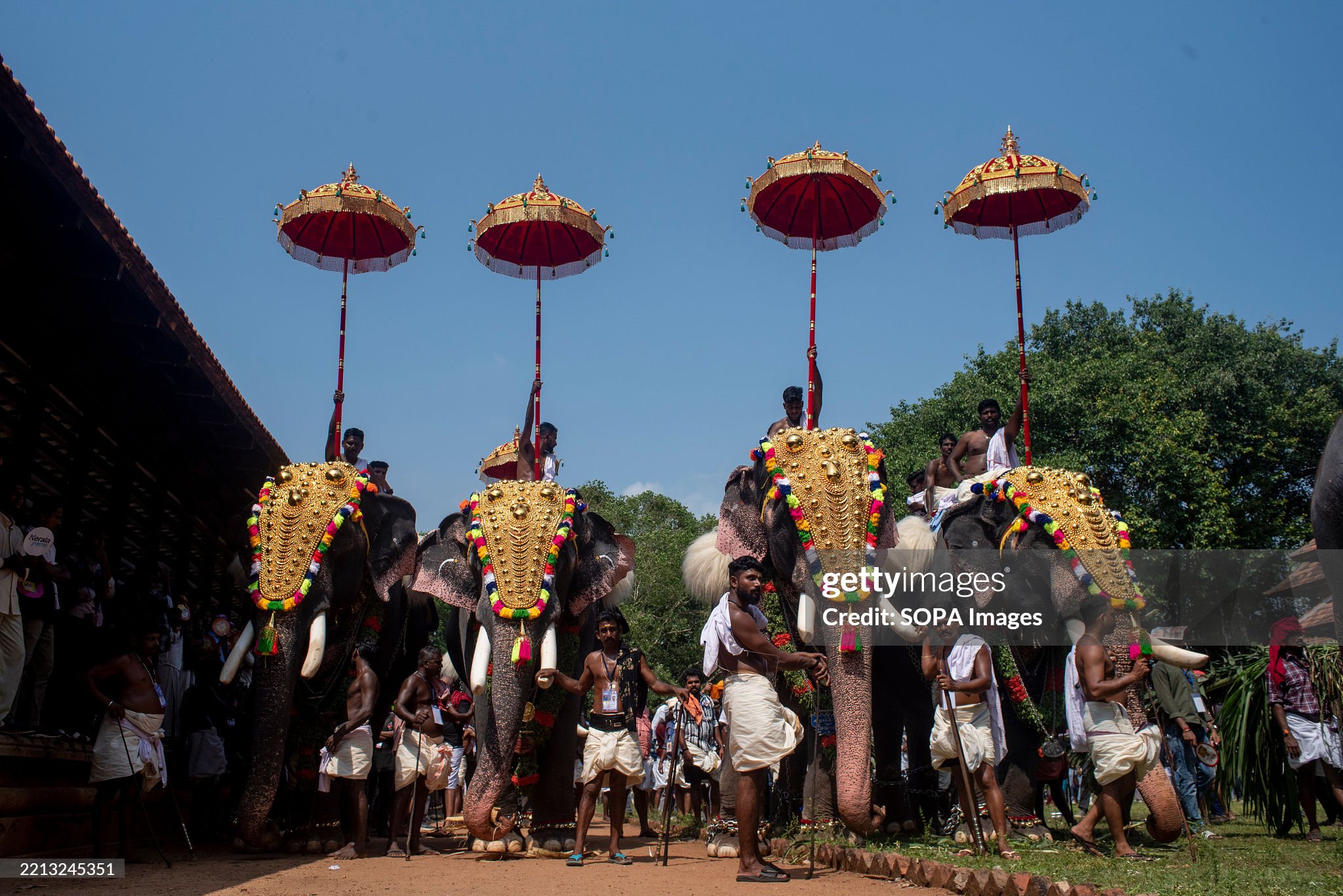
In going to the next random bit of equipment I went to looking for images of elephant parasols and came across the Thrissar Pooram festival and Elephant festival in Jaipur. They were very helpful for design ideas and I went to town on the elephant blankets and umbrella. Not seeing a real limit to what I could do I just went with what I thought I could live with without getting bogged down with too much detail.
As anyone following may notice, I have found affection for elephants and from what I’ve heard about running them in Age of Alexander this will be the first of perhaps a few more. I don’t intend on getting the AoA universe book but that may or may not change on if I get involved with a local group playing historical gamers. I know that I can get more pachyderms to field the same as I did with camels in my Arabian Knights since there is a Book of Battles scenario for protection of a convoy.
The future is wild and wooly. No, I’m not planning on mammoths.
Tiger Uppercut!
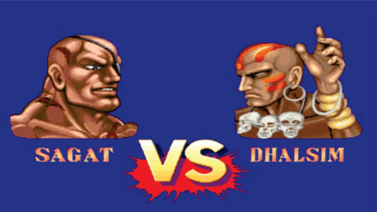 Dhalsim proves superior
 John's version
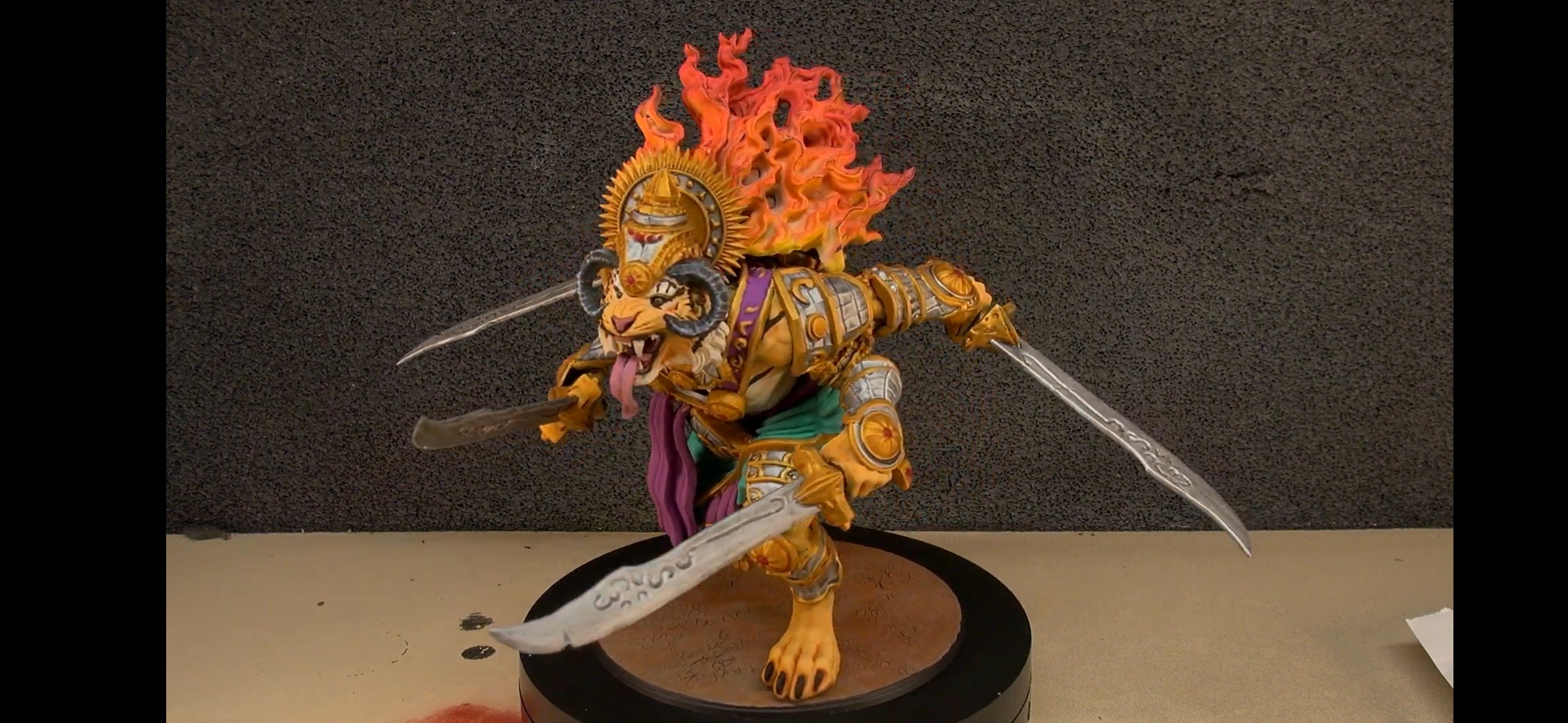
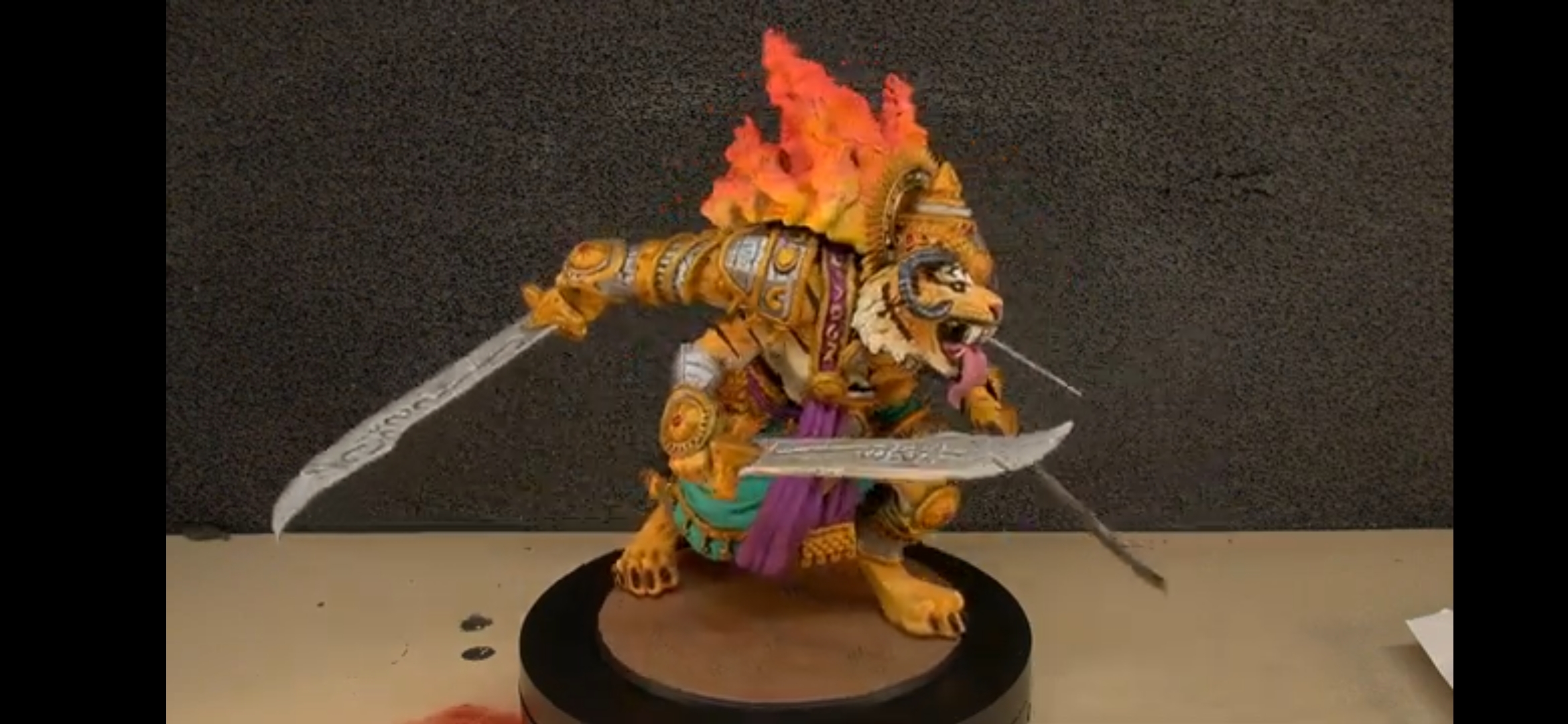
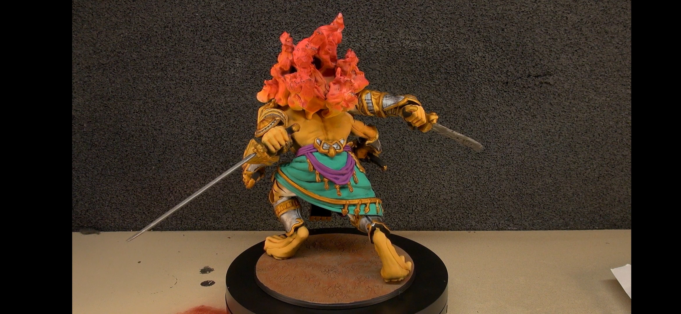
Painting is done and now to show off the figure. Unlike @johnlyons I have done subassembly painting with the sash, left arm and head done separately. Parabellum’s Rakshasa Ravanar wasn’t quite as bad as I had feared. Thank you John for your 3Colors Up tutorial when you took on the kit. I have been inspired by some of the footage (just like George Lucas) for how to work on this model. The flame was painted by itself as was done in the video. I have also modified my paint scheme in order to tie the tiger into the rest of the army. I’ve used the same recipe that I did with the turbans and other garments. The initaial large vertical striping of the fabric was done using Tamiya masking tape that I aligned as best I could. After that it was all freehand. The rest of the model I took on as a chance to tie the color into the Trinnavarta. Keeping some sort of uniformity at scale can be a pain because deviation stands out more.
My version
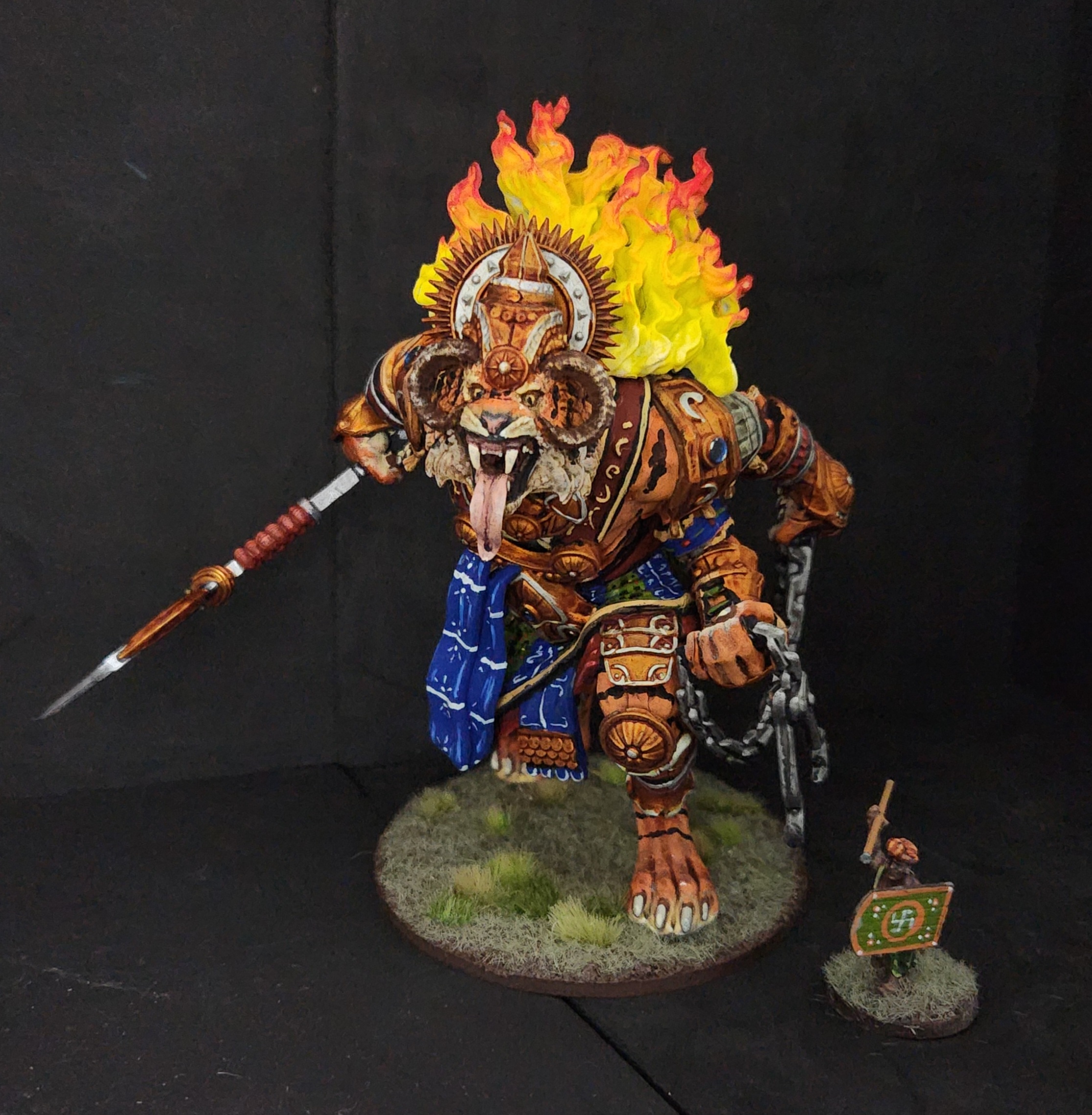
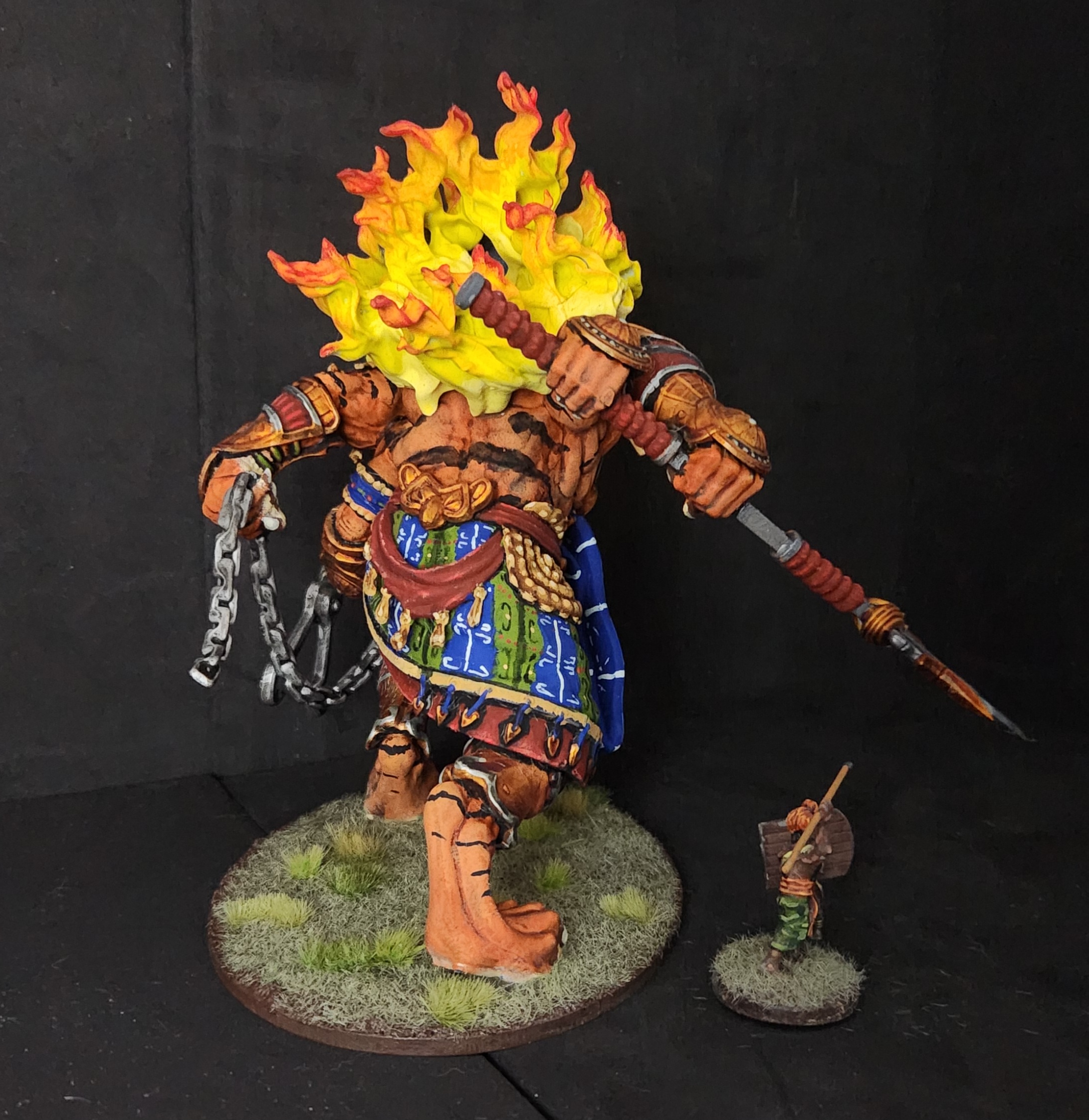
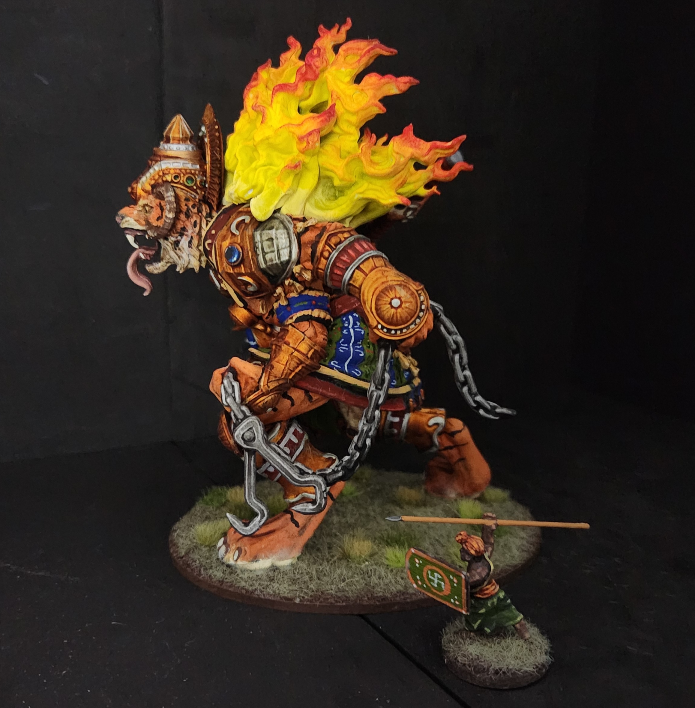
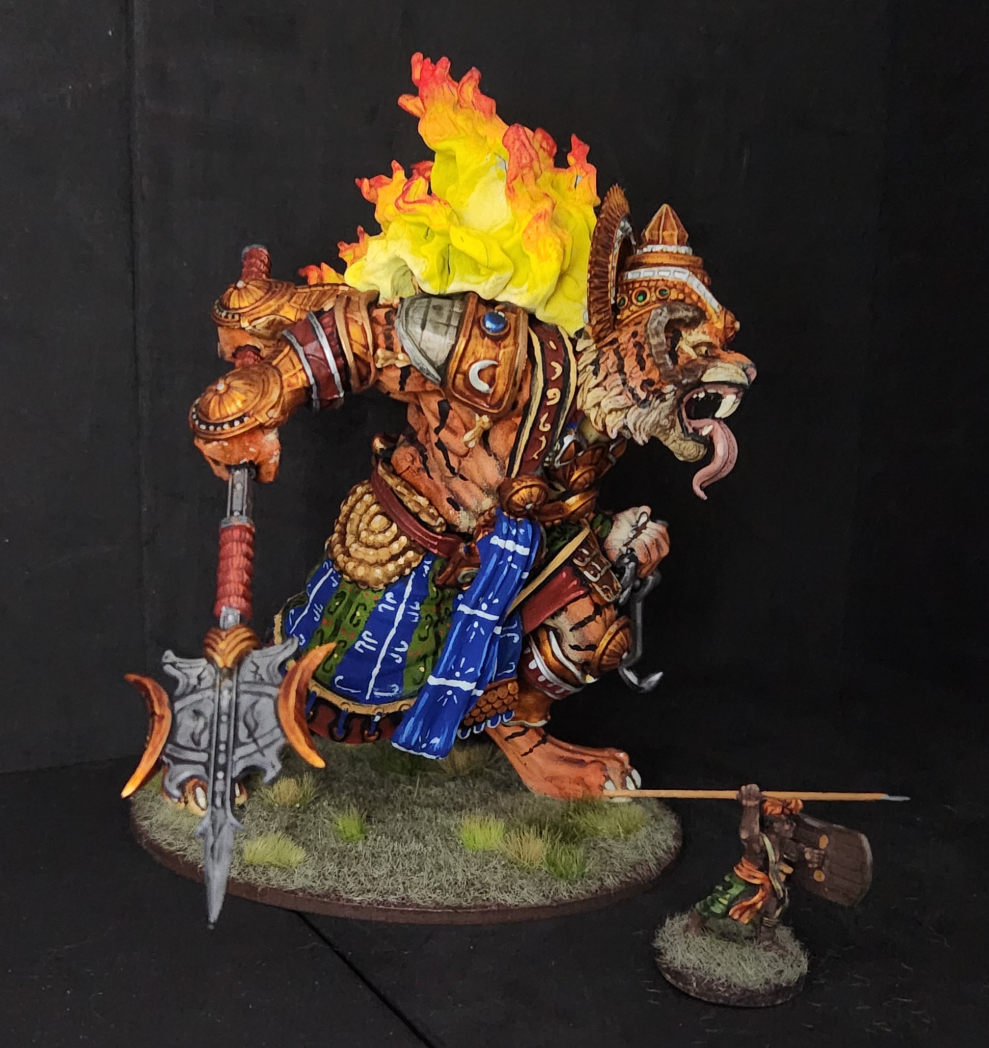
My change for this model was using Tesla Blue from Scale75 which ended up looking like crap so I covered it with Vallejo Model Color Blue (70.925). It ties back to the bhagnathi tiger Creatures already featured and I’ll be using it for my tiger riders in future. My only complaint is that the medium of the Scale75 might have a shelf life or may need serious remixing in a way that Army Painter had some issue prior to the Warpaints line.
By and large, I’m pleased to have this ready to go to with the others. It fills the visual space for the army tray and keeps a theme for display which is a treat on and off the table.
Yoga Fire! Yoga Flame! Yoga Blast!
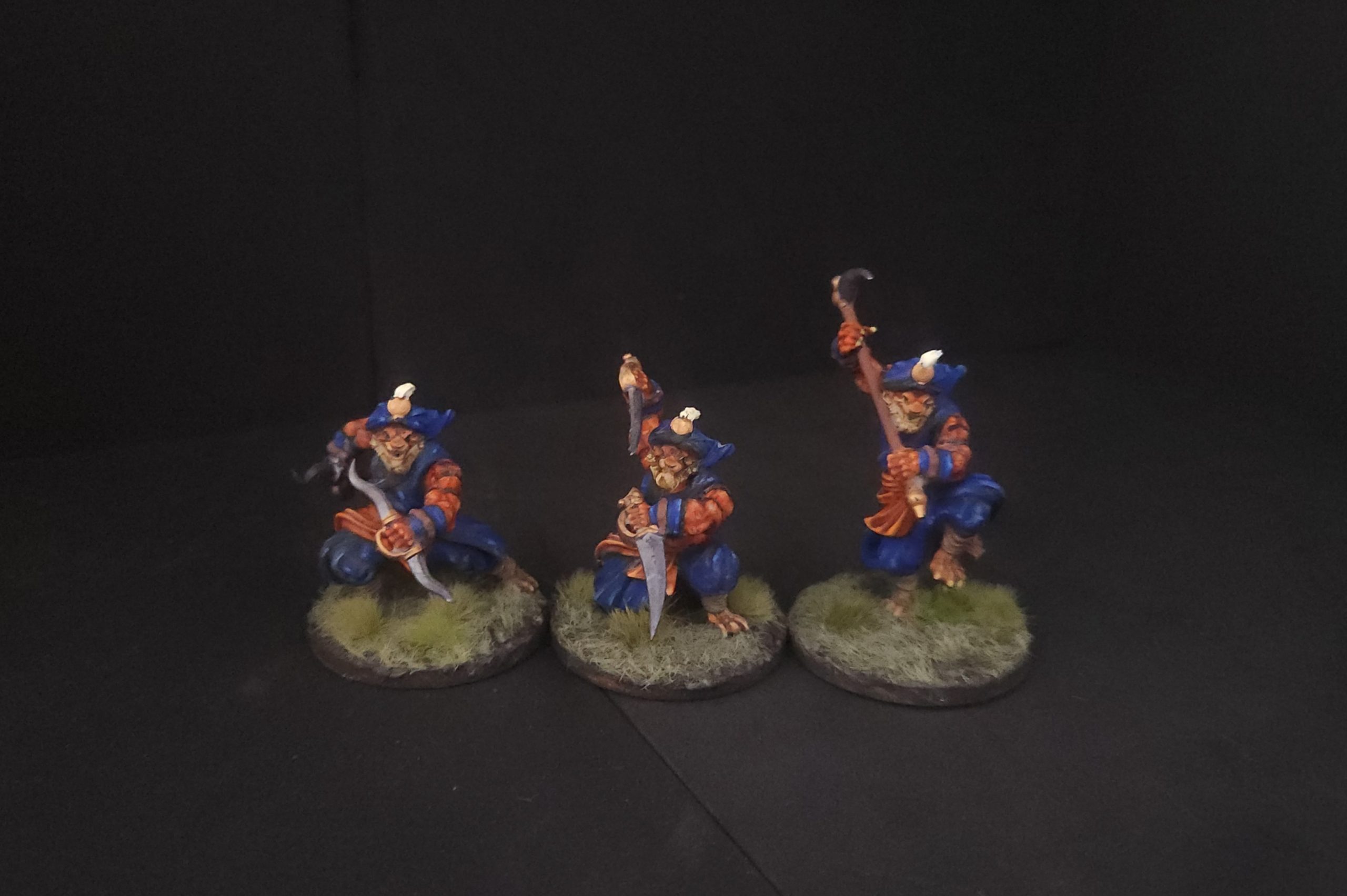
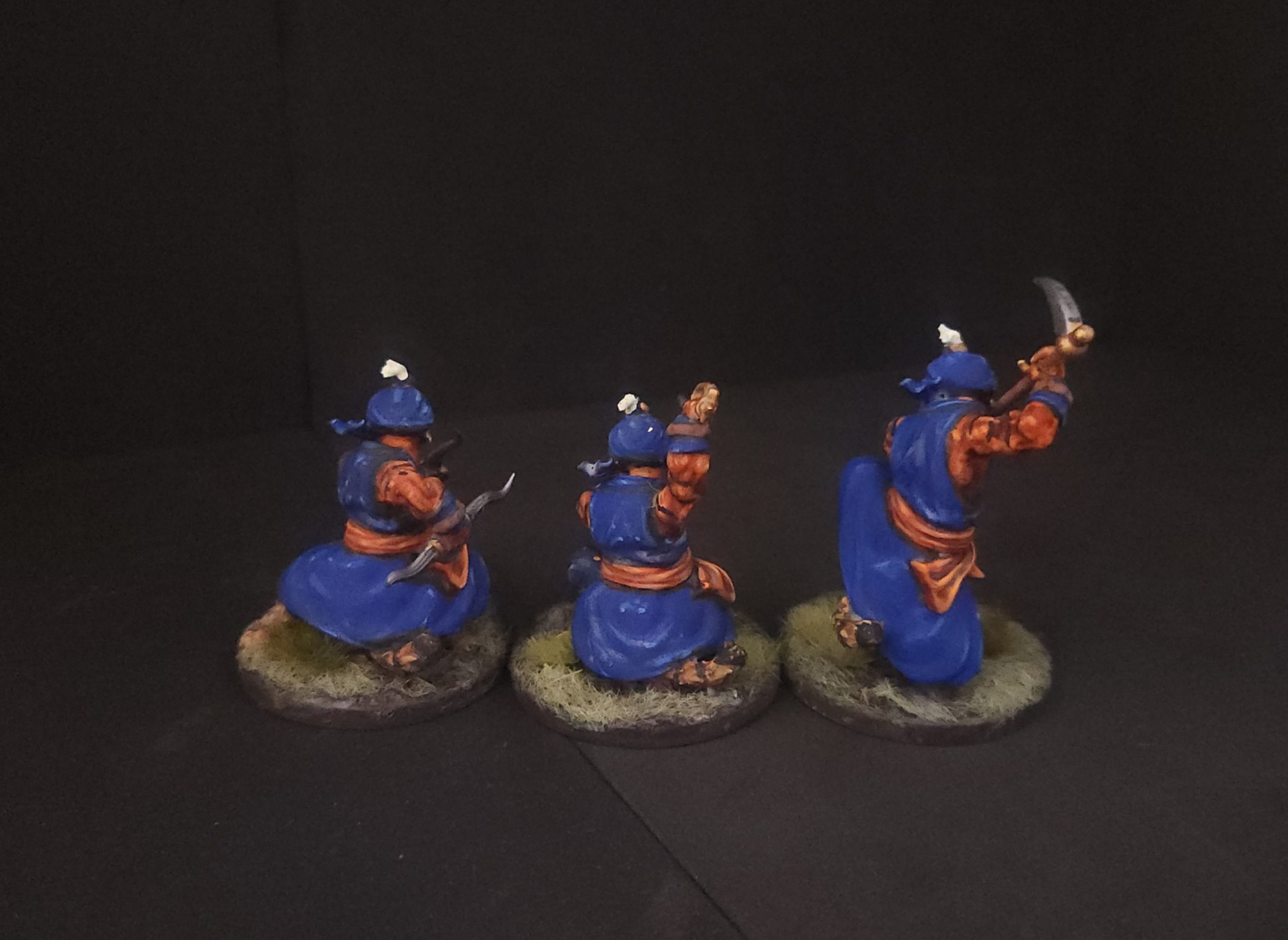
Here I have a trio of figures from Wargames Atlantic digital from their fantasy line which have printed up very well. In trying to get some tiger anthropomorphic figures all I had found previously were tabaxi that were outfitted in European style cloaks and light armor. I like the idea of adding variant humanoids but I didn’t want to break the motif of the army. I was very pleased with the set as Creature options for Age of Magic.
Being modular resin prints they don’t match up absolutely so pinning and gap filling was necessary. The one-and-done of plastic as a material would be nice for ease of building them. For Wargames Atlantic the likelihood of them selling these figures as a kit is unlikely as the sales likely don’t justify the cost of steel moulds. For my purposes these do the job and putting the arms where I wanted was a nice touch of customization beyond single pose prints.
Leaning into the Sikh swordsman videos and my plan for tiger riders I’ll feature blue as a prominent color. It balances well with the orange of the natural tiger coat and the trim for the rest of the army.
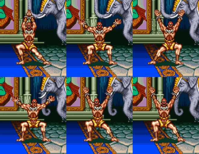
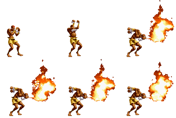
Mandatory Dhalsim insert from Street Fighter
Set into good hands
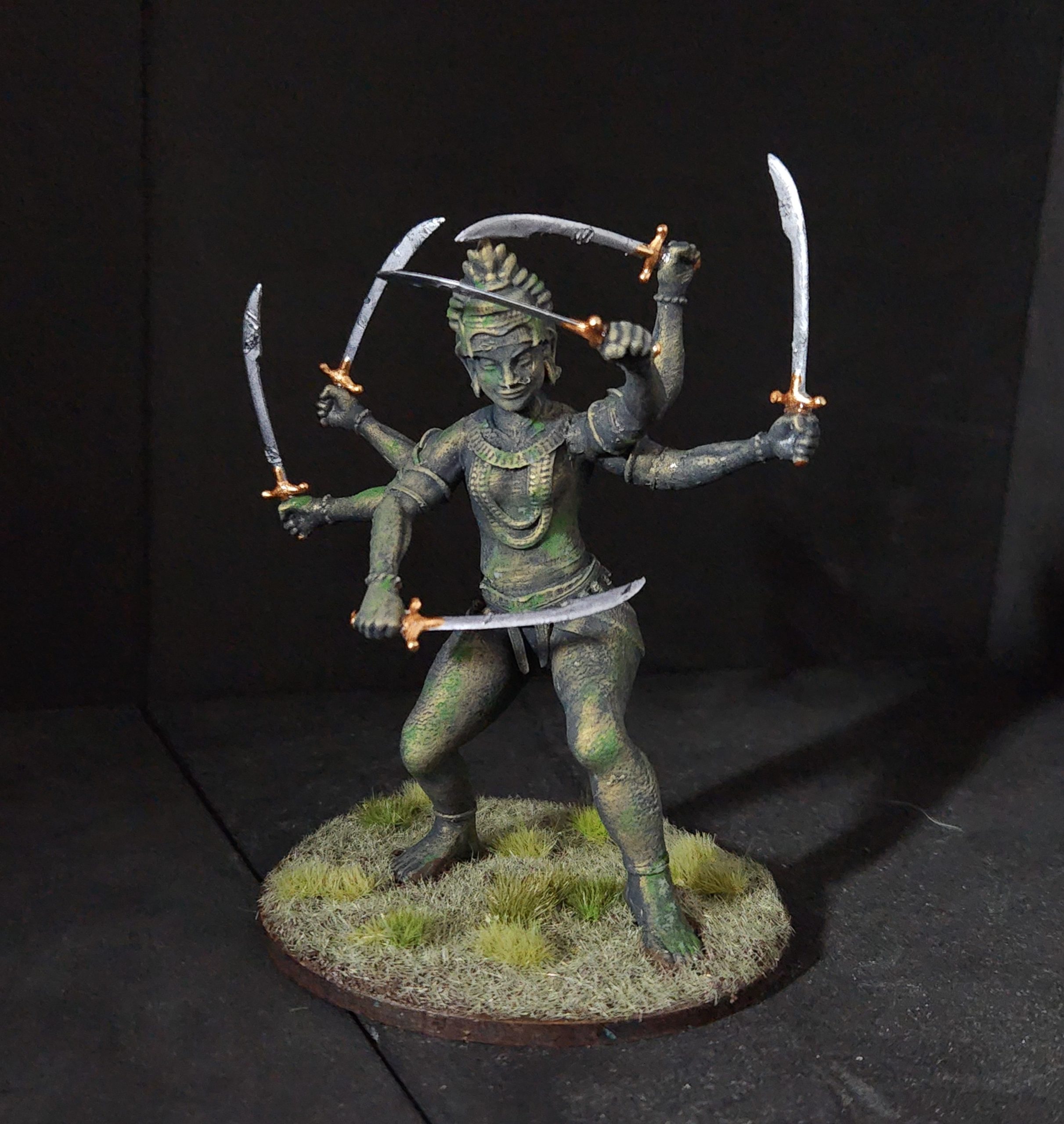
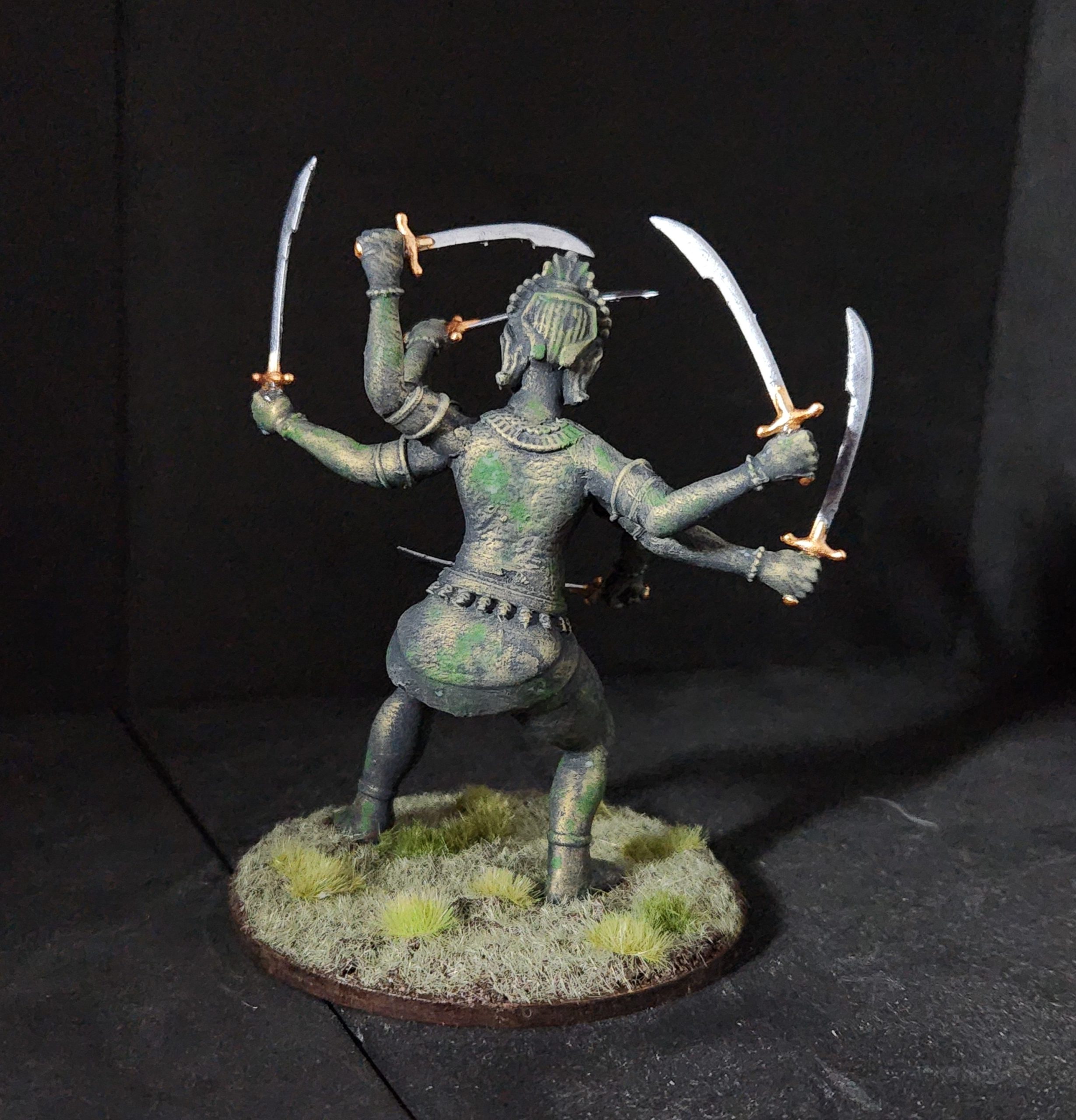
I’ve not been able to get my new photographer for the imagery here but I figure it would be good to have before the closing bell of the Spring Clean Challenge. I’ve gotten the figure done and I will say the swords are very frickin’ flimsy. This was modeled to be an 11″ model and not this small. I’ve managed to balance this out on an 80mm base. Another note for the size is these swords have busted off repeatedly and will likely keep doing so. I give up and I’ll just live with it.
Here I am very happy with the patina as it wasn’t too rich a spray using IPA and pigment powder. I think I’ll keep it and investigate what I can get done as far as a custom 3D print in metal. It would keep me from having to secure the hilts to the hands over and over again.
Working on Kali
The first test was underwhelming at maybe 60mm tall. The full blown model needs to be double that. Off and away my printing pal went to figure out the scaling again. Now to think about paint.
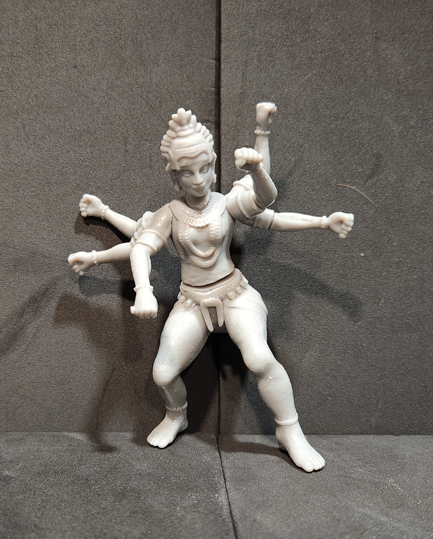 One multipart pain in the ass coming up
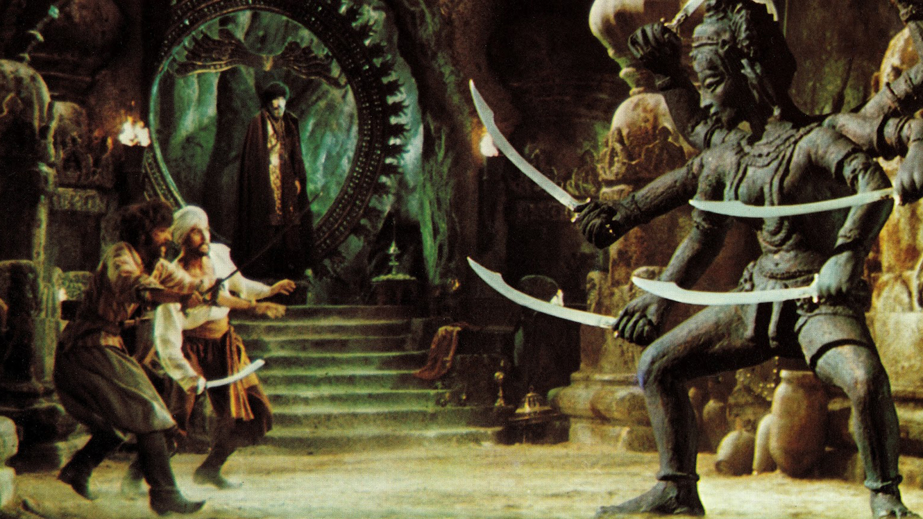
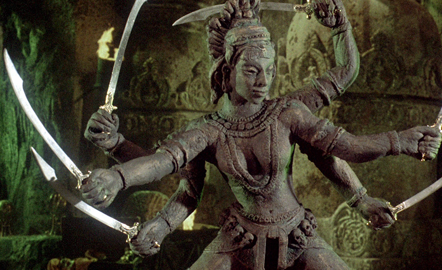
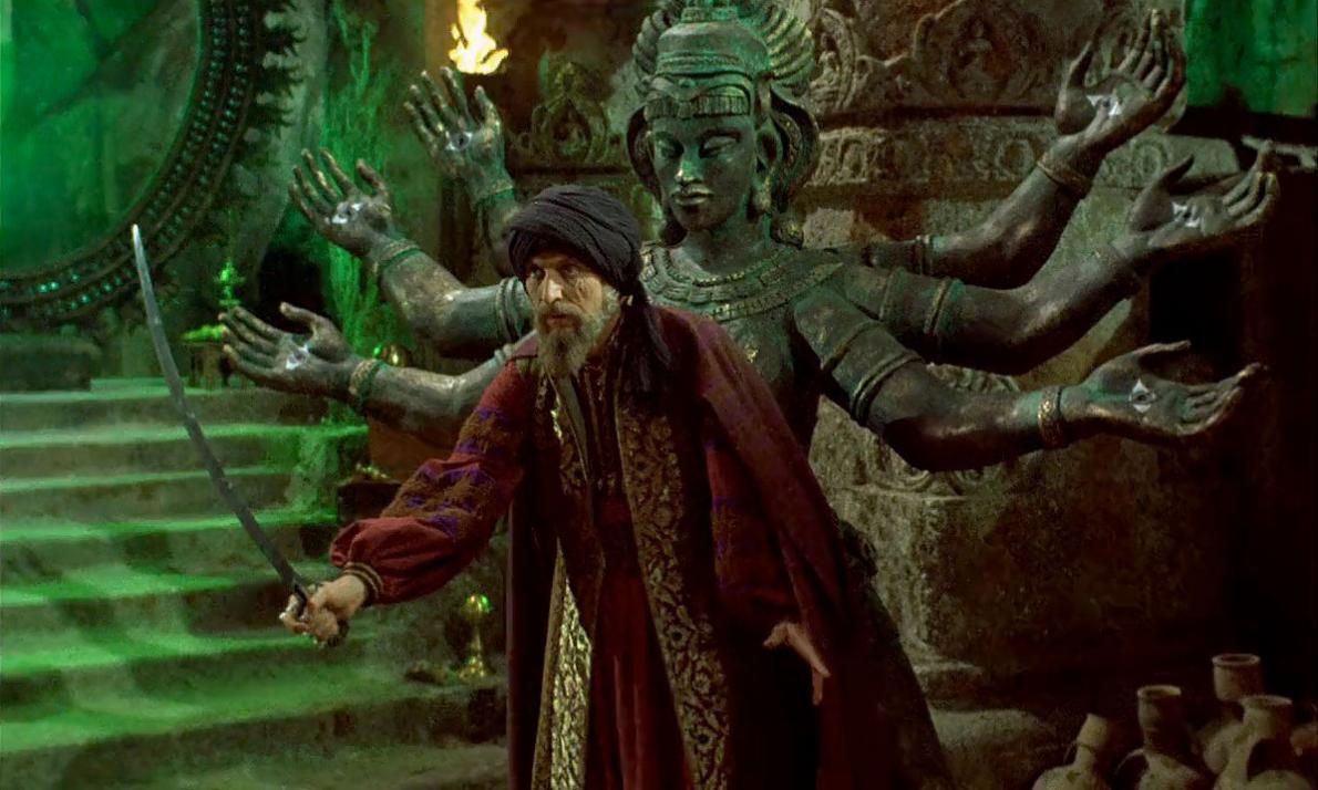
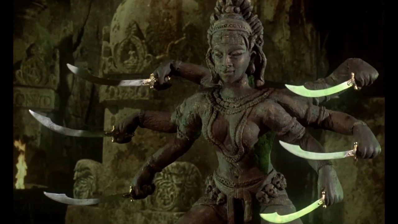
There’s a charm about watching an old film in its standard definition and getting the grainy quality of resolution with the color washed out and not supremely defined. It does make for a pain in the rear when trying to make something look screen accurate and color match properly. Here is my best attempt at getting the details of the Kali statue as presented in its original form.
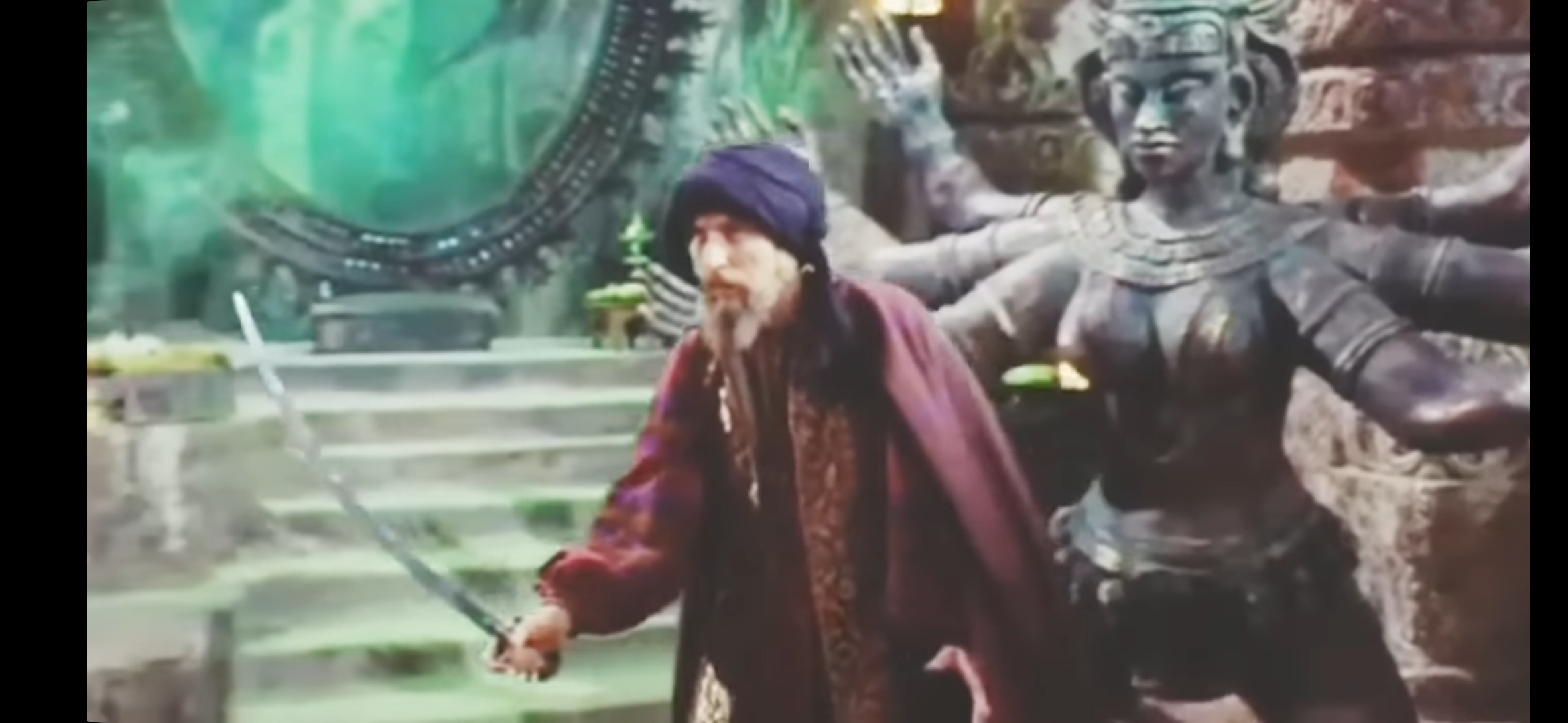
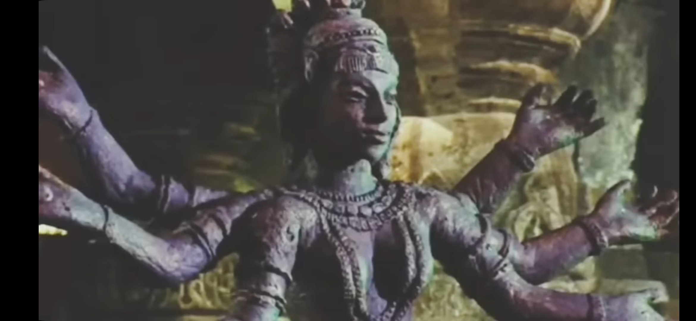
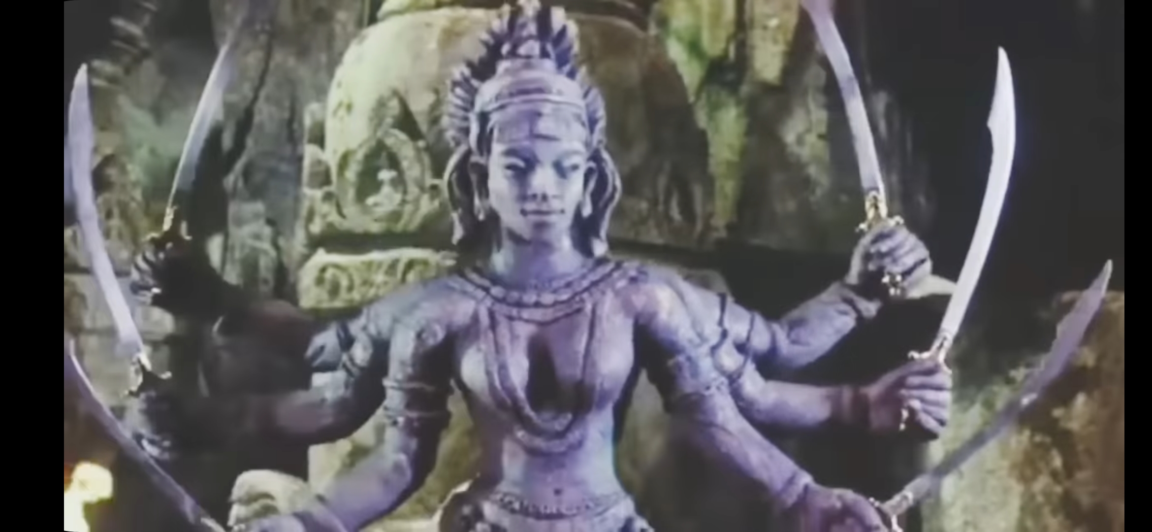
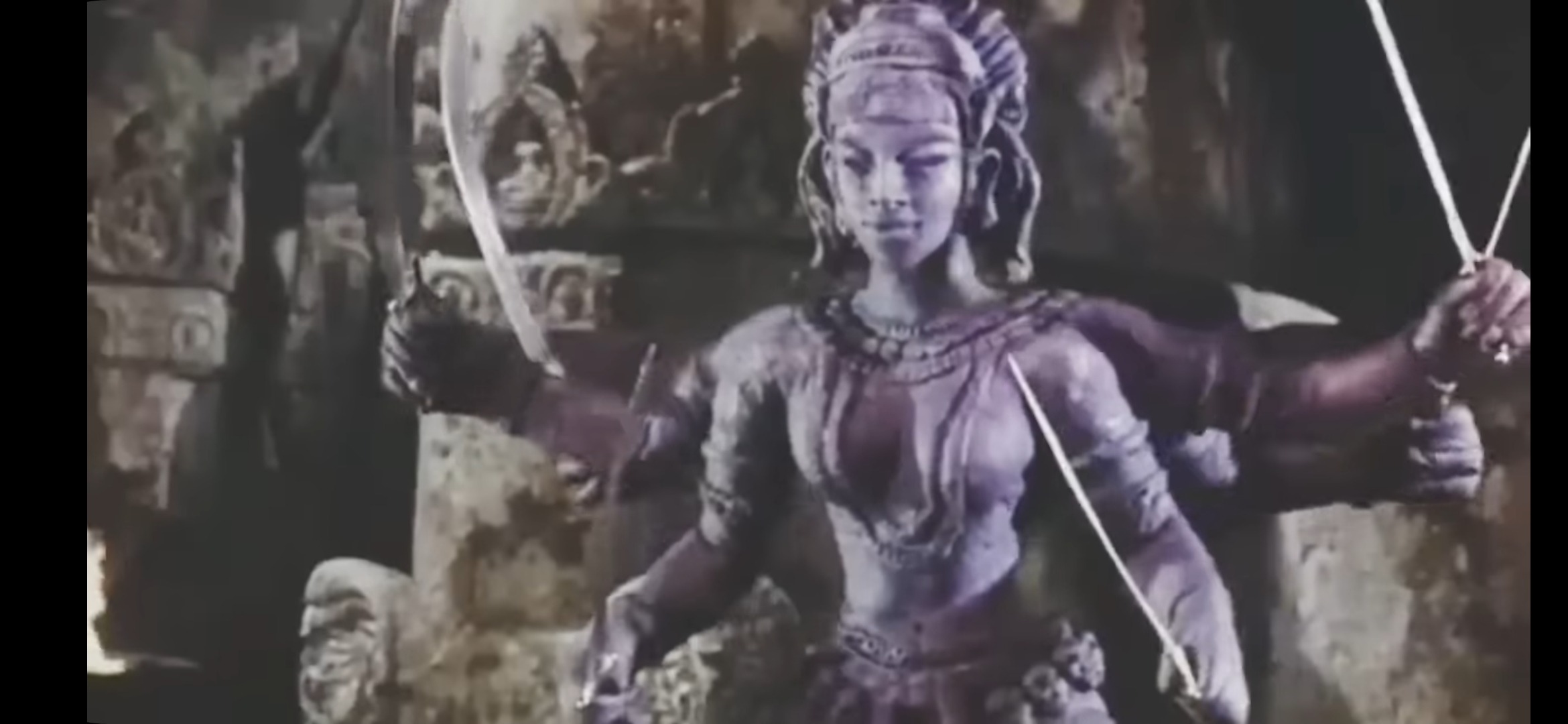
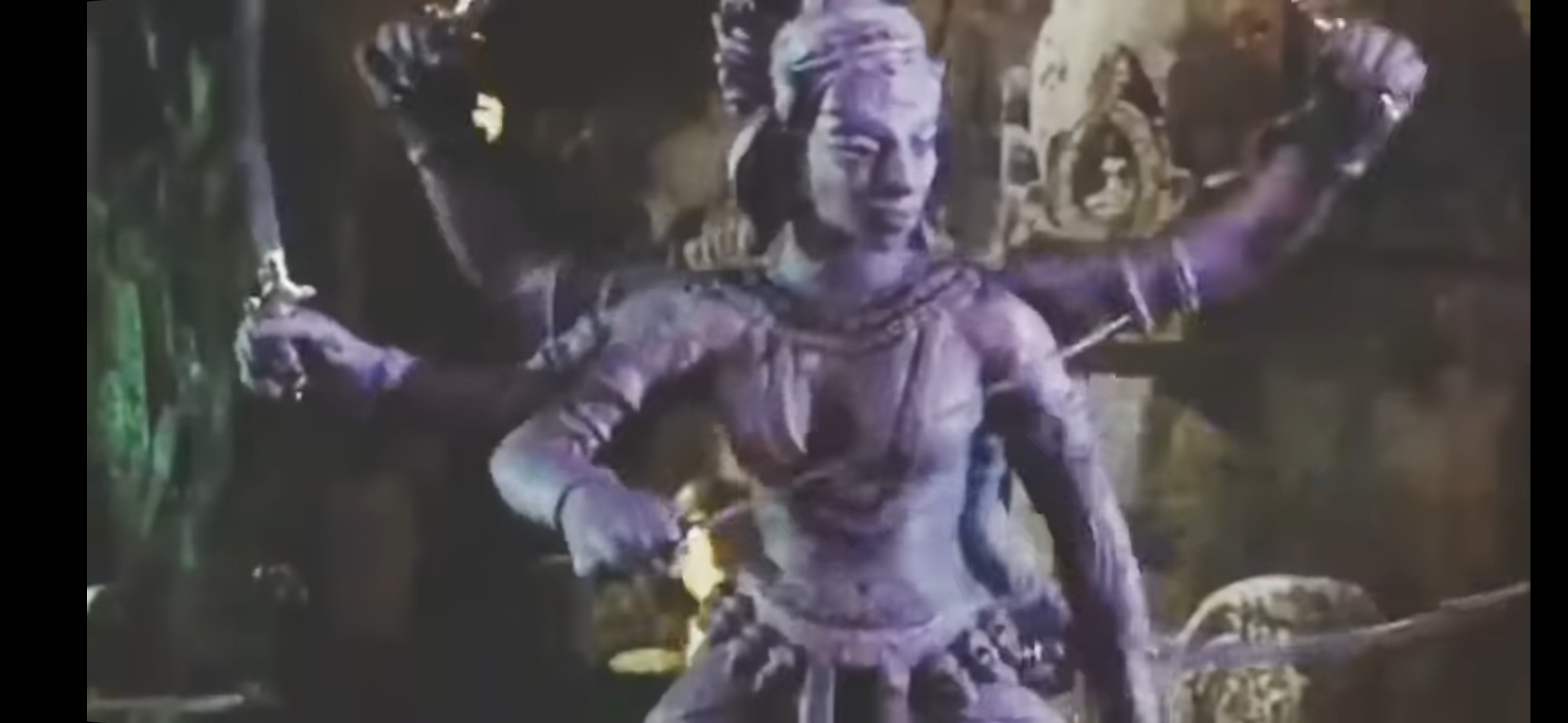
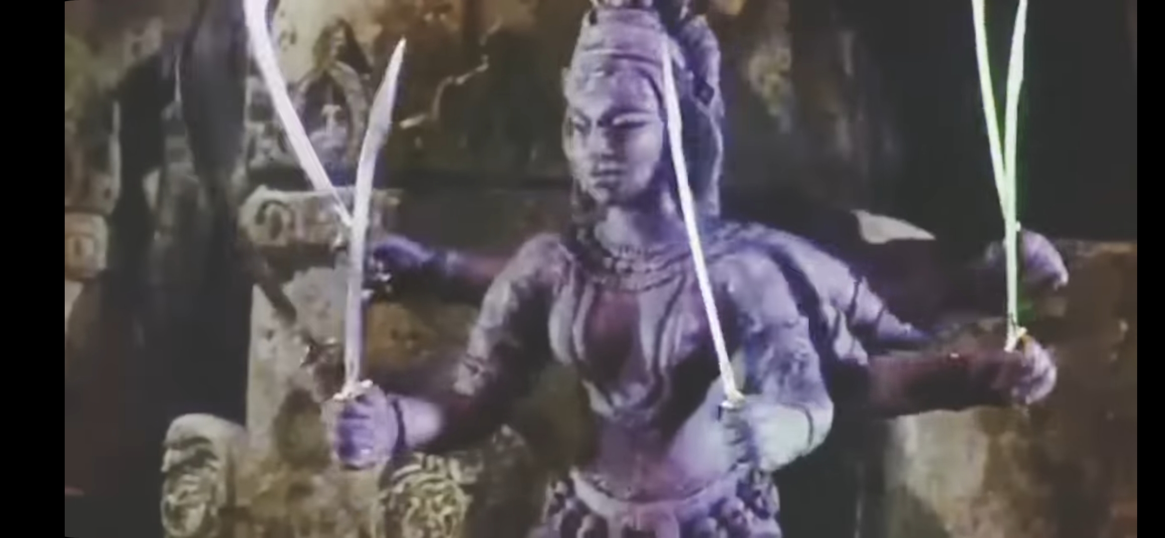
After a search, there was an enhanced version of some film stills and I’ve decided to use as further reference. It makes me think that the method I went about painting Talos previously. I think it was the best accident to achieve what I wanted. I’ll use the small figure as a test to try and achieve that again.
Flocking hell! It's massive
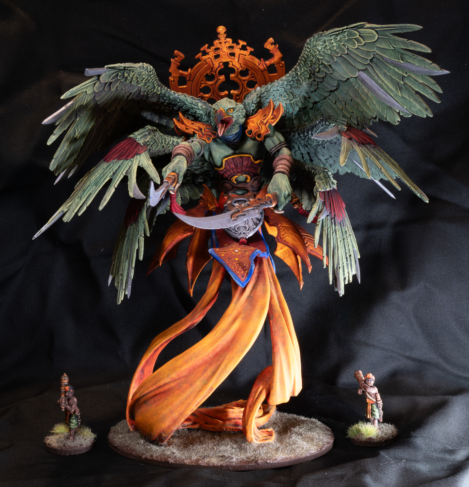
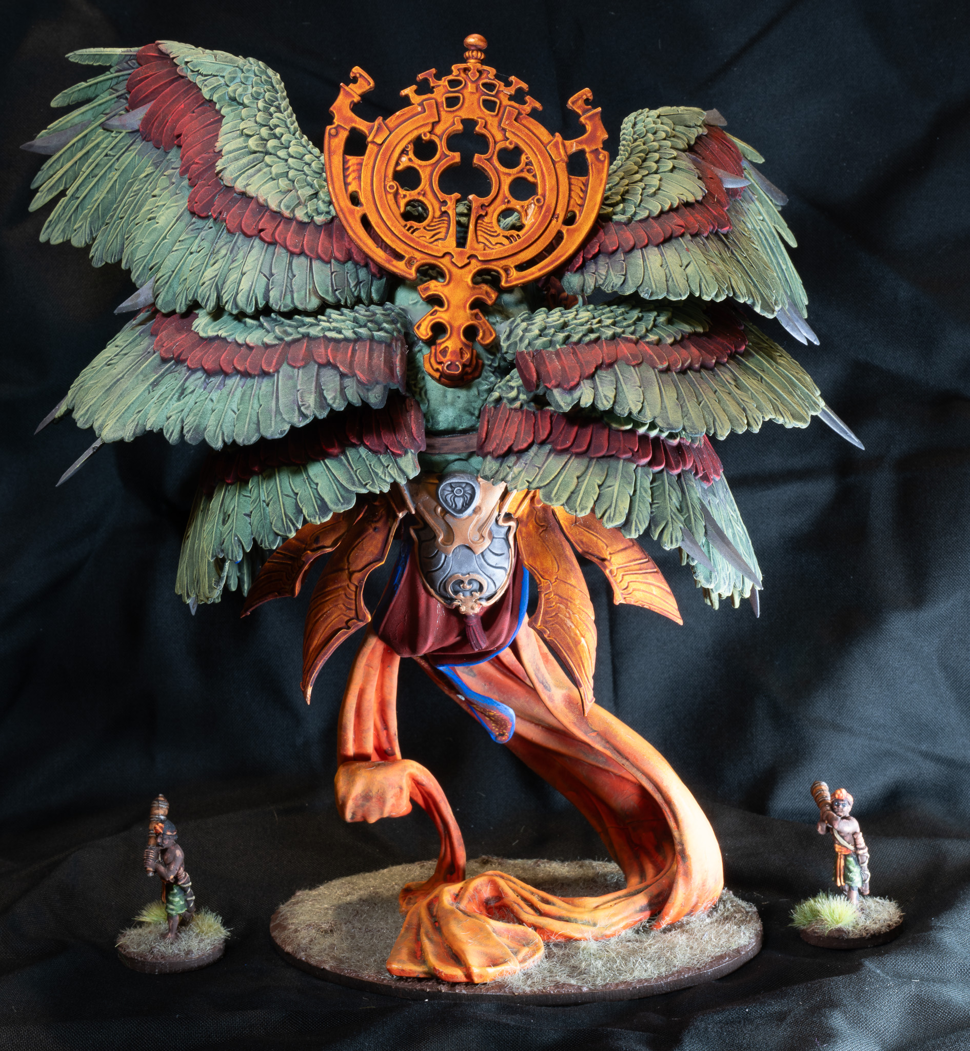
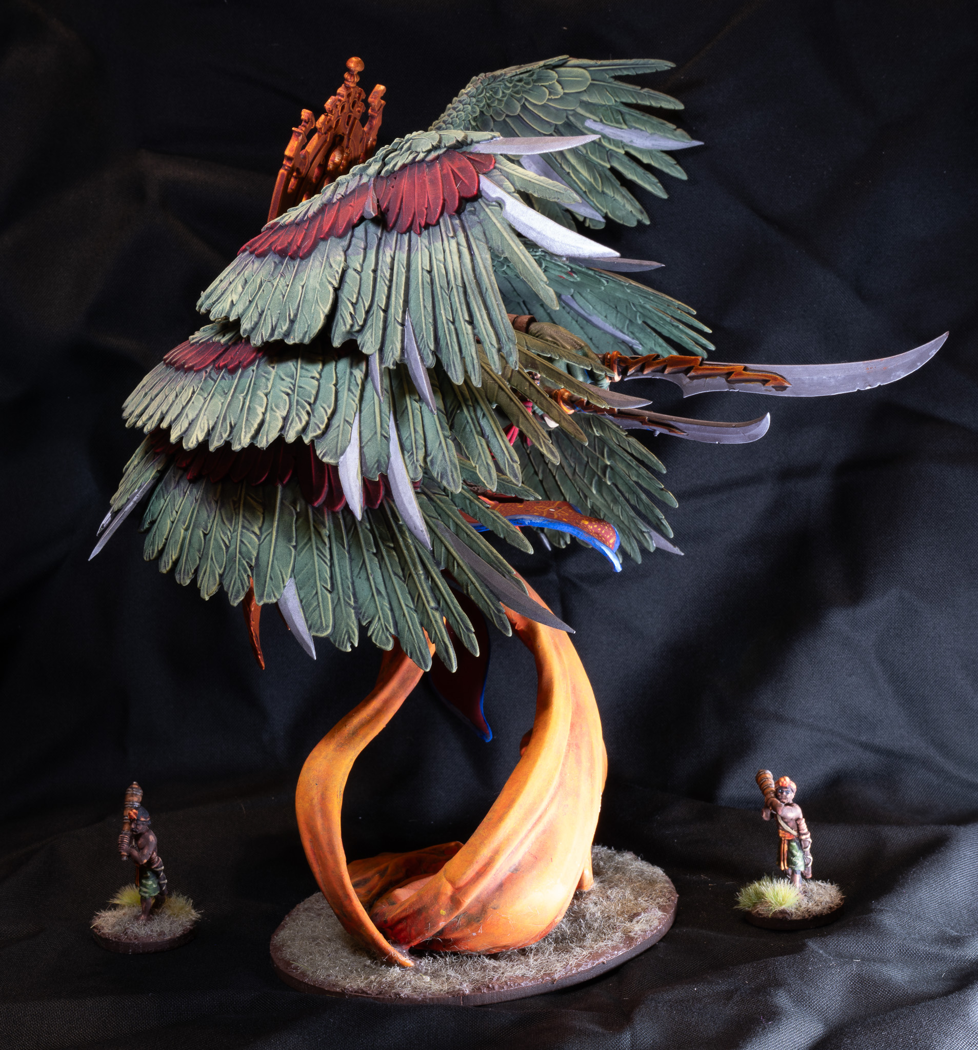
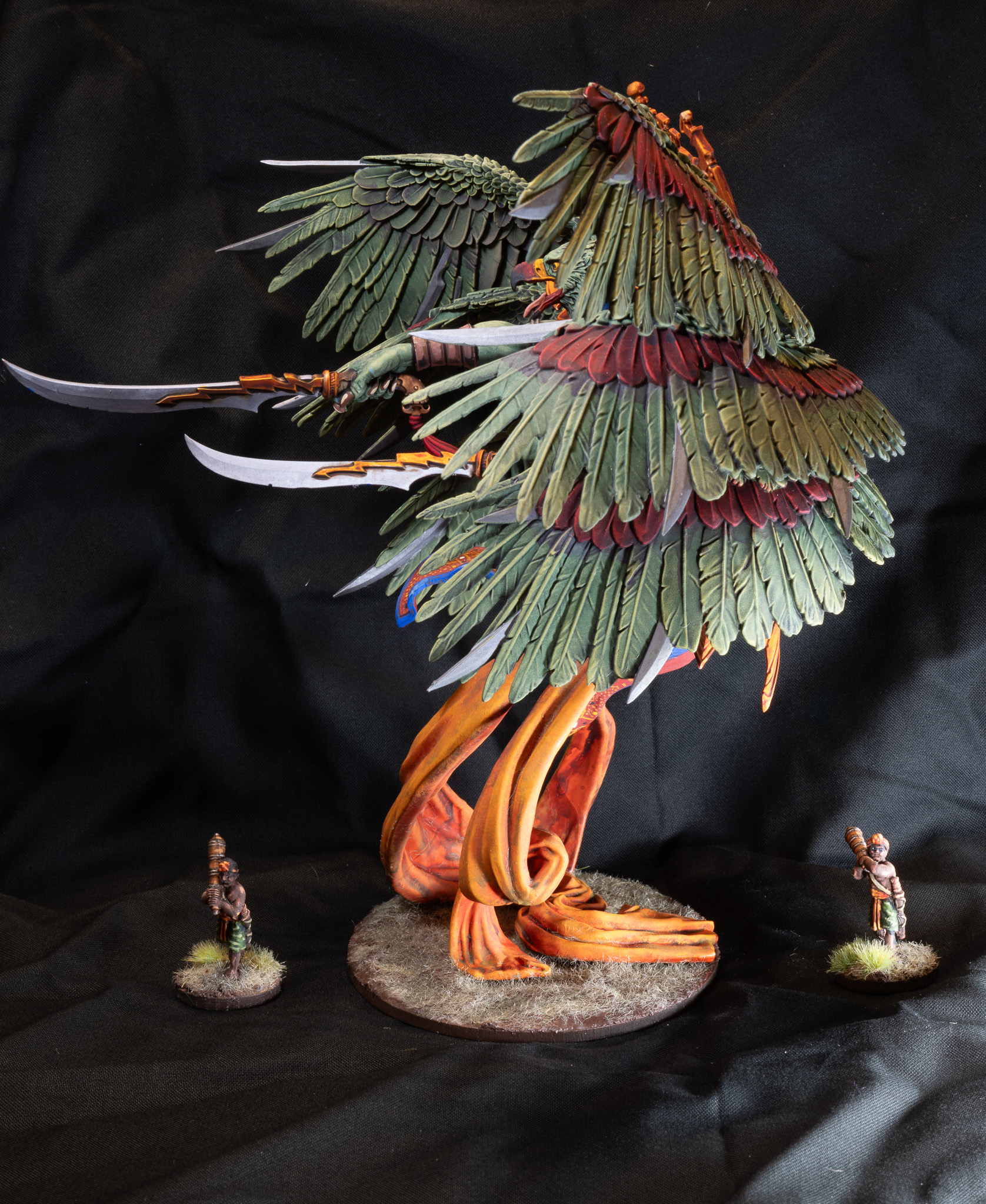
This is one hell of a large model. Parabellum was not playing around when they wanted to make a showstopper. My complaint is that there should be some measure like Gundam as to the difficulty of some models. This is beyond beginners and will only end in tears for the unprepared.
Trinitiavartha is a kit that requires building it in sections and subassembly painting if you want to up your display. There’s no way around it. It is also best held together with sprue goo. In order to get the best adhesion I suggest masking the connection points before priming so you keep bare grey plastic for later. The contact points were engineered for a moulding production problem and the modeler/player has been left with a functionality issue.
Assemble the body with the flowing fabric, head and arms. DO NOT attach the armor plating yet and leave the backpiece alone for now.
The first problem is trying to keep it all balanced as you join the top of the fabric to the bottom of the torso. It will hold but it does need some assistance to sit level at the end so be sure to figure out what base you’ll use and have it sit flat. If you plan on getting fancy with you paint job DO NOT attach the fabric to the base until your figure is varnished. You won’t be able to adequately get under the model to angle a brush very well. This is the same reason yo leave the armor off as the waist fabric has good open space to play with freehand.
The second problem is the armor once you get the fabric portion out of the way. The figure’s right side is fine to attach as there is a section like a pelvic crest that it fits onto well. The figures left side, under the sword closer to the body, doesn’t fit as well. Gap filling with a material that bonds like-to-like is the best course of action here. I make this decision after using 5 minute epoxy and gap filling with CA glue. Despite the short epoxy cure time it needed assistance to sit in place without shifting and falling off. The rear plate is molded onto he fabric so it doesn’t pose an issue unless you’re trying to get fancy on your fabric design.
The third issue is the greatest technically and visually. That is the wings. If you want to drybrush or do any work painting them first is the only way to go about it before attaching them. Once on there is no getting to the face closest to the body. You will need to work from bottom to top. The layered effect does not allow any other way. The bottom wings attach well and should have an extremely strong bond due to the engineering. This goes for the top pair of wings which should be attached last. The middle wings… they’re garbage. They work for the design but the connections are suggestions which won’t hold up well to play. It is imperative to pin them so they have a solid structure to prevent shifting while an adhesive is curing. The way the wings sit also will be a pain for how the top set into place. At your own discretion, if you want to avoid too much misalignment of the wings you can always attach the bottom set and the top before tackling the middle. It bears repeating, the center wing attachments are not great. They will need to be given extra attention to stability so that they sit with space between wings and stand up to play/transport.
With all those headaches out of the way the back panel device can be easily slotted into the divot between the wings. You might want to press against the lower end of it to and keep contact between the back/ornament for full adhesion of the part.
A lengthy rant on the build for a visually rewarding monster.

![Battle It Out In The Early War With New Flames Of War Set [Updated]](https://images.beastsofwar.com/2026/10/fow-barbarossa-cover-600-338.jpg)