





The Dogs – Spring Clean Challenge 2026


Recommendations: 296
About the Project
It all started with the mother load of early Regiments of Renown on Vinted. Should I? Oh, go on then :). After that I've had to be sensible and trim down to something that can actually get finished and works with the rest of my collection. Its time to realise a long held ambition, since around 1985, to get an army of Regiments of Renown onto the table.
Related Game: Midgard Heroic Battles
Related Genre: Fantasy
Related Contest: Spring Clean Hobby Challenge 2026
This Project is Completed
Making a start
The idea for this project is to build a Dogs of War army made up of the finest Regiments of Renown in the known world. I’ve had a box in The Pile for a long time with a “Dogs of War” label on it. I put all of my favourite fantasy miniatures in there. The best bits of my collection taken from different manufacturers and created by different sculptors, but in my opinion the best fantasy miniatures ever produced.
I buy one special present for myself for my birthday and this year I went for a box of the Alcatani Fellowship that I found on eBay. As expensive as you might imagine but that is in the eye of the beholder. Fantastic sculpts by the Perry Twins.
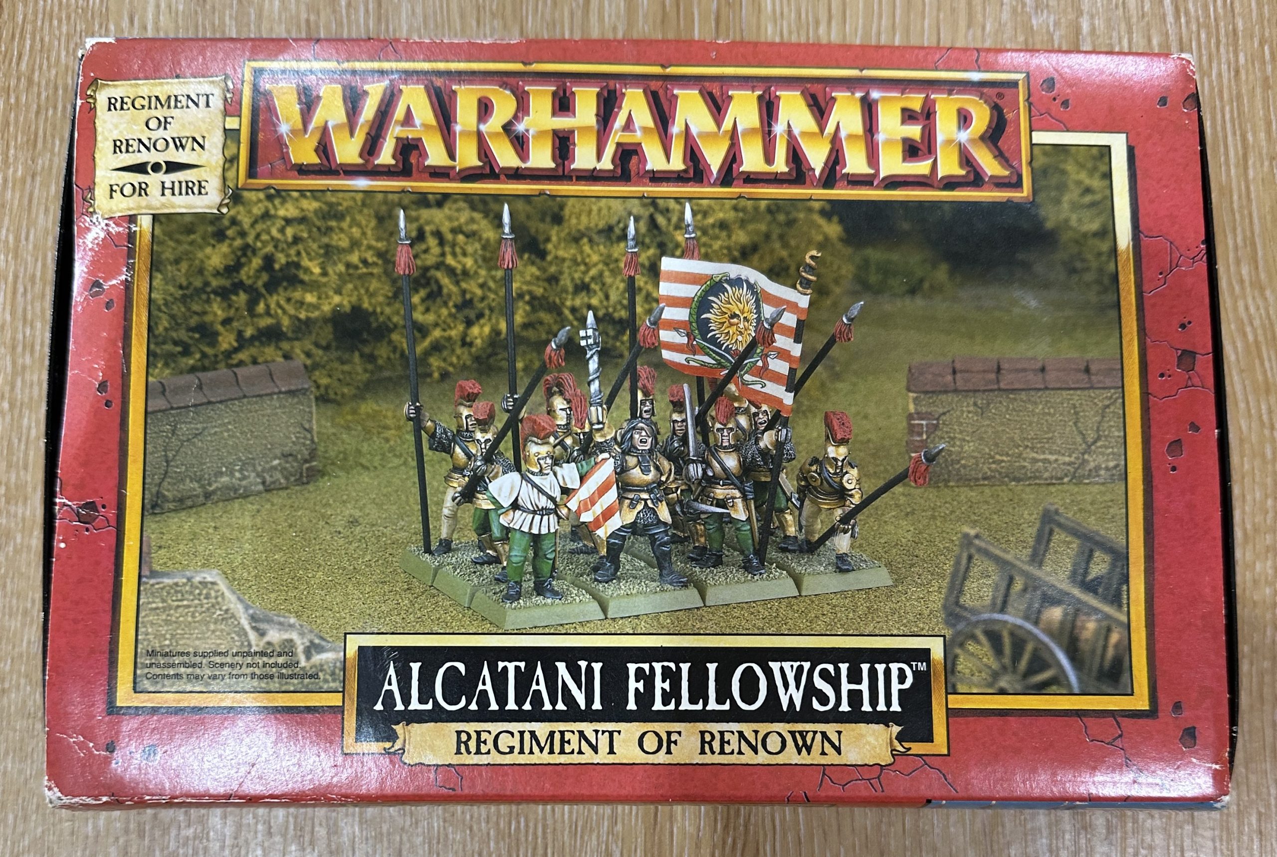
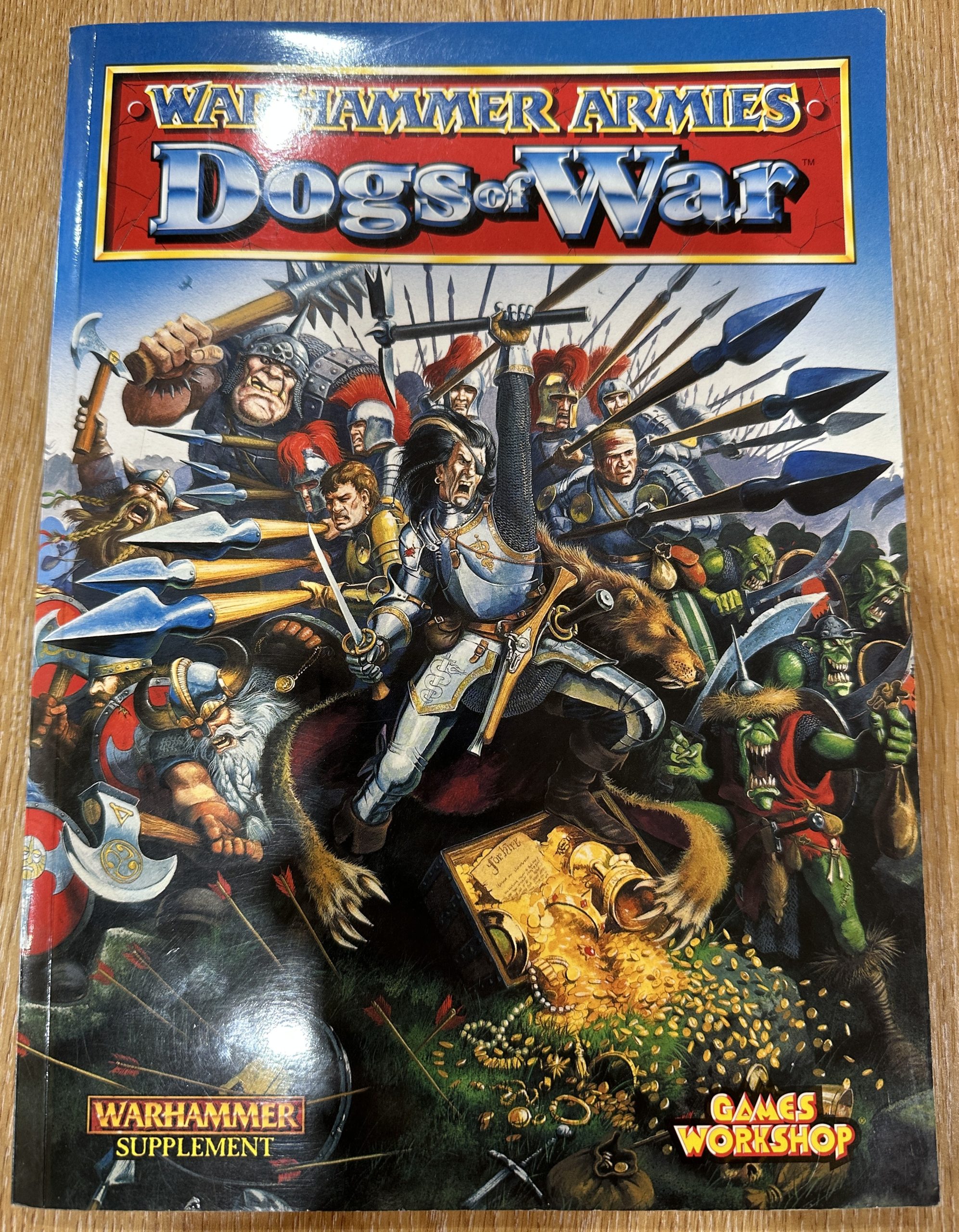
I added a copy of the Dogs Of War army supplement for 5th Edition Warhammer Fantasy Battles from 1998. This is the one that the ‘new’ Regiments of Renown like the Alcatani Fellowship were made for.
There was a discussion on one of the streams I watch, probably the UHH, about Vinted being a great place to shop for miniatures. I have a poke round on there occasionally and was looking for the Lothern City Guard Regiment of Renown or Elwing’s Guard Horse. Not long after Christmas I came across this:
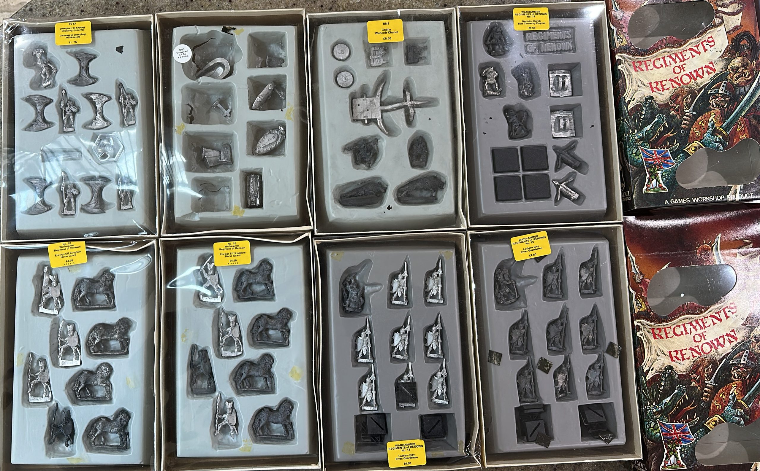
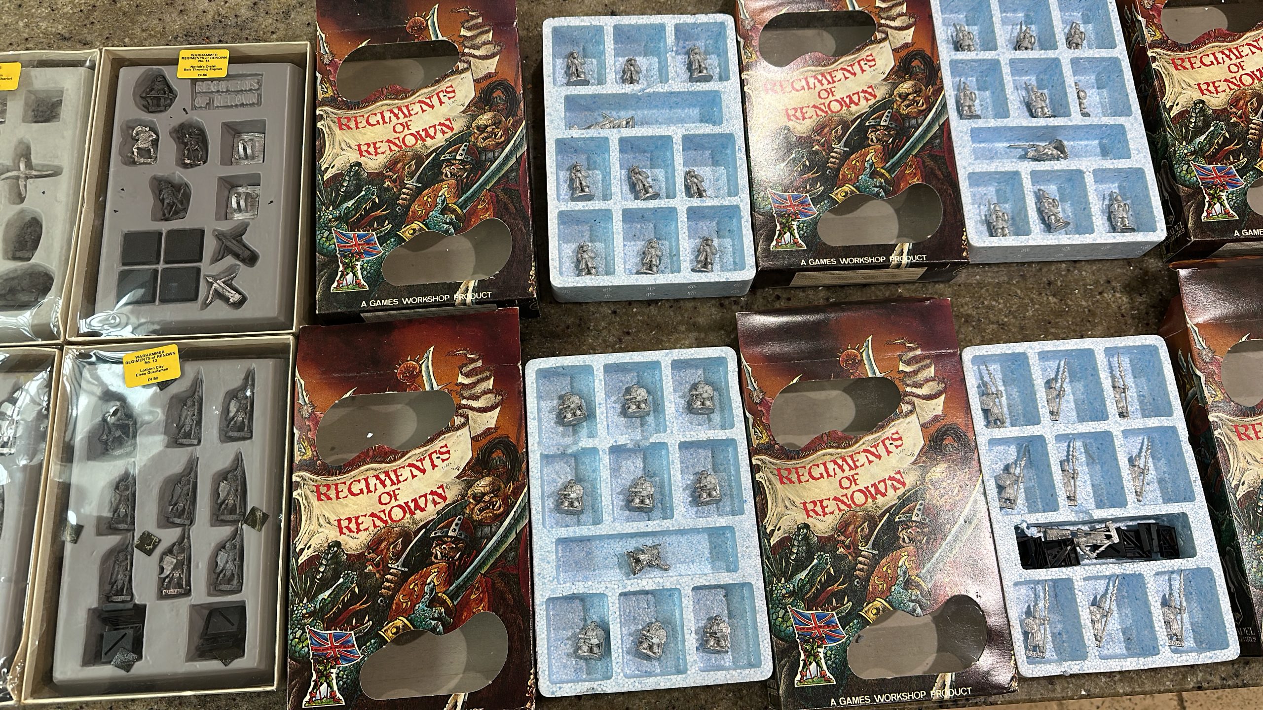
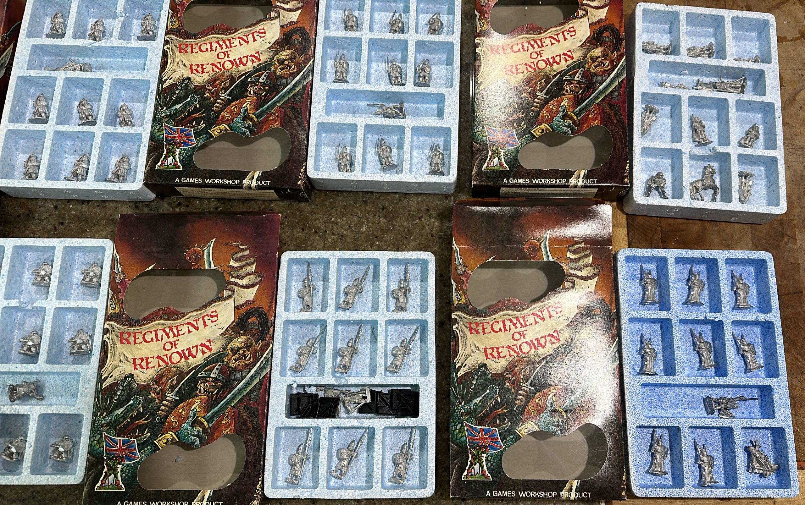
Yes! Someone was selling off the mother load of original 1985-88 vintage Citadel Regiments of Renown. Prices very far from the outrageous levels you see on eBay where you pay £10+ for a single mini.
There are two boxes of Lothern and two of Elwing’s. I’d have been happy to get just those four for what I paid for all of it. I had to lend the hobby budget some money to get the deal done so needed to pay it back. I decided to sell the monopose early miniatures; Bugman’s Rangers, Meghil’s Dark Elves, The Elf Bowmen, Desert Dogs, Knights of the Cleansing Flame, Knights of Origo and a random mounted Strider (all shown in the last picture above) went onto eBay. I didn’t have to charge outrageous prices to get my money back and I’m glad to have passed these on to other collectors. The boxes were in great condition. Either this was a much loved collection or it has been in the back of a cupboard since the late 1980s.
Money repaid I held on to the rest to see if they were needed in this project. Then on to The Pile to see what we have already. Alongside the Lothern and Elwing’s units this is what we fished out:
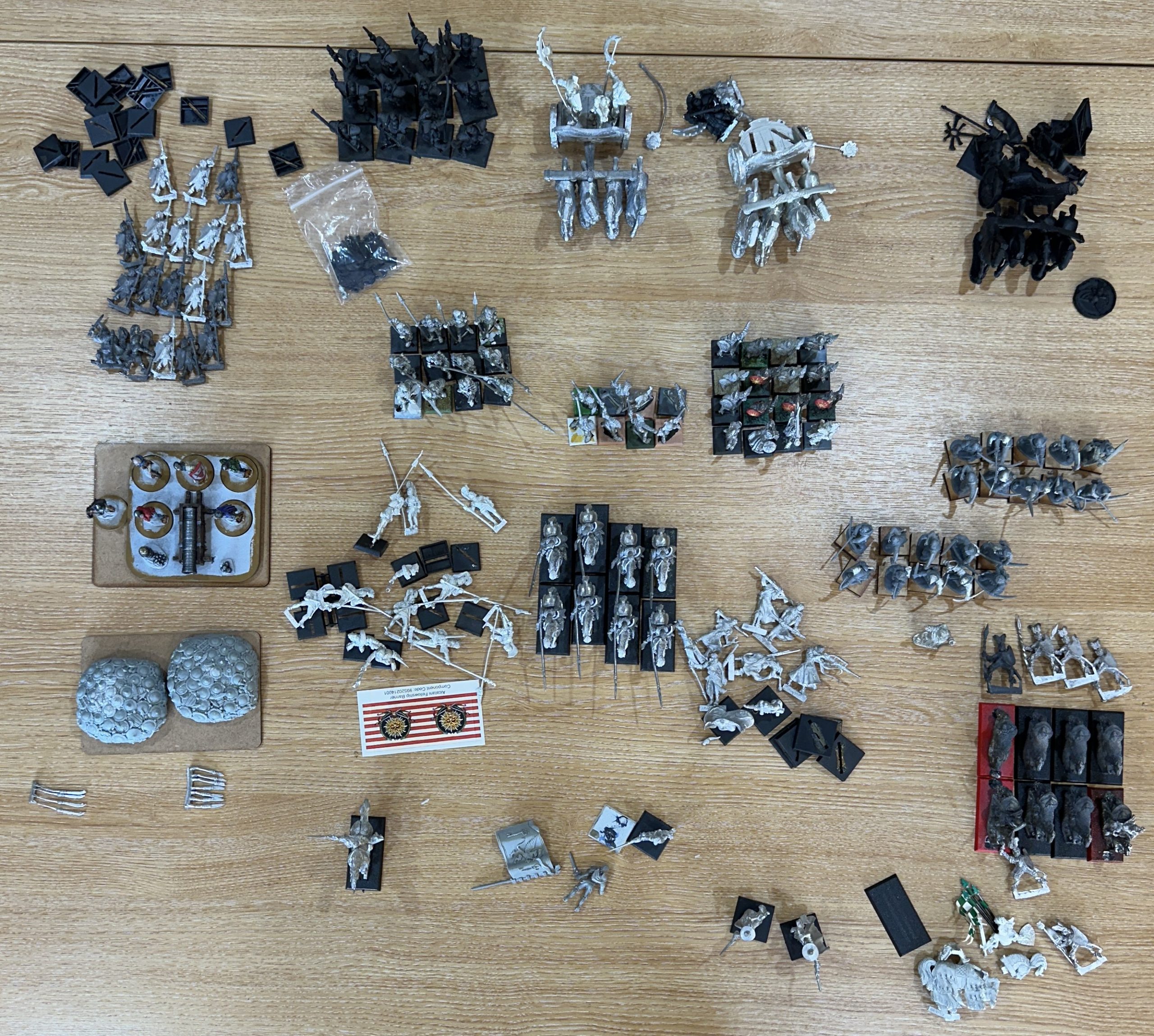
If you recognise all of these you win the hobby internet 🙂 I’ve spent some time today sorting through to find some bases for those minis that don’t have. I’m going for square (as nature intended) slotta-bases for infantry, either 20mm or 25mm and then standard 25x50mm for the cavalry. Midgard movement trays are on order from Warbases.
I have a notebook that I use to keep all of my hobby records, musings and planning in. I made up an entry and started working on a Midgard list for this army. A standard force in Midgard is 300 points. I’ve got way too much stuff here so will aim at double that. Anything not required can go. I’ve got too many other projects already, I definitely don’t need to start something else.
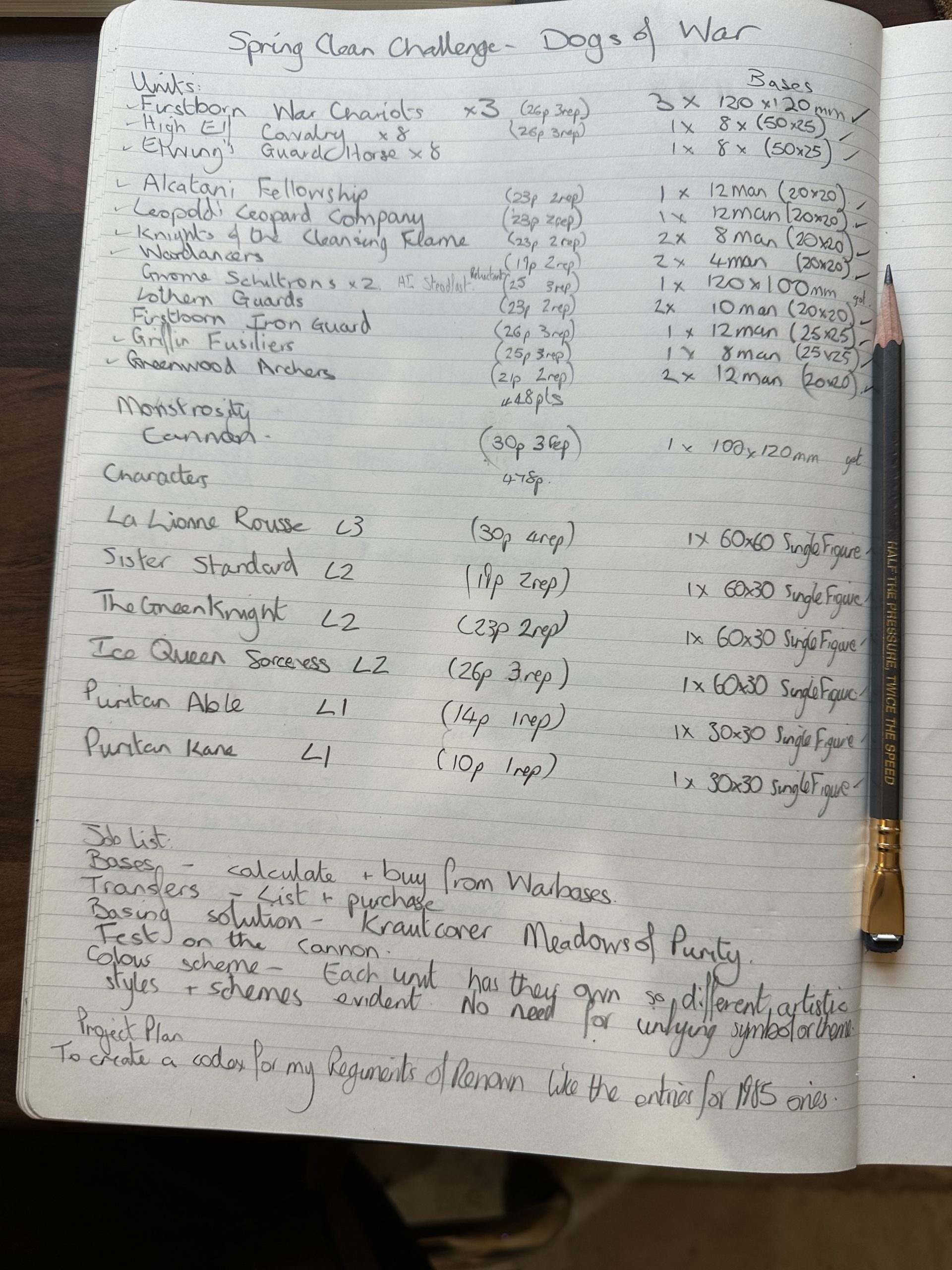
So on to getting everything based and ready for undercoat which I’ll do tomorrow. Hopefully we’ll still have decent weather so at least it will dry quickly.
Going forward the project will be both a blog of my general progress, painting log so I know how I got all of the finishes (which doubles as a handy how to guide for you, dear reader) and then a little something else. I’ve decided I want to make a final entry for each regiment that reads like the original entries for the first Regiments of Renown. Each one came with an origin story and some background for the leader as well as a set of stats for the game. I can manage that too, although the game will be Midgard HB rather than Warhammer FB.
Primed and ready
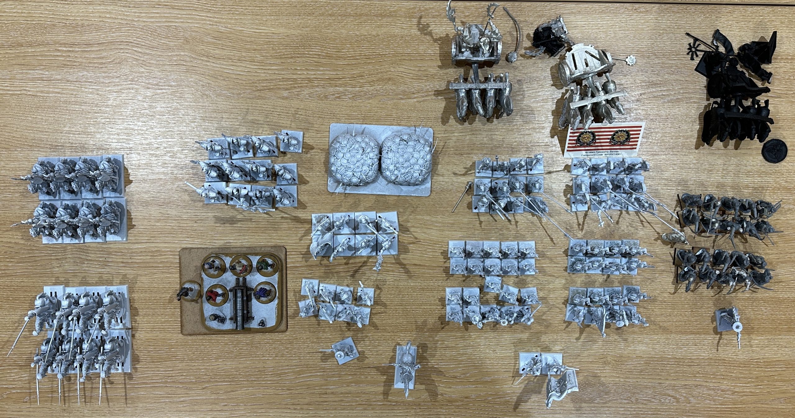
Spent today basing and then priming ten units and 4/6 heroes. They will need all day tomorrow to dry properly. Working with Speedpaints it is necessary to have a well set primer. If you work on the undercoat too soon you risk it coming off as Speedpaints are much ‘wetter’ than a standard acrylic.
Meanwhile, a small amount of building and repairing is underway. I found the top half of the Leopard Company standard after they got primed so will need to get that stuck on tomorrow. The Green Knight is still in the miniature hospital having been sorely abused by his previous owner. No idea what they did but I can’t get the two halves to meet properly or get the slotta tabs into the base slots. They’ll have to come off and I’ll glue and pin him onto the base. He needs a bit of greenstuff work too to cover the gaps in all of the joints.
As you can see from the photo I’ve got everyone arranged into units and am starting to think about the army disposition and which heroes will command which units. In Midgard the army is divided up between 3 senior heroes, one of whom is the army commander. They can influence any units but the other senior heroes can only influence the units under their own command.
Our three main heroes will be:
- La Lionne Rousse who is the Army Commander and will get the main pike and spear units, along with the fusiliers and cannon. She will be assisted by Sister Standard.
- The Green Knight who is likely to get the cavalry and chariots in his command
- The Ice Queen Sorceress who is likely to get the Greenwood Archers, Wardancers and possibly the schiltrons. She may well also get the two L1 heroes Kane and Able.
Good news on the orders front. Warbases emailed me to say the Midgard unit bases will be here on Monday. Ace 🙂
Miniature hospital and a kit bash Ice Queen
I wanted a sorceress on horseback and remembered the Kislev Ice Queen so looked at images online and was rather struck by this conversion on Stuff of Legends
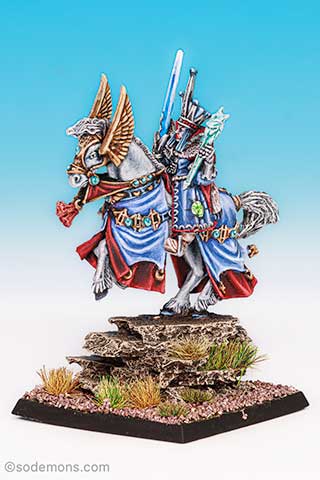
This is a conversion using parts from several models. The queen herself originally came with a standard plastic horse. The horse here is from the Prince Tyrion High Elf miniature, two different versions, the head is from the earliest one that came with a plastic barded horse and the rearing body is from a later version.
I went to the modern version of the Citadel Bitz Service, eBay, and found the queen herself without horse, the two halves of the horse, his head and his tail all from separate dealers. Probably cost me just over £40 which compares to buying a special character for AoS.
Everything arrived yesterday:
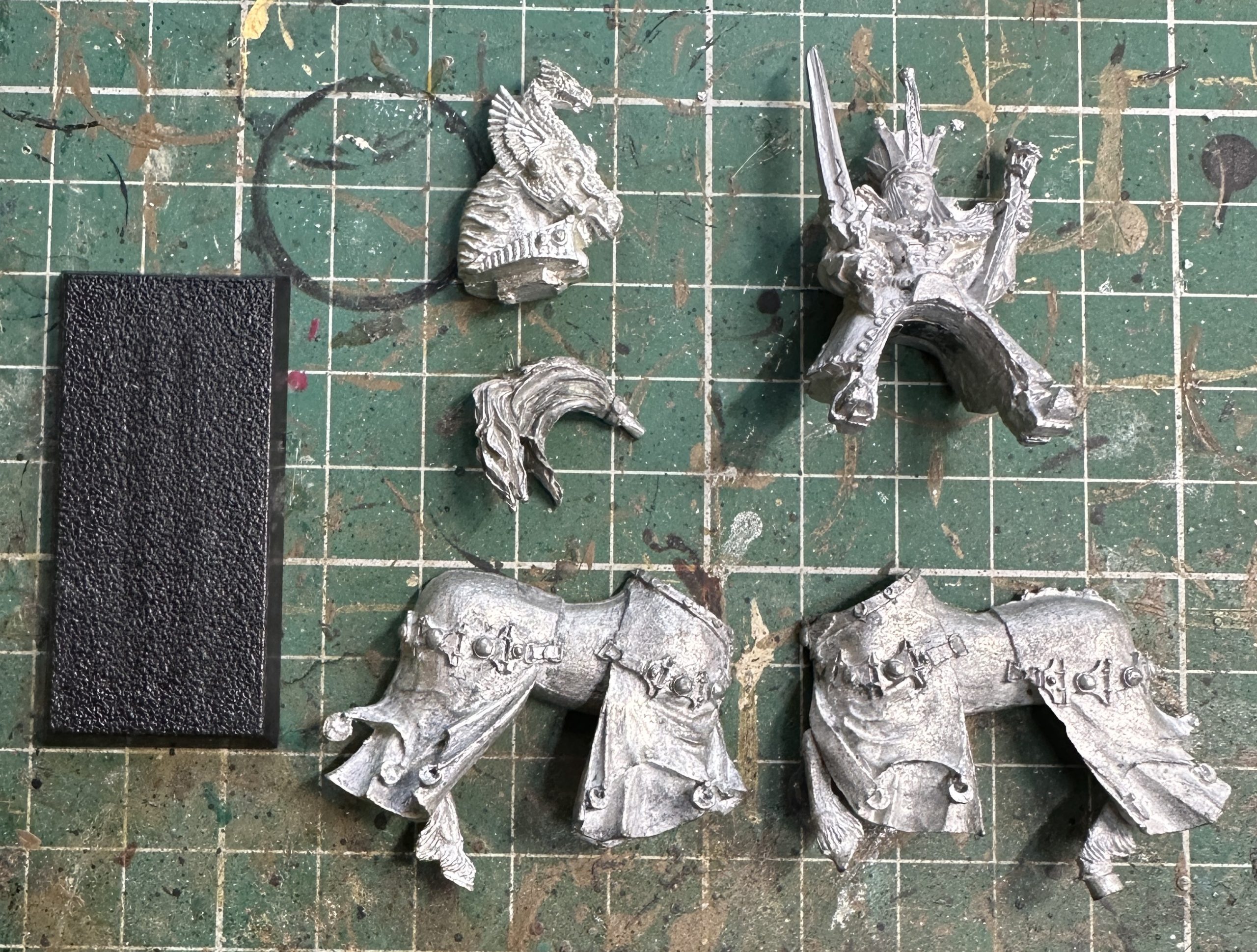
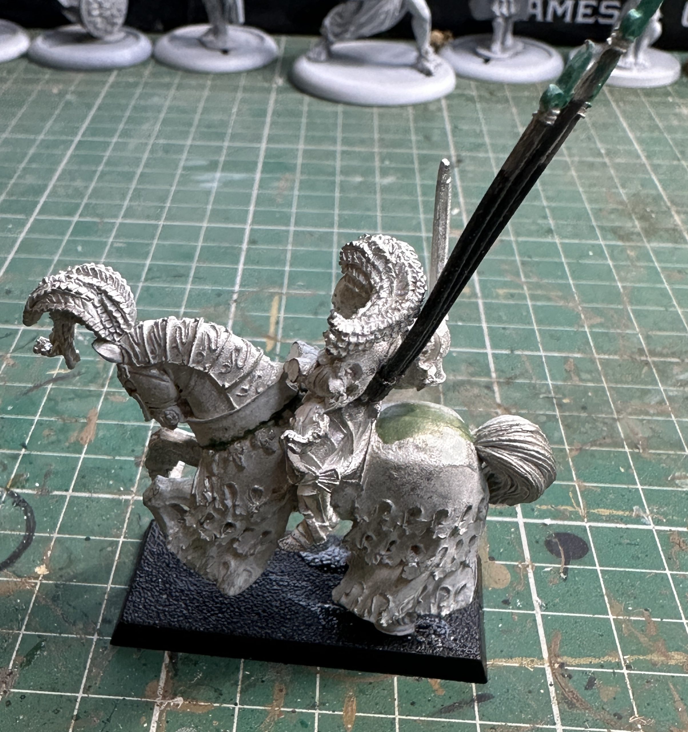
The build was fairly straightforward. The only adjustment was to shave the peg in the neck down to fit the smaller round hole in the body. The ridge that runs along the middle of the caparison over the flanks needed to be trimmed back slightly to allow her majesty to seat more easily. Overall she is a pretty good fit but there will need to be some greenstuff work on the joins on the horse, especially at the neck, and between the rider and horse.
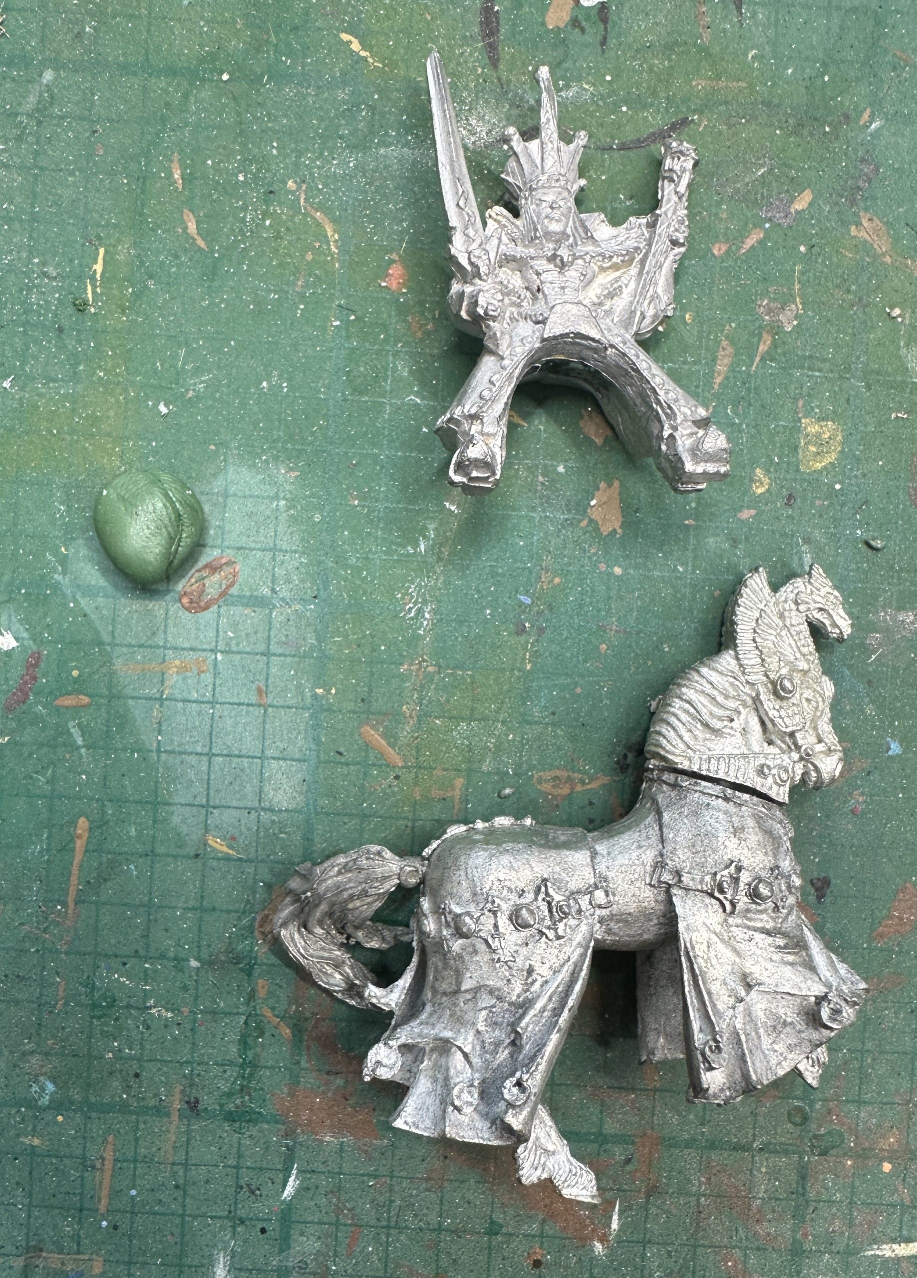
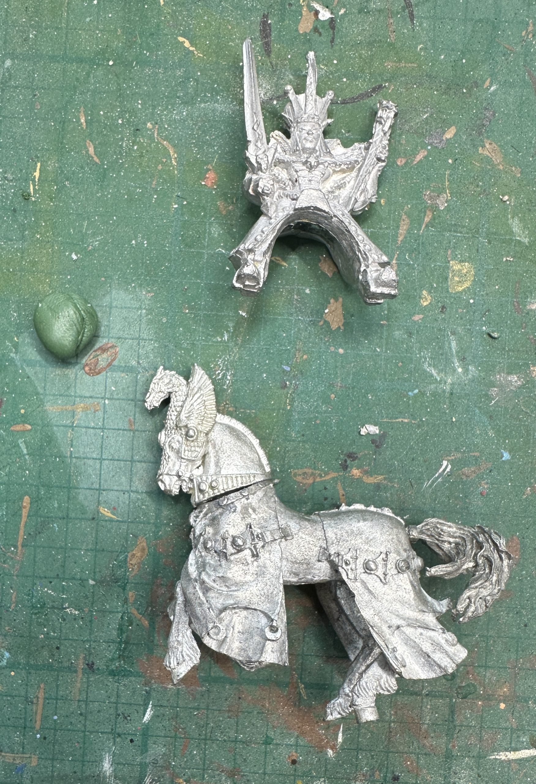
You can see the size of the bit of greenstuff that was used. Once filled we get this:
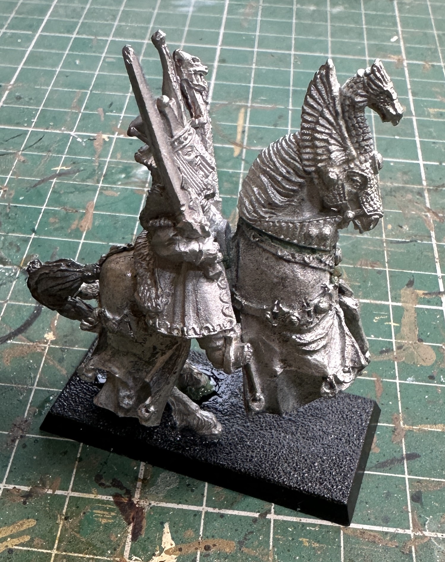
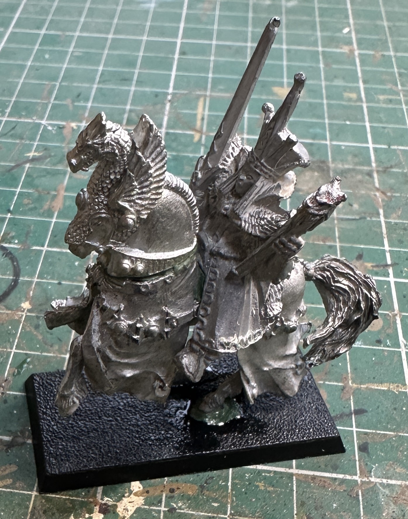
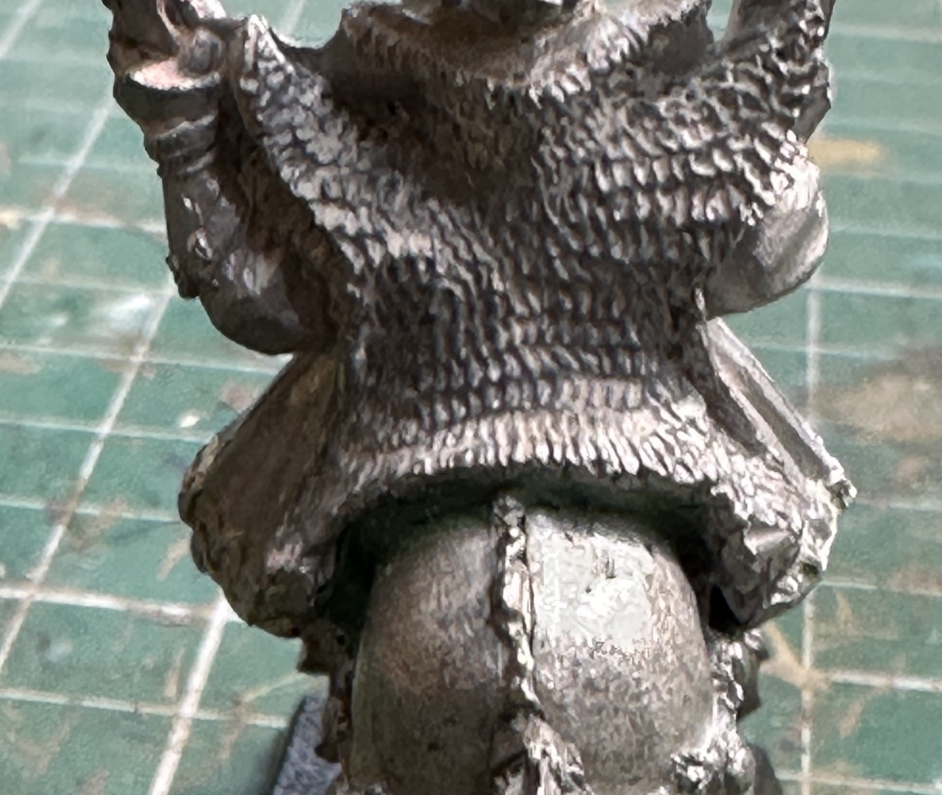
Particular attention was paid to creating a realistic join for the rider. This mostly meant filling in any gaps between her and the horse where a gap wouldn’t have shown were she a real person sitting on an horse. The largest amount went on filling in under the fur cloak. The cloak is fully sculpted so to extend it and sculpt more might not look right. Therefore, I opted to fill under the fur as if there were layers of clothing that were ruched up as she sat in the saddle. The edge of the fur then sits on them.
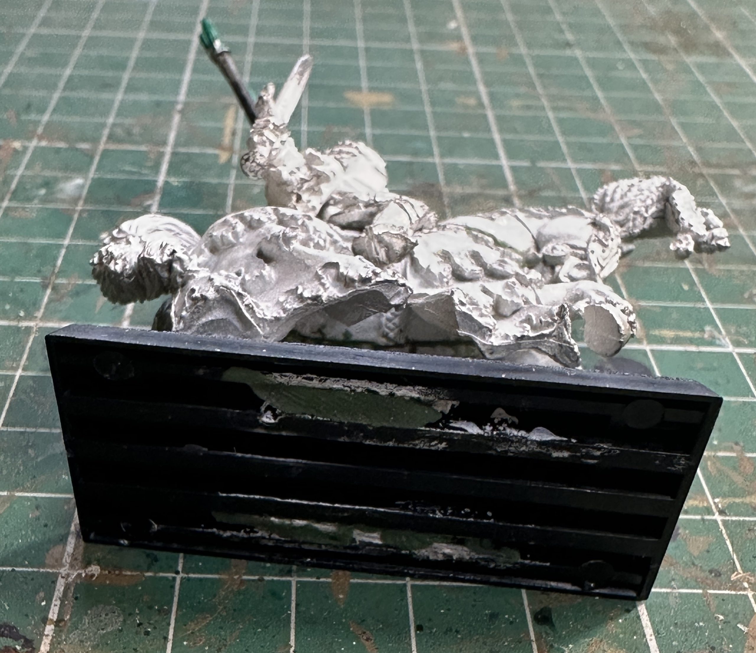
Another concern was the single attachment point onto the base. There is a single plug under one of the hooves. A hole was drilled in the base and the plug was glued into place, with extra greenstuff added on the underside to provide a bigger surface area for the glue to contact, which should make it much more robust for use on the tabletop.
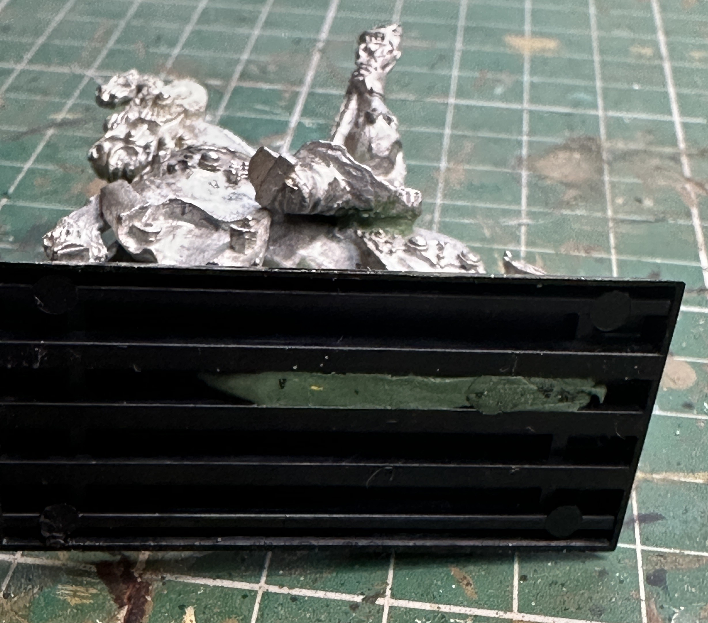
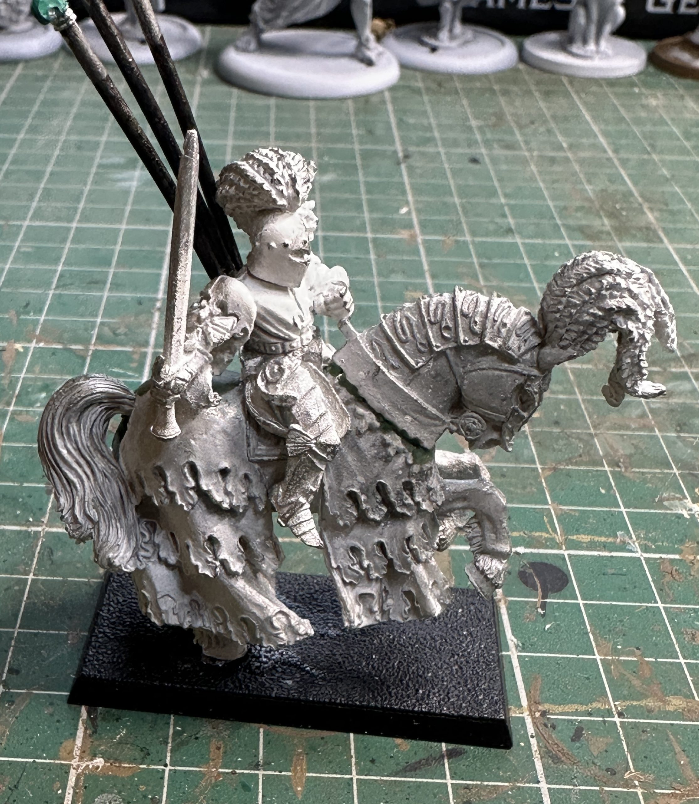
As well as the Ice Queen the Green Knight has been getting some greenstuff attention to various gaps and uneven joins. He was pinned onto his base with holes drilled into his rear hooves and then a chopped up paperclip stuck down into the groove underneath the base with a small amount protruding above. The hoof holes were located onto the two protruding paperclip pins and then the whole securely glued. The underside was greenstuffed over the top of the pins to provide a better hold for the paperclip section that are under the base. He now looks like this:
Overall Colour Scheme and Test Painting the Wardancers
Overall Colour Scheme
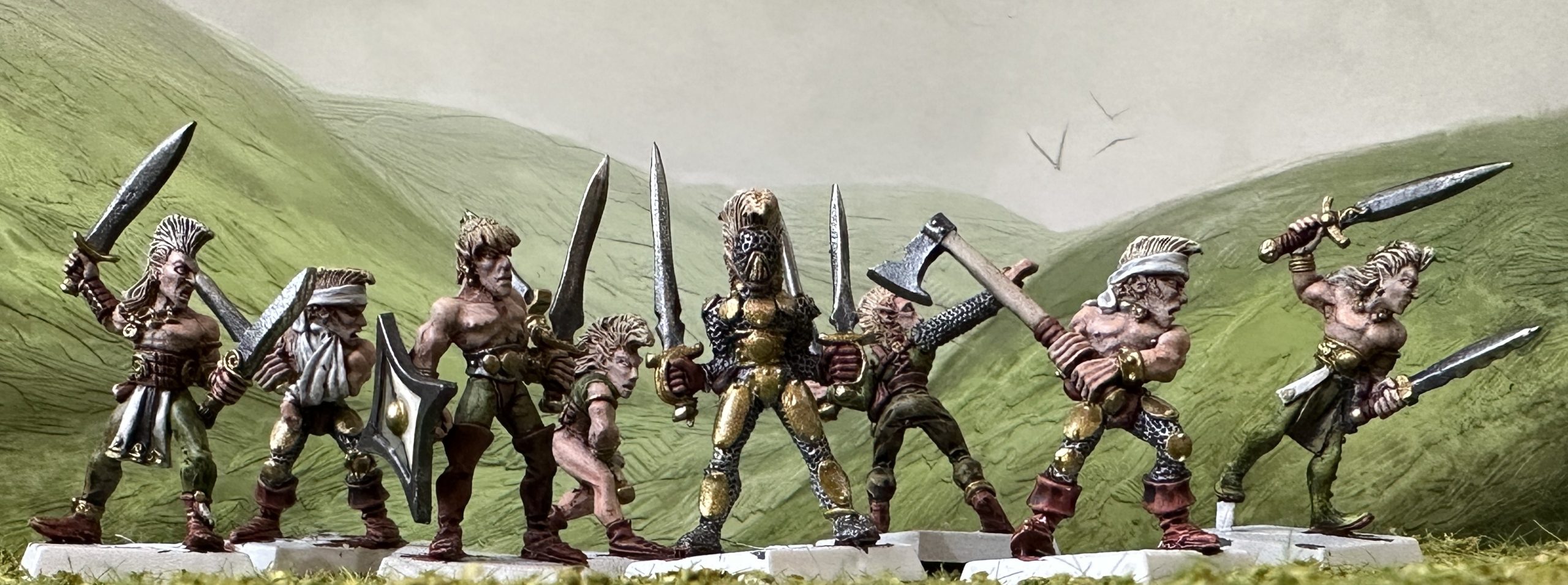
I want the army to look cohesive but as a collection of separate Regiments of Renown these mercenaries don’t wear a single uniform, matched colour scheme, have matching banners or any of the usual tricks we might use to visually tie the force together.
There are things helping to unite the look. They are all going to be painted by me the same Speedpaints+ style. I’ll do base coats with Speedpaints over the top of the zenithed primer. Then after a coat of matt varnish I’ll go back over key areas like the armour with 3-4 layered acrylics. This gives the models a nice pop and helps brighten and enrich colours to provide a hyper-real look that suits fantasy figures.
Basing will be the same for everyone. I’m going Goblin Green edging rather than my more usual earth or black. I’ll also use the same basing finish – probably a Krautcover as they are just too convenient.
As to colours I’ll keep things fairly logical in terms of the main colour choices for a unit. Armour will usually be bright steel and the other main metallic will be gold. All units will have some black and white somewhere. Although this will be fairly subtle it should provide enough of a visual link to help unify the force a bit. I’ve decided to restrict myself to two main bright colours, blue and red. So an individual unit will have the option of having blue or red as a focus colour with black and white appearing in every scheme. This won’t happen for every unit as they will look too similar if I do that. Those who would logically have a different main colour focus will get that instead. The Wardancers are going to be green and the archers will either be green or possibly I’ll go russet instead but not so much on the blue or red. I took a similar apporach painting a large Kislevite army for Warmaster and they looked good.
To test the overall approach I’ve picked a small unit, the Wardancers.
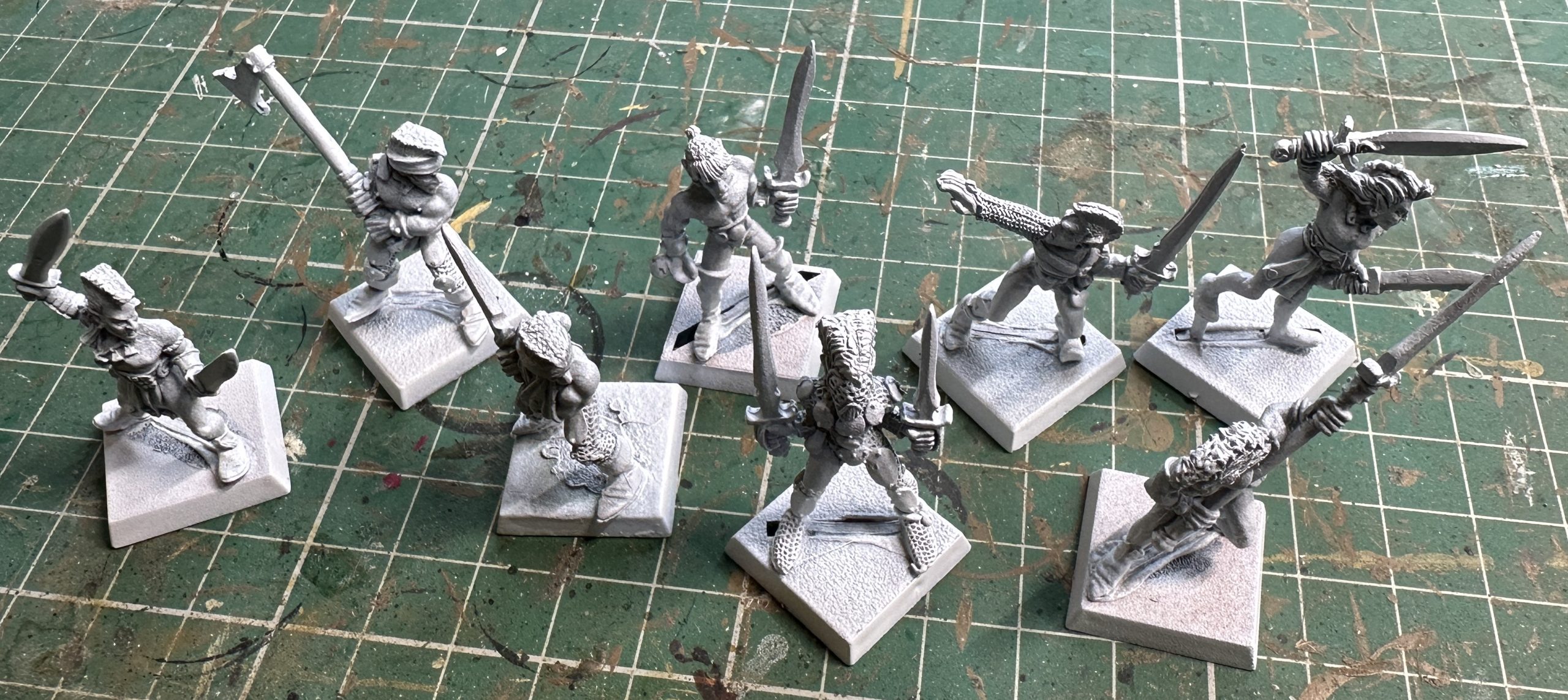
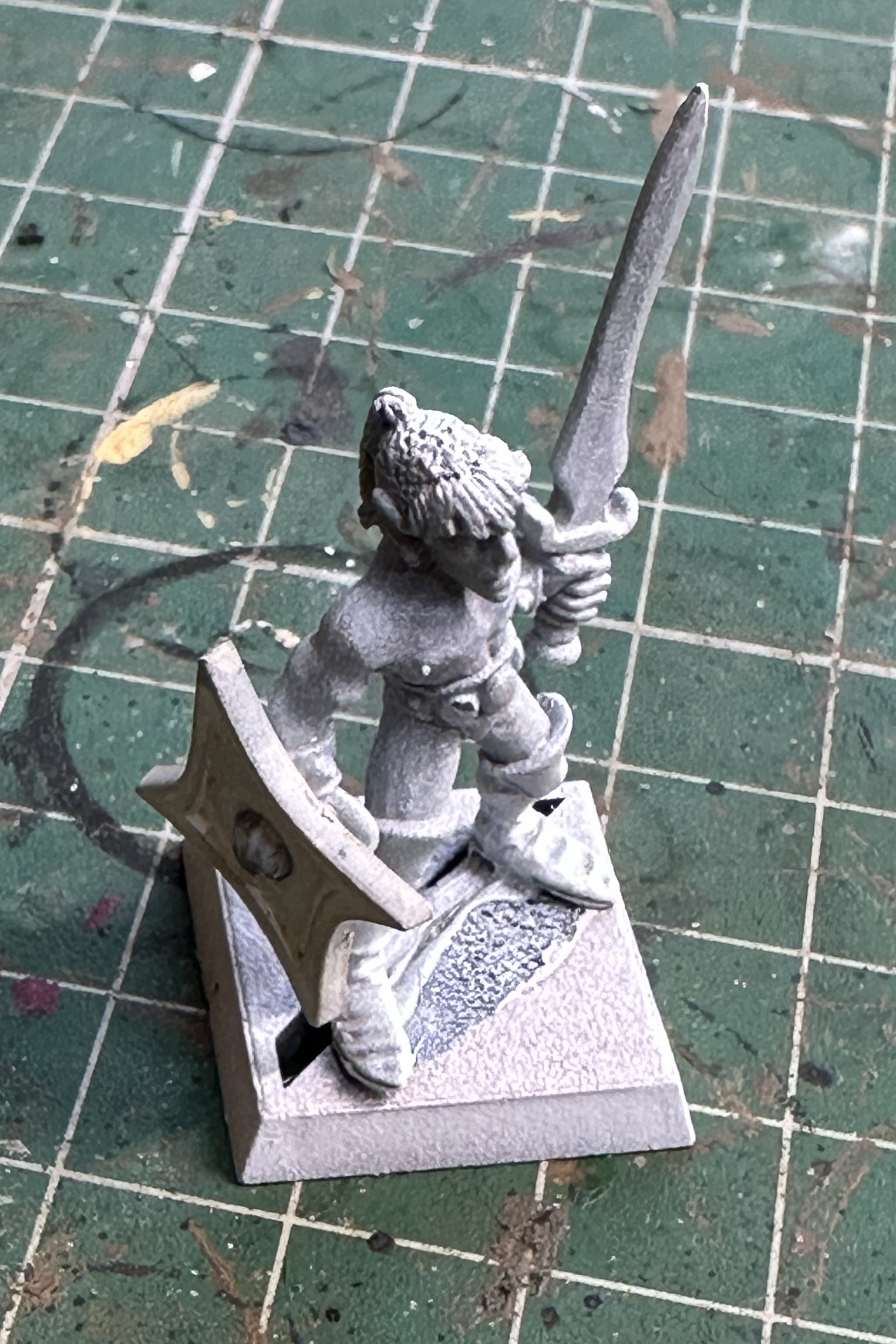
Not much to do with these. Only one has a nub for a shield so I went through the 1980s plastic shield stash and picked out one of the four pointed ones:
Painting Guide
AP Speedpaints first
- Skin with Crusader Skin
- Clothing with two similar Olive Green shades, Desolate Brown and Algae Green
- Leather in Burnished Red
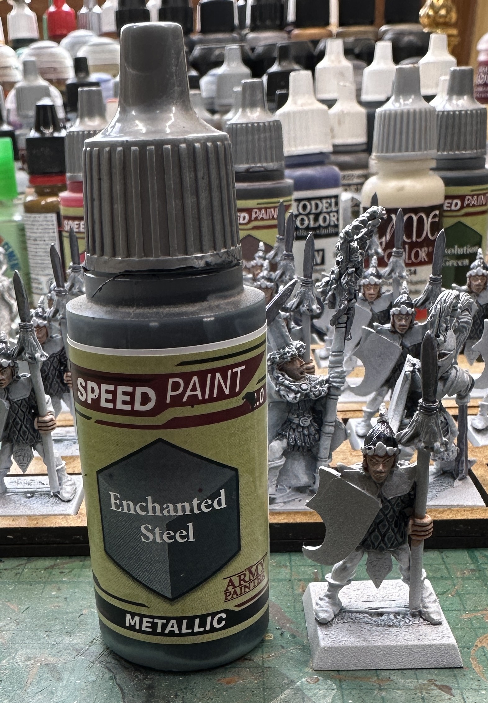
- Steel and chainmail in Enchanted Steel
- Armour plates and jewellery in Aztec Gold
- Hair in a variety of colours and blends working from Sand Golem as the darkest through Bony Matter to Pallid Bone as the lightest.
- Wood in Bony Matter
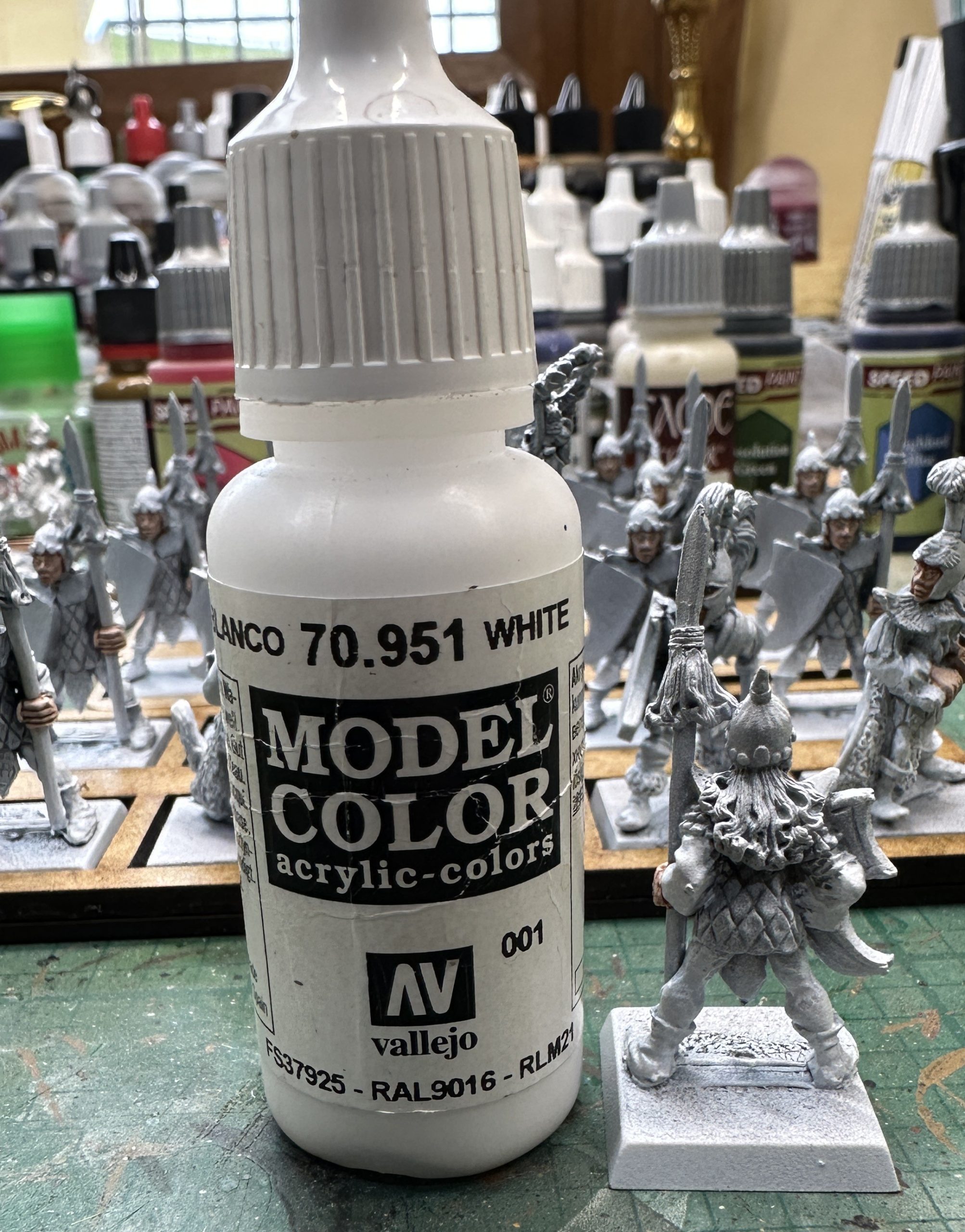
- White bits base coated with Holy White and the white colour reestablished with Vallejo white acrylic.
- Black bits in Grim Black.
The basecoats for the armour (5 and 6 above) are the ones I use for elves. This will mean they should still look right alongside my other elves. I’ll probably do the humans in a more usual Broadsword Silver and Hoplite Gold.
After the Speedpaints were on I gave everything a matt varnish – Mr Hobby Super Clear Matt spray is my weapon of choice at the moment. This evens out the appearance of the colours. Neat Speedpaints look a bit odd with sharp contrasts and shiny areas so it is hard to see the final finish. Matt varnish sorts this out and helps even up the finish so you can see if there are any areas of unevenness or missed coverage that need to be addressed.
Highlights
- Steel and chainmail. Everythnig is given a generous drybrush with Dark Star Steel, leaving just joining edges and deeper recesses. Then Darkstar Baroque with a lighter drybrush or direct application onto the upper half of blades and the upper surfaces of chainmail. Finally top edge highlights, blade edges and any top surfaces and corners are picked out with Vallejo Metal Colour Pale Burnt Metal.
- Armour plates and jewellery. Because I’m working up from Aztec Gold which has a slightly green undertone I’m not layering up with anything too orangey or warm in tone. I started with Darkstar Regency Gold over the top 2/3 of surfaces. Then Darkstar Renaissance Gold over the top 1/3 and a final upper edges and top pointy bits highlight with Vallejo Metal Colour Gold which brings back some of the green based look in the top highlight.
- White accessories re-highlighted with Vallejo white.
- Skin is tackled last as I need to see the rest of the model finished to see which areas of skin need a bit of improvement to sit well alongside the newly highlighted colours. It needs highlighting and tonally correcting where the Speedpaint has come out a bit uneven with a mix of Vallejo Model Colour Beige Red and Vallejo Game Air White. These are blended by eye for the requirement of the part being painted. I try not to warm up the skintone too much – I like my elves pale and wan.
Not doing bases yet. I won’t have either the edging paint or base cover until after I’ve been to Salute. I am going to use my very green photography display mat (by Model Scene) and I’ve picked a fresh background from the Jon Hodgson Fantasy Background Book.
Painting Lothern City Guard
The original description of the Lothern City Guard tells us this about their uniform:
The uniform comprises a close fitting helmet, which is gilded. The tunic is padded and white, the belts and other decorative items are red. Spear shafts are blue, whilst most metal is either steel or silver. Haisplinn himself wears the arms of his family, including the tall, red crested helmet, purple embroidered tunic and equipment in gilded metal. He also has a metal breastplate.
I’m going to go with most of this. So white clothing, steel armour except for officers which will be gilded. Red tone leather and red crests. Spear shafts are going to be blue. Now shields are not going to be standard as my regiment isn’t from Lothern but instead the lost city of Lindheis in the far east. I’ve looked at the options and there is a tower/lighthouse on the etched design plate I have for shield designs. We’ll use a white one of those which will show up best on a darker background so I’ll go with blue on the shields.
After a quick check with some potential colours on a white bit of card I settle on the two main ones, a purple shade of blue and a bright pinkish red. And so to work. First Fleshtone on hands and face. Then the white clothing was brightened from the zenithed white with an over-brush, i.e. a wet dry-brush to loosely pick up the higher parts of the tunics and hose.
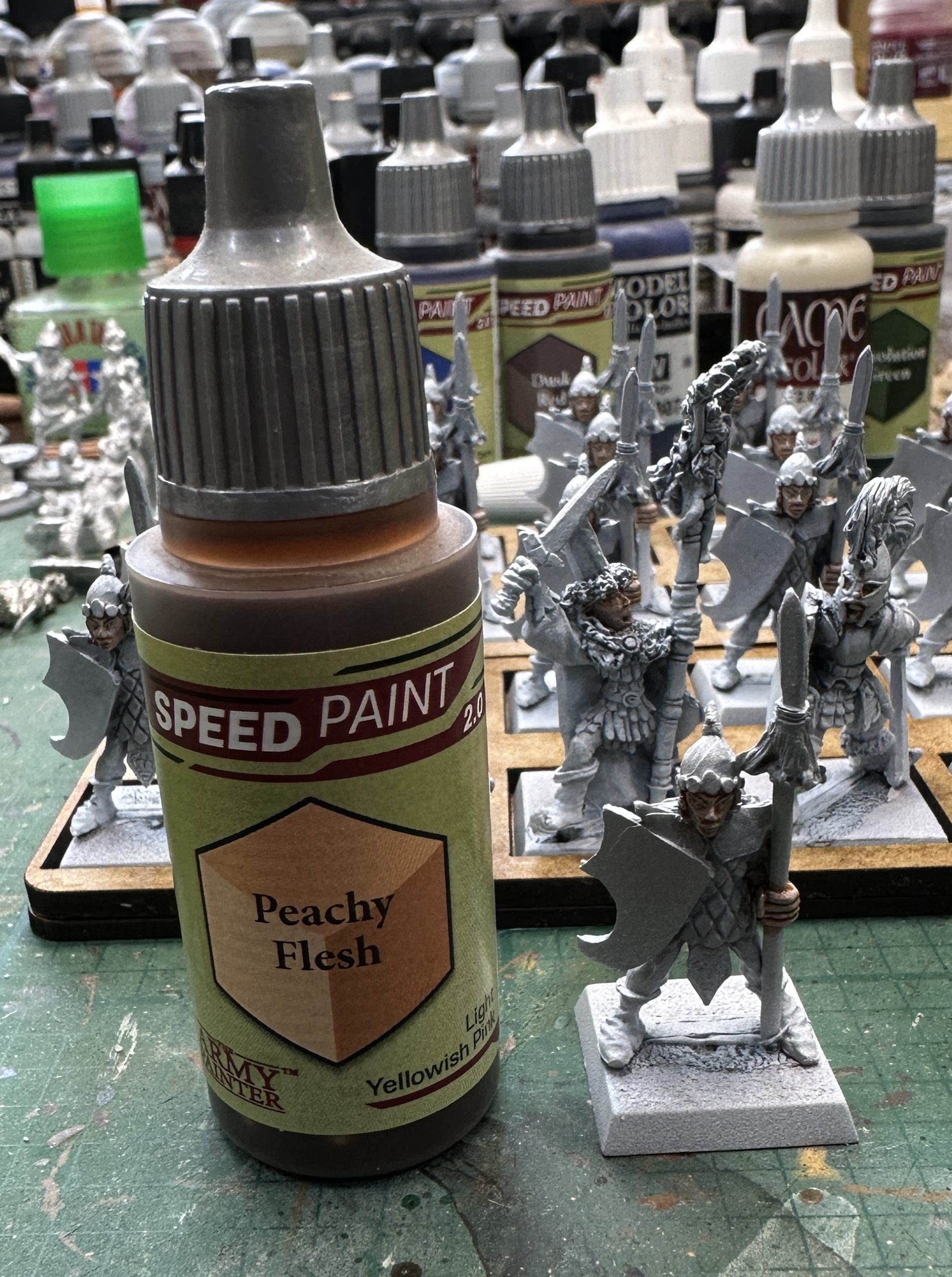
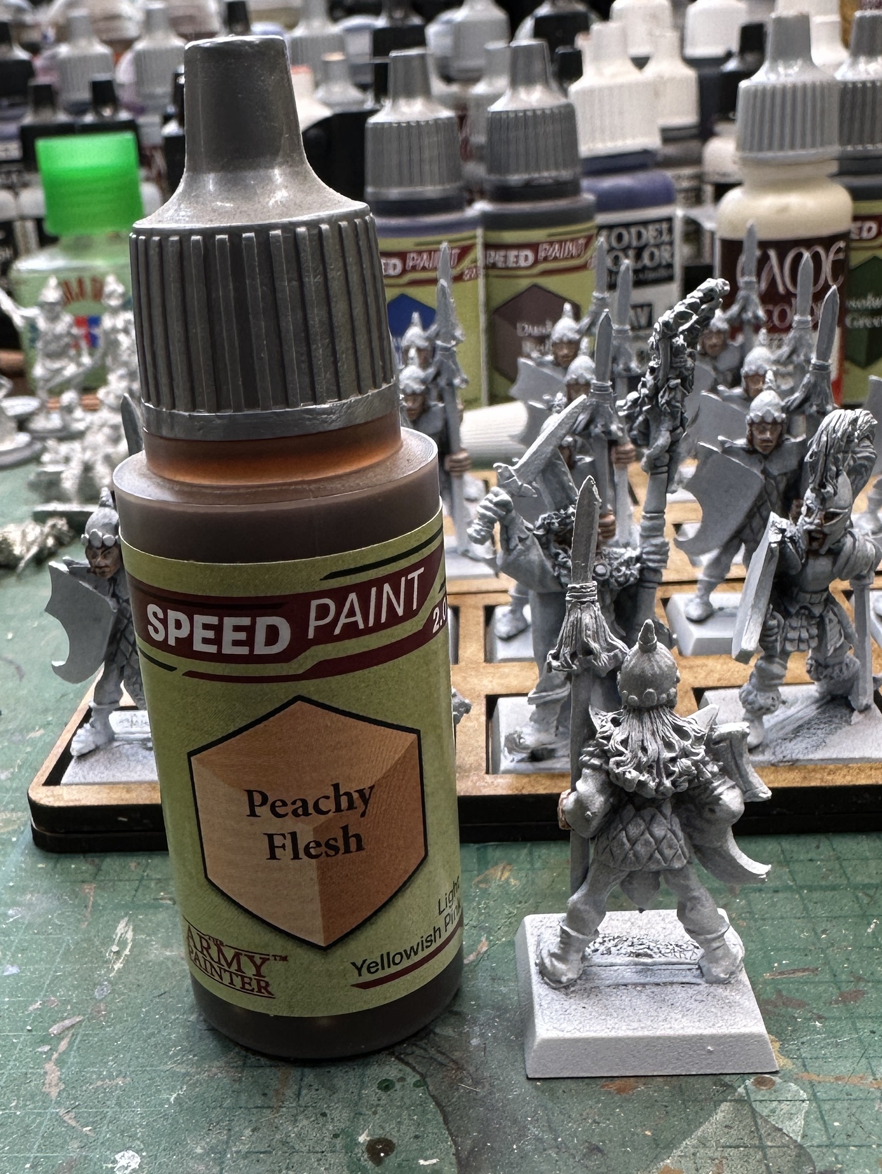
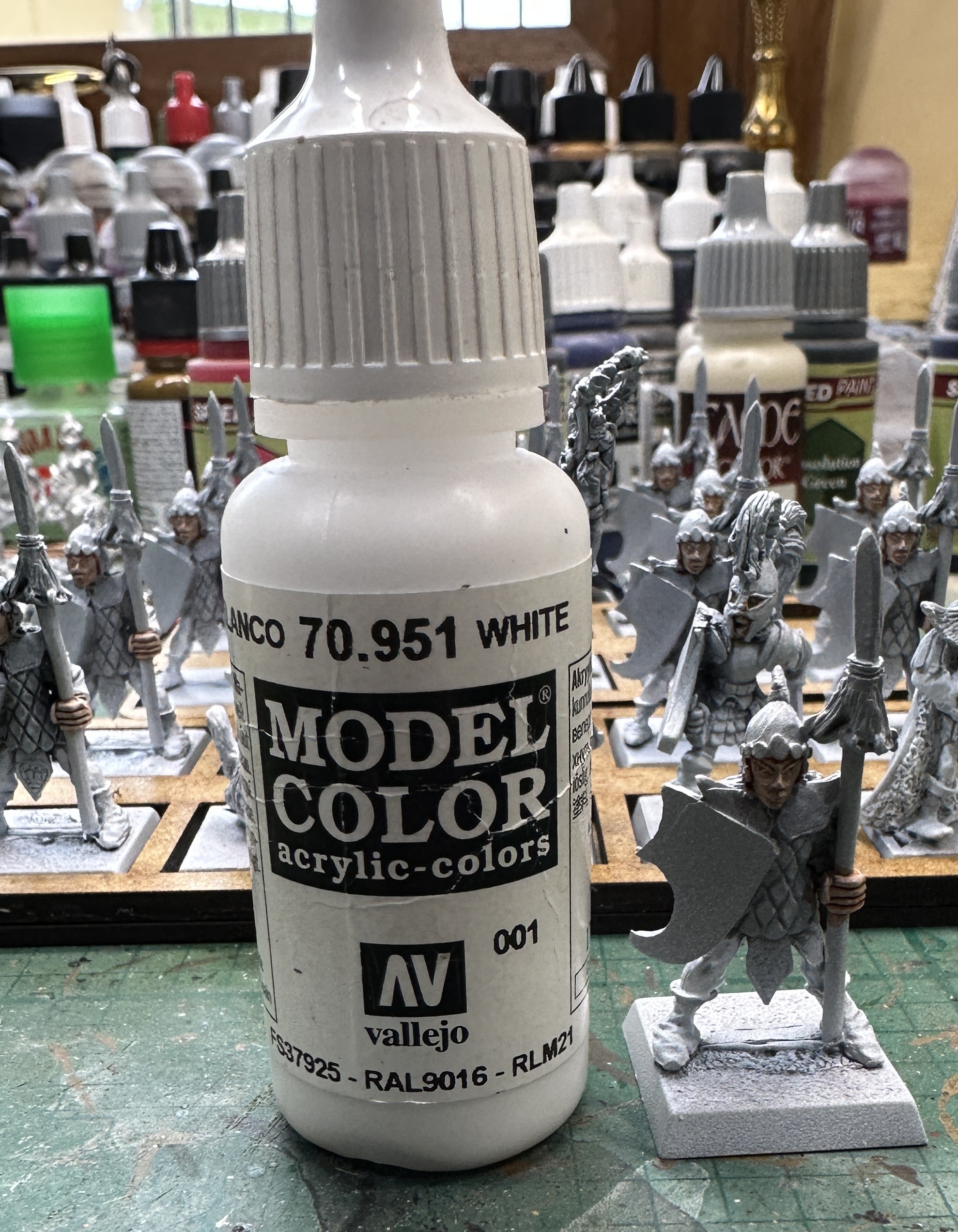
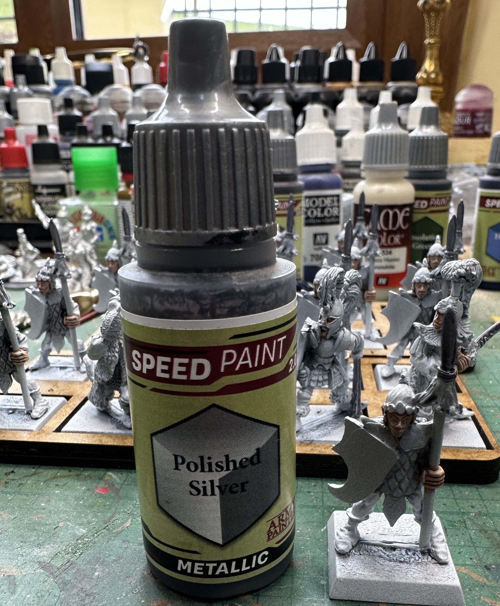
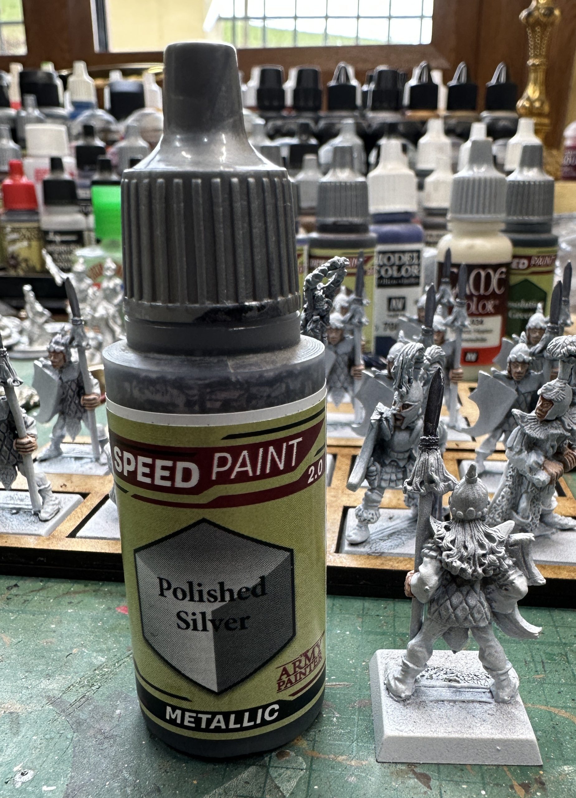
Next I did the steel metallics. A silver undertone on the spear heads and then my more usual choice for Elven steel, Enchanted Steel on the scale hauberks and helmets.
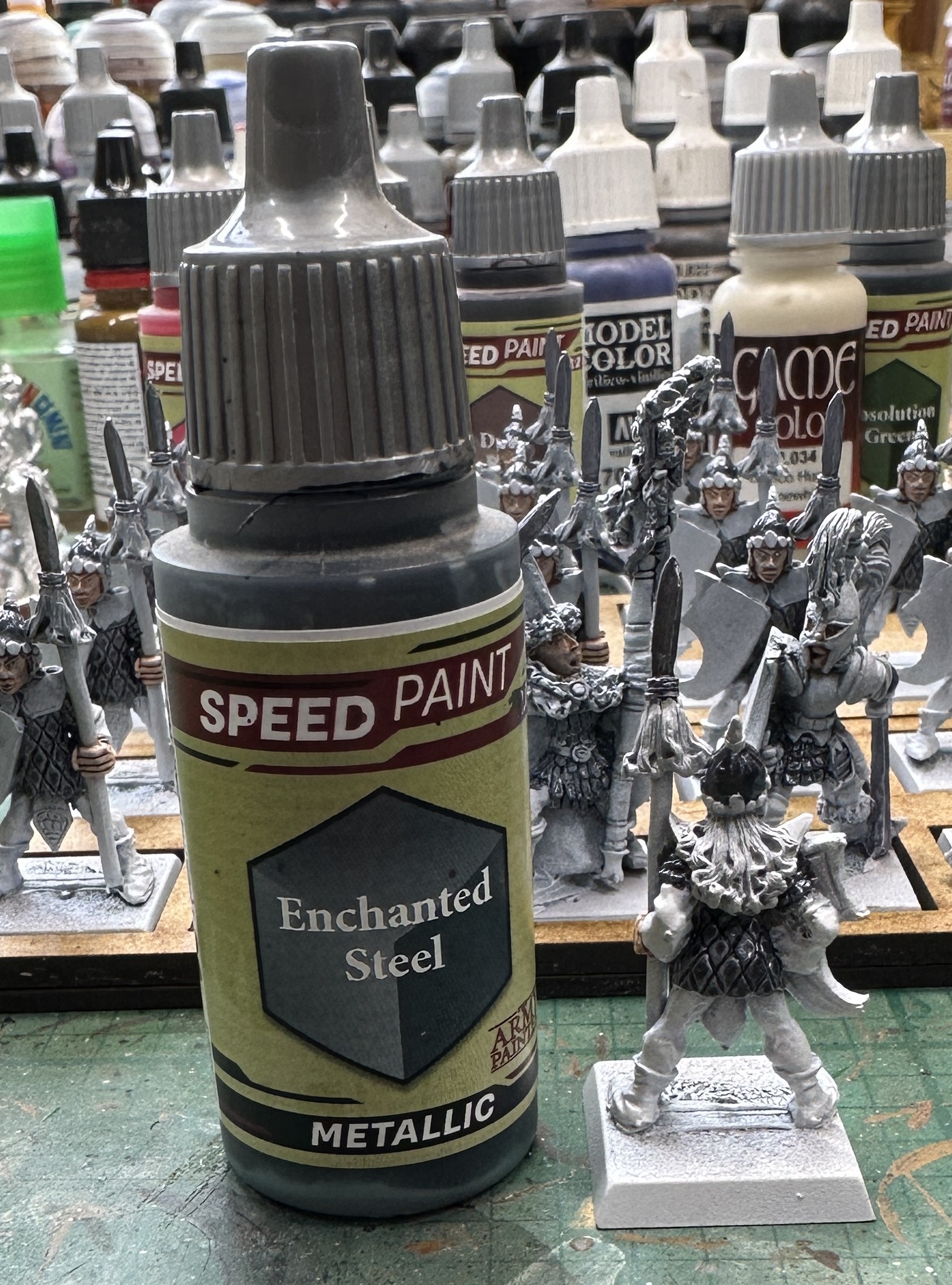
Now for some colour. Blue to start off with on shield faces and rims and then the spear shaft. After that I blended a couple of drops of red into 10 of the leather colour to just up the reddish tint a bit. That went onto shoes and some leather details on the characters.
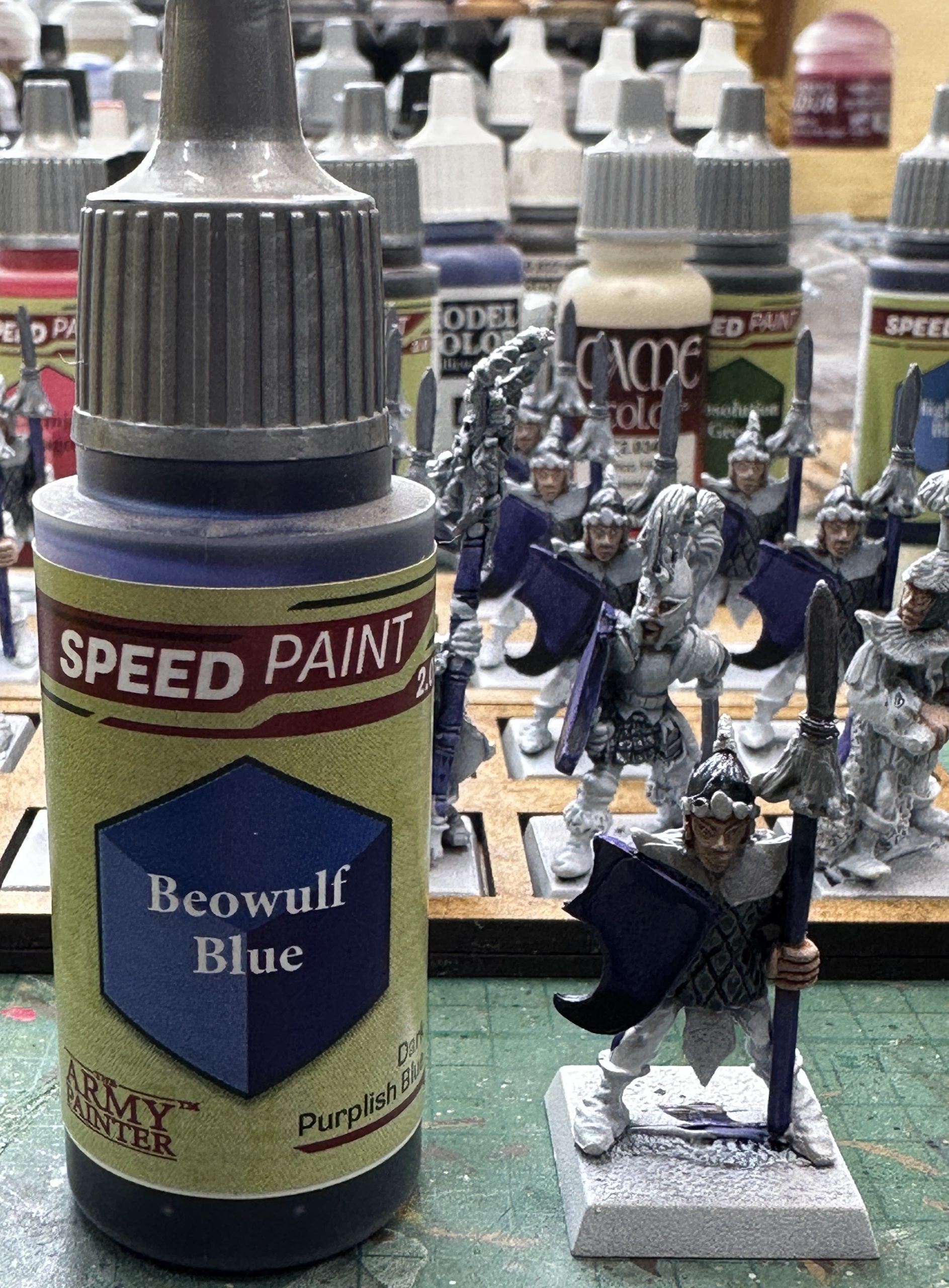
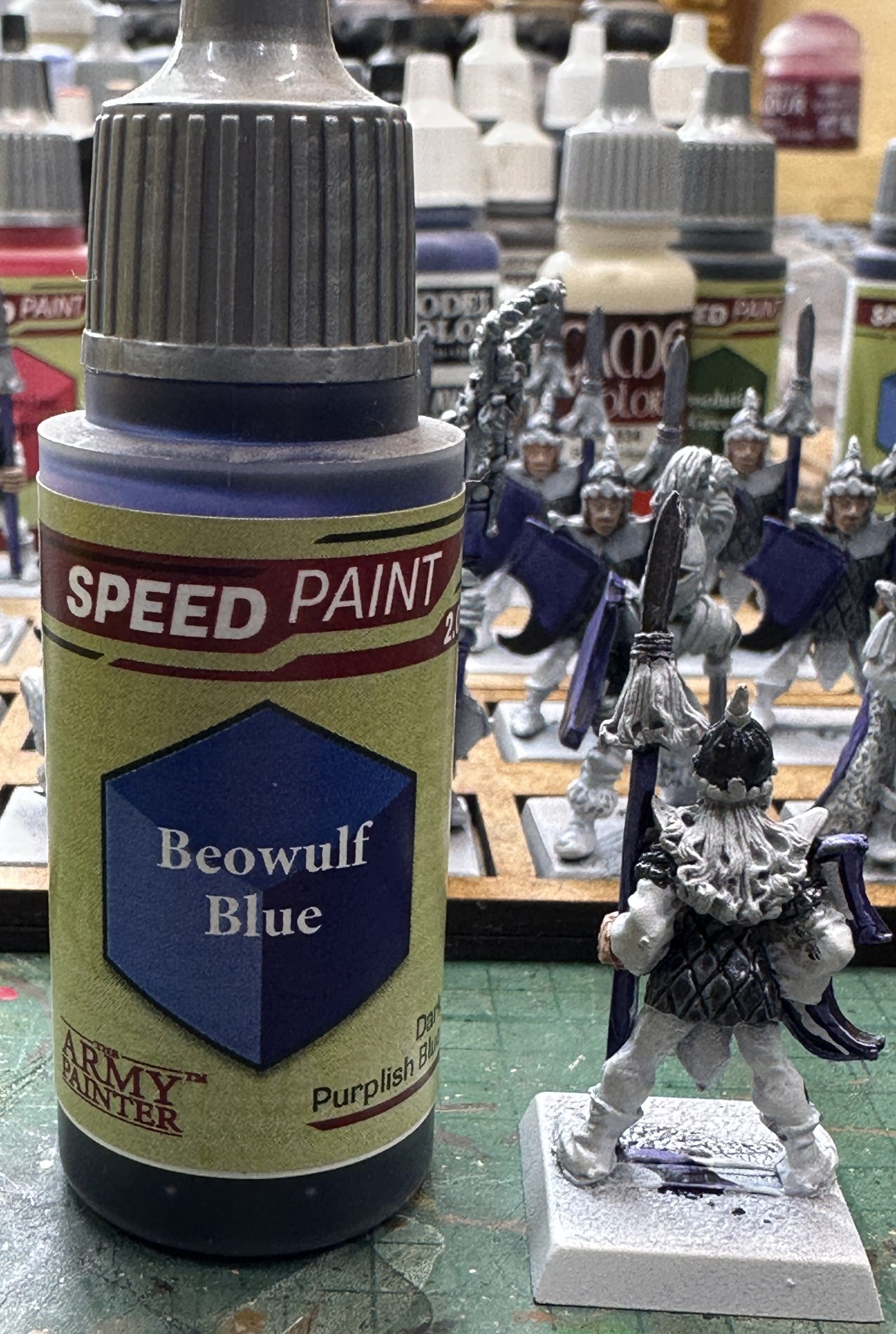
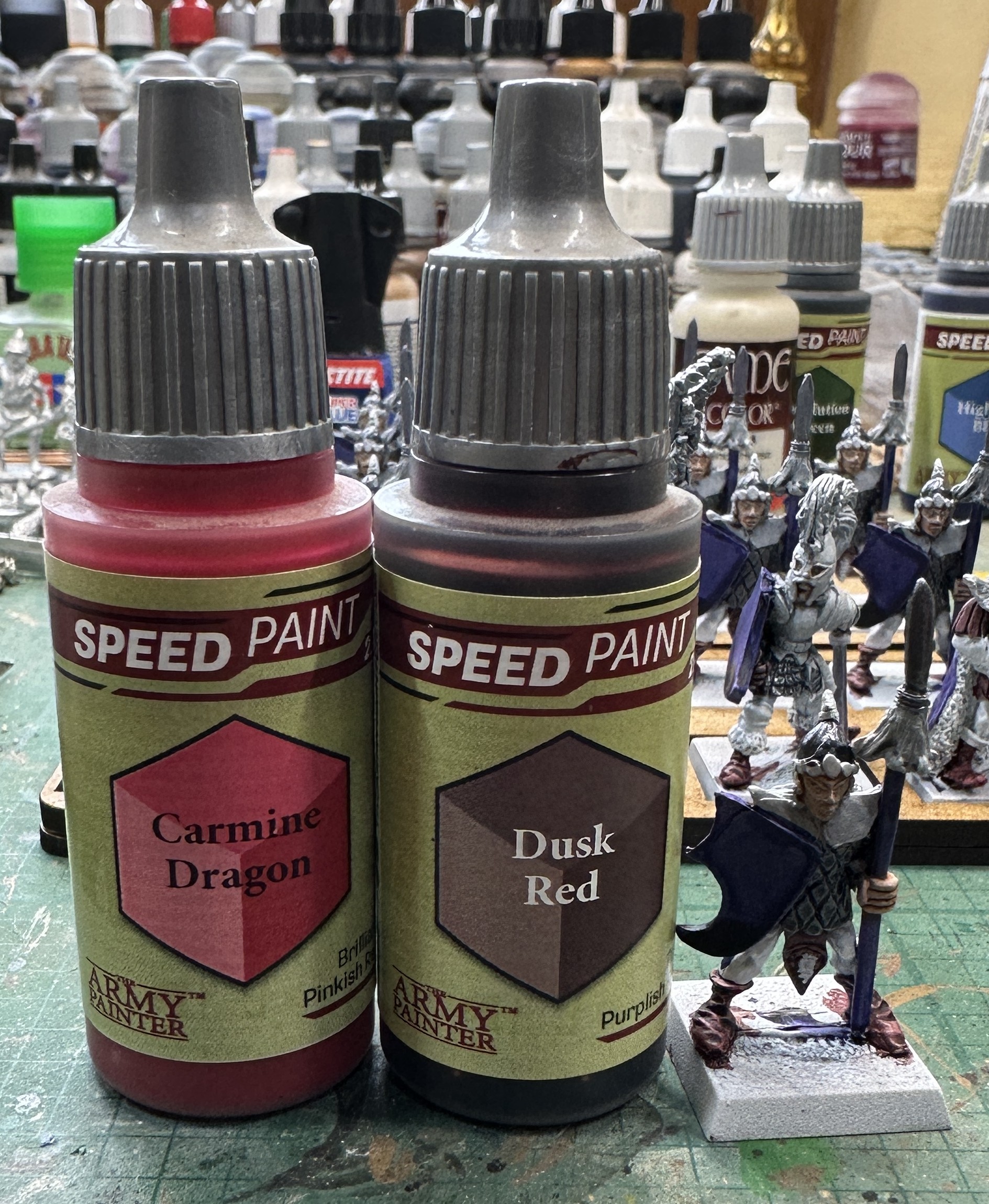
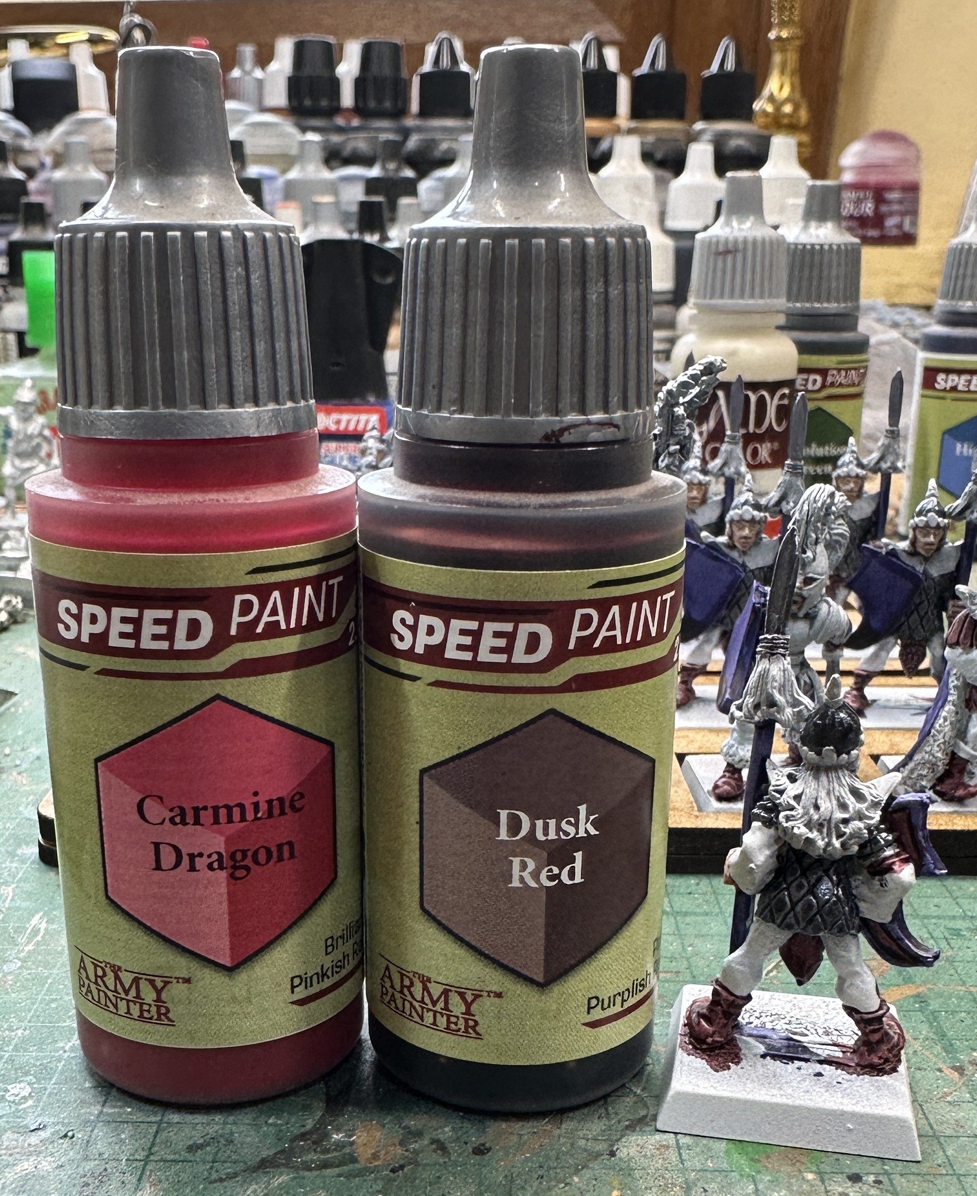
I’m not happy with the coverage of the blue on the shields. I wanted it darker at the bottom but having had to go around the rims after painting the face, there is a darker line around the top edge now. I’ll correct this later, once they are dry, with a wet blend. That way I can get a brighter tone in the upper third which should set the emblem design off nicely.
The contrast colours now. Red for the spear fringe and my usual Elven choice of a greenish shade of gold for their shoulder guards.
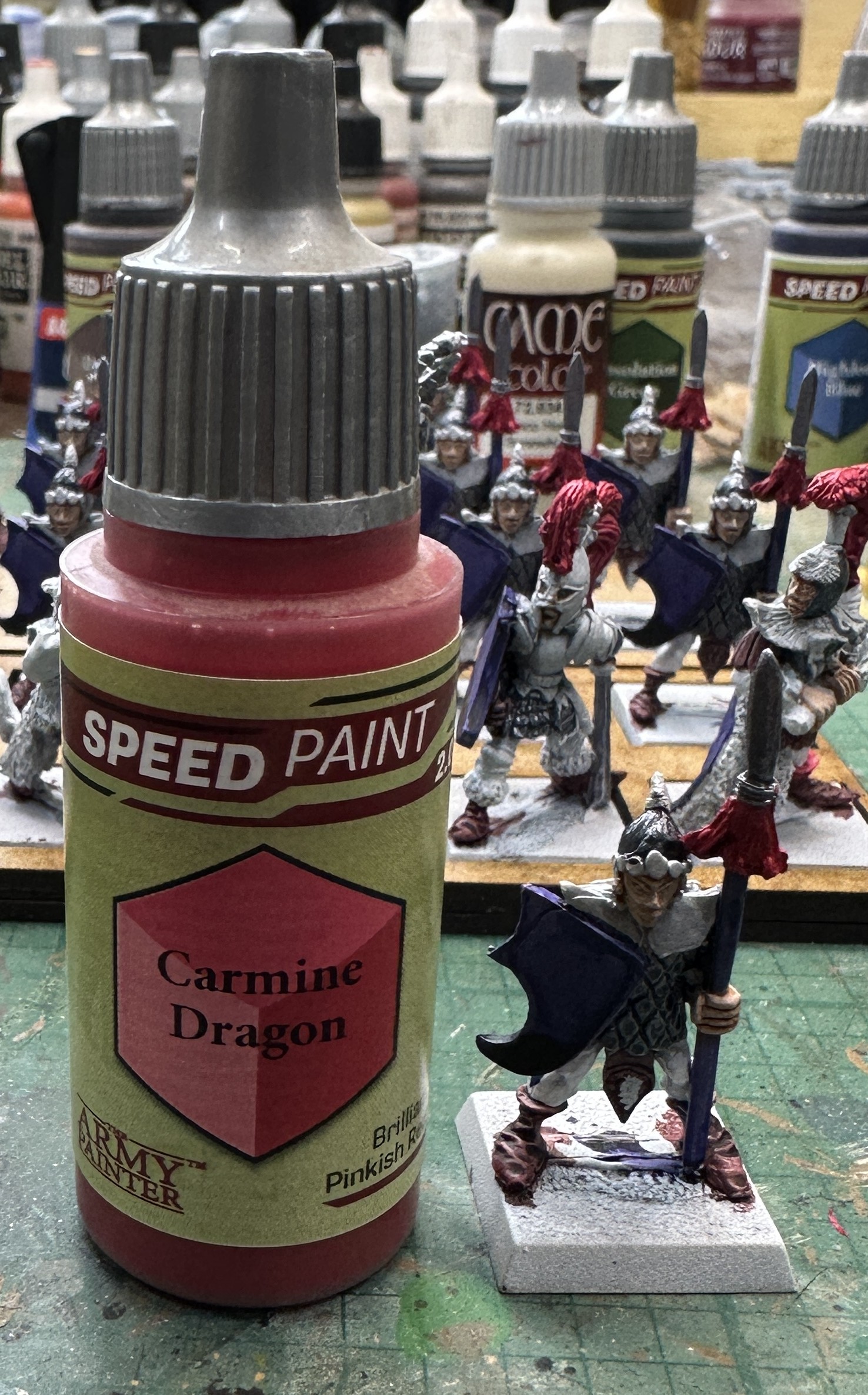
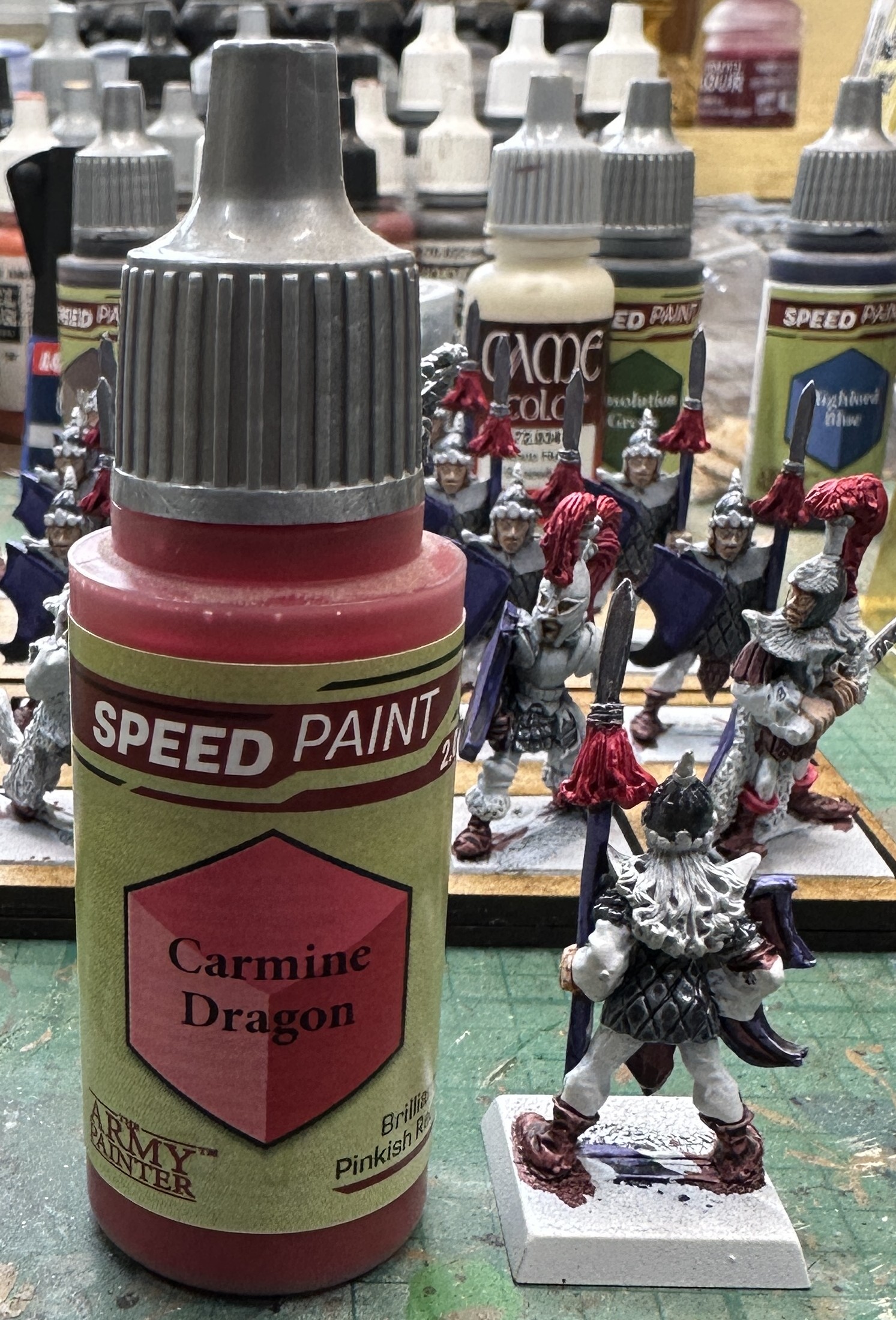
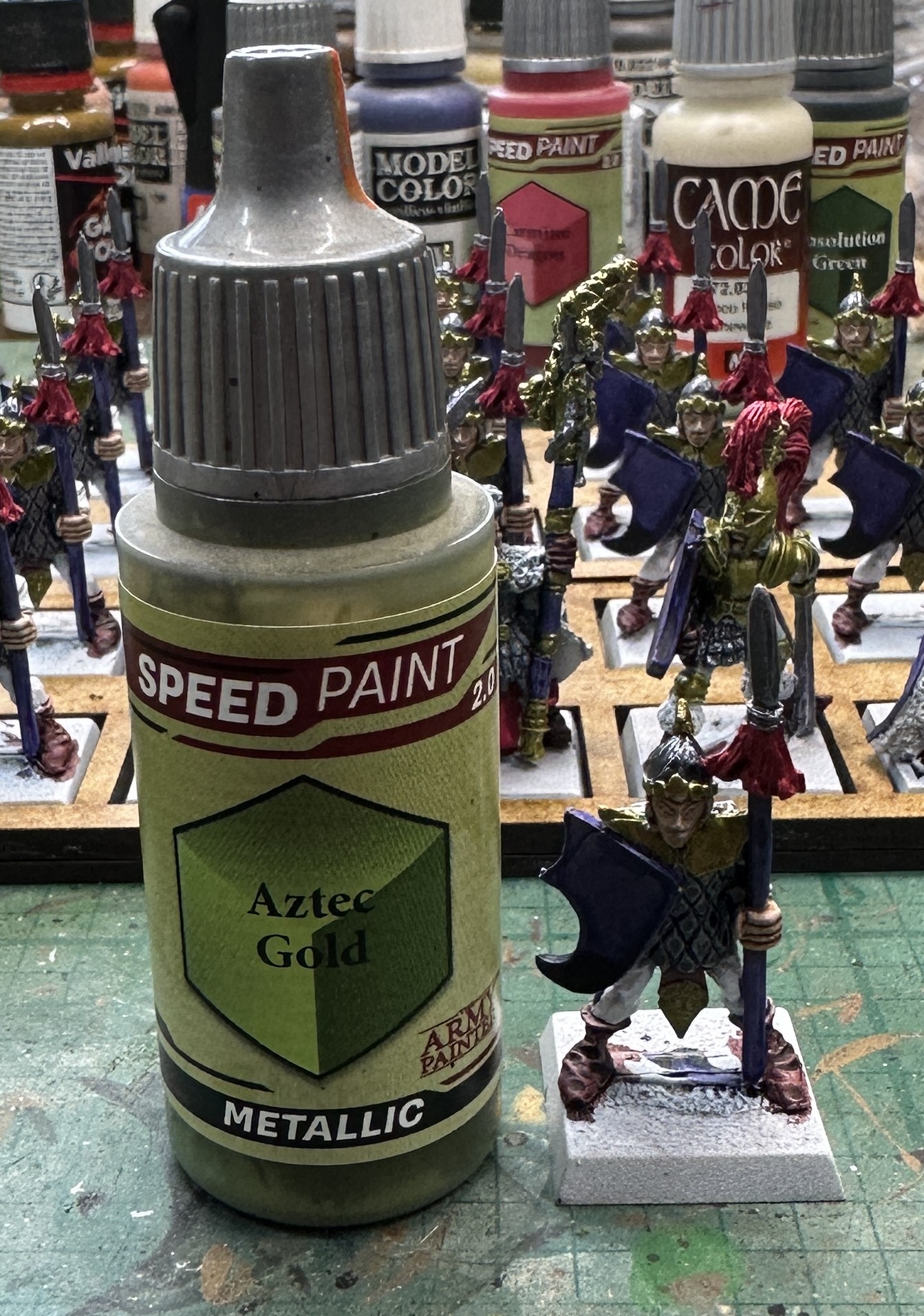
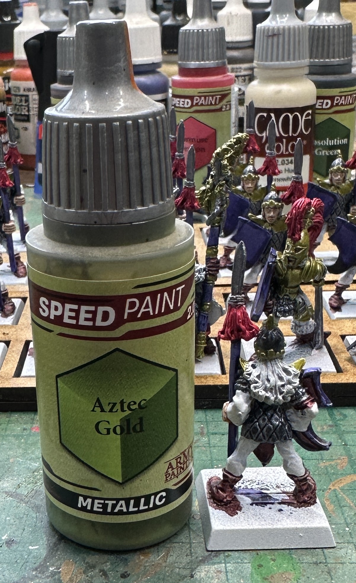
Final main colour was the hair. This was either the neat versions of one of these colours or a two or three part blend. As I was running out I dropped the next colour on top of what was on the palette and kept working. This should provide some variety but everyone will still be blonde.
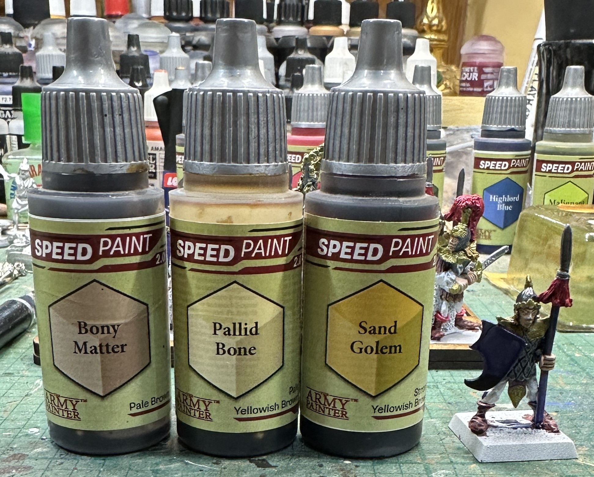
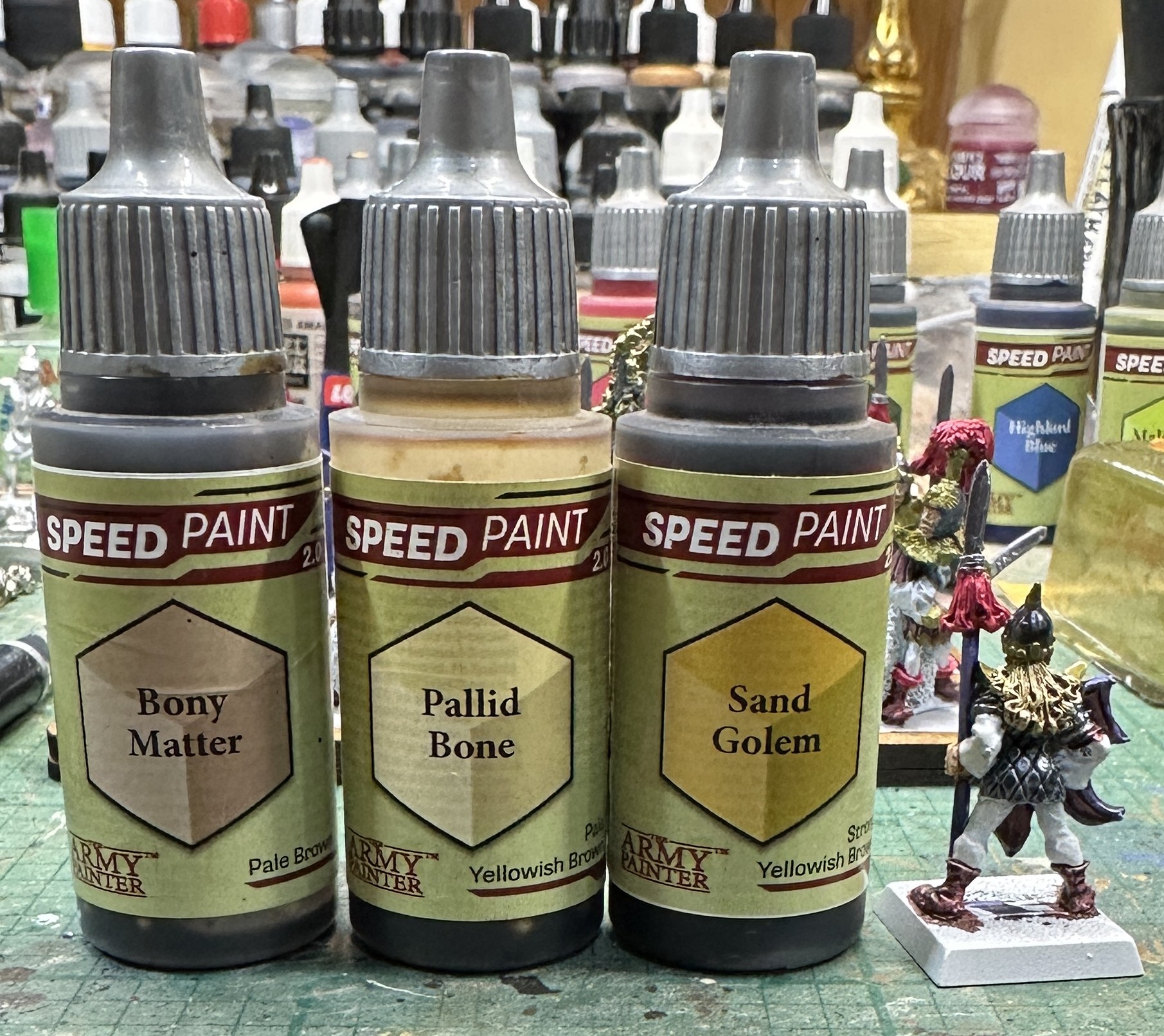
Now we are on to highlights but before that a bit of repair work.
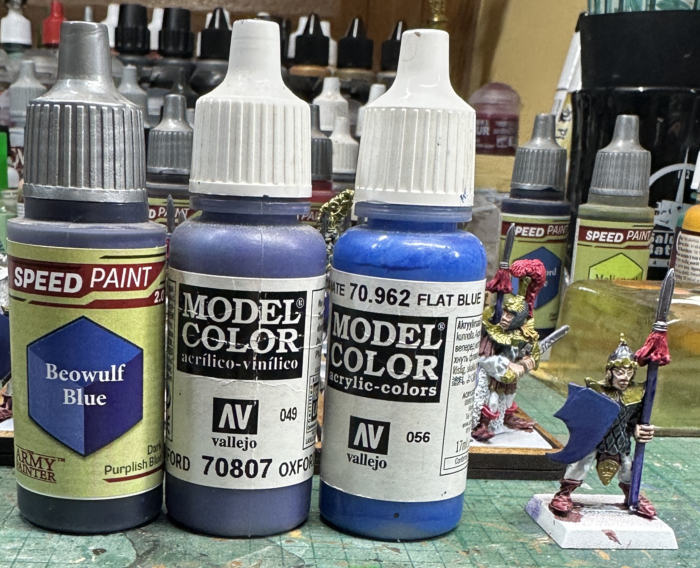
First the wet blend on the shield faces to sort out the patchy colour. I put these three onto a palette. I then mixed the Oxford blue with some Speedpaint for the mid tone and added some Flat Blue to that to get the top tone. They are applied in three stripes, Speedpaint at the bottom, Oxford Blue blend across the middle and then the brighter blue across the top. Layers are gently blended together with a wet brush if they look a bit jarring on the mini.
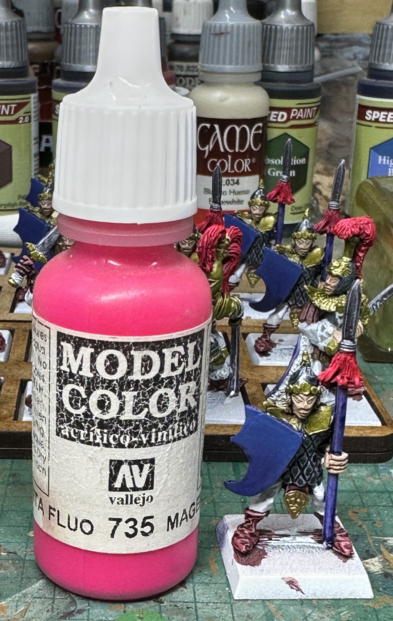
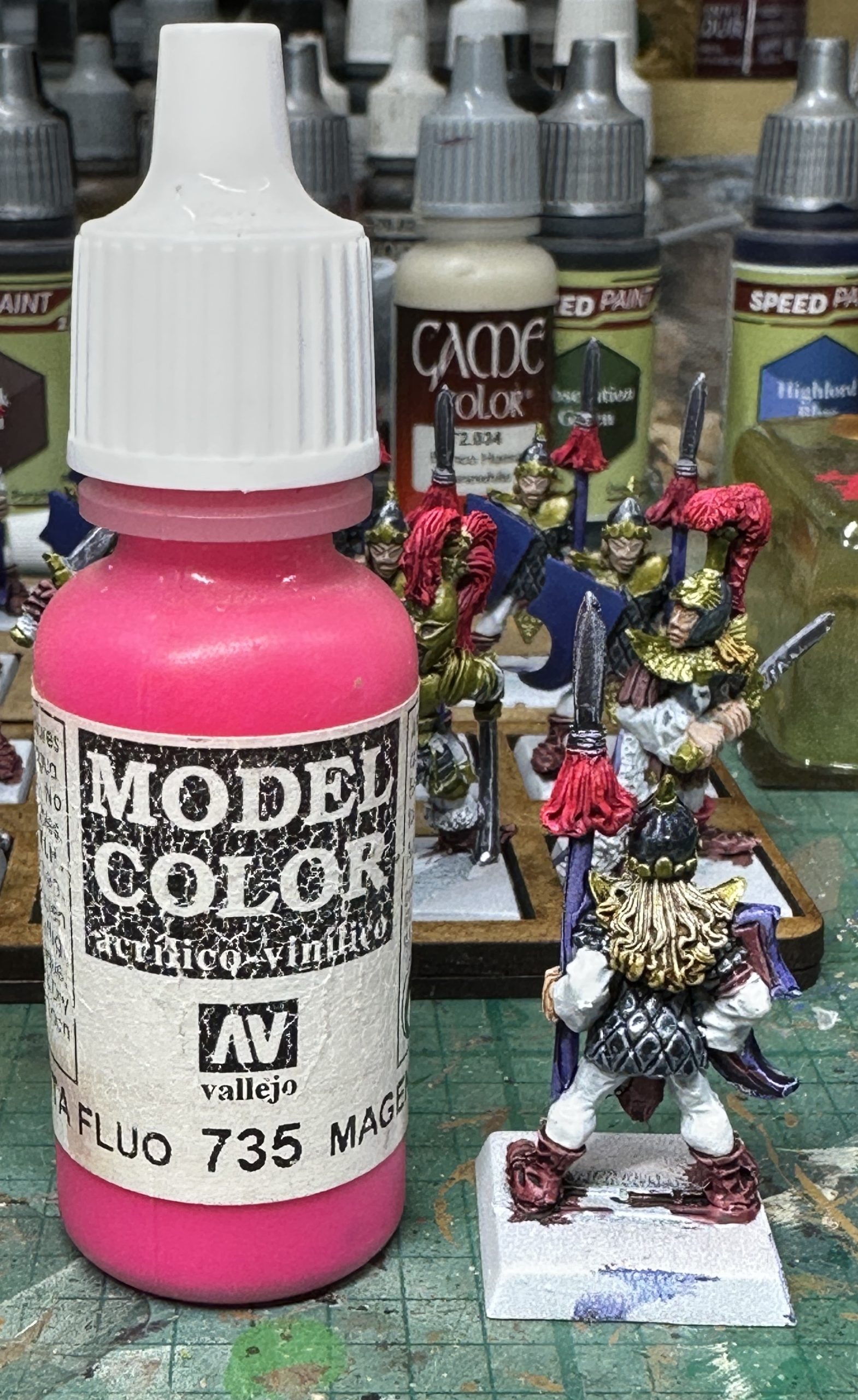
Highlights for the red were done with Magenta Fluro. This will look a bit redder on the model and give a bright but still tonally correct highlight colour. Never let it be said that elves are afraid of bright colours 😀
Just one day’s painting to get these done to this stage. A run over with some matt varnish in the morning and then I can get final highlights and tidying done before finishing the metallic layering for maximum bright and shiny.
Painting Lothern City Guard Part 2 - Goblin Hobbies Stamp kit
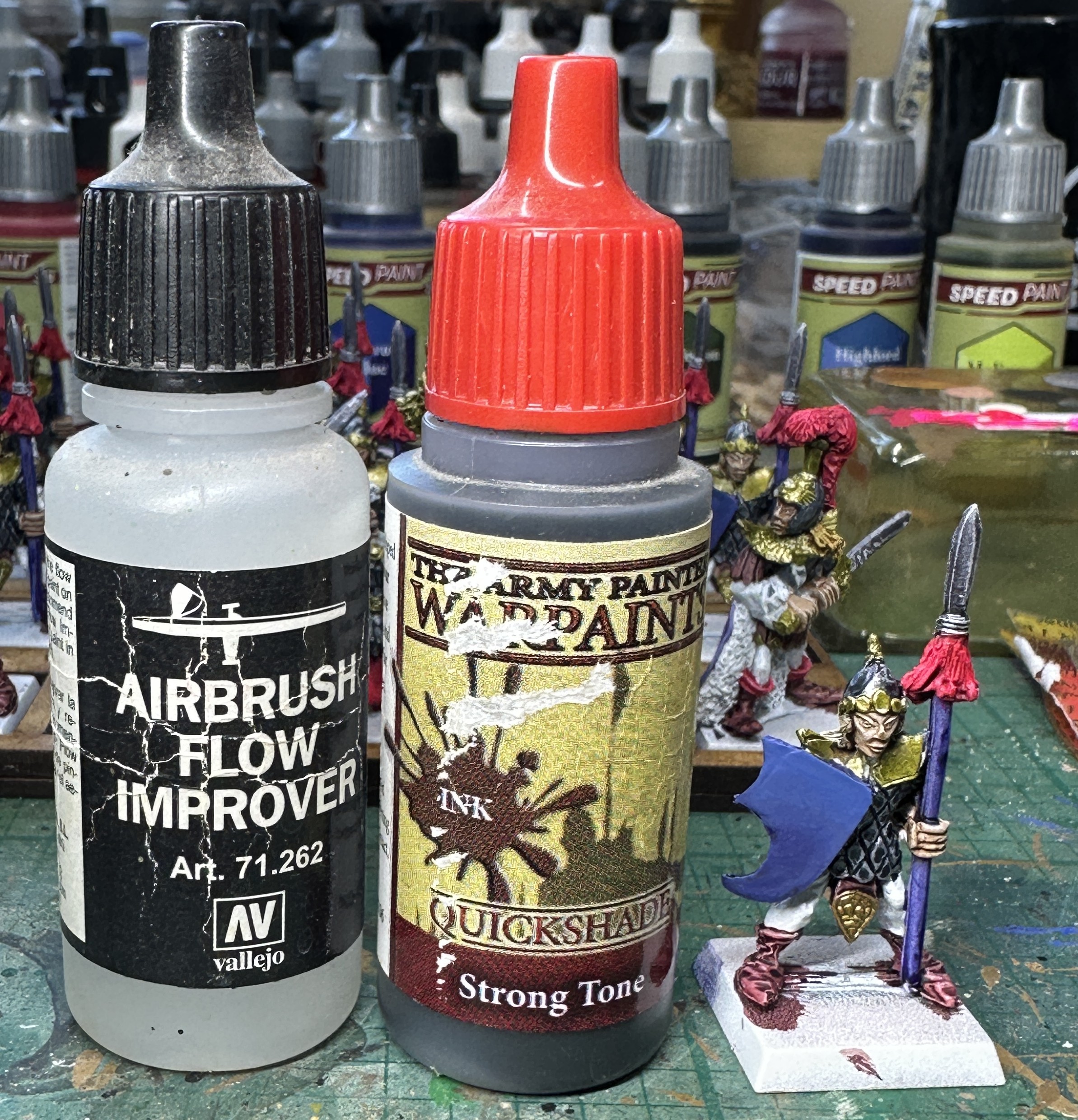
Took a look at everything this morning and the skintone looked a bit flat. Time for a light wash. I don’t want to warm up the colour at all, just increase the contrast to help the sculpted details show better.
I blended some AP Strongtone Wash with some medium, two thirds to one third.
Now for something new. I’m trying to stretch myself and learn a new technique with this project. At Christmas I got given a Goblin Hobbies stamp kit. I’ve not used this technique before so watched the videos on their website that introduce the technique. They are useful and there is an excellent Gerry Can about this as well which I can heartily recommend (and thanks to @sundancer for finding the link for me).
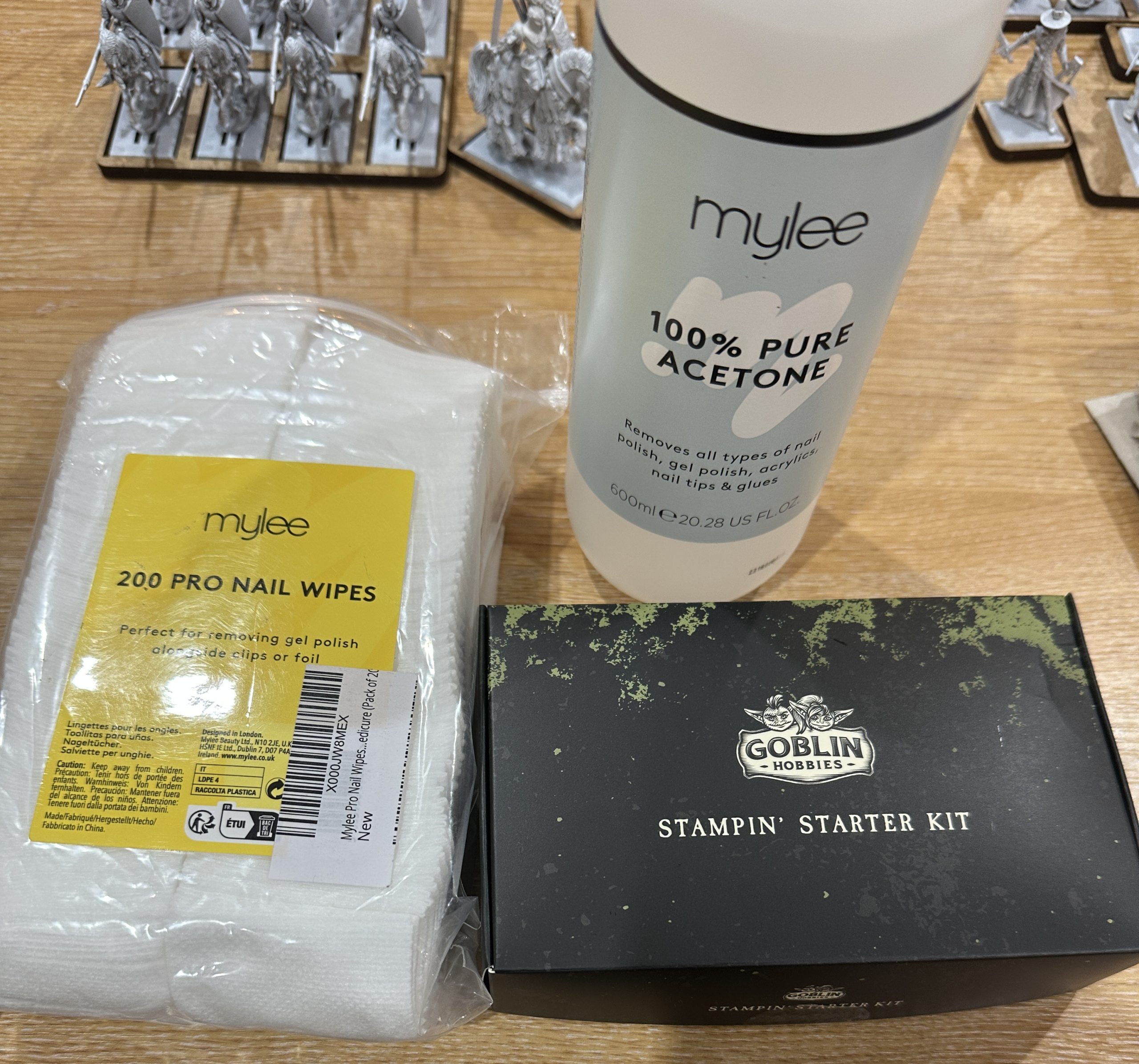
Some prep is needed. You have to blot the silicone ends of the stamper for several hours before you start using them to get some of the production oil off as this stops the design sticking. I also needed to order some lint free pads (basically medical gauze) and a bottle of 100% Acetone as this kit uses nail varnish.
I picked a design I wanted. There is a tower and a ship’s wheel on one of the etched sheets. I’m going with a tower up the long length of the shield on the right and there will be enough for a small ship’s wheel on the left. They are Sea Elves after all.
Here’s the kit and tools used.
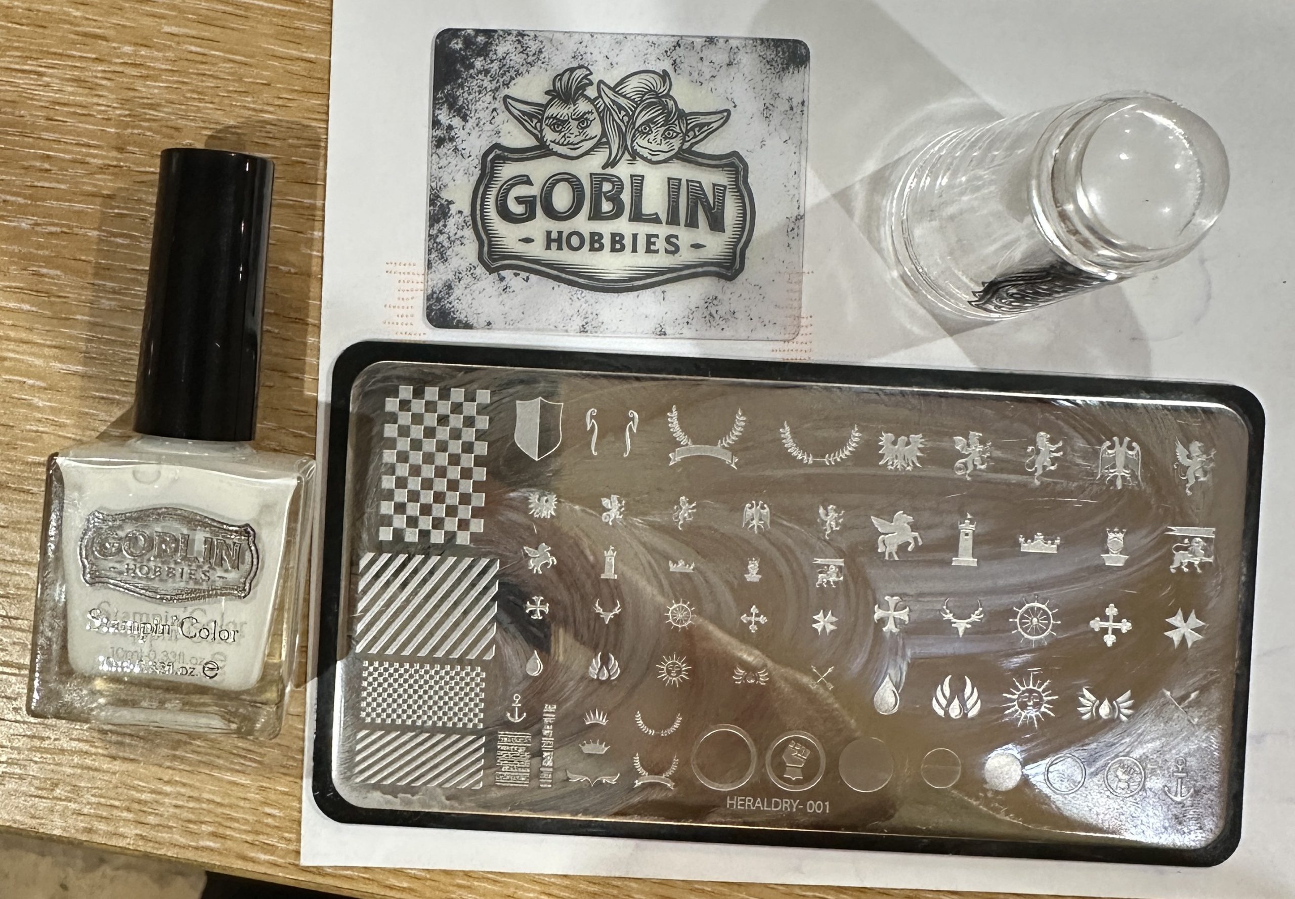
I practiced a lot on a piece of scrap card. The technique isn’t easy and isn’t instantly repeatable so getting a perfect pick-up off the etched sheet is hard and then getting it transferred into the right position isn’t all that easy either. The tower was easier than the ship’s wheel. Because it is so small it dries incredibly quickly so is very hard to pick up because there isn’t enough time to do the swipe and then pick up the stamp and roll it over the design. I got quick enough eventually but it took a very long time with lots of failed pick-ups.
So as you can see some weren’t as good (on the left) but others looked nearly perfect (on the right). Most failures on the wheel:
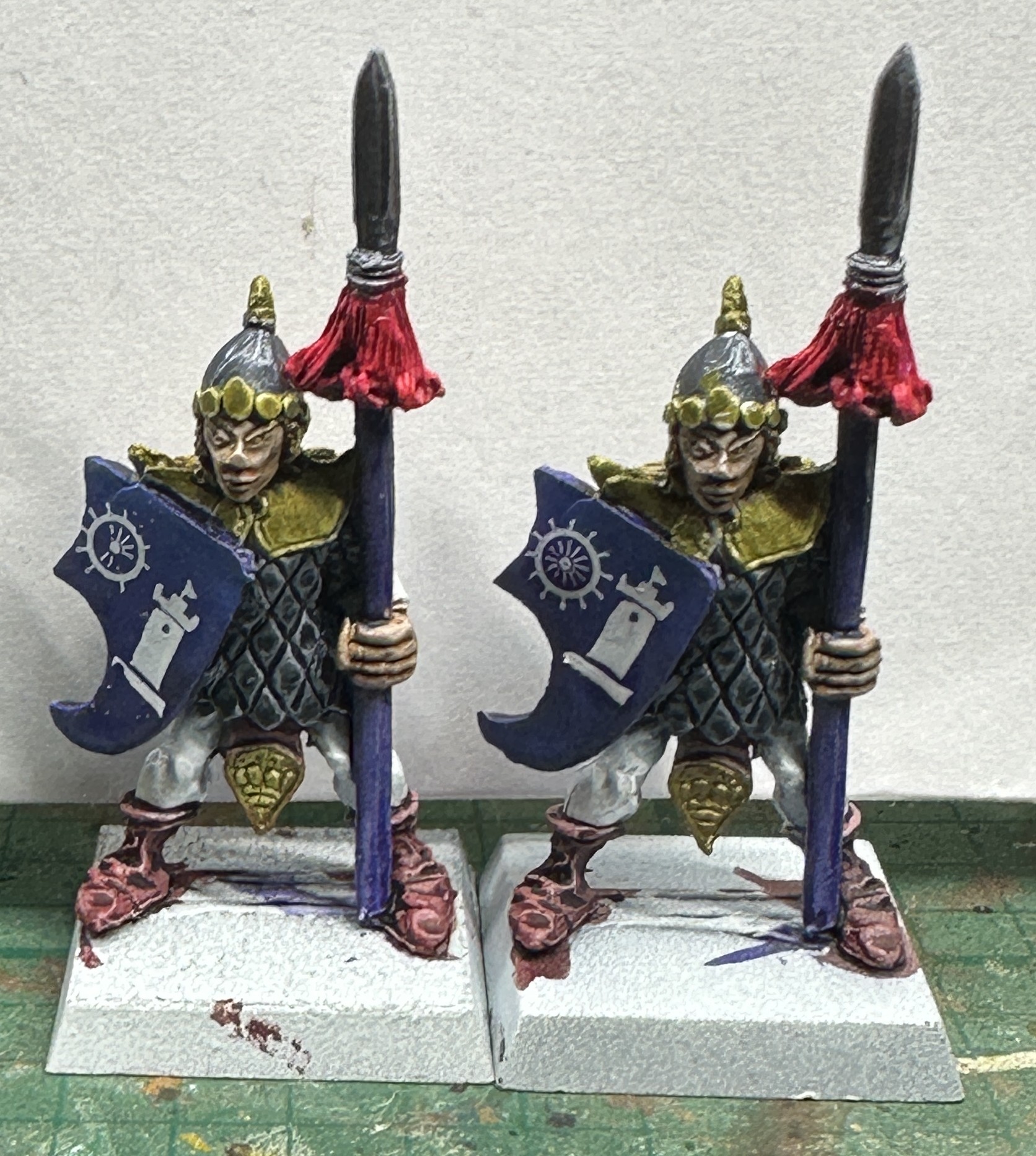
I did the leader last and he came out with the best looking transfers.
Once done some of the transfers started to flake or were clearly not fully stuck on. I coated them in some matt varnish to help stick them on and diminish the sheen that the nail varnish has. I was then able to tidy up any missing elements with some white paint.
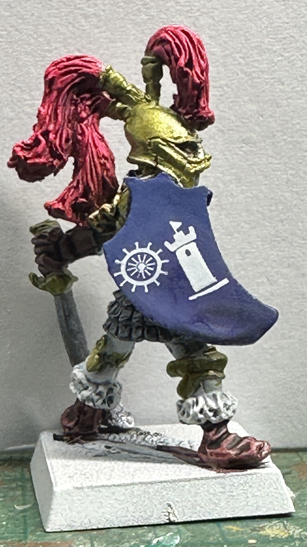
That used up today’s hobby time so I’ll have to finish off the metallic layering tomorrow.
Painting Lothern City Guard Part 3 Shiny
After all of the work so far all that needs doing now it to get the metal lovely and shiny. Elves never knowingly less that dazzling so I need to go bright on the metallics.
Fortunately I’ve found some great paints to get a high shine on metals. First we have the steel.
I use Darkstar Baroque to put the basic metal shine back onto the figures. Not a complete overpaint layer, I’m leaving the edges and low points in the Enchanted Steel. Over that just on the edges of weapons, tips and high shine points on armour I use Vallejo Metal Pale Burnt Metal. This is almost a chrome finish – the clearest I’ve found as the pigment is very fine so it doesn’t make the finish grainy.
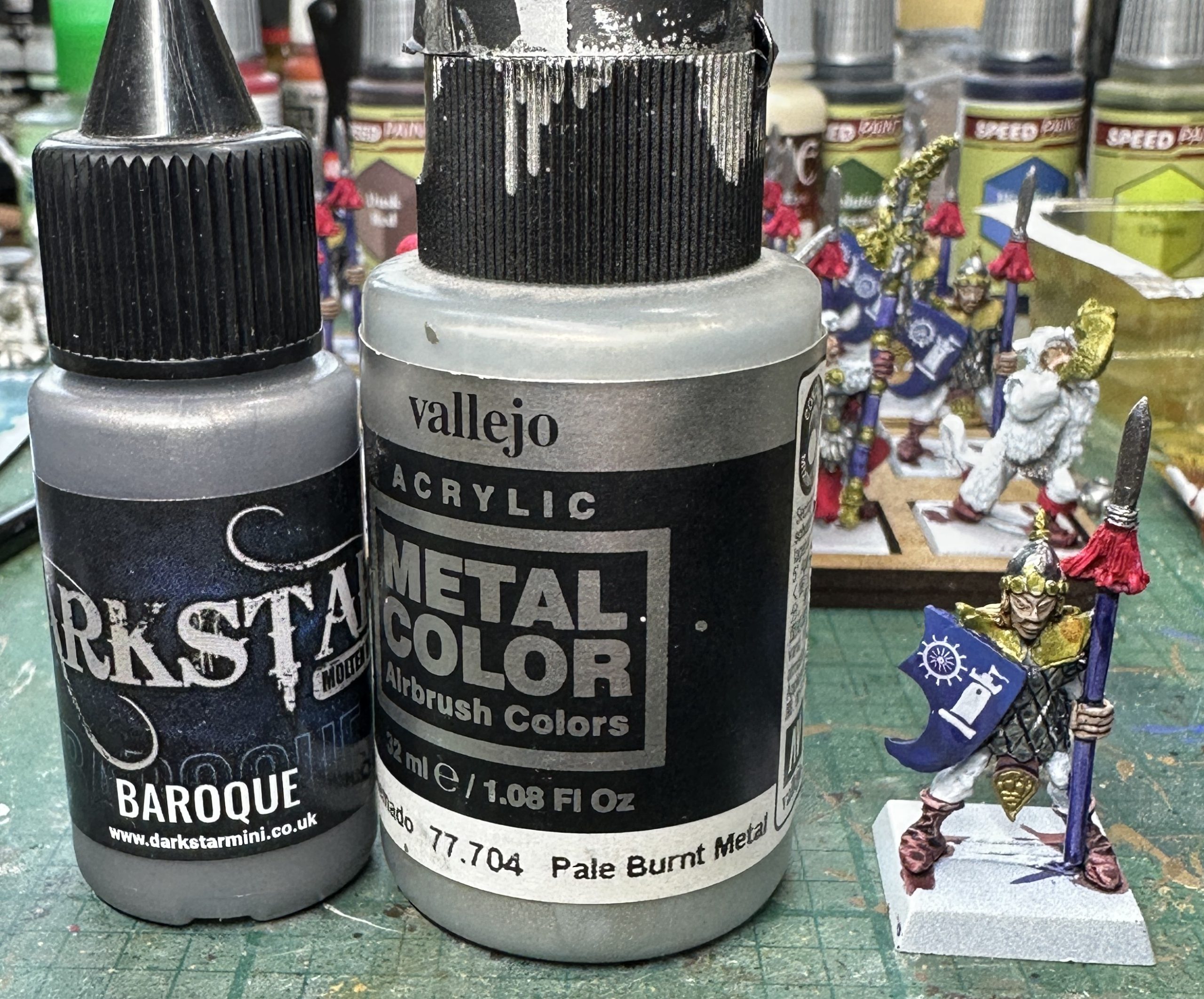
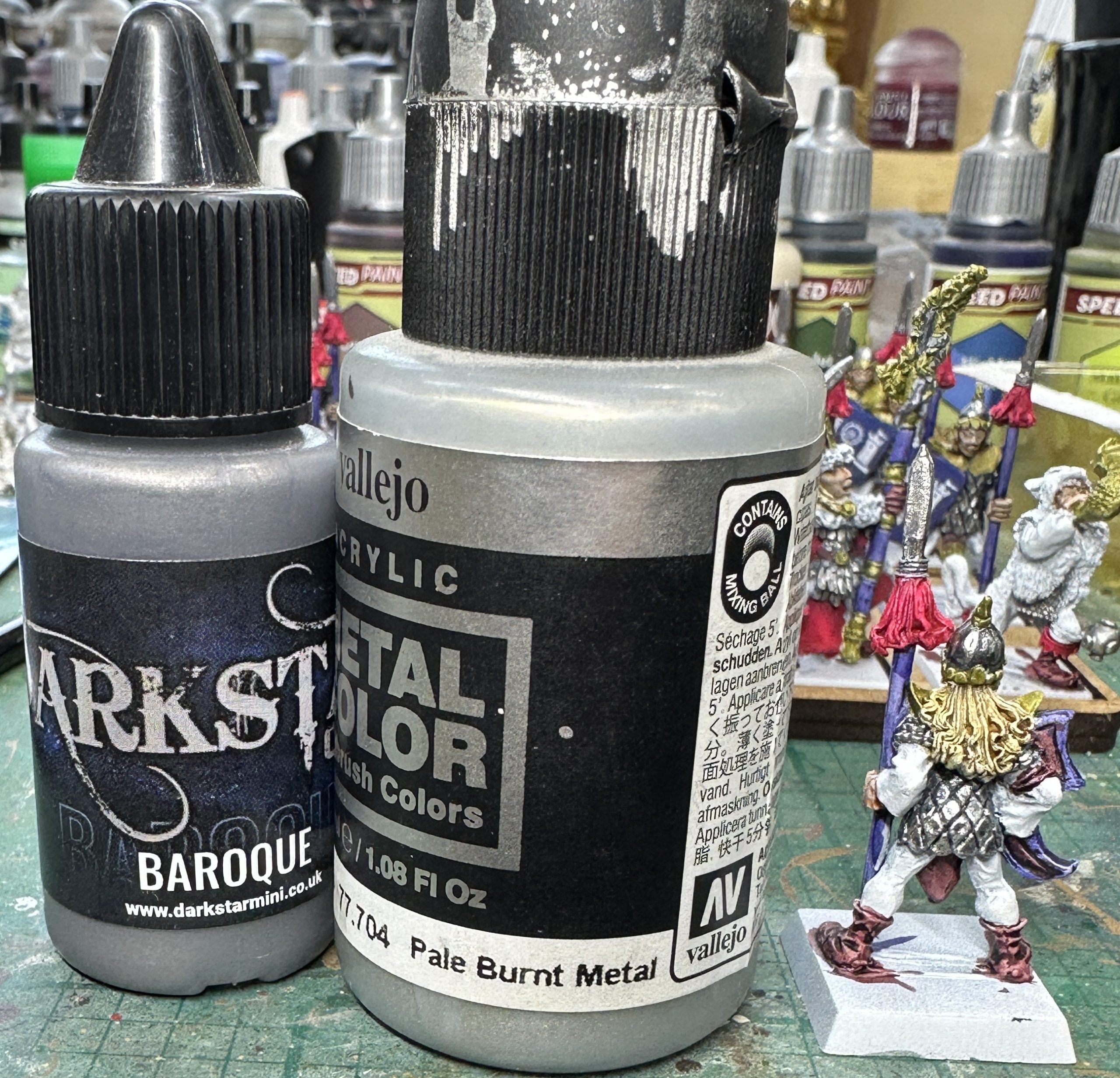
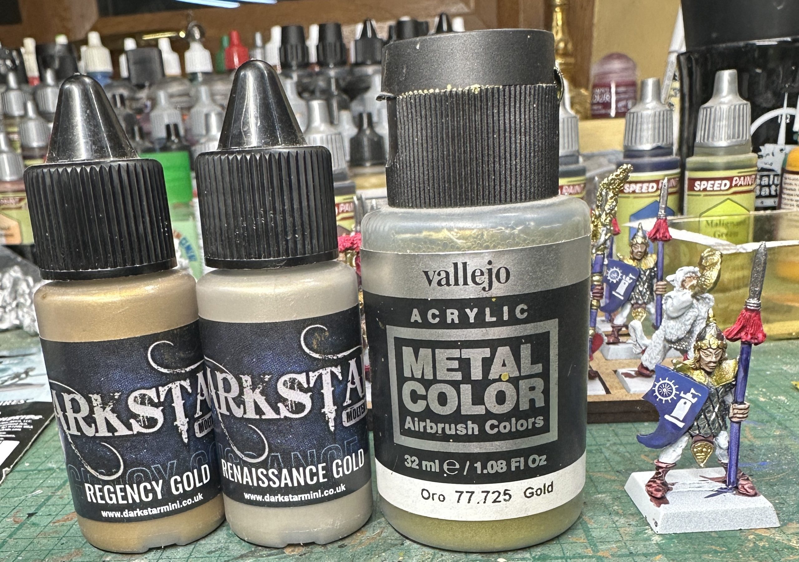
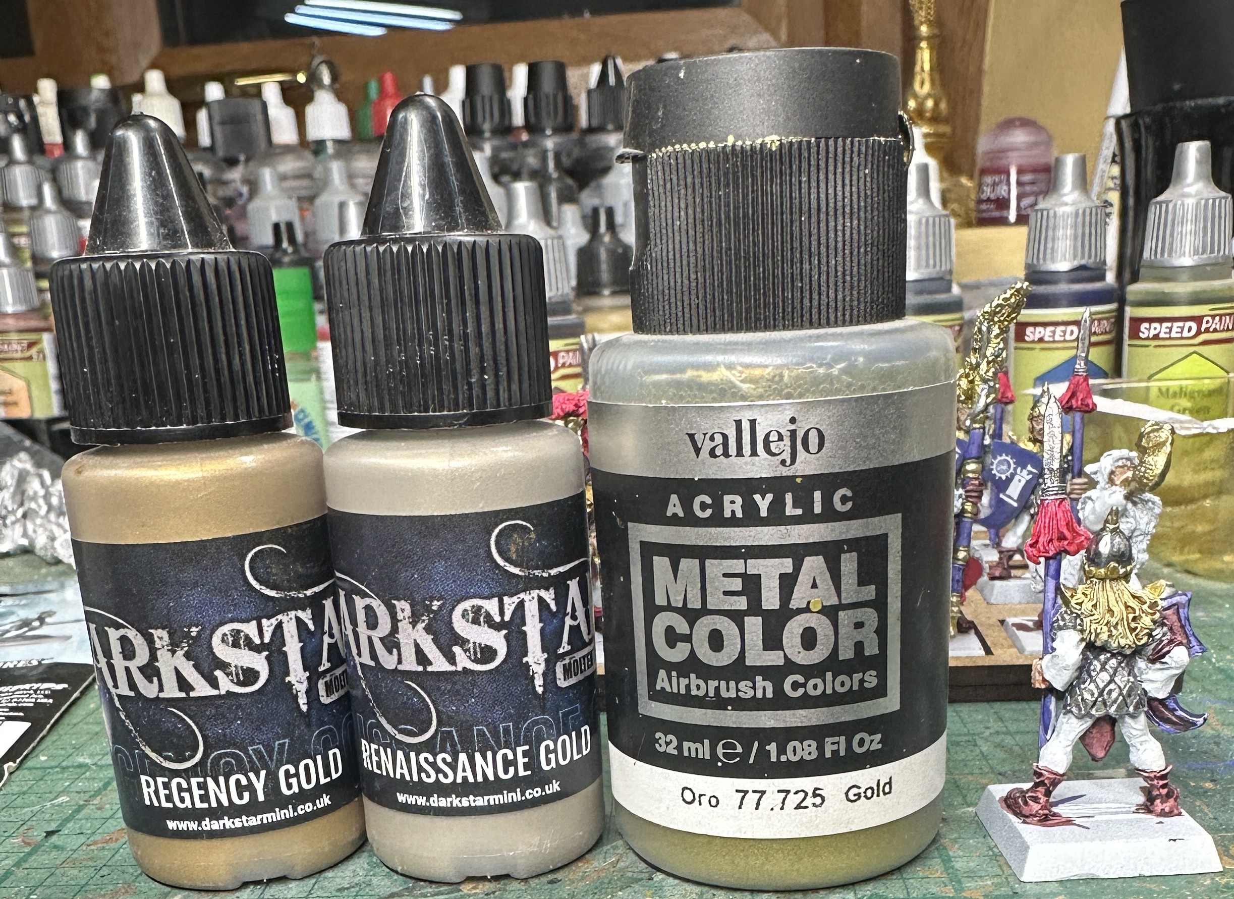
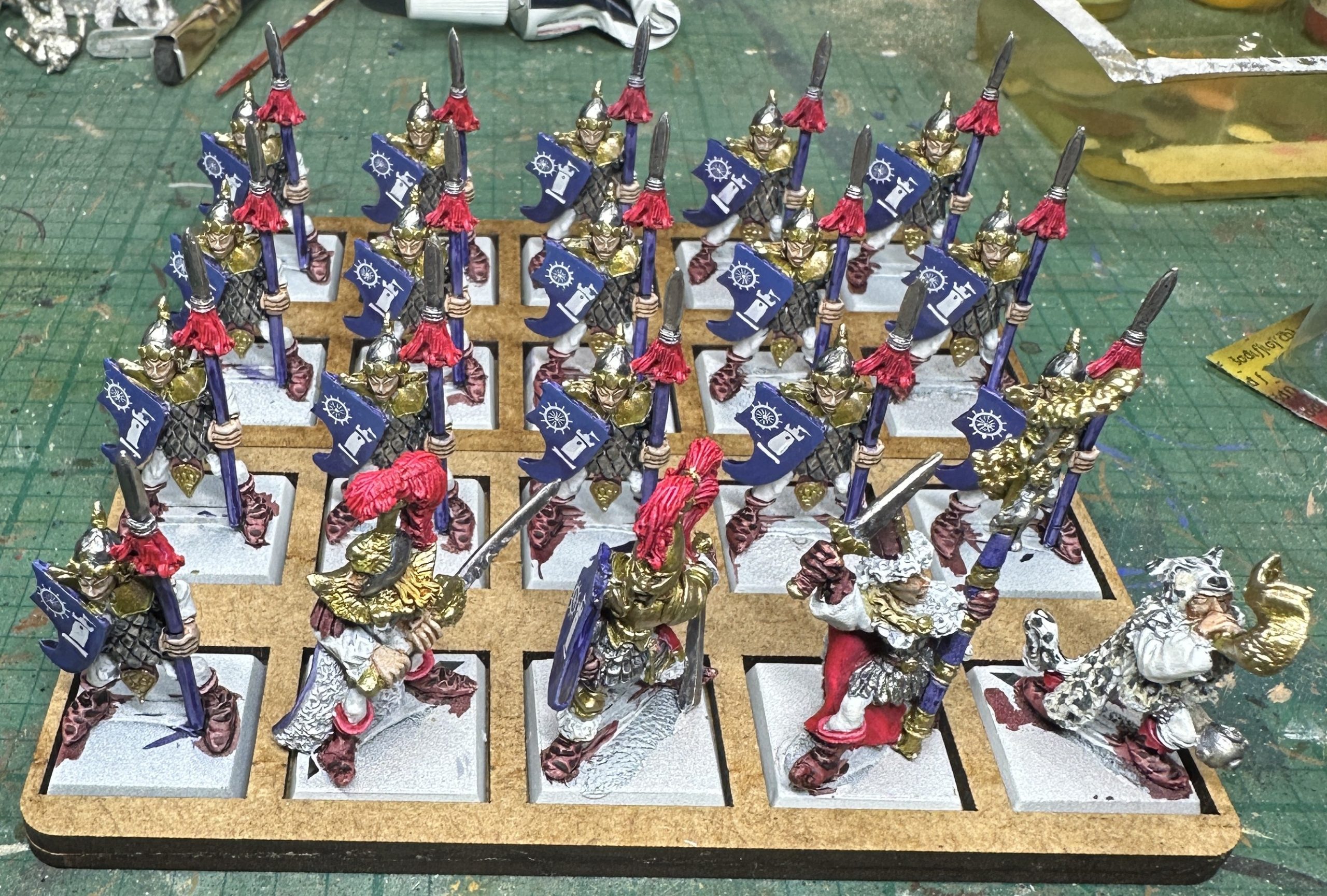
Now on to the gilded armour and gold weapon fitments. To get a bright shine I have to add an extra layer. Starting with Regency Gold I overpaint in the same way as I did on the steel, leaving the original colour in recesses and at the joins between colours. Next I went with another Darkstar paint, Renaissance Gold. This is very bright and would normally be the top highlight but we want our elves extra shiny. This went into the usual highlight positions at the top of high points and edges. I also picked a notional direction for light, from the upper left of the front of the miniature, at 11 o’clock. Then put patches of highlight onto the flatter plates and surfaces where this light would hit them. Finally a top and edge highlight using Vallejo Metal Gold. In small quantities this has a colour appropriate chrome finish.
Now a couple of finishing touches on the character miniatures. A touch of black here and there and a snow leopard pattern on the musician’s animal pelt. The pattern is much bigger than in real life but it needs to read as leopard at a glance so the characteristic circular loop spots need to be clear enough to see and are therefore upsized.
As with the Wardancers the basing will have to wait until I get back from Salute with the stuff needed to finish them.
Shiny 🙂
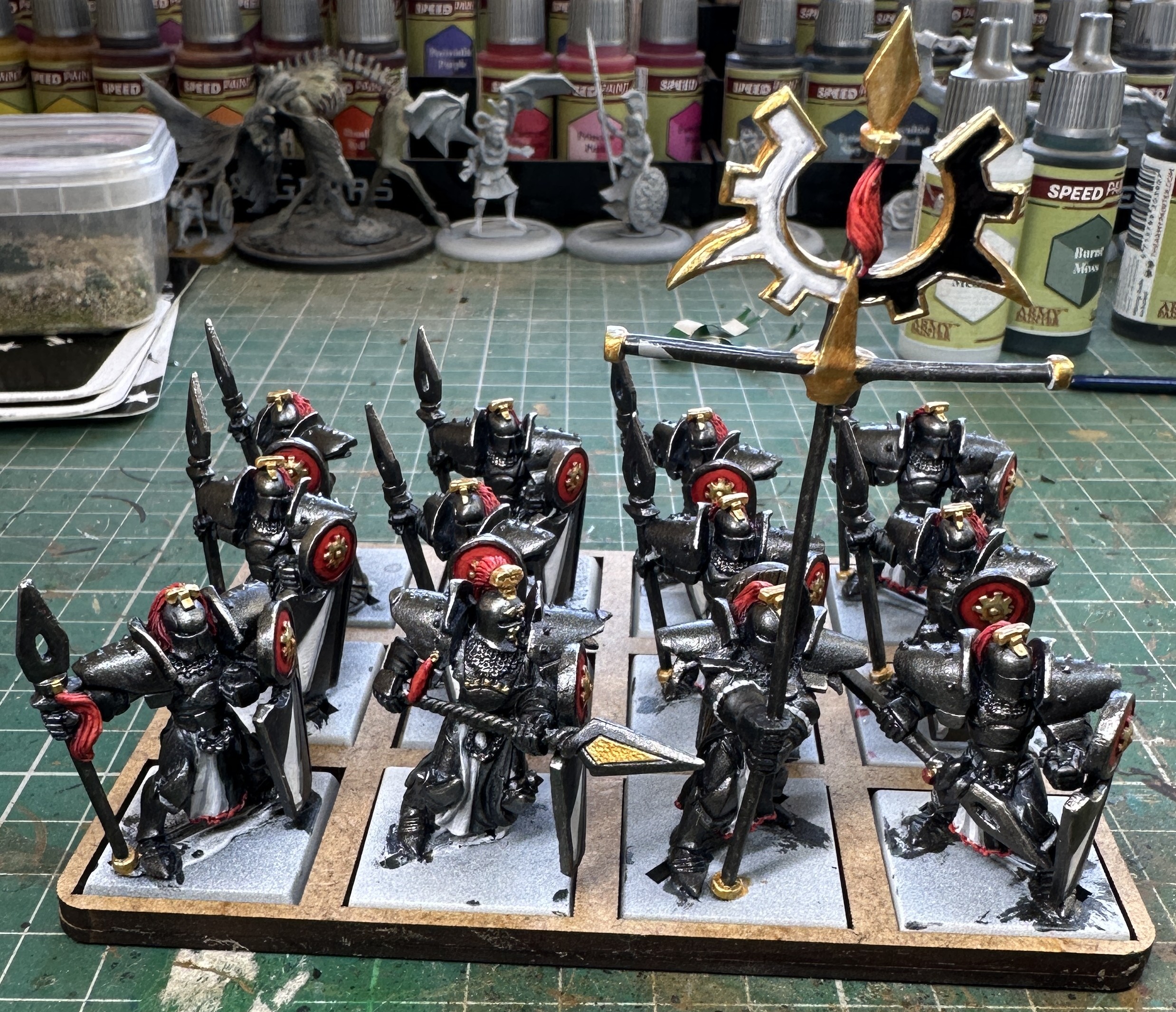
Painting Firstborn Iron Guard
The next unit is the Firstborn Iron Guard. They are Chronopia models from the Target Games era of the game in the late 1990s. I bought them new then and they have been sat in the collection ever since.
The Firstborn in my setting are a religious cult. I’ve moved away from the background as written (which has some AoS hallmarks) to help them to fit into my quasi-Old World setting. Here the Firstborn are a cult whose belief system centres around the principle that Humans were the first race, not Elves. Specifically they claim descent from these first beings, hence Firstborn. The Iron Guard are the shield bearers of the order, holding and defending on the battlefield. They refuse to give ground to any inferior race, which is basically all of them given they know they were the first.
They have extensive understanding of forging and each man makes his own armour to the divine pattern handed down to them. They are finished with a technique called “bluing” where the armour is gently heated in a flame to oxidise the outer layer of the steel. This gives it a distinctive dark colour with a faint blue hue.
First off are the base layers (all AP Speedpaints unless specified):
- Spear shafts in Darkstar Blue Steel
- Armour in Enchanted Steel
- Plumes and loincloth bottom edge in Poppy Red
- Helmet Crest and spear butt in Darkstar Royal Gold
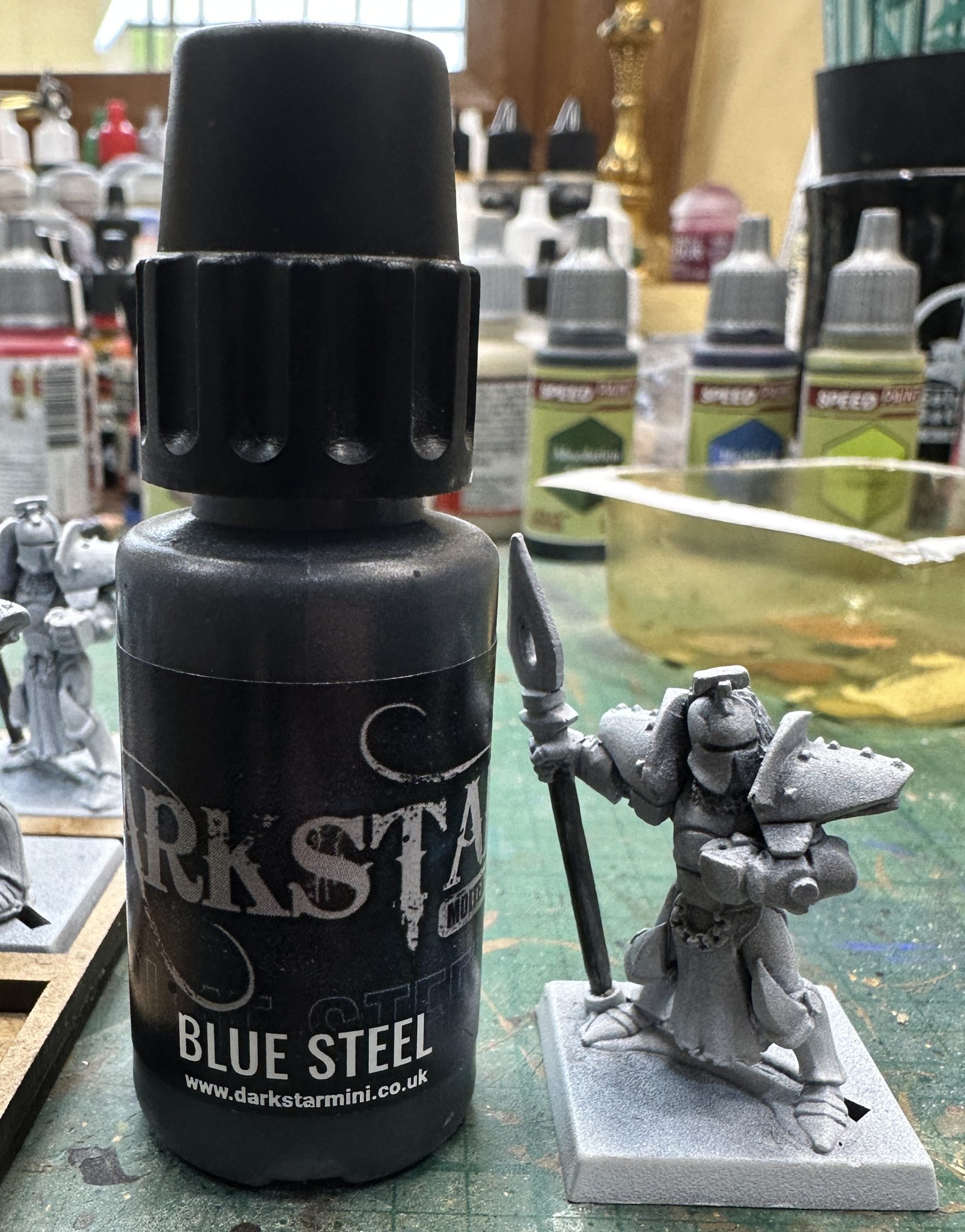
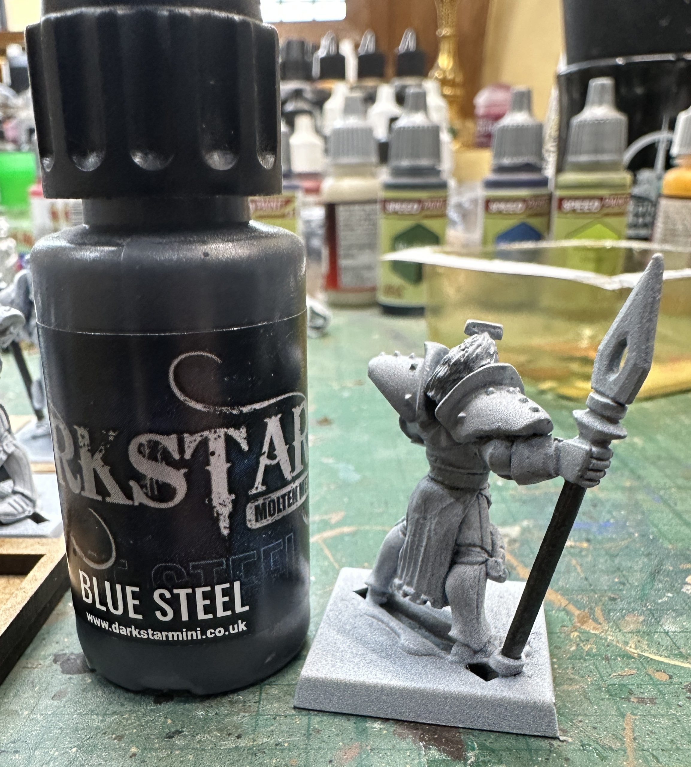
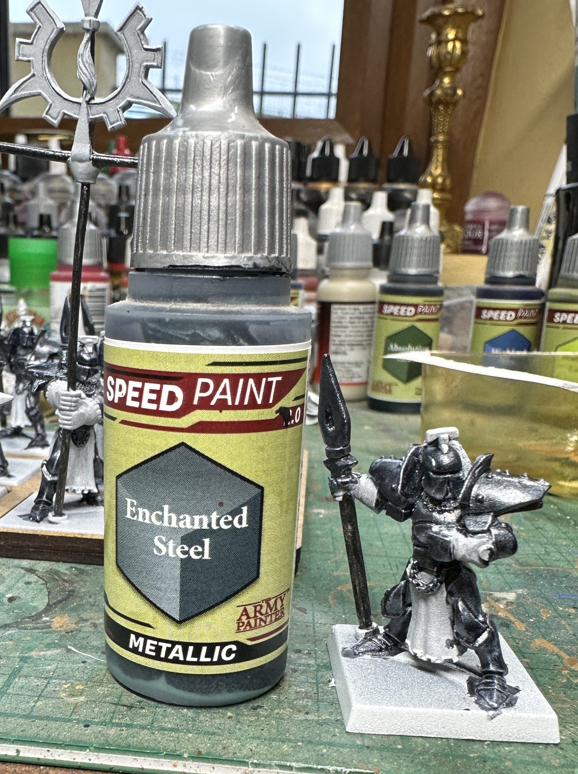
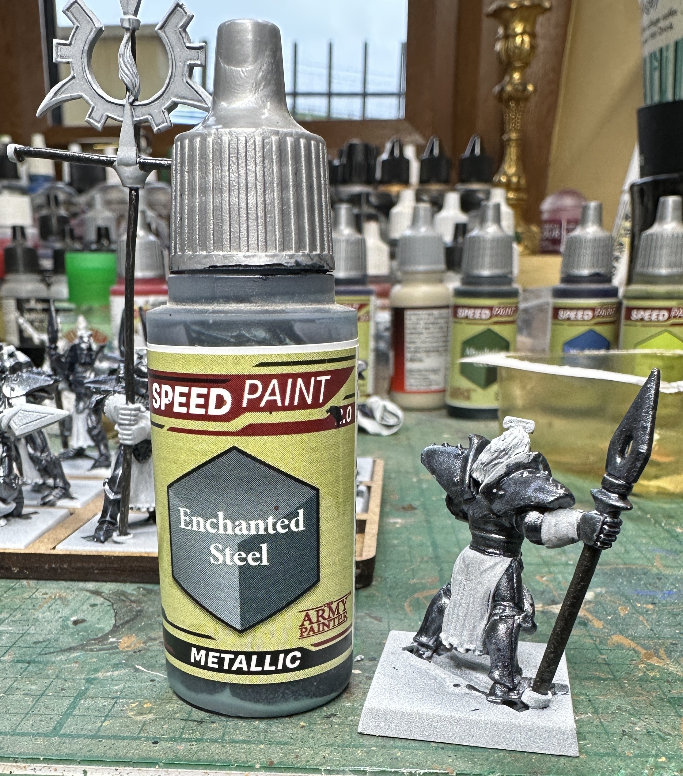
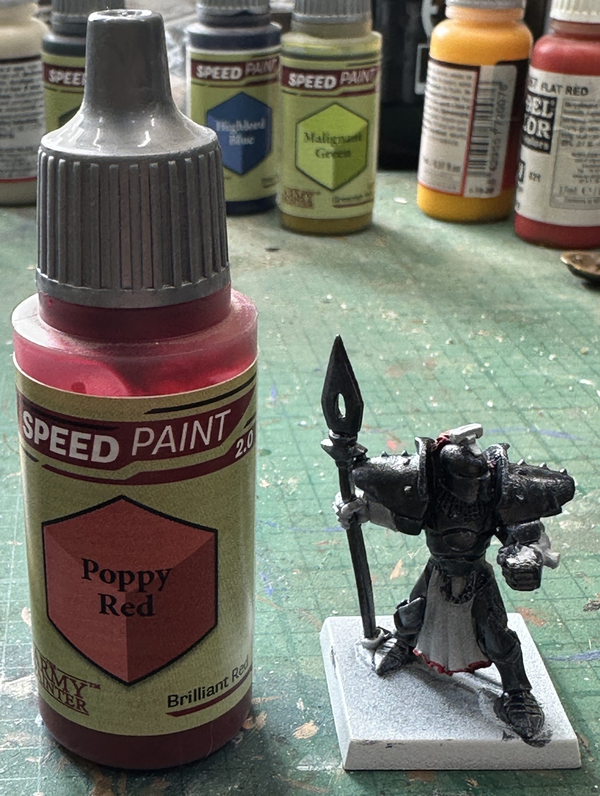
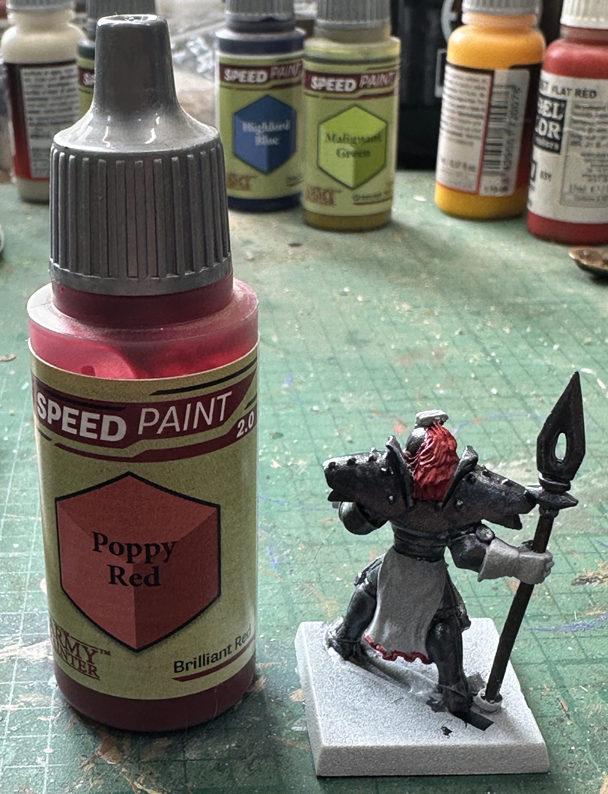
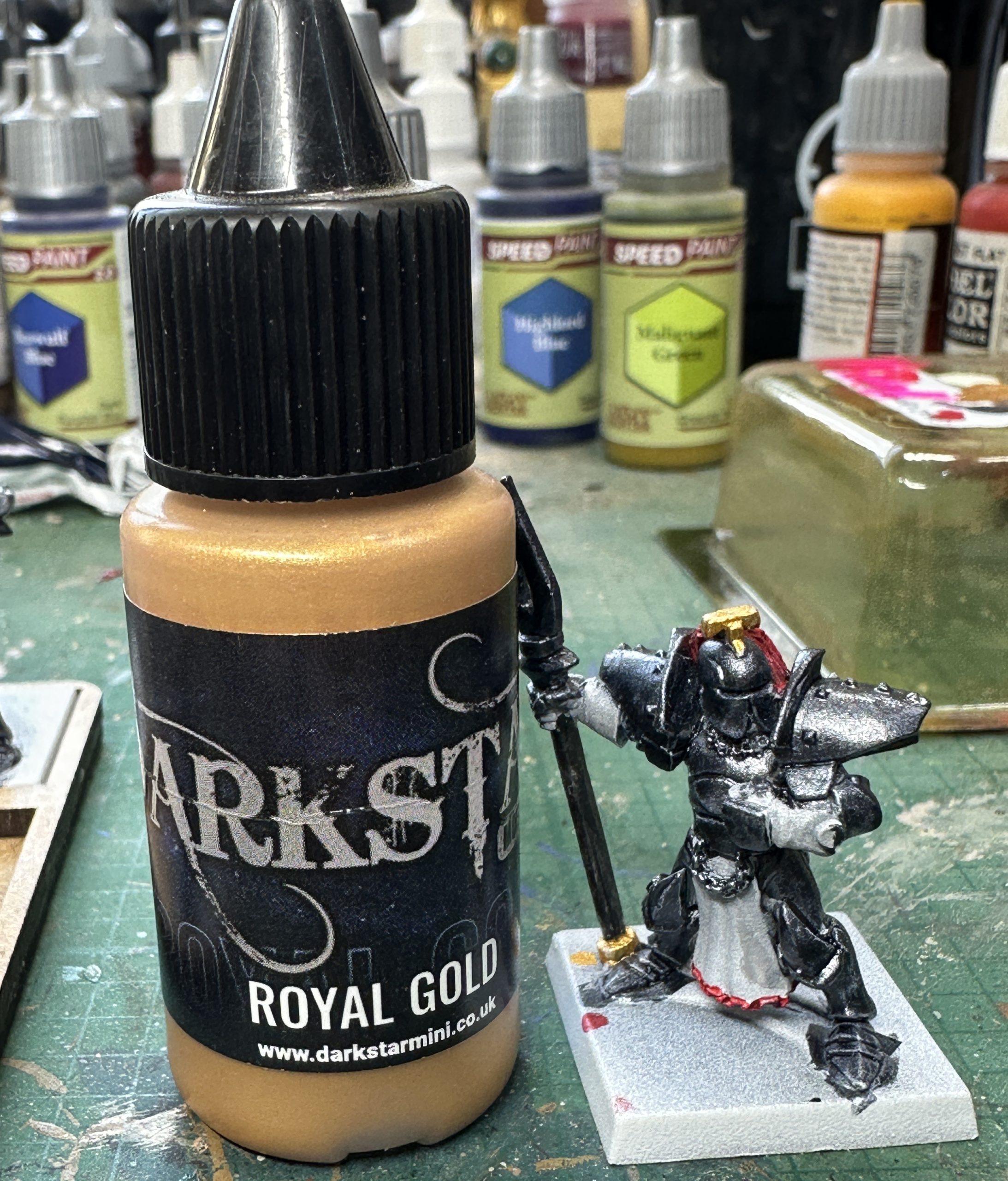
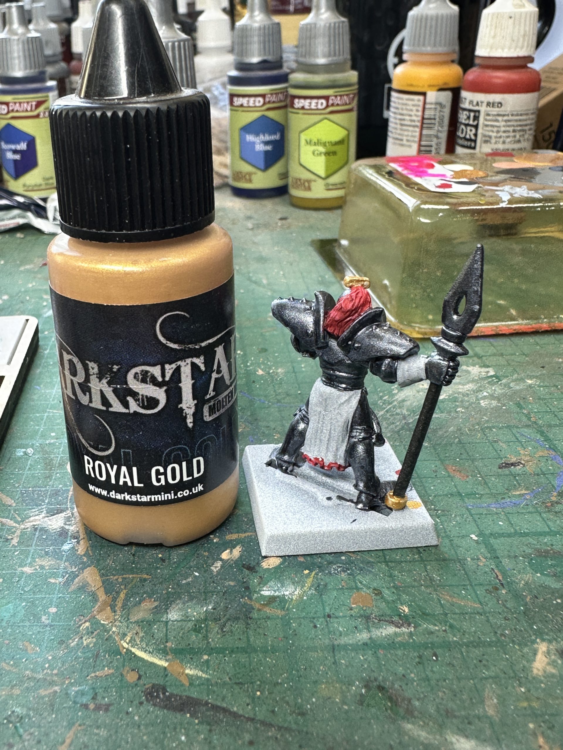
Next I moved on to the cloth. The original concept has them in a monochrome chequered pattern but I’ve got lots to do so I’ll stay with the black and white but do it in vertical halves instead.
I started with a line of Vallejo Cold Grey acrylic down the visual middle of the loin cloths. With something visible as a guide I then put the black on with AP Grim Black which gives a good layered effect when dry. The Speedpaint white isn’t so good and just makes everything different shades of grey so it is necessary to go back in to restore the highlights with acrylic white.
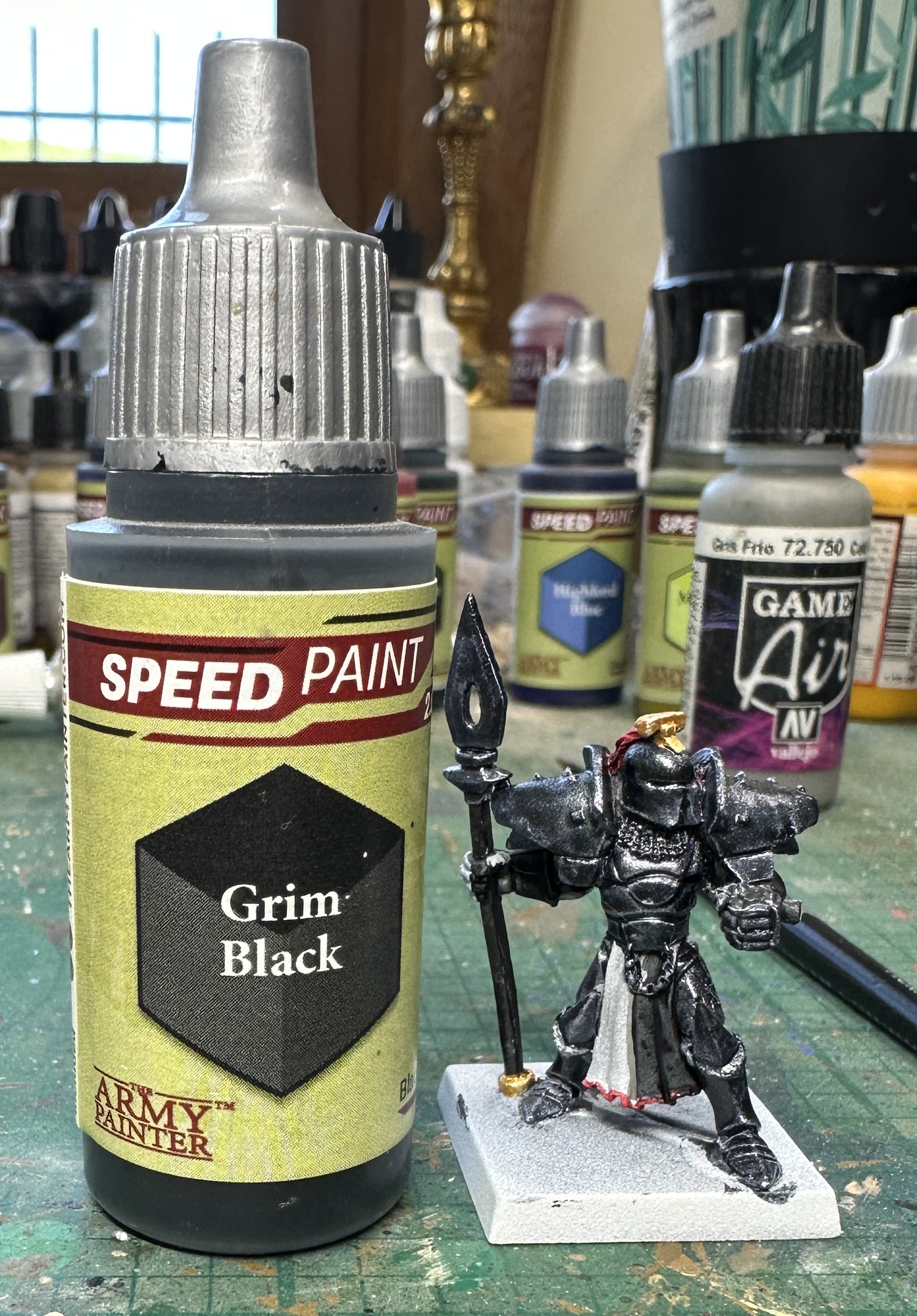
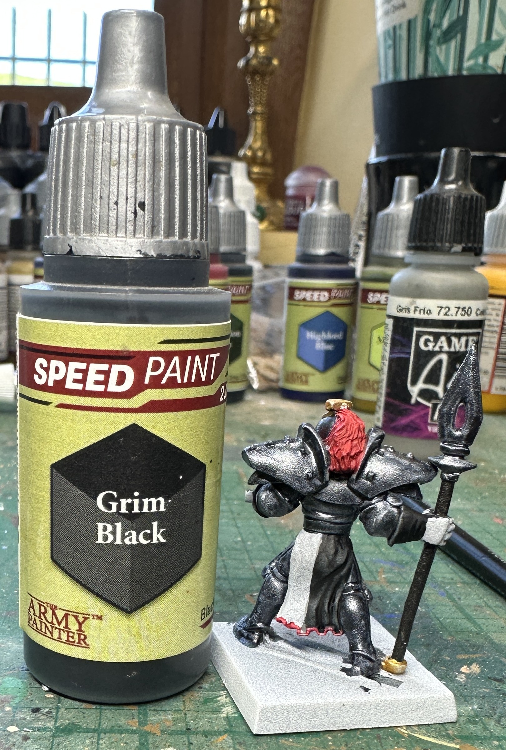
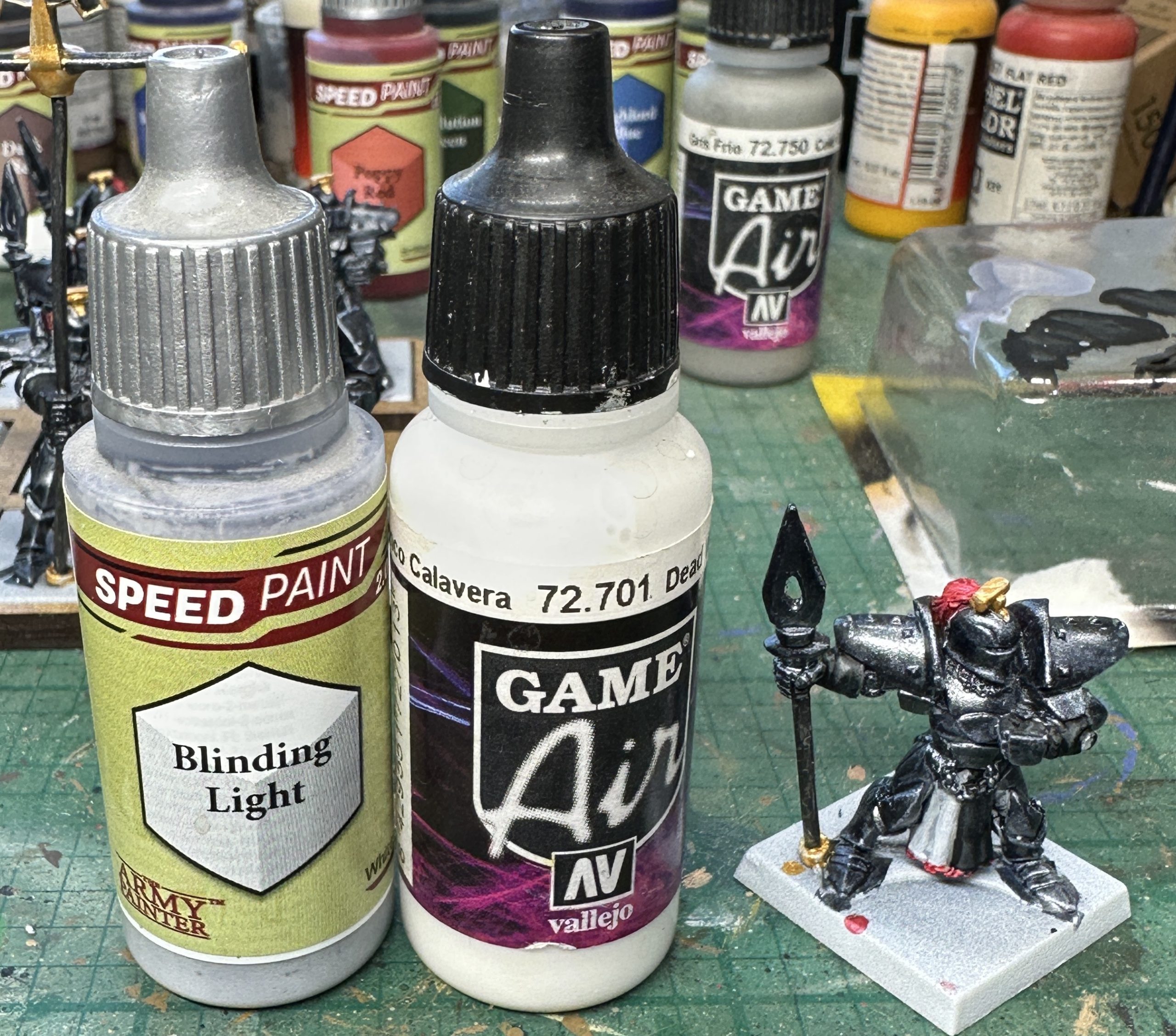
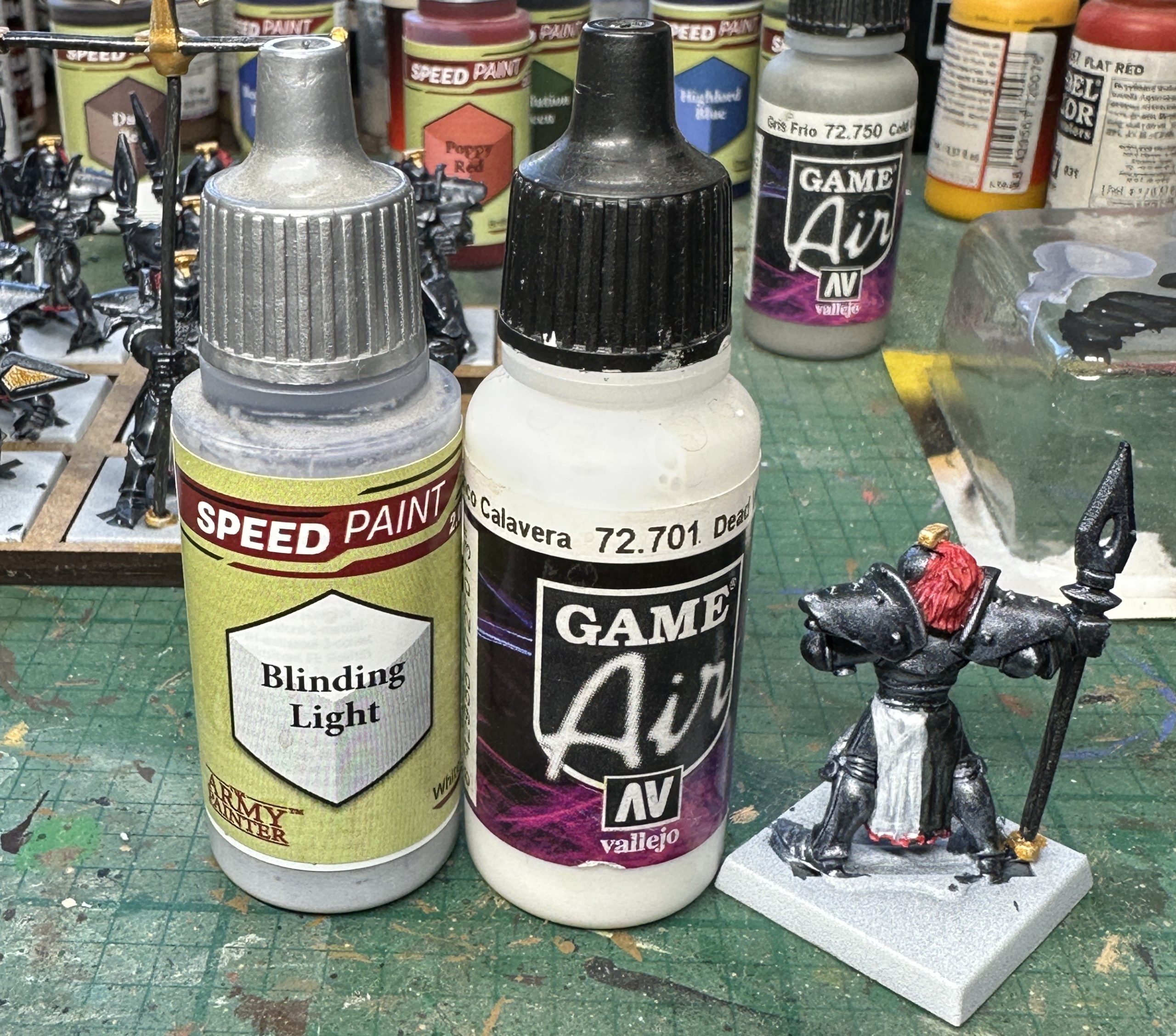
With this stage complete the models were varnished with Mr Hobby Super Clear Matt spray. This is the only varnish layer they will get and protects them as much as possible from handling in game situations.
This matt layer means the shine needs to be restored to the shiny bits like the armour. I’m happy with the flat effect on the spear shafts so they will stay as they are. Reshining is done by an overbrush (a sort of wet drybrush) with Darkstar Blue Steel. Then the highlight layers are added focus moves from:
- broader upper surfaces, any parts that will catch light coming from above and to the left of the front of the model using Darkstar Steel
- to the highest surfaces; the upper faces of the shield rim, side edges of the shield, upper defined edges of armour plates and poleyns (knee protectors) and pauldrons (shoulder protectors) in Darkstar Baroque
- Finally, Vallejo Metal Pale Burnt Metal to the brightest points like the corners of the shoulder pauldron ridges, shield rim upper edges, spear points and blade edges.
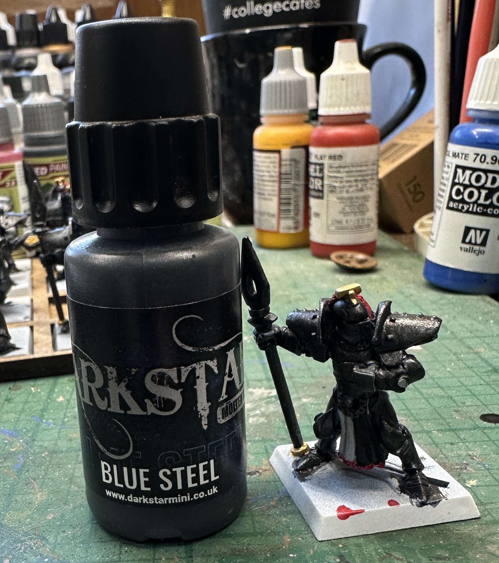
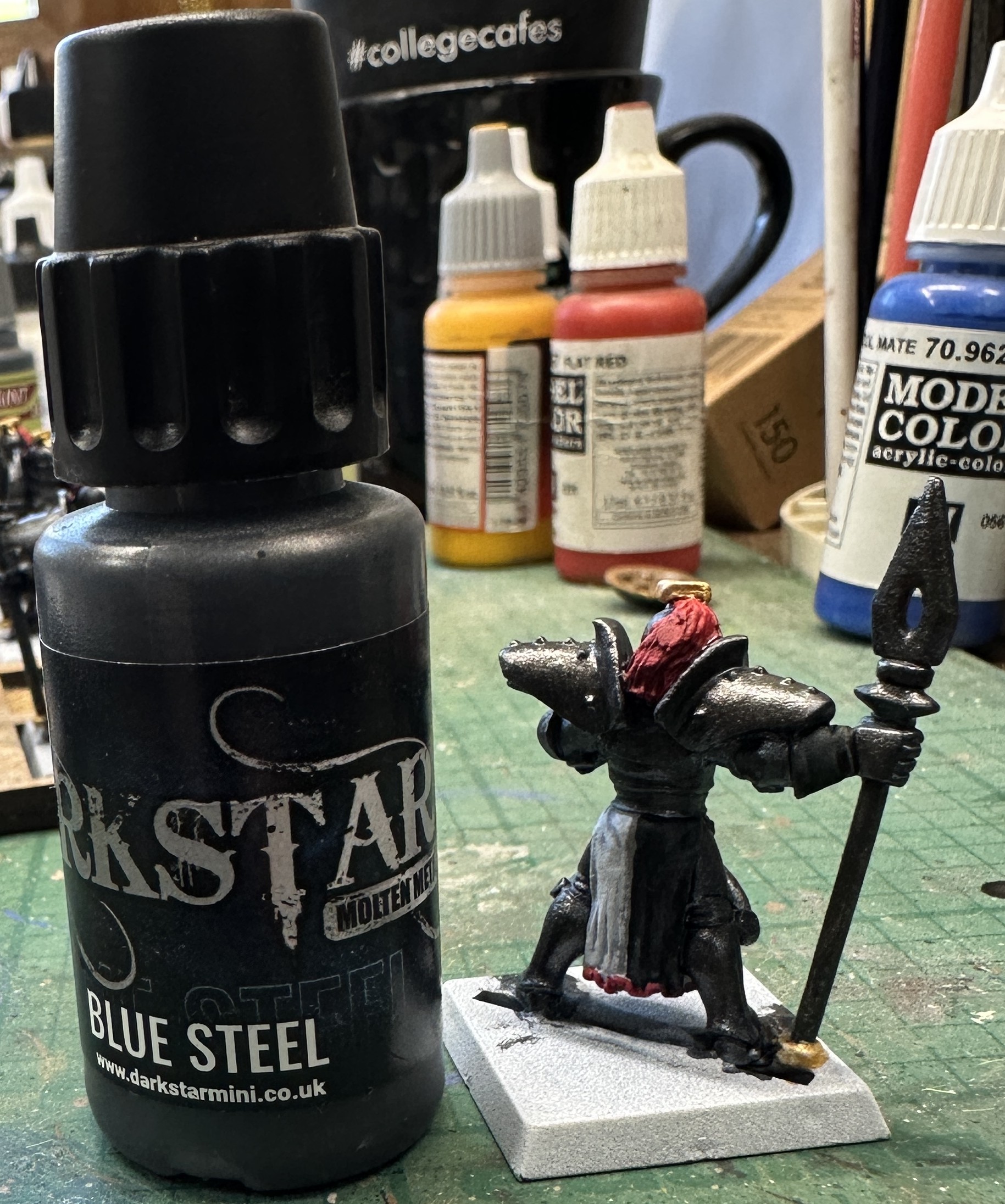
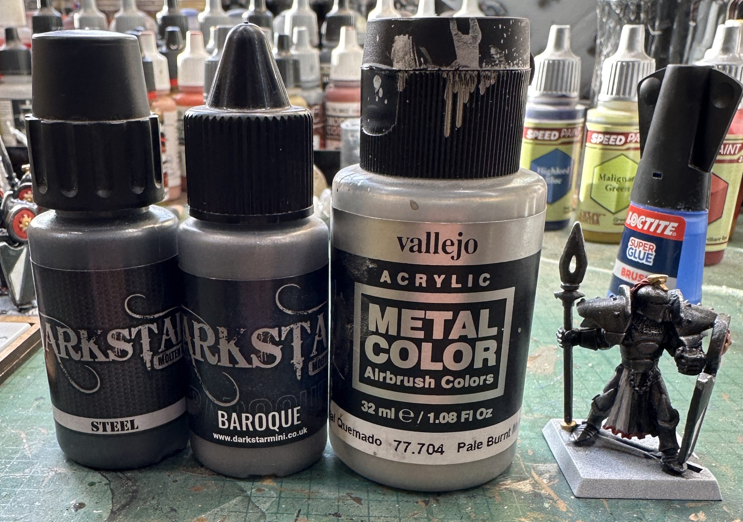
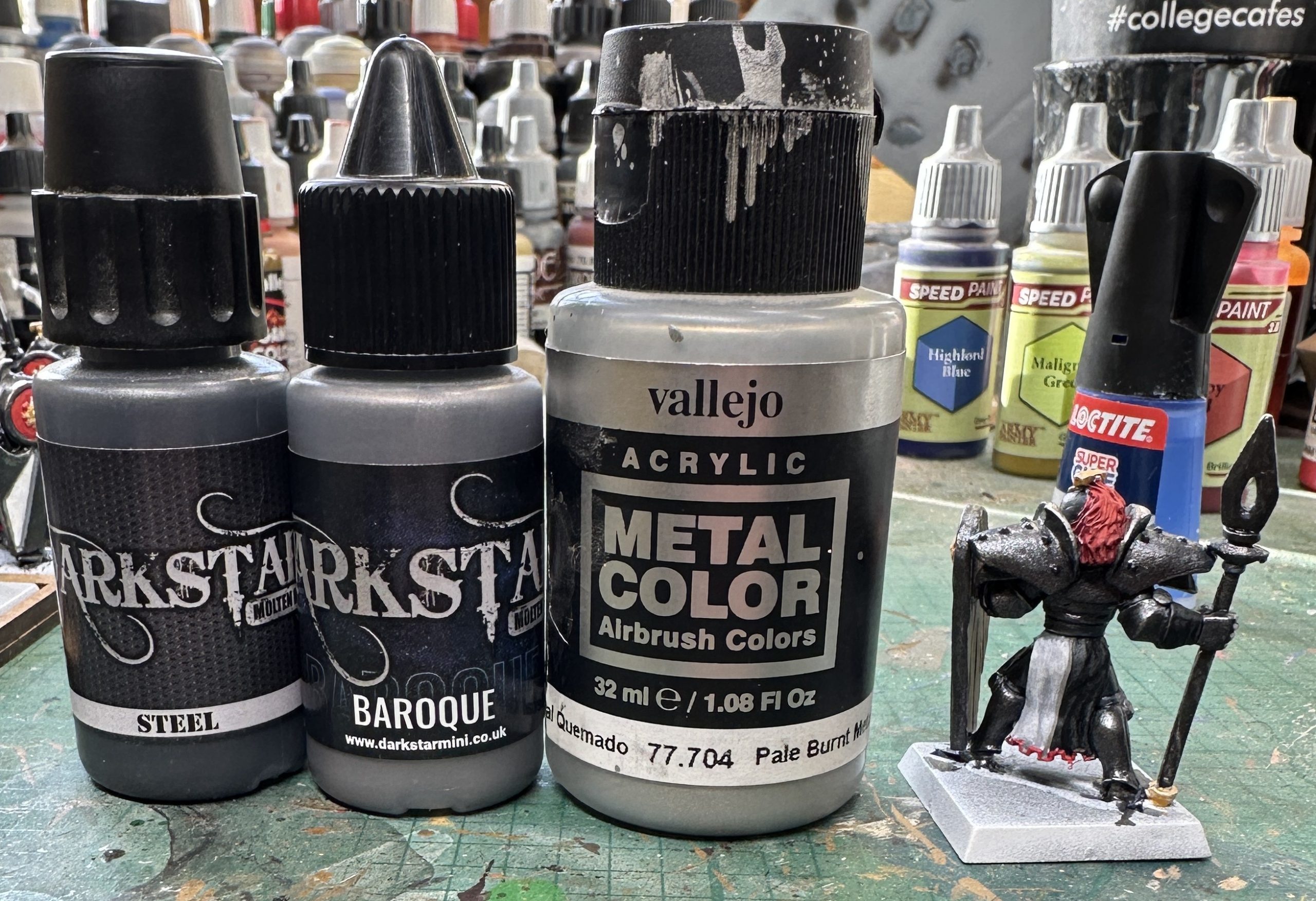
Final highlights. AP Firey Vermilion into the plumes. Then a more complex process on the gold areas.
The shields were painted in parallel to the miniatures and added near the end. There is a gold cog symbol on the shield which was first circled with the Firey Vermilion. Then I overpainted most of the gold with Regency Gold. A wash went over both red and gold using AP Warm Skin Shade and then a final highlight on the upper half of the symbol and central rivet.
The crest on the helmets received similar treatment. Regency Gold on upper surfaces, a stripe of wash to help darken the junction between red and gold and then the Vallejo Gold as an edge highlight.
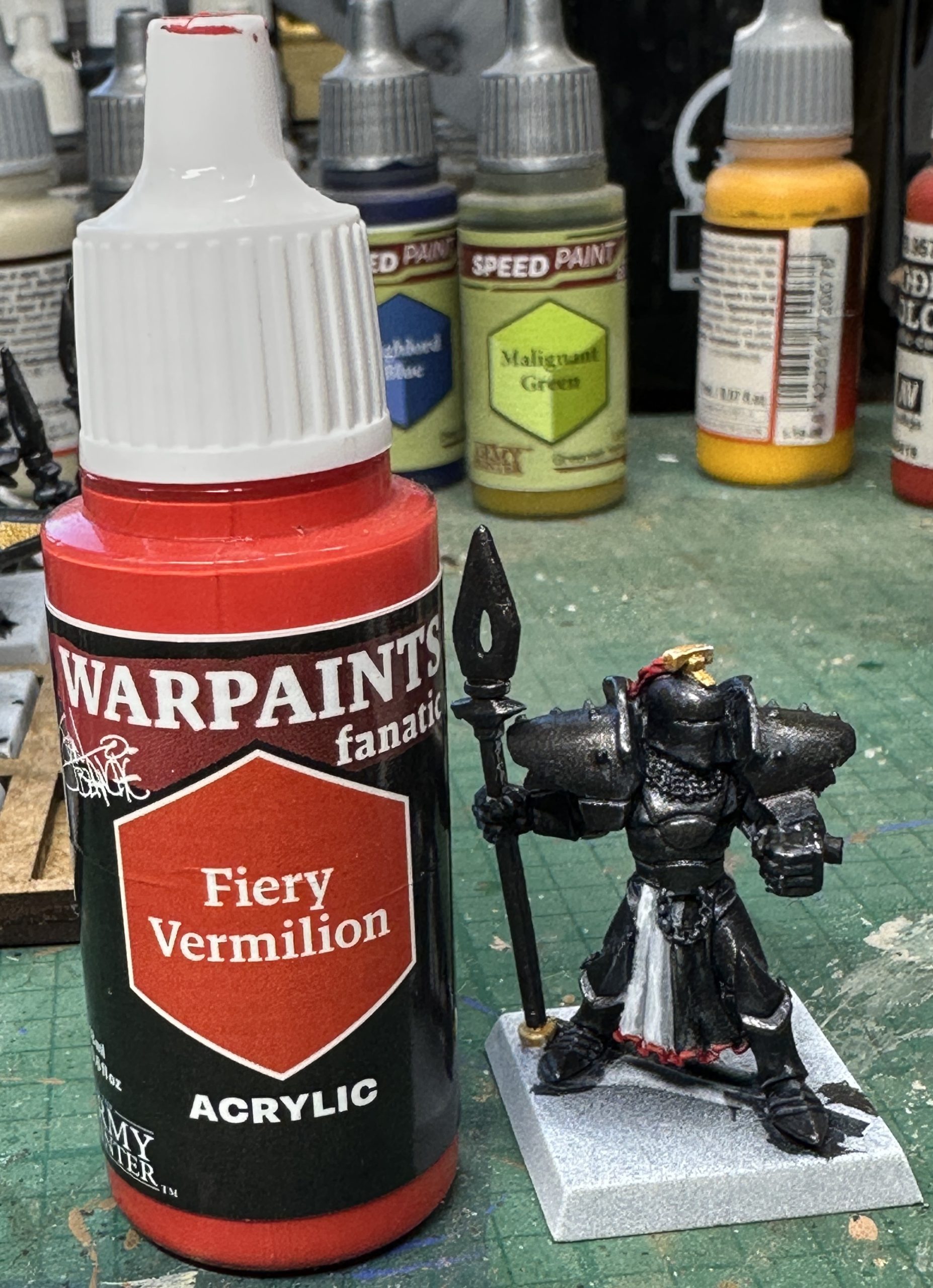
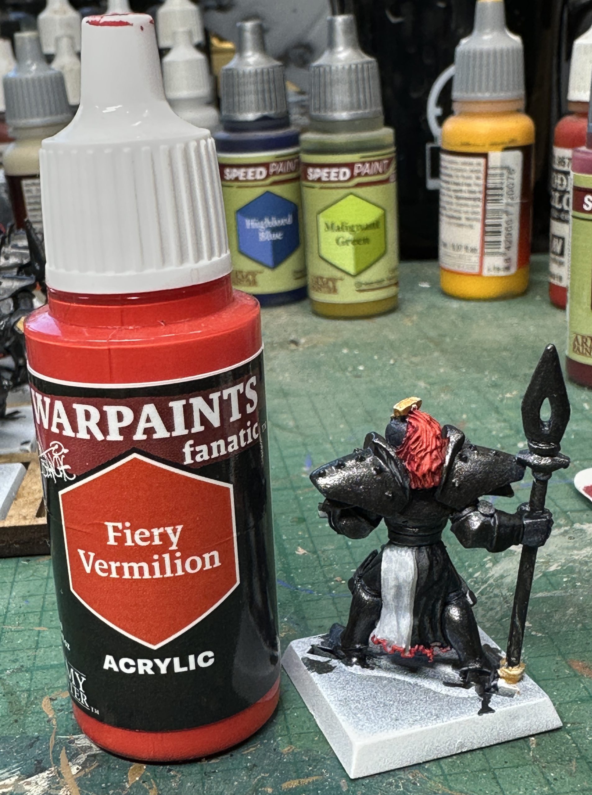
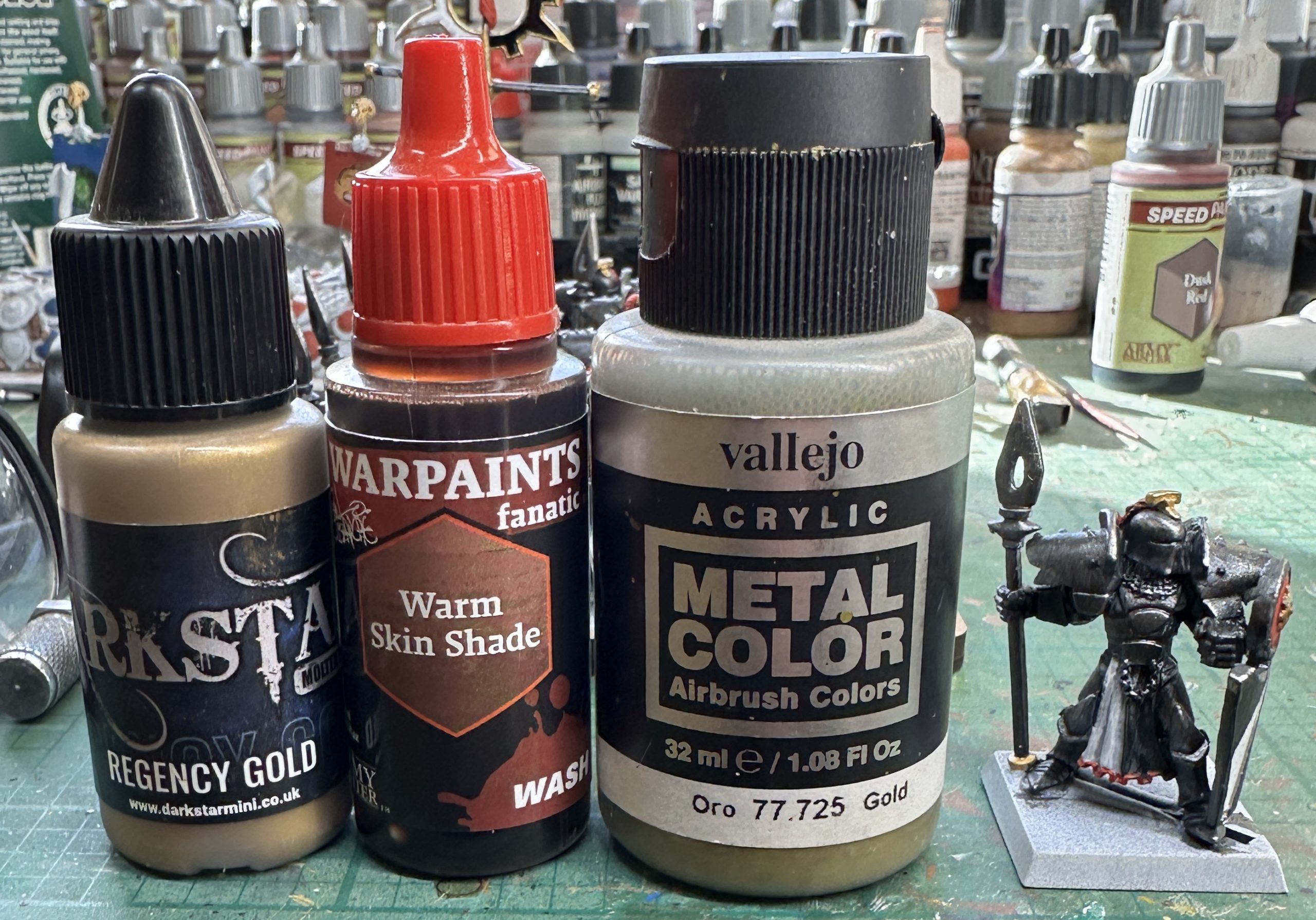
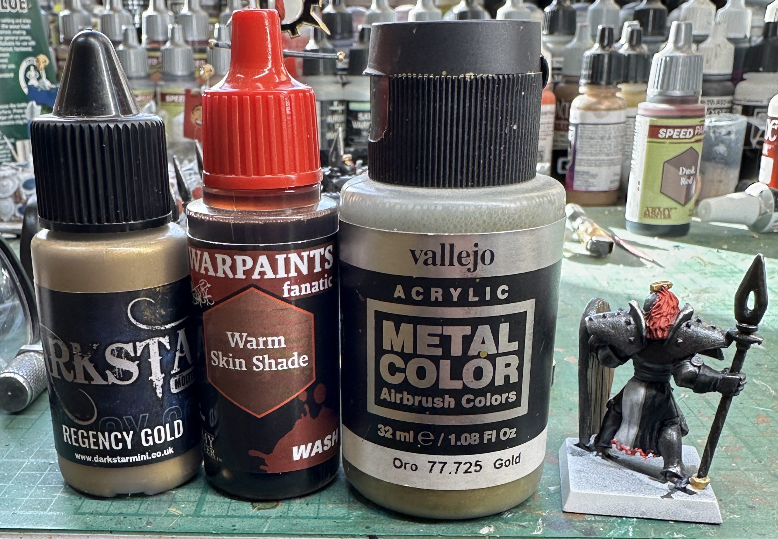
Finished. No basing and no banner yet. I’ve got to get the gubbins at Salute this weekend.
Shiny. Well a bit dour, but still a bit shiny 🙂
![Gripping Beast Announce They Are Closing Their Doors [Updated]](https://images.beastsofwar.com/2026/09/gripping-beast-announcement-cover-600-338.jpg)