


VLOG: Shiny New Site Upgrades & More!
January 21, 2015 by warzan


For some website features, you will need a FREE account and for some others, you will need to join the Cult of Games.
Or if you have already joined the Cult of Games Log in now
What difference will having a FREE account make?
Setting up a Free account with OnTableTop unlocks a load of additional features and content (see below). You can then get involved with our Tabletop Gaming community, we are very helpful and keen to hear what you have to say. So Join Us Now!
Free Account Includes
- Creating your own project blogs.
- Rating and reviewing games using our innovative system.
- Commenting and ability to upvote.
- Posting in the forums.
- Unlocking of Achivments and collectin hobby xp
- Ability to add places like clubs and stores to our gaming database.
- Follow games, recommend games, use wishlist and mark what games you own.
- You will be able to add friends to your account.
What's the Cult of Games?
Once you have made a free account you can support the community by joing the Cult of Games. Joining the Cult allows you to use even more parts of the site and access to extra content. Check out some of the extra features below.
Cult of Games Membership Includes
- Reduced ads, for a better browsing experience (feature can be turned on or off in your profile).
- Access to The Cult of Games XLBS Sunday Show.
- Extra hobby videos about painting, terrain building etc.
- Exclusive interviews with the best game designers etc.
- Behind the scenes studio VLogs.
- Access to our live stream archives.
- Early access to our event tickets.
- Access to the CoG Greenroom.
- Access to the CoG Chamber of Commerce.
- Access the CoG Bazarr Trading Forum.
- Create and Edit Records for Games, Companies and Professionals.
Supported by (Turn Off)
Supported by (Turn Off)
Supported by (Turn Off)


![Games Workshop Kick Off Grot Week For Warhammer 40,000 [Updated]](https://images.beastsofwar.com/2026/04/grot-new-40k-news-cover-600-338.jpg)

Hhhhhhmmmmmmm….
Hhhhhhmmmmmmm…. … Good!
Hhhhhhmmmmmmm…. … Bad!
or just… Hhhhhhmmmmmmm…. ?
Hhhhhhhmmmmmmmm……… …….. Good for sure.
I was thinking
Hhhhhhhhhmmmmmmmm……..Coffee!
I really love these Vlogs, guys. They make a great addition to the site and community.
Please keep ’em coming,
Bryan
Nice, fresh look on the new site = Good!
Personally I´m more interested in the videos rather than articles, but there´s a good mix I think.
-First thing to address; Justin’s beard face grew very quickly. (Rad) 🙂
-Second I am really happy with the web site changes. Great work on that team BoW.
-Thirdly, Lloyd deserved the coffee.
Loving it guys
looks good what I have seen.
I am an old man and I fear change, but the improvements get two thumbs up!
I am really pleased with what I have seen so far with the changes. Thumbs up guys. For the Vlog 🙂
I love these Vlogs, they make a great addition to the site .
Website is loking better every day, keep up the good job.
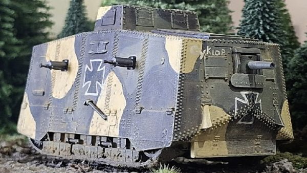
@warzan I guess you mean the wheeled resupply vehicle from Ghost Recon Advanced Warfighter 2, which was later replaced by the mortar-toting walker in Ghost Recon Future Soldier. Which I have never, ever managed to get working in co-op.
Bah!
Your prejudice towards abhumans is duly noted! You will be hearing from the RDL soon(Ratling Defamation League).
Lol
Glad to see you guys are working on the site layout and such. I’ve got a couple suggestions that hopefully you’ll consider.
My first suggestion is to move the log-in. Scrolling to the bottom of the frontstage page to log in to the backstage is really annoying. In my opinion, the login should be at the very top left of the navigation panel. Also, for some reason, even though I have it set to auto-log in, I’m finding that most of the time I have to log in manually anyway. Not sure if that’s browser specific, or code breaking, but moving the log in as I suggest will make that a lot less annoying.
My second suggestion is to slightly reduce the width of the article form factor. The reason for this is so that with Windows 7, you can margin snap your browser window to the left, and open another browser that is margin snapped to the right side. I do all of my browsing like this because you guys often have supporting links that I’ll click while watching a video or reading an article, with more information from the manufacturer, or another supporting article, website, etc. But it’s frustrating when the page format doesn’t auto scale to the width of the browser window, and the edges get cut off. If the article width was slightly smaller, it would easily fit, and I think there is enough white space in the current format that this could be accomplished.
Anyway, hopefully these are things you are thinking about, or find useful as feedback! Keep up the great work!
There is a login link at the very top left of the page 🙂
We are looking to make it more noticeable
We are also looking at some layout possibilities 🙂
So stay tuned 🙂
Huzzah. So there is a login link. I never see that link because I scroll down to read, then realize I’m not logged in… Speaks to browsing habits, and perhaps a bit of an overwhelming nav/bar. Thanks for listening!
I’m liking the changes and your reference to age made me smile. One of my tenets in life is Simple always works best.
Also looks better on my phone as well.
The Imperial Navy army is looking cool Warren, I love the Puppets War vehicles – got one of those APCs and one of their VTOLs for my warpath enforcers, so if you wind up dropping it from the army I’ll take it off your hands 😉 You might want to check out the Puppets War Dragonfly Mark II transport, it is a true beast of a flying machine and would make a kick ass Valkyrie!
Looking great guys. You’re really building that magazine feel.
Love these Vlogs and the updates to Backstage. Warren, nice Bed Head ;-). Justin, Man that beard is looking Epic, I’m jealous. I agree Lloyd deserves a coffee.
I have an issue when you say magazine style. For me the really tiny frame BoW are running in gives the text like 400px to live in. I would love to see BoW upgraded in width to acomodate more modern screen resolutions. Now it just feelst tiny in its 1024 resolution.
Fore me a magazine layout wold eliminate the left add column and be wider in text. To be honest I cant se a big difference beteween the normal layout and the magazine layout.
For me eliminating the left side to widen the text would make a huge difference because then the big aricles you have like “battle of the bugle” would be more condeced instead of being a mile long because you have a very small space for text in articles.
I work and different computers with different resolutions but I feel the width is too tight at the moment. I always felt your proper articles were anoying to read because of the tiny space giving it a less magazine style and more of a ‘piece in a gossip magainze’ feel. The narrow frame promotes tidbits rather than proper articles.
wow, that was a long post. Well, it got things of my chest. You are doing a wonderful job so just keep evolving and keep me satisfied!
Remember currently we have to take tablets and things into account (yes we know all about responsive design, but that’s easier said than done)
But we will evolve it as I think we’re on the same wavelength as you.
Is looking a lot better but it will be great if it will were a responsive layout, using more of the screen space, sometimes i tend to scroll-zoom the site in order to get a better view and i’m not using any kind of tablet.
No news about using AJAX/Backbone/Angular for posting comments and avoiding the entire reload of the site ?
It would be nice to be able to filter the hobby and painting videos by game, by category and technique that would be great. For example if you tagged Dust to Dust with weathering and then gave that same tag to some of John’s older tank god videos. Right now browsing through the archives of backstage is a bit of a chore unless you know exactly what you are looking for.
You are clicking the weathering tag that’s currently there yes?
FIrst, I’m loving the magazine layout for articles when I’m logged in to backstage, but like someone mentioned previously, it sometimes doesn’t stay logged in despite ticking the “remember me” box, so the layout shifts from time to time. Not major, but something to look into.
Second, Warren, if you’re going for a Navy/Rescue theme with this Militarum force, how cool would Valkyries done in coast guard colors (white/orange) look? Especially as a contrast to the dark blue armor/uniforms of other models in the force! And of course, the usual light ghost grey color of other navy vehicles. Keep at it man this needs to be a project that sees completion 😛
The site doesn’t actually log you out, it’s serving you up a cached page by mistake.
A refresh of Ctrl F5 will almost always resolve this.
Because of the high tragic levels we have to use ‘smart’ systems for reducing server load, unfortunately they can be ‘smart to the point if dumb’ some times !
Would that work the same on my phone? Because it always logs me out!
Great changes! I’ve read more articles in the past week,than total in the previous 2 years! You’ll see from my comments to follow that my main interaction with the site is the videos but written articles have become more accessible for me with the he design.
New pages seem much faster to load and scroll on my iPad.
The sidebar and other improvements look to make the whole site more usable to me.
At some point once most of improvements are done you might consider a short video on how to “use” the site in some common use conditions like “check all the news”, “check for new videos”, “call up playlist of all videos in given series”, “dig into a game, get all articles & videos about that game” etc
Site and videos continue to improve more and more. All the presenters do great jobs!
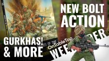
You’re spot lighting of Bolt action has me nearly ready to jump into it. Justin’s enthusiasim for WIld West Exodus has me looking seriously considering that as well.
Keep up the great work!
New magazine layout is a better way to browse the site.
I like the new design of recent topics from forum .
Can you make button/link for login/logout more visible?
Loving the new regular vlogs, nice changes to the website, definitely improved the look.
@warzan – Completely with you on the ogryns and ratlings, I love my guard army but there’s no way in hell those subhumans are going in it! lol
On the buttons for your forum links, one of them is spelt wrong. Pulp, punk, horror and “WIRED” should be “WEIRD”.
I’m with you on that abhuman rejection thing, @warzan. 😉
I have an all human and machine Imperial Guard army (army log in the imperial guard forums, if you’re interested) and I have no intention of adding sub-species to it… For the ratling, I was thinking of kid snipers (excuse my dark sense of humour). That would explain the lower physical stats…
i really appreciate all the changes. If i may, something i’d personally like to get back is the filtering options inside the hubs… for example it was possible to select hordes from the menu and then filter the content by displaying either gaming tutorials, painting tutorials, unboxing… that’d be nice. But i guess behind the removal there must have been a reason…
We are working on something like that, but the tags have to be right.
But slicker navigation is definitely on the cards
Ah another thing i’d like.. a list of all currently active mini related kick-starters. Maybe in the side column as a filter I don’t know. But with all of the kick-starters ongoing and the ones in the pipeline i always tend to miss the starting date…
Love the Thin Lizzy compilation on the desk, not so sure about the sentinel model.
It’s good to see the site evolving towards the future of web design and interconnectivity. There are some sites out there, which were great community hubs, but dried out, when they didn’t evolve with the technology and everything was looking old.
Use it as a CRASSUS ARMOURED ASSAULT TRANSPORT (FW) with some rule swaps 🙂
Cool changes to the side. For me ad’s were never a problem, because they rely on our beloved hobby. So I never turned them of. But those magazine style bigger pictures look just ace. The actual, mostly black is a little bit to dark for my personal liking.
I like the ch-ch-ch-changes! 😀
I also like how my username looks in that weathered typeface; very militaristic for Arnie’s name in Predator. It’s as if you did it just for me, lol. 😛
That direct feed from facebook is very cool.
There’s a typo on the Pulp etc label, reading “WIRED” instead of WEIRD. 😛
Now add a text editor to the comments. 😛
“There’s a typo on the Pulp etc label, reading “WIRED” instead of WEIRD” fixed thanks for the spot @majordutch
great stuff
Guys, i’m loving these regular “behind the scenes” VLOGS.
Website changes are looking very sharp
and Justin suits a beard
Thin Lizzy and black Coffee the power behind all website development.
Good work lads it looks and you’re ready for the move to mobile,
Keep on Truckin
Just stumbled on this; great stuff these vlogs! I’m also looking forward to the Bolt Action show, as I’ve dipped my toes in to that great game (and some Hail Caesar miniatures from Warlord as well). Keep up the great work!
Bravo