Google Analytics is a powerful tool that tracks and analyzes website traffic for informed marketing decisions.
Service URL: policies.google.com (opens in a new window)
_gat
Used to monitor number of Google Analytics server requests when using Google Tag Manager
1 minute
_gid
ID used to identify users for 24 hours after last activity
24 hours
_ga_
ID used to identify users
2 years
_gali
Used by Google Analytics to determine which links on a page are being clicked
30 seconds
_ga
ID used to identify users
2 years
__utmx
Used to determine whether a user is included in an A / B or Multivariate test.
18 months
__utmv
Contains custom information set by the web developer via the _setCustomVar method in Google Analytics. This cookie is updated every time new data is sent to the Google Analytics server.
2 years after last activity
__utmz
Contains information about the traffic source or campaign that directed user to the website. The cookie is set when the GA.js javascript is loaded and updated when data is sent to the Google Anaytics server
6 months after last activity
__utmc
Used only with old Urchin versions of Google Analytics and not with GA.js. Was used to distinguish between new sessions and visits at the end of a session.
End of session (browser)
__utmb
Used to distinguish new sessions and visits. This cookie is set when the GA.js javascript library is loaded and there is no existing __utmb cookie. The cookie is updated every time data is sent to the Google Analytics server.
30 minutes after last activity
__utmt
Used to monitor number of Google Analytics server requests
10 minutes
__utma
ID used to identify users and sessions
2 years after last activity
_gac_
Contains information related to marketing campaigns of the user. These are shared with Google AdWords / Google Ads when the Google Ads and Google Analytics accounts are linked together.
90 days







![Gripping Beast Announce They Are Closing Their Doors [Updated]](https://images.beastsofwar.com/2026/09/gripping-beast-announcement-cover-600-338.jpg)

Looks like a nicely painted army.
This is a great example of a 2 color up army that was rushed for table top – what these guys are calling ‘Basic Table Top’. Its pretty good given that the criteria is Table Top Ready. Since I am bored at work I will run down my own comments.
You can see straight off that its pretty much 1 base coat in a dark shade, and 1 primary color coat in the main shade, with no real highlighting, and certainly no specular highlighting or deep shadow work. The best example is right off the top, on the loinclothes. Also, you can tell that they base painted each model (deep color) and let the paint dry before they applied the primary color – because there is no real blending. Depth of color id achieved primarily by washes. You really see the lack of depth of color in the shoulder pads.
With regard to the power weapon blades – airbrushed obviously. But for my money, the best quick and dirty design for the power weapons is a reverse blend on the flat, contrasted with a standard blend. What I mean is, on the flat of the blade (the back portion) – the color blends from dark to light moving from the top of the blade down, while on the edge of the blade, the color blends from dark to light moving from the bottom of the blade up. It.s a fast and effective technique which you can see demo’d on other videos on youtube. Basically it means you paint the blades twice, and you have to do some tape work, which does require more time.
Grey Knights have that great raised lettering, and It’s a shame they didn’t make that pop more, with a deeper base color, and true silver/ gold highlighting on the raised sections. I think a quick drybrush on them would have been worth the extra effort.
The standard is good but not great, and if you are going to put some extra time in, you should put it there. Surprised that it is essentially blank. I can see how they would not want to go with metalics on the banner, but the lack of bright highlights really flattens out the images. The deamon really needs a lot more shading and contrast in order to stand out from the flat red of the cloth of the banner.
On the Draigo purple power sword – this is a great example of the dilemma of uniformity over individual specialization. By making the sword purple, you certainly make Draigo stand out, but you break uniformity. Does that go with the fluff? Does the break in uniformity benefit the look army overall? I always struggle with this decision. In this case, I think the purple sword is so subtle a change that its not too noticeable, which leads me to ask, does do enough to call out Draigo as a character model, or does is just distract. Draigo has enough character sculpt that perhaps a change in palette is redundant.
The purifiers do look good. First time I have seen the white on silver. If you know heraldry, you know white and silver are essentially the same color – considered non contrast, and usually don’t go all that well together, they tend to mute each other, but i think in this case the blue tint on the silver armor creates enough contrast to make it work. Not sure if I like the bright red of the cloaks and banners contrasted with the deep red / maroon of the guns. Probably just a matter of taste, but I don’t think the contrast adds to the scheme, and tends to muddy it up visually. I probably would have gone with a red similar to the color of the guns, but just highlighted it up a bit more to allow for variation of texture between cloth and metal.
On the glowing eyes, I think this is an interesting technique, but not necessarily to my taste. I do think that the edge line of the eye shade / lens still need strong shadow definition, which people tend to leave off when the do the glowing eyes. This is what I see here. Personally, I think the effect works best when the dark edge of the lens is truly dark . shadowed, and the glowing color reflects only off the raised portion of armor around the eye. A really challenging effect to do for a Table Top ready army, because you need the time to do it right. Since this is commission, the time just isn’t there to do it really well, so you get what you get here, something close, but not quite there.
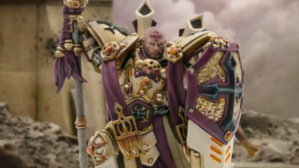
For the Inquisitor and the priest – excellent job on the scalp stubble. I struggle with getting just the right blend of gray and flesh / skin tone. Not sure I agree with the choice of white as the highlight color for the inquisitors iconography (knee pads and belt buckle). I think because they highlighted the model with silver edgework, the white just doesn’t pop. Maybe its just the lack of shading. They went with grey as the deep shade. I wonder if brown as the deep shade for the white would have made it work better. Also, since the loincloth is white as well, youv’e now introduced white, on white, on silver (highlighting). Classic heraldry technique would say this is unacceptable / not a good color selection because you have no primary color contrast. You can sort of see this – the white bits just get washed out. Overall, a well painted model, but I think the color choices are just a bit off. The priest is just excellent. Just a bit more contrast, deeper reds at the deepest folds, and some true specular highlighting, and he would be complete. (But again, this is not really the painters fault, just not part of the scope of the commissioned work.) Personally, since this guy is such a psycho, I would have chosen to leave some dried blood on the blades of the chainsword to really bring out this guys lust for battle, and maybe a few spatters on his clothes. Tricky to do without really throwing off uniformity, (back to the character dilemma) but this guy seems pretty much on the edge of sanity, so it seems to fit. I like models that tell a story so…
I was a bit surprised to see the introduction of green as a standard color on the psychers. This goes back to the uniformity or variation for the sake of character issue. Obviously you want to visually call out your psychers, but do you do it by adding an irregular color which can throw off the whole scheme? A trick I like to do to call out characters but keep the army uniform is to reverse the scheme, but not the colors. This is what the painter has done for the Priest, and it works well. I would have carried this scheme over to the psychers – Deep red robes with white belt scarfs, and white pants. He didn’t talk about it, but he also introduced a blue color for 2 of the assassins. Since these models act independently from the main army I guess the variation in color is acceptable, but I probably would have gone with a black and red scheme – what he used for the death cult assassins, rather than introduce the new color.
You really see the speed painting impact on the vehicles. They do look pretty flat. Not much shading on the armor. Another element that is a matter of taste is rivet / bolt shading. Personally I like to see deliberate shadow work around the bolts and rivets. But to do this well you either need to base color the rivets and highlight them individually (preferred but time consuming) or you need to individually wash each rivet (faster but not as strong of a contrast). This may be a minor point, but it goes reinforce the dilema of table top ready and full 3 colors with shadow and specular highlighting. You also see what I think is one of the challenges of the overall color scheme. Metalic silver vehicles, I think, end up looking very dull and flat when compared to vehicles pained with a color. Perhaps if they would have shaded the model with the blue wash applied to the Grey Knights, it would add some interesting depth. Otherwise, its just flat. Maybe reverse the scheme, and use deep red on most of the model, highlighting with silver? Its a tough problem for Grey Knight vehicles.
Interceptor backpacks. Barf. Not the painters fault, but those things are just stupid.
Dreadknights: That little extra heraldry really helps the model stand out, but doesn’t violate the scheme. Well done. And the model has enough detail, that the silver does not become flat, because the blue wash has enough raised area to be applied to so that visually it stand out. I might have actually carried that heraldry on to the left shin guards of the dreadknight drivers – thematically color consistent, but adding just that extra bit of character. They were probably pushed for time, but there is one unforgivable sin on the second dreadknight – flash or join lines on the arms. I think the glowing eye effect on the second dreadknight is just a bit overdone.
I think that for both the Raider and the Chimera I would have gone with a stronger contrast on the caterpillar belts, probably deep black with dark grey highlights, to try to give the model a bit more contrast. This is of course a matter of taste. There is a lingering subtlety to the dark silver of the belt against the bright silver of the chassis, but I think that from a table top view, this will be lost, so I would go with enhancing the visual impact by adding more contrast. Once again you have the flattening effect of all that silver on the Raider, but there are enough details so that its not quite as severe as it is with the Chimera. There is also a more use of the deep red on the Land Raider, which I think works better.
All in all, a great 2 color up army. To do it true justice – and give it a really fair review, I think it would be helpful to know 2 key things – 1 the army list, and 2 – the time allowed for painting the army. I have personally painted 2 commission armies for tournament players, and this standard – the 2 colors with some wash work and some extra attention to characters, is usually more than what they want / expect, and in general will look better than 90% of the armies at any tourney. I’m also not a fast painter, so I have to give these guys a lot of credit. I think this would be an army any tourney player would be proud to show off. Of course, he would have to be honest about the fact that its commission work, but in my experience, the hobbyist who is both an great field general, and a great painter, is a rare bird indeed.