


Hellboy (an old Spring Clean Challenge)


Recommendations: 1525
About the Project
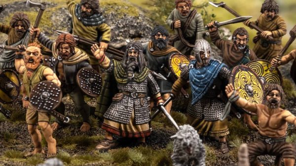
Clearing the Flames of War debris from my desk I realise I have a chance to get on board the Spring Cleaning Challenge. Looking at my choices I realize that pretty much everything I have to choose from is spring cleaning My choices being : Blood Rage, Conan, Mythic Battles Pantheon, Zombicide Black Plague and Green Horde, Joan of Arc, Dust 1947, and a couple of expansions for Imperial Assault, Hell boy, There's a few moere in storage but they probably wont come out till Xmas and are looking like candidates for next years spring clean. As Hellboy was pretty much the last thing I got to play with my mates before social distancing its Kind of a no brainer
Related Game: Hellboy: The Board Game
Related Company: Mantic Games
Related Genre: Horror
Related Contest: Spring Clean Hobby Challenge (Old)
This Project is Active
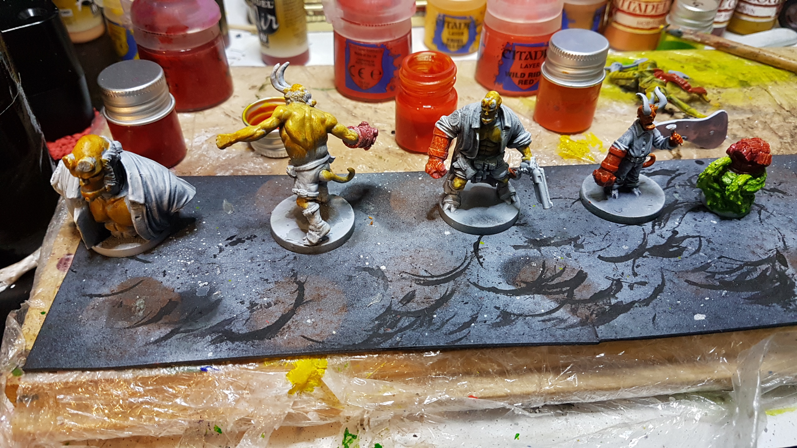
Base glazing
So the BRD members rely on a similar colour palette so sticking to my idea of seeing how much under sketch I can utilise , instead of just using as reference and painting over, I am building up my colour as I go.
I’m realy enjoying this method, it feels relatively quick, and allows for lots of colour variation and gives good shading control.
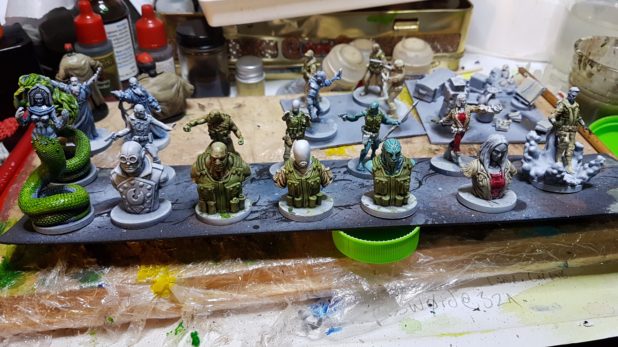
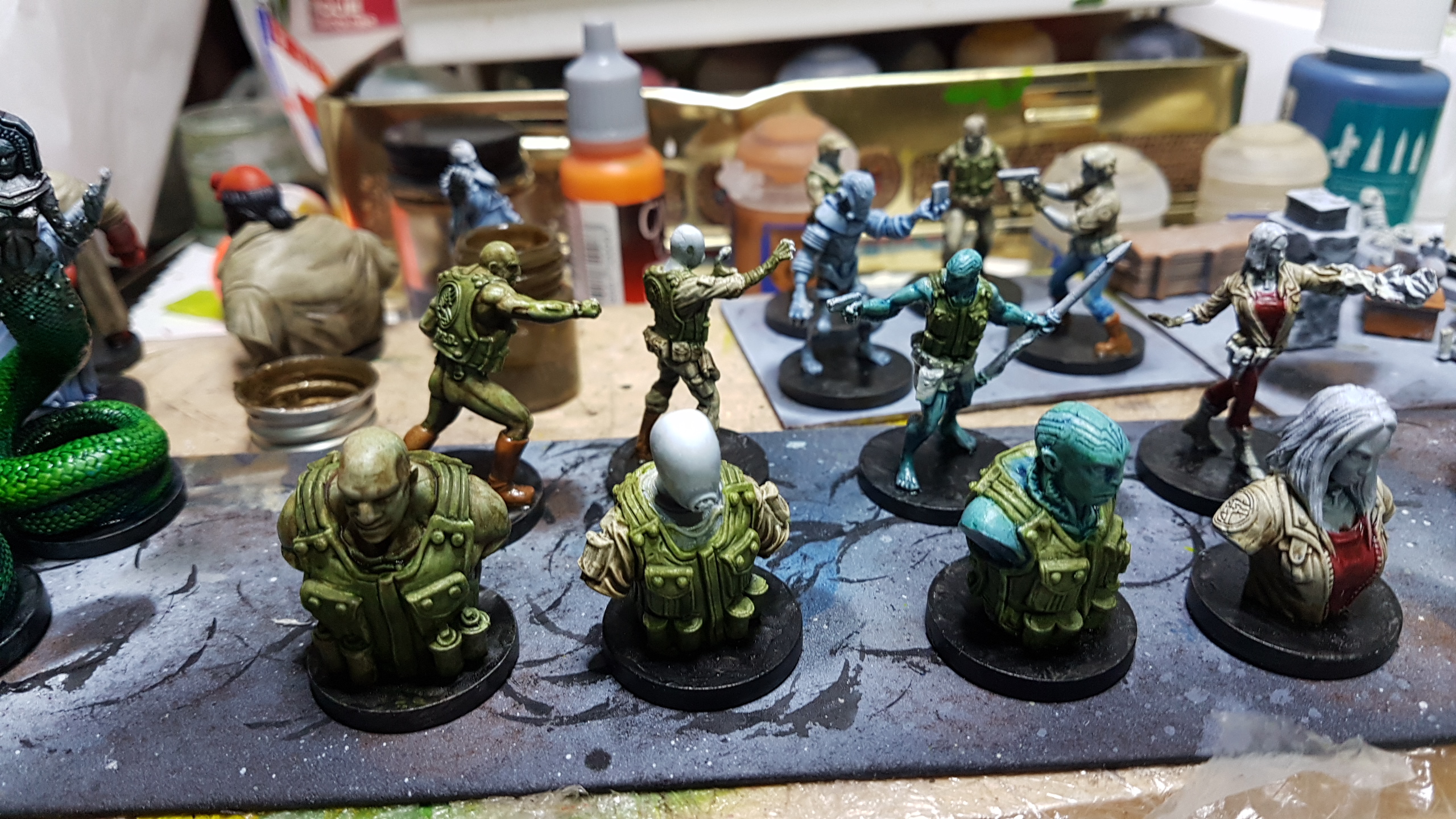
The images bellow are to show the progress this week. None in this set are what I’d call complete yet.
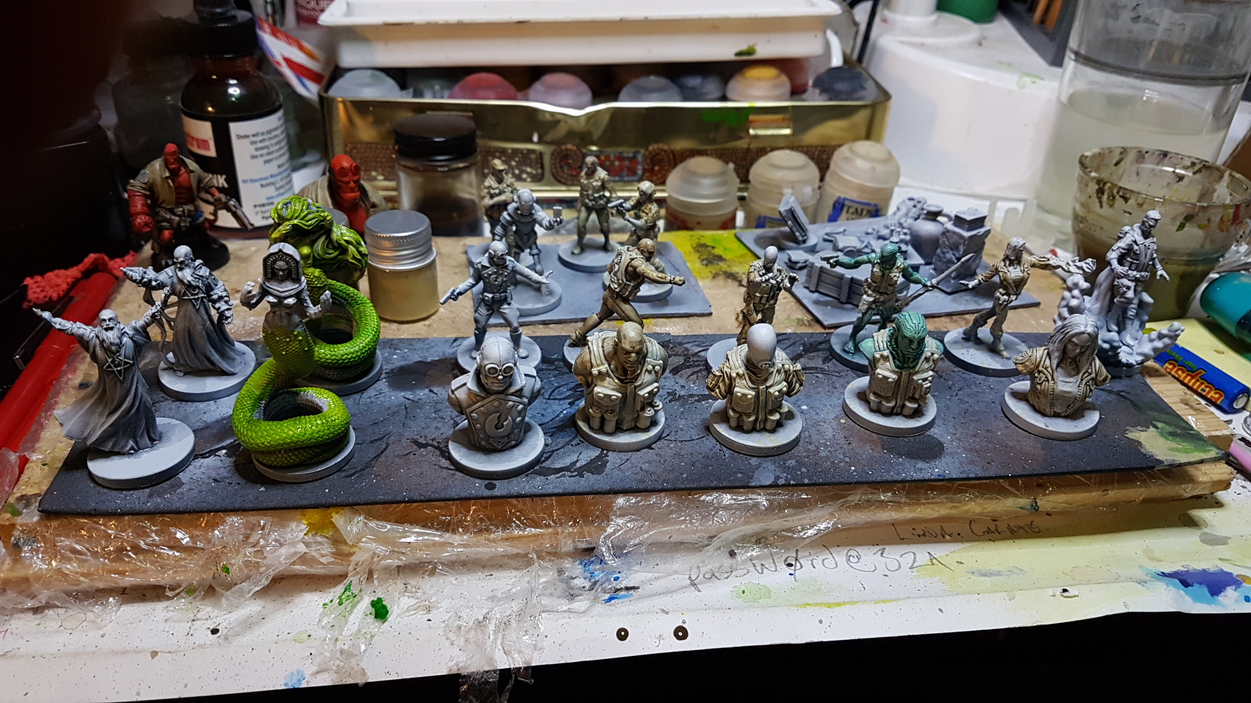


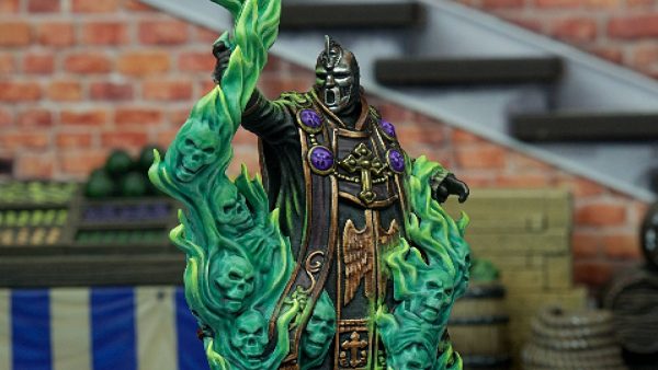
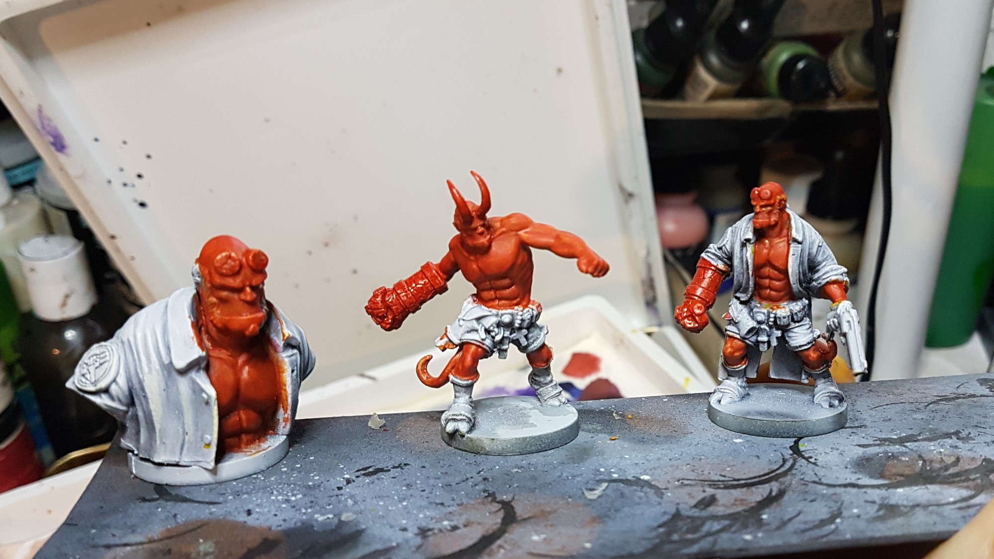
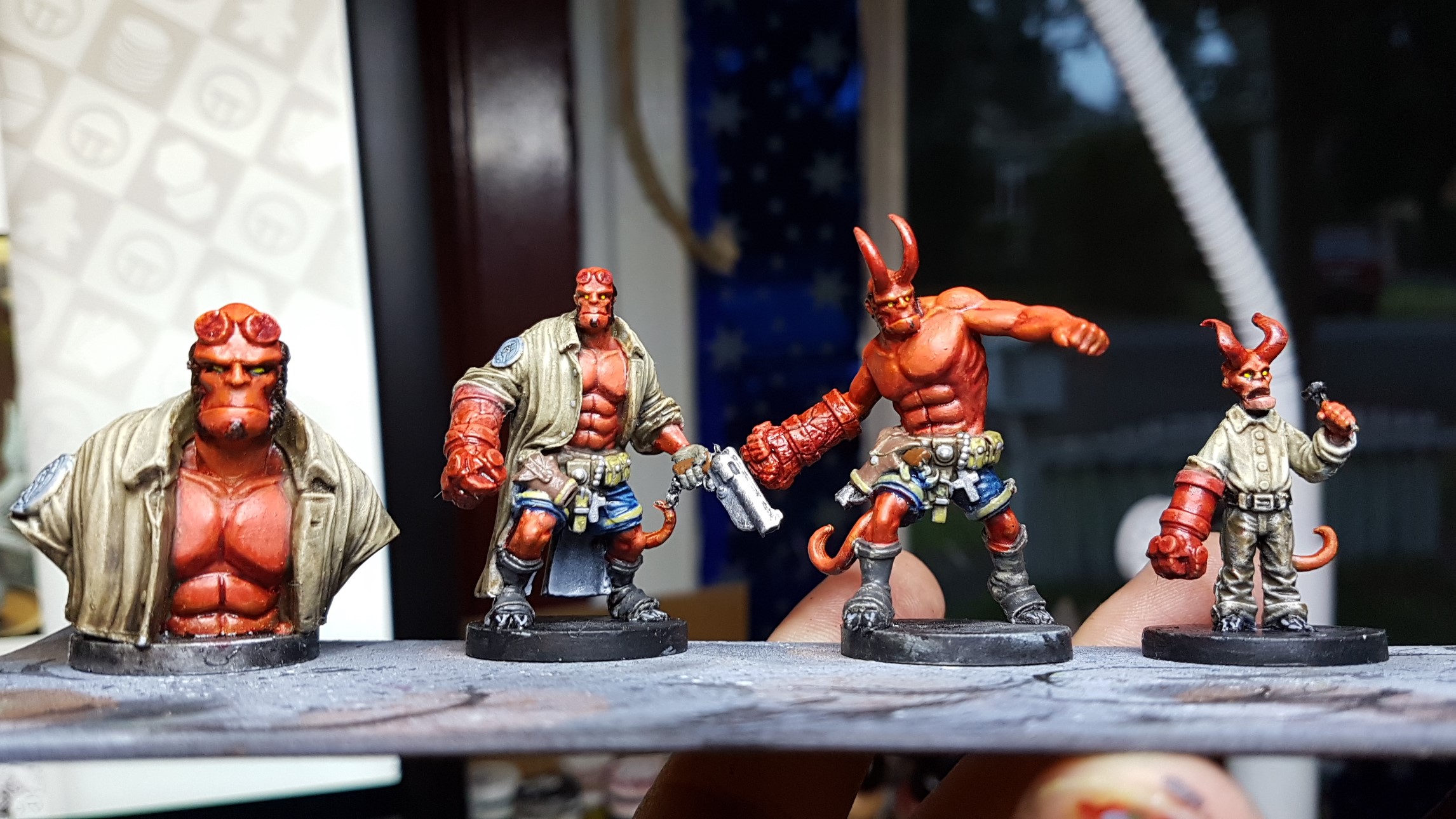
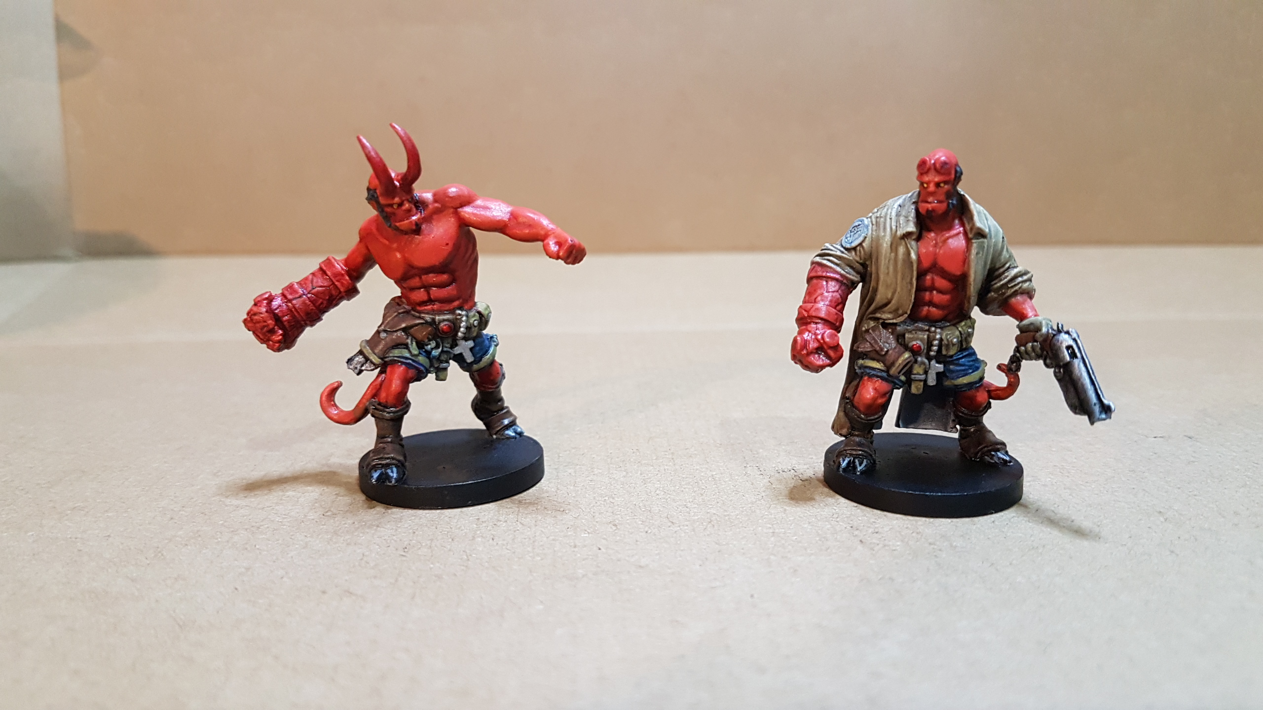
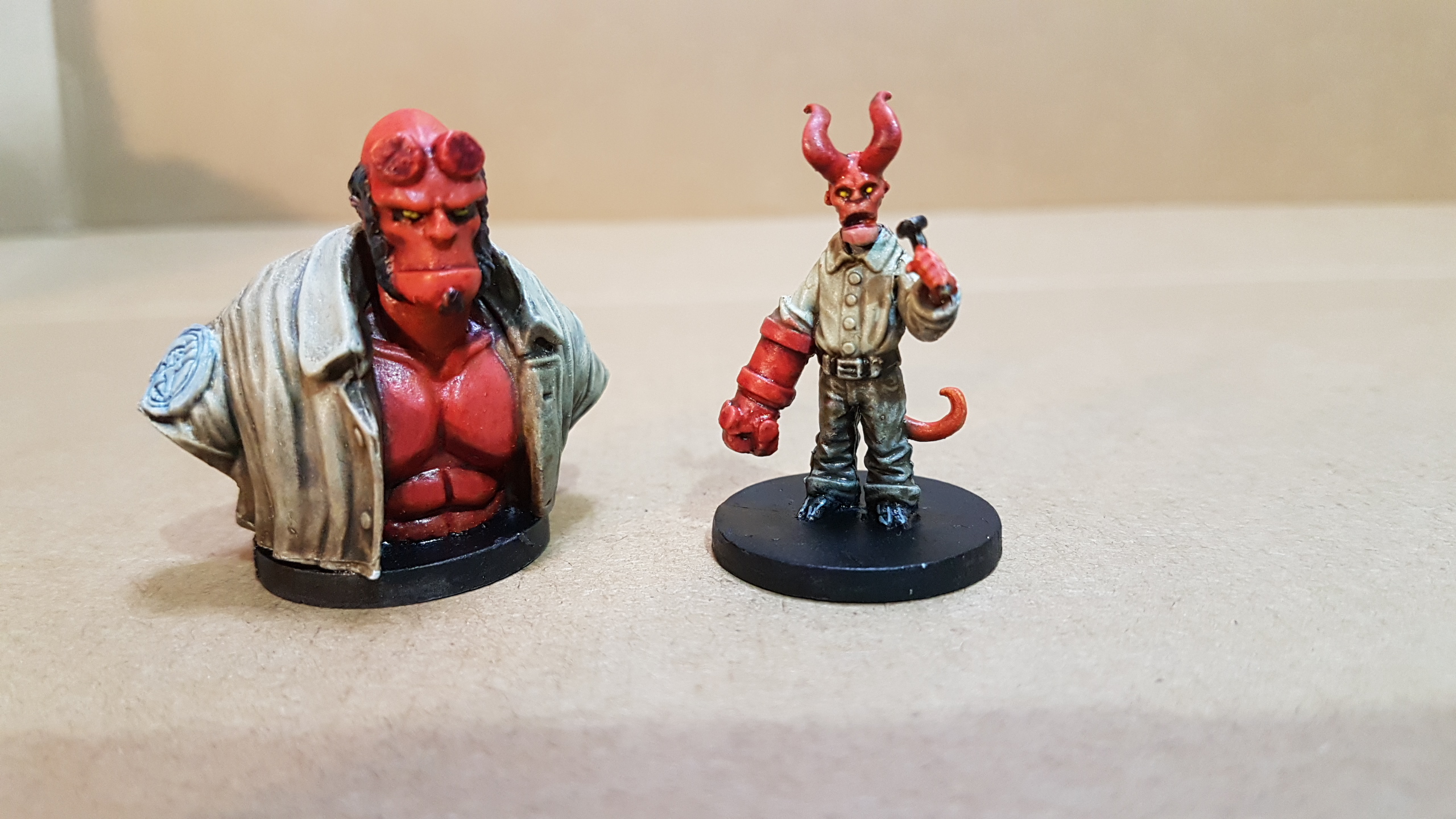
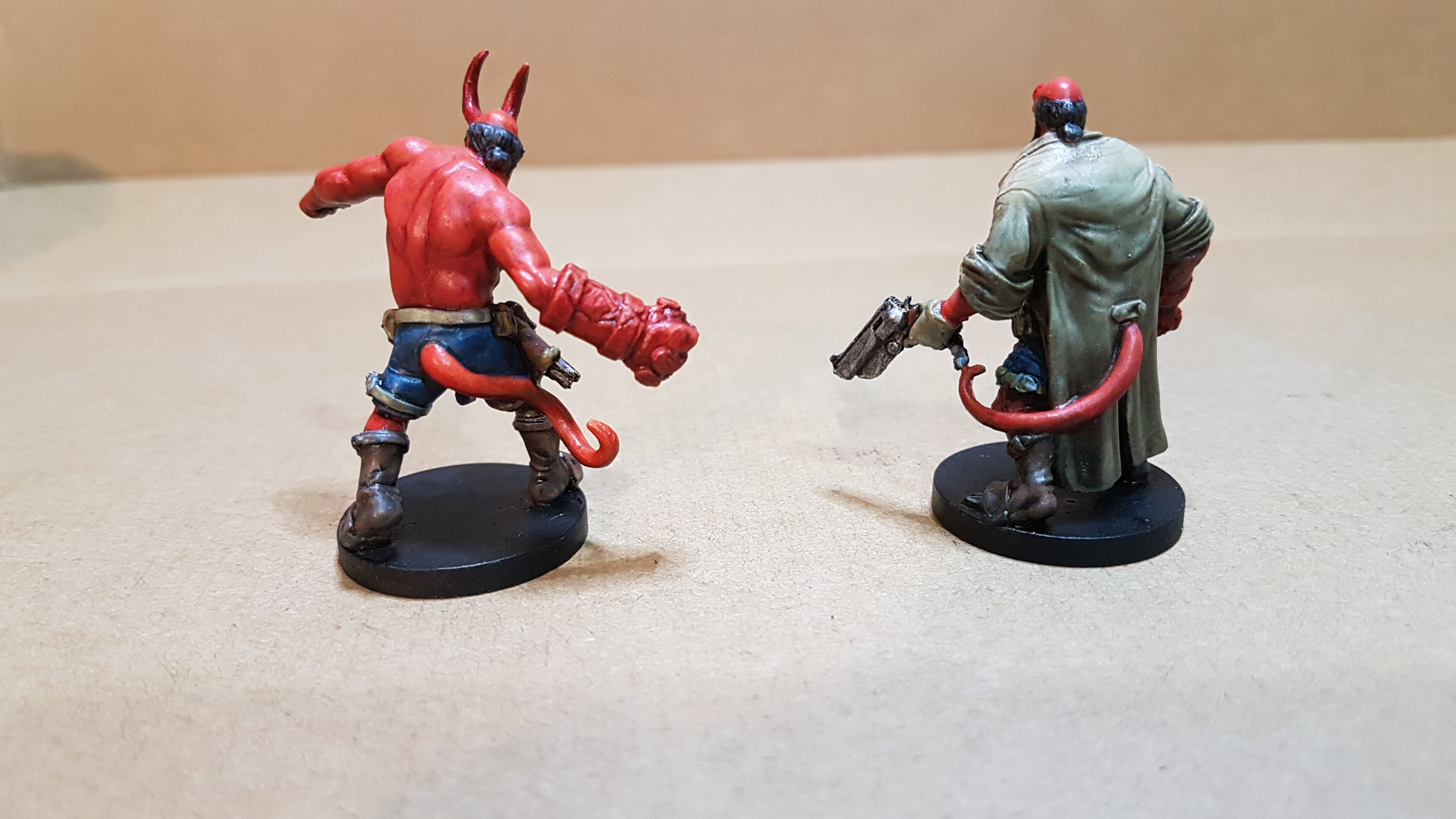
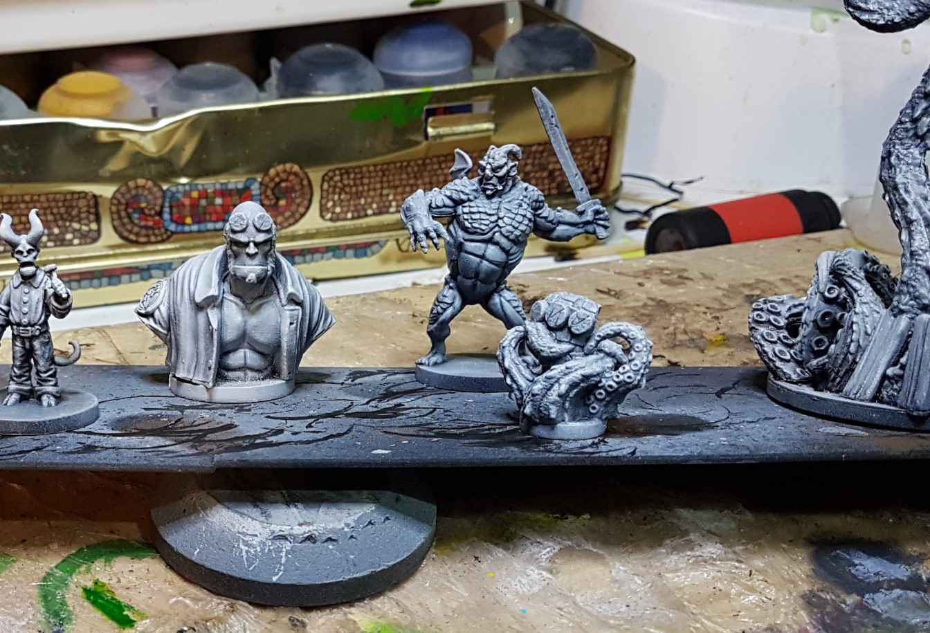
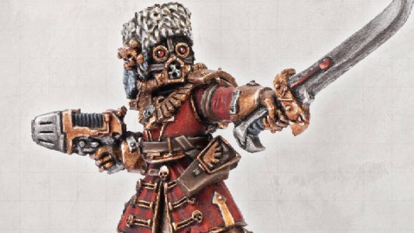
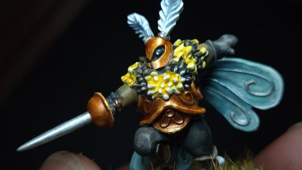
HELLBOY
So I tried to maintain my current methodology and use glazes, and washes and build up to my desired effect but found 2 general issues.
- Glazing red to get the specific shades of red I wanted wasn’t as straight forward as I wanted. Hellboy is a very solid red but as glazing up to an effect generally relies on you starting with a white or light colour, glazing red on white left areas that were too pale. I had created a few glazes from red/orange up to a dark red to see how it changed as I went through each layer. In the end I found my mixes weren’t providing as consistent a finish as I wanted so resorted to using some thinned down citadel , Wild Rider, and Evil Suns Scarlet and used my home made mixes to tint or glaze as required.
- Glazing and washing over larger smooth areas is a bitch. Yeah it’s an obvious one, though its not normally an issue with most standard figures up to 32mm it did play havoc with the scaled up bust. So his great coat required a bit of back and forth but I got there in the end.

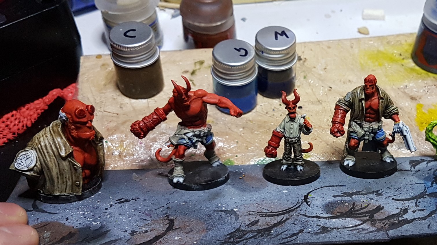
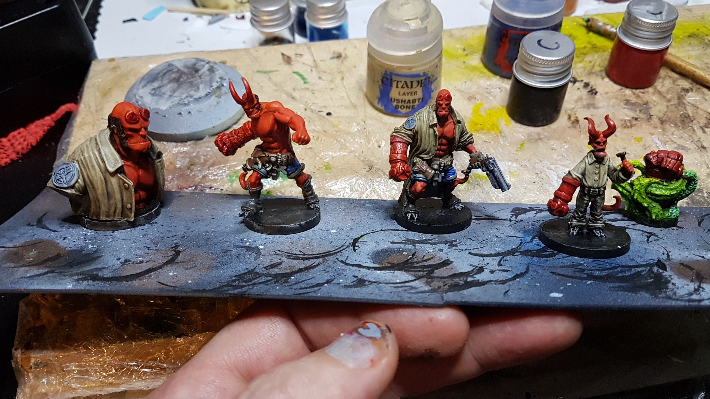
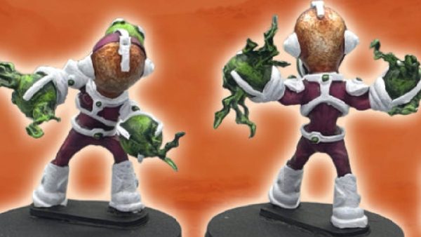
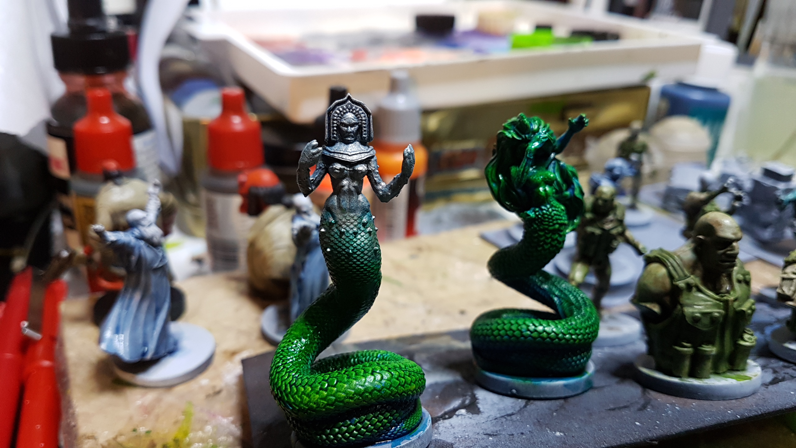
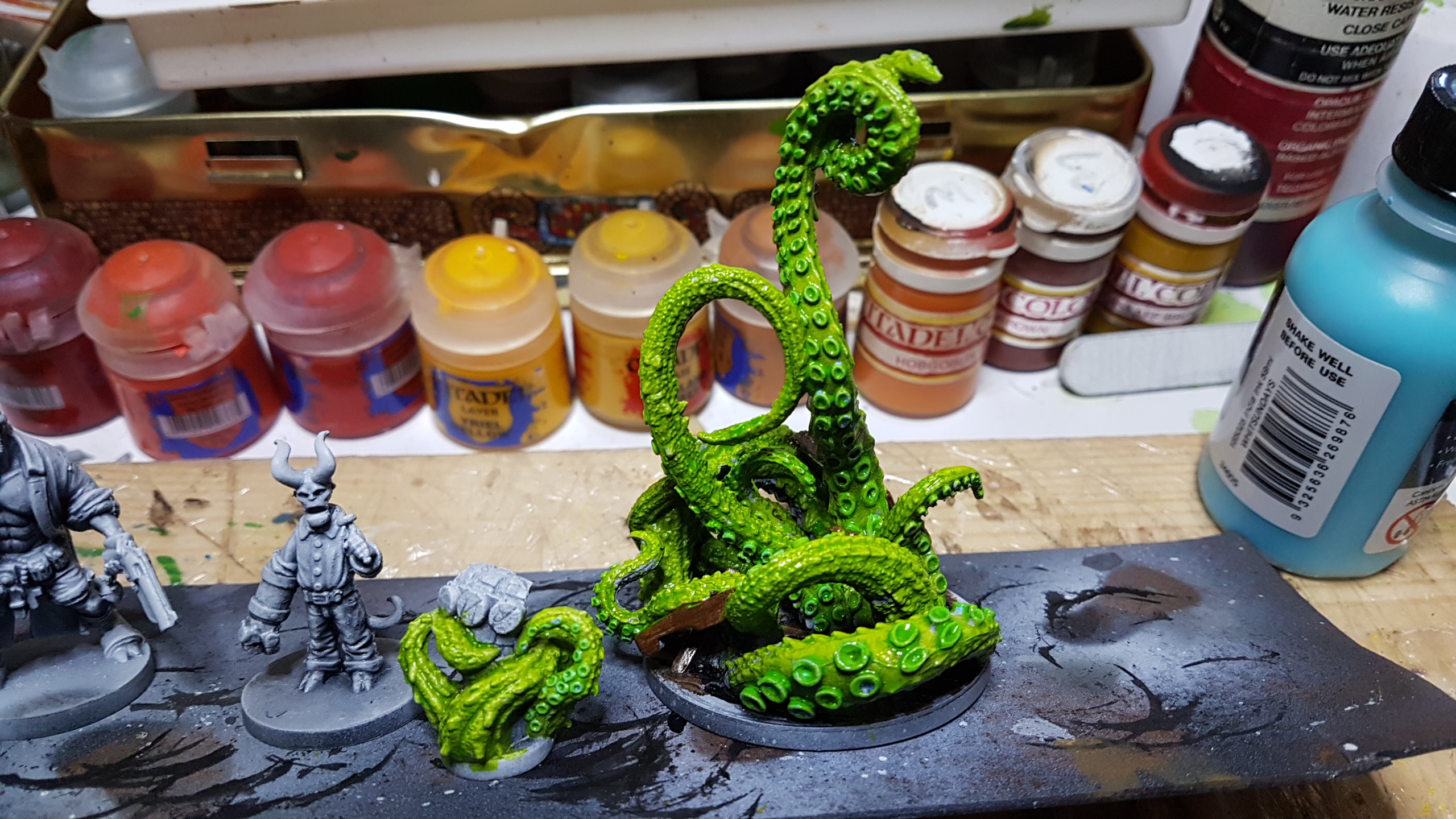
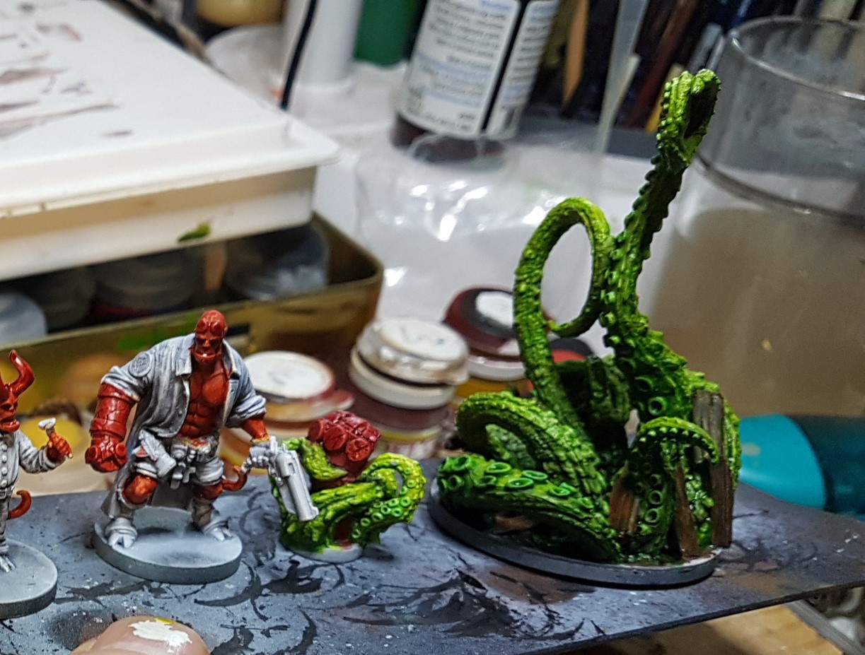
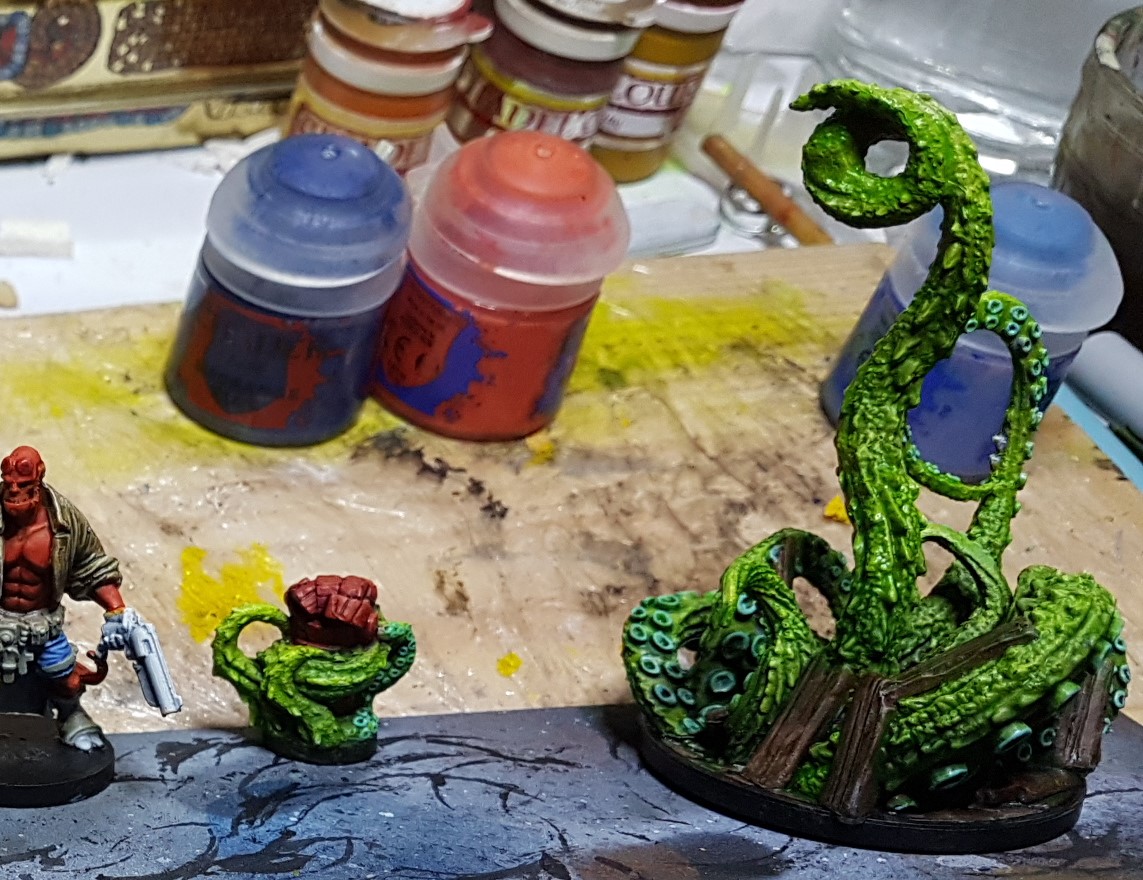
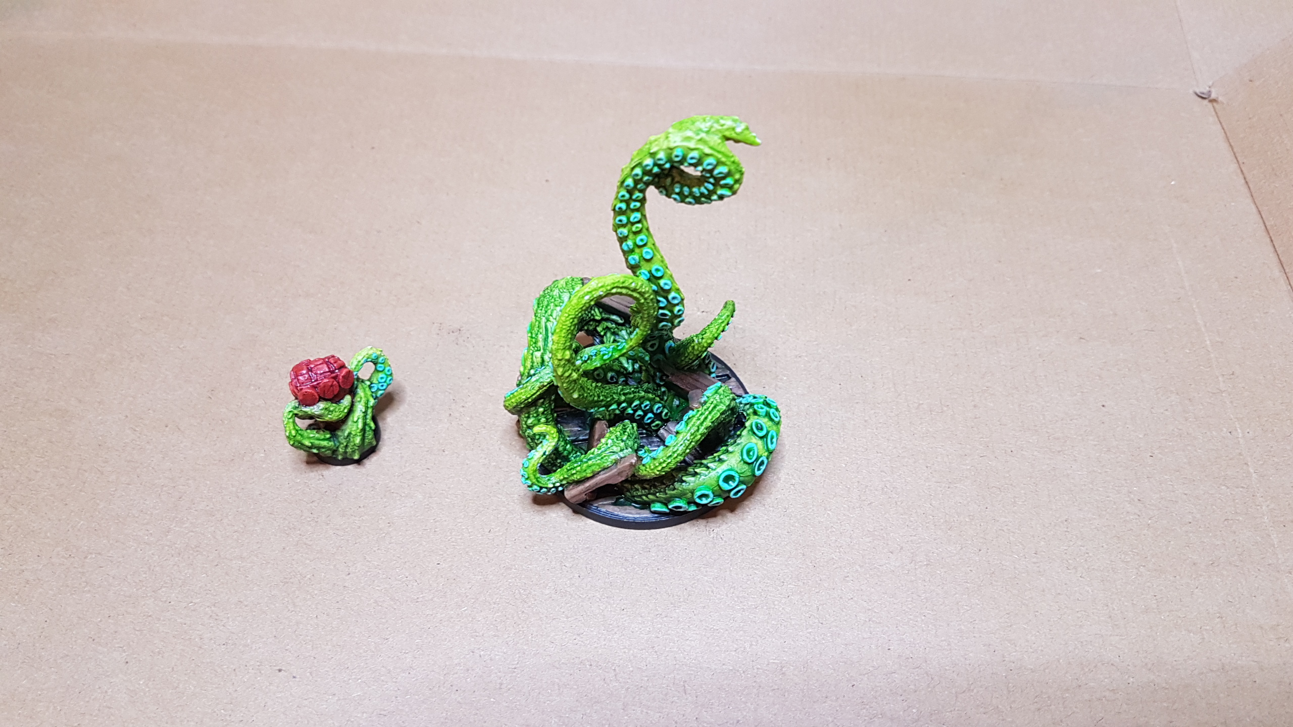
Tentacle Monster and Right Hand of Doom
Tentacles were a base coat of my home made lime green contrast/glaze followed by a darker green contrast/wash then a bit of extra Army Painter Military Shader near the bottom to accentuate the shading further.
I had experimented with painting the suckers first but that was soon erased so done again towards the end. The timber pieces were painted a dark brown before at the start then a lighter tone was used where the timber was obviously visible before a little black wash top restore details.
The right hand of Doom was done same alongside

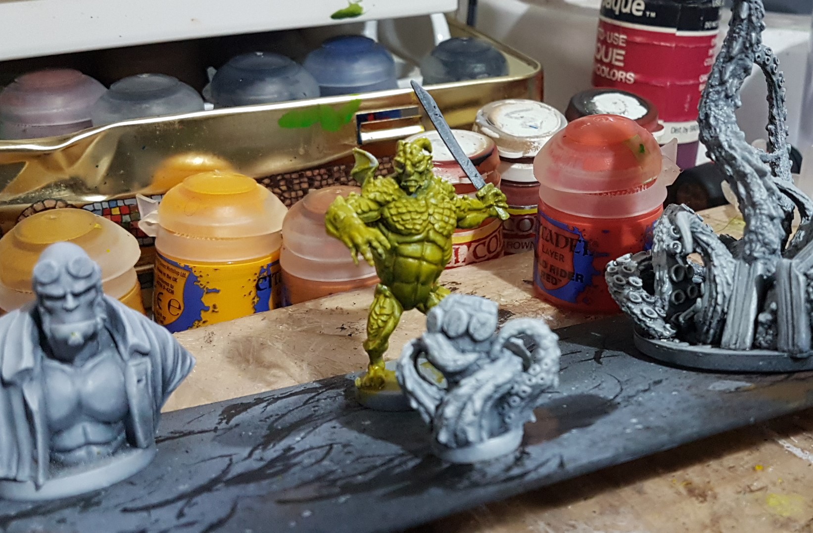
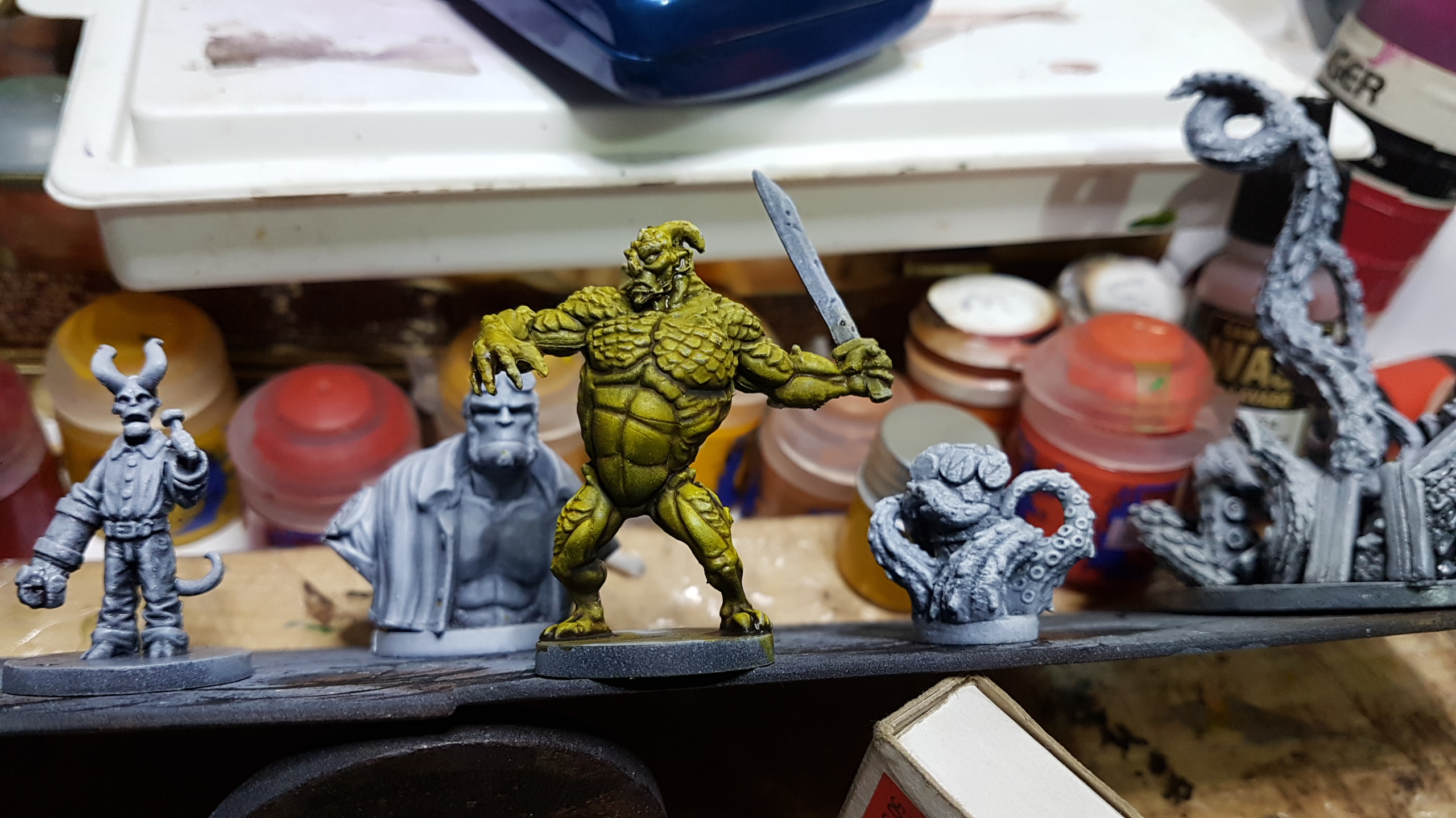
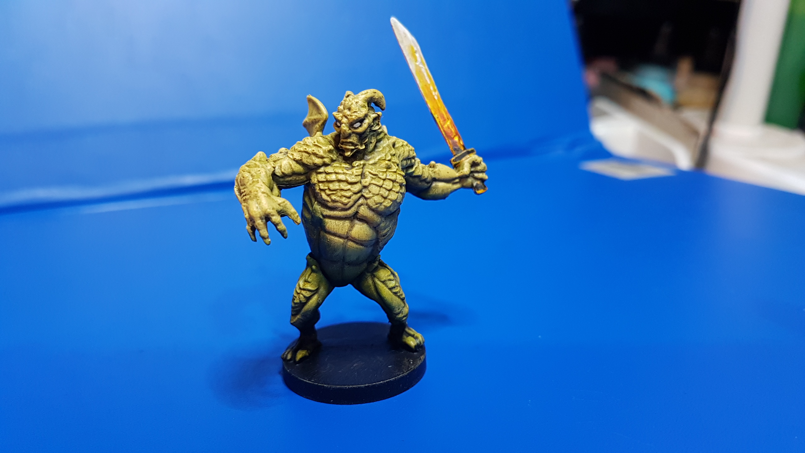
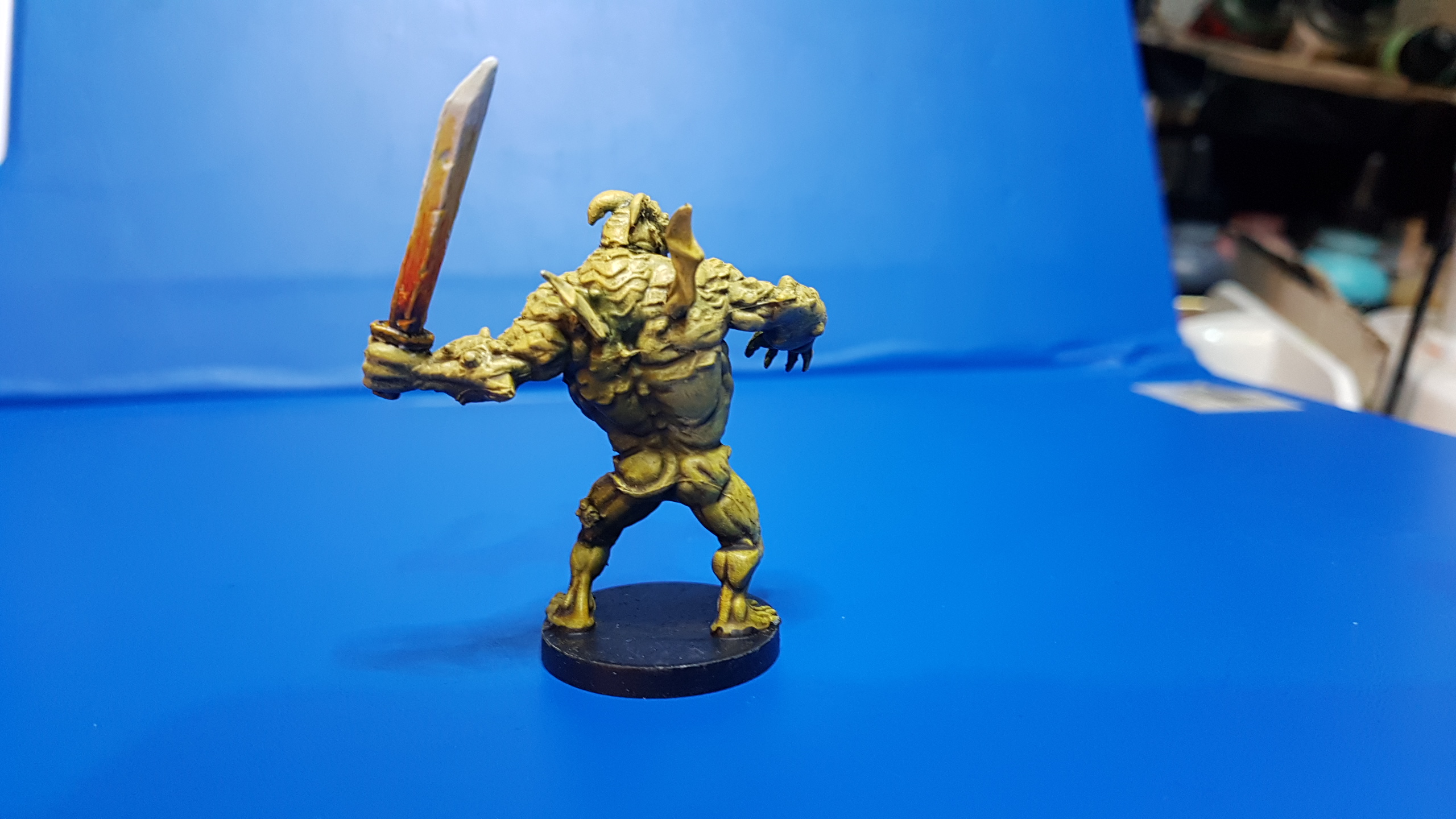
UALAC
Taking the comic art as inspiration this time I tried to use the undersketch as much as possible again. A thin coat of my mustard yellow contrst home brew and a couple of washes and it was almost done. Probably spent more going back and forth on teh sword with this one
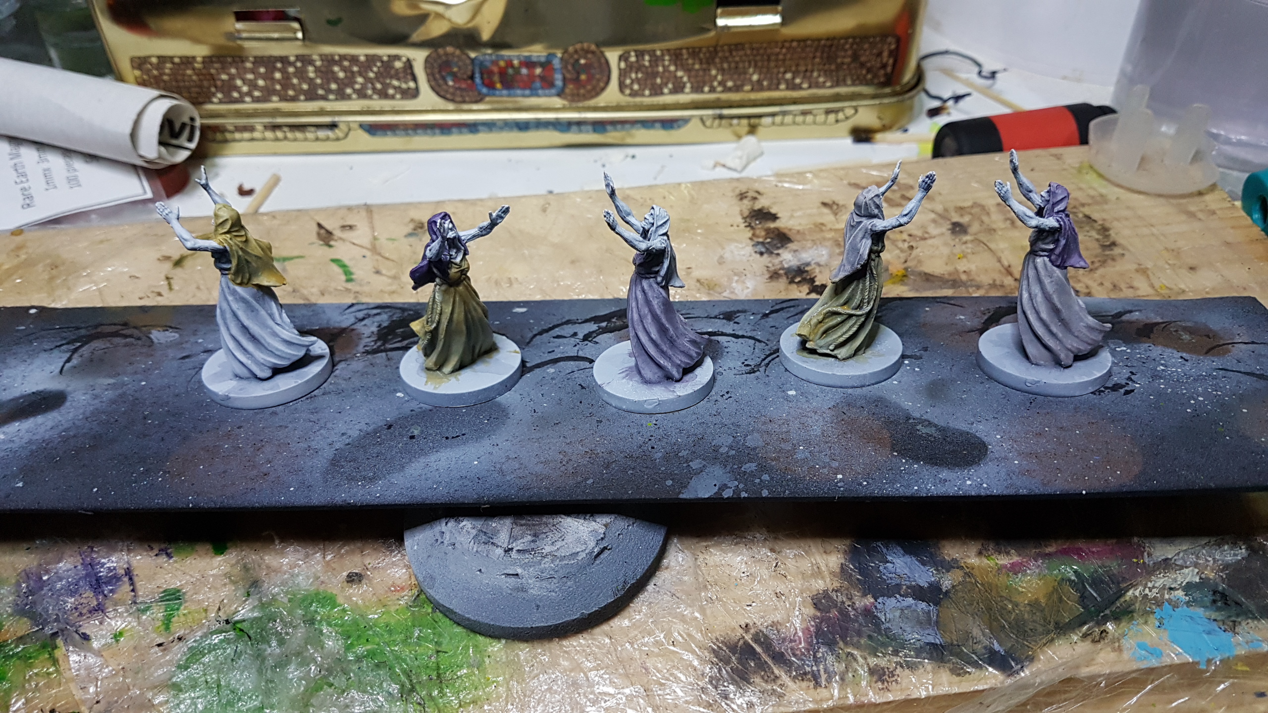
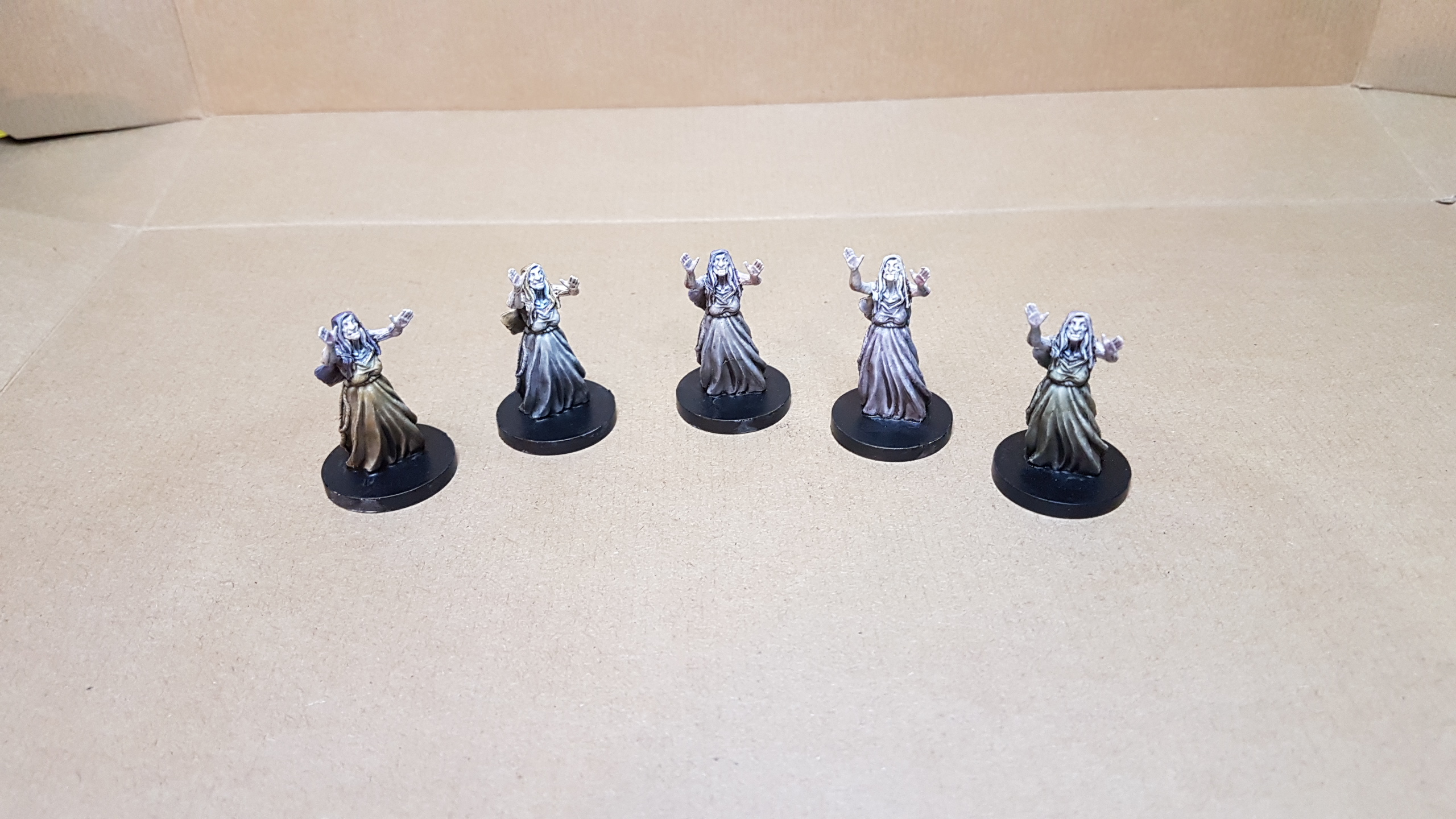
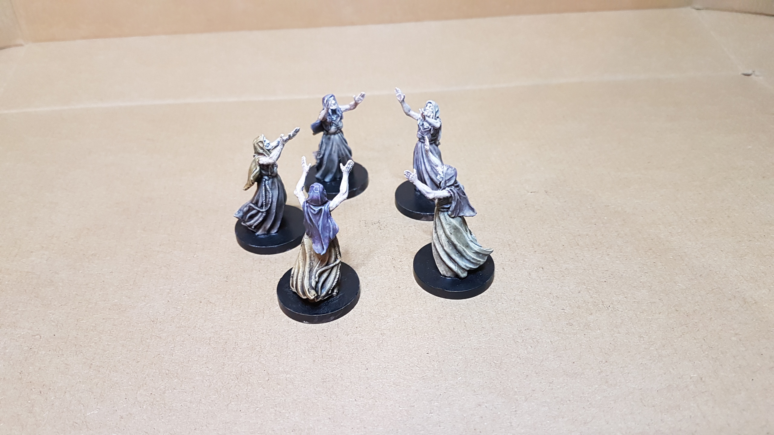
Witches to steal your britches.
Utilising the sketch layer as much as possible I glazed in some washed out colour then washed with a loose dark wash and a layer of undiluted strong tone. Photos are showing me a few mould lines I didn’t notice earlier, but I need to move on and look at heroes and boss monsters.
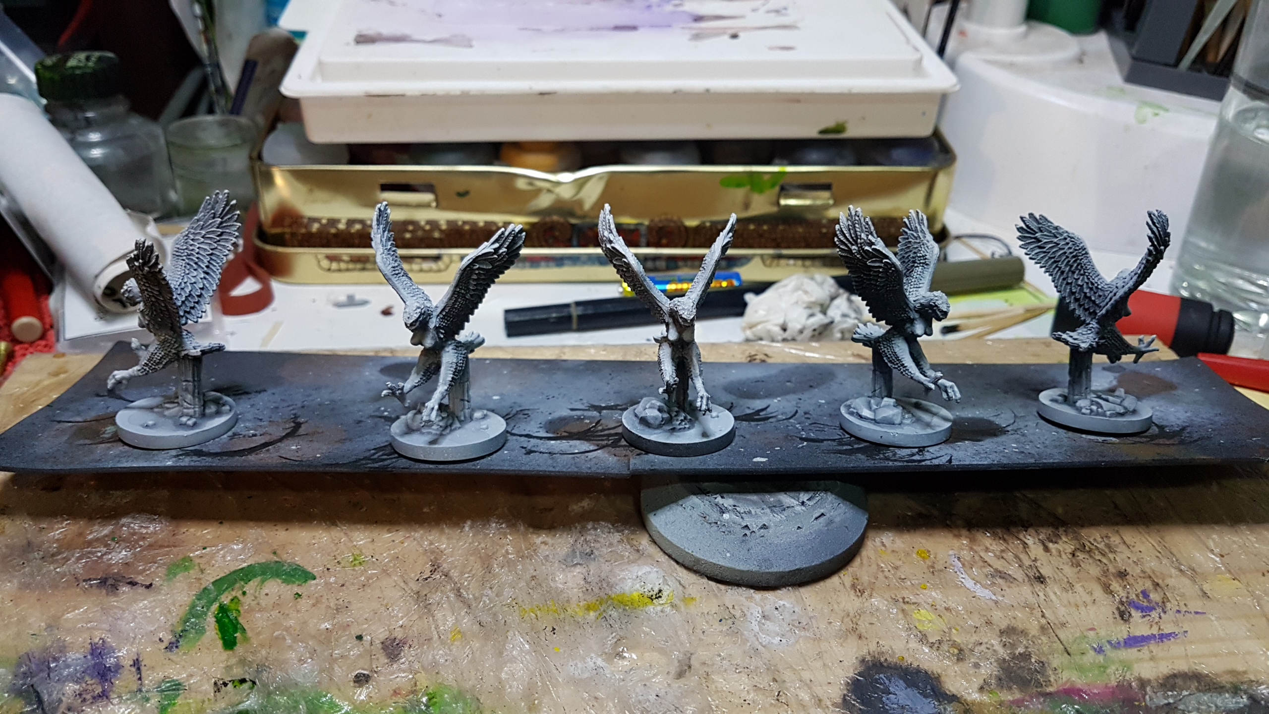
She’s got wings but she’ll drag you down
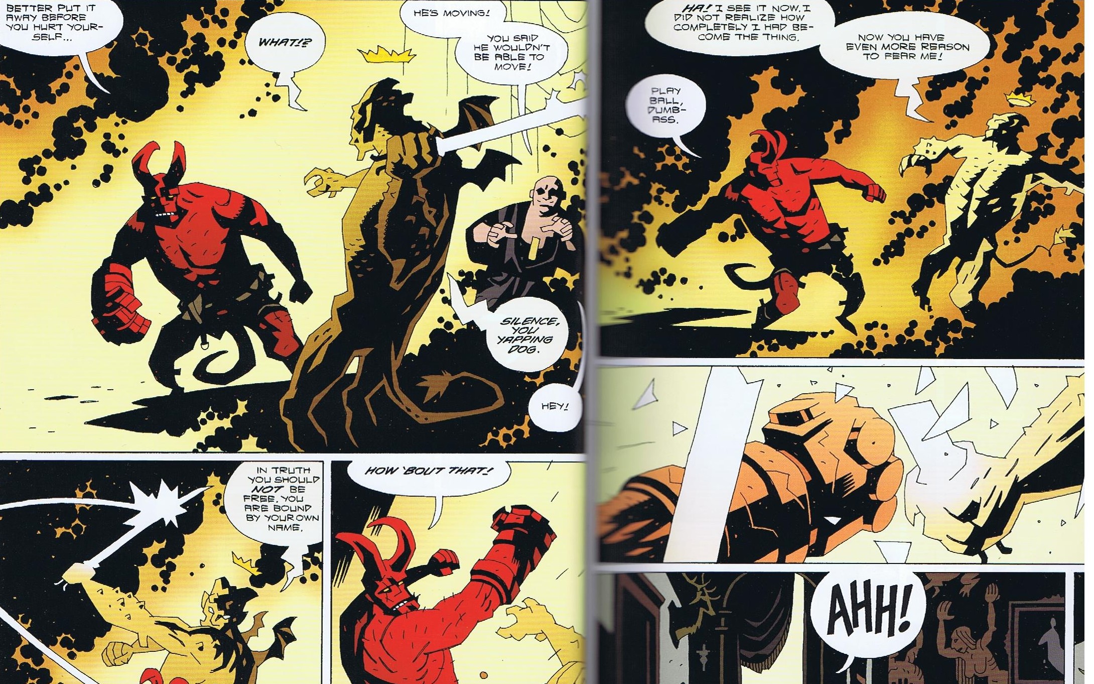
Harpies as depicted in the Hellboy comics are basically black/grey monotone after transforming from giant black birds. But Mignola wasn’t shy of changing character colours between pages and I’ve already painted plenty of black and grey and earthy tones and feel like doing something a bit fun and different that will stand apart from the other minions.
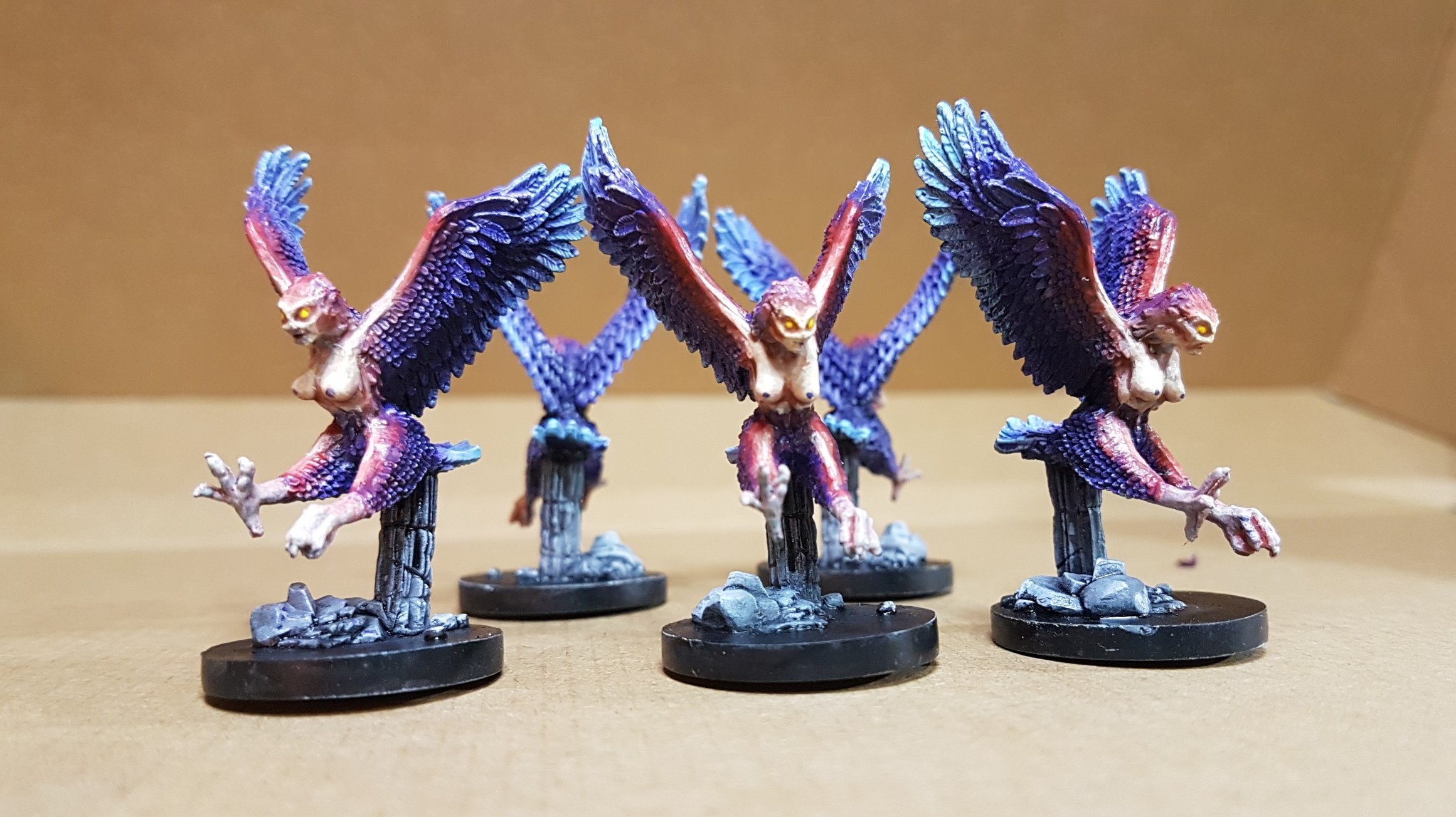
So taking a couple of vibrant india ink colours and some Game Ink Violet I started layering in my colours. It took a few passes before I was happy with the placement and intensity and I had to switch to Vallego Fire red to get the depth I wanted but it was worth it.

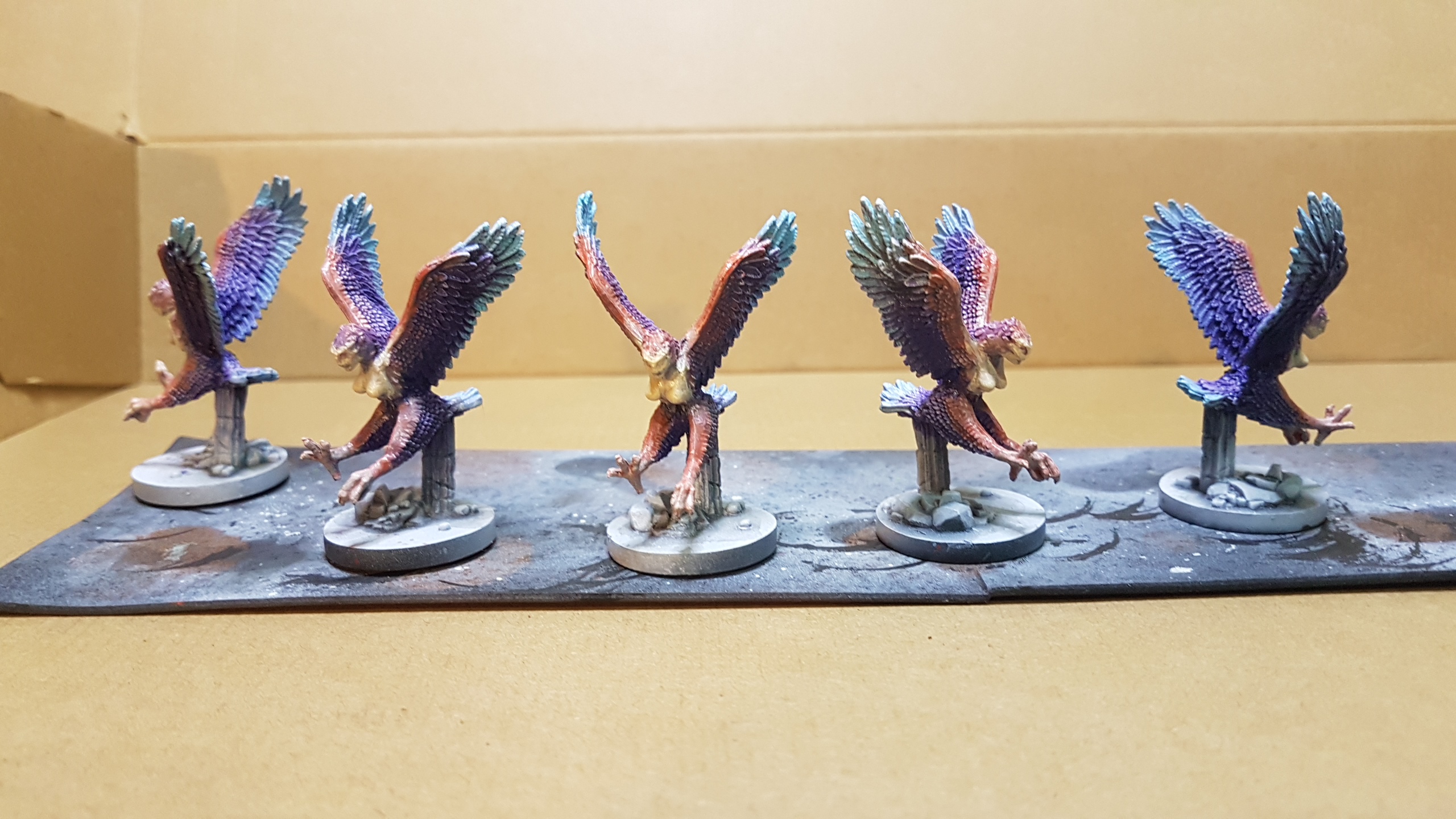
To complete, a little black wash to the darkest areas and some very light dry brushing of the red and blue to pull the wings together. The more human aspects are successive glazes of Vallego Skin Tone and a bit of Game Colour Flesh wash
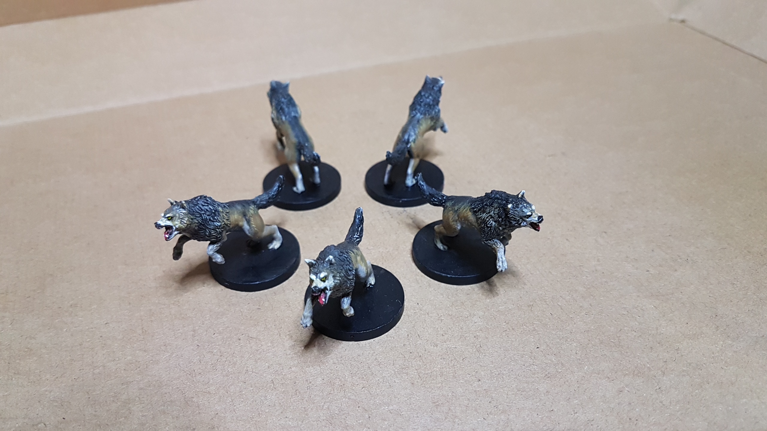
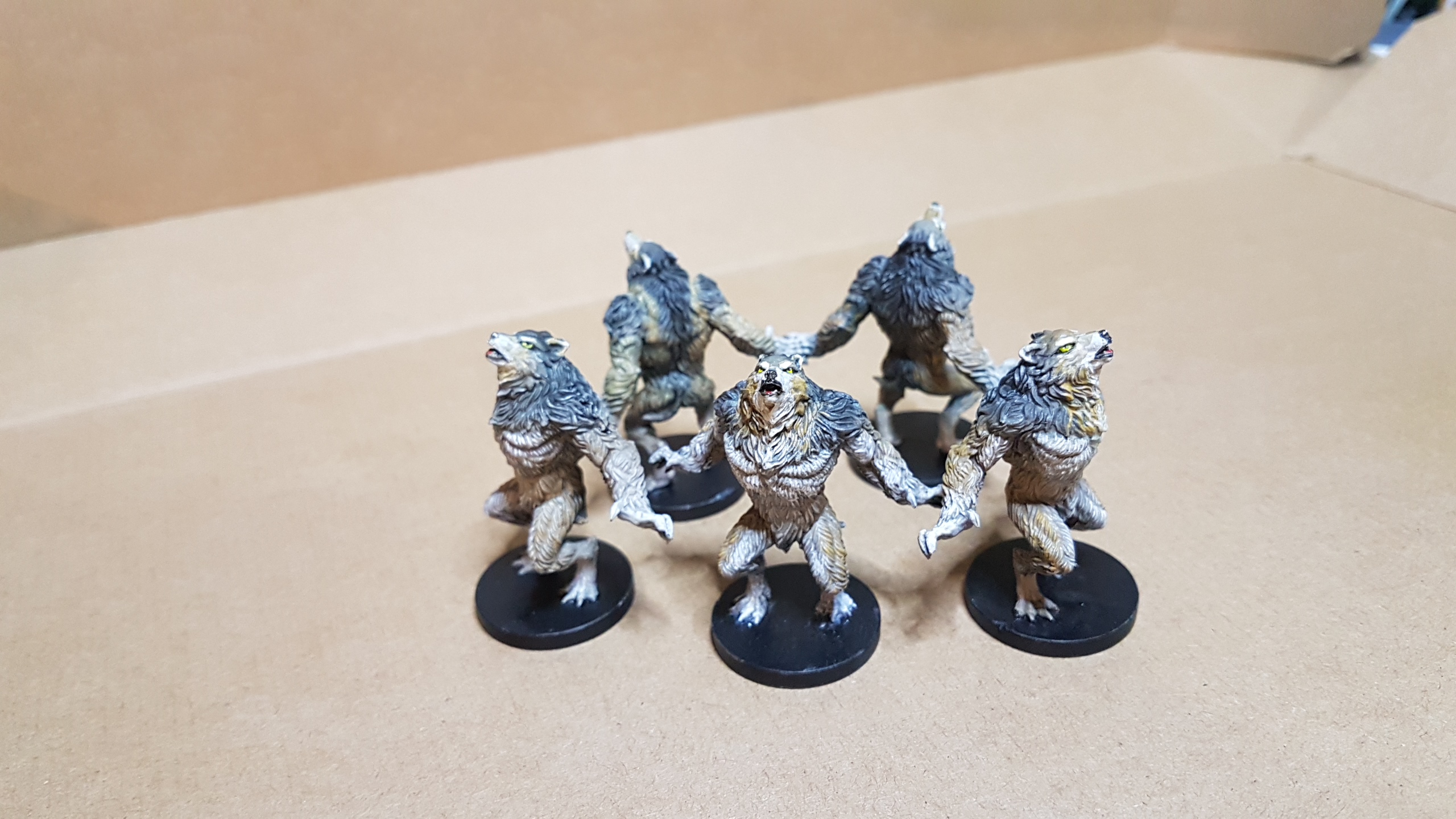
Who let the dogs out!
To get these K9’s rolling I did a google search on Euopean Wolves then did a quick airbrush base using :
Vallego Panzer grey for the dark areas around the back and neck,
Vellego Golden brown around the face and flanks.
And a mix of Vellego Sand (ivory) and white for the chest/under belly, paws and under chin.
As airbrushing often coats too well and can blow out undersketching and details I followed up with a splash of black wash on the grey areas and some strong tone everywhere else.
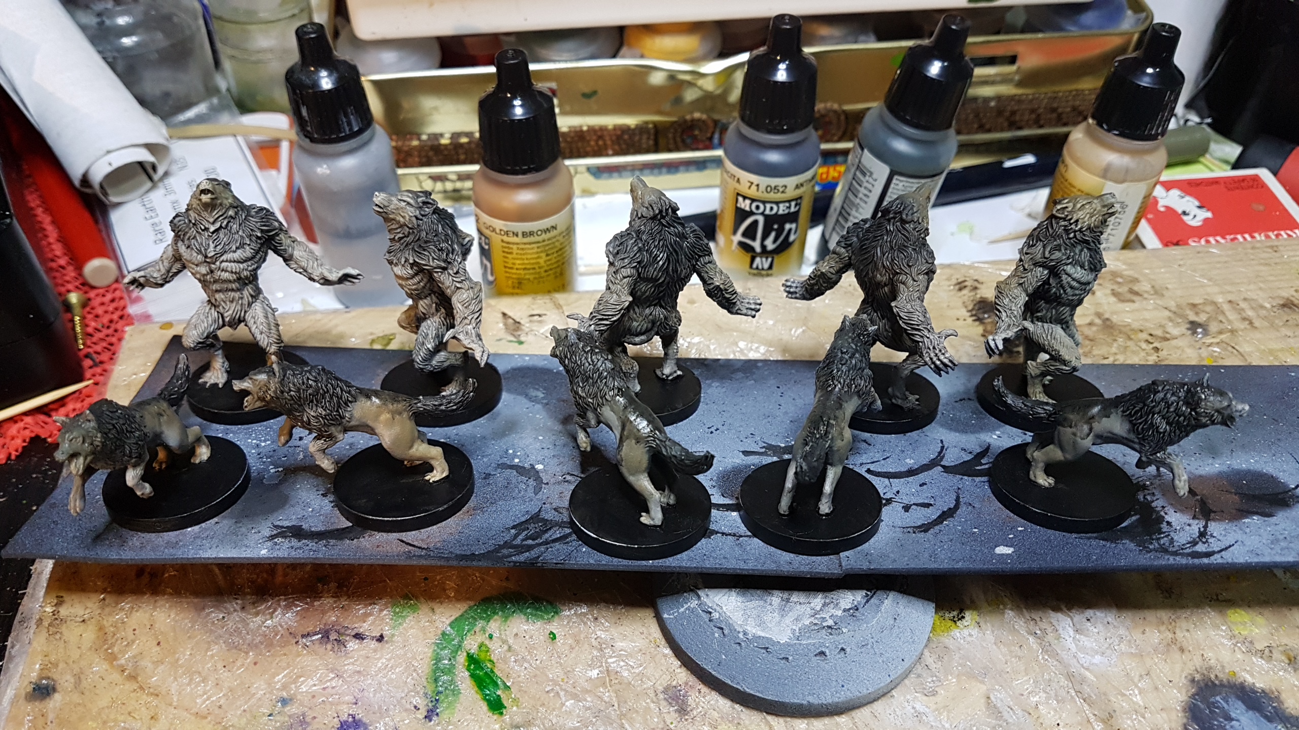
With a fairly solid base now down I proceeded to mix various shades with the pallet of colours above to bring out more details and create various fur patterns. Sometimes dry brushing a section, sometimes glazing in a few strokes. Considering the wolf flanks, there being no limit to the mnumber of fur strokes I could put in, I rationalized that a basic effect for playing with was what I needed and assessed my work at game play distance.
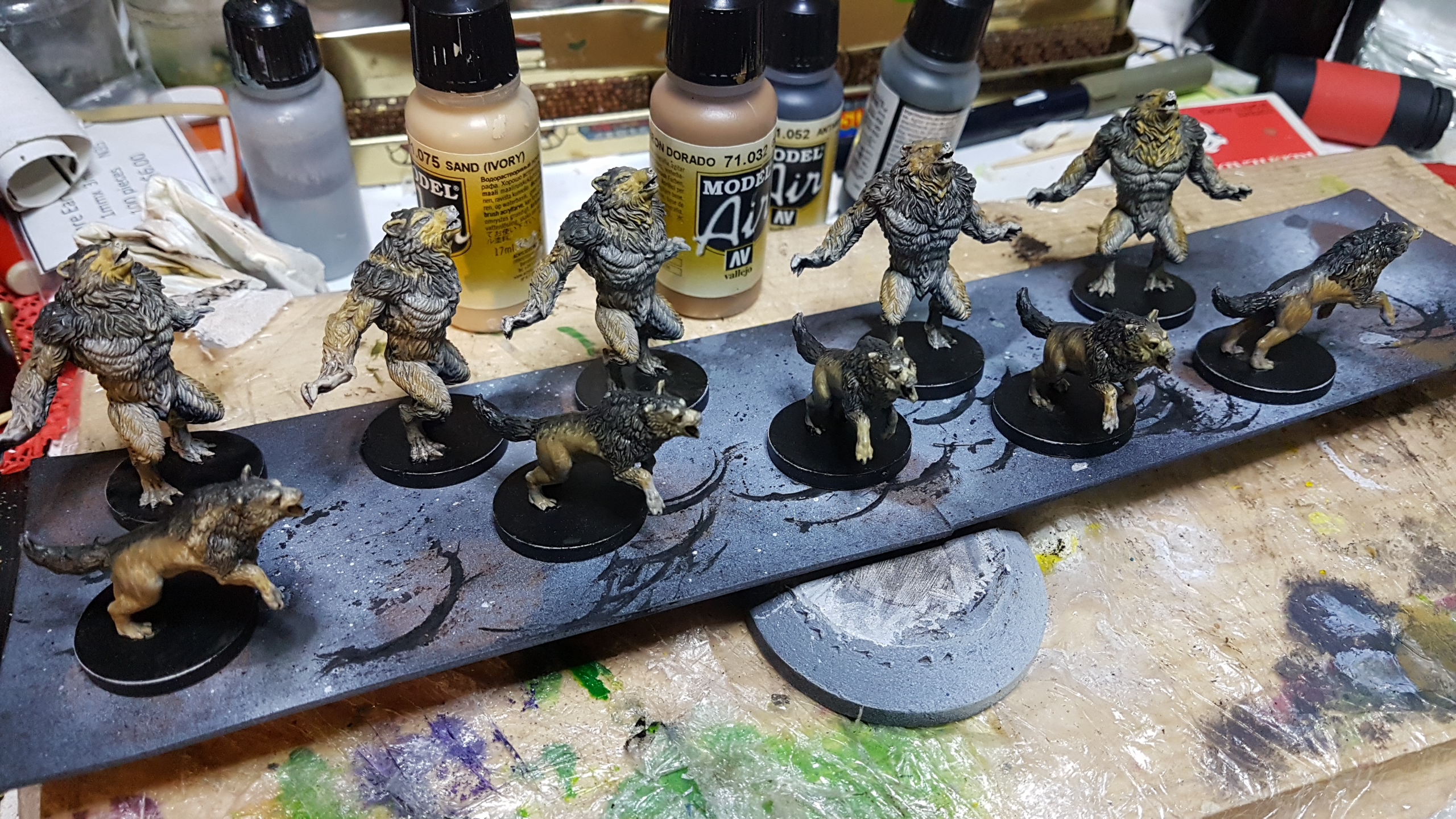


A splash of colour to the eyes and mouths and I call done.
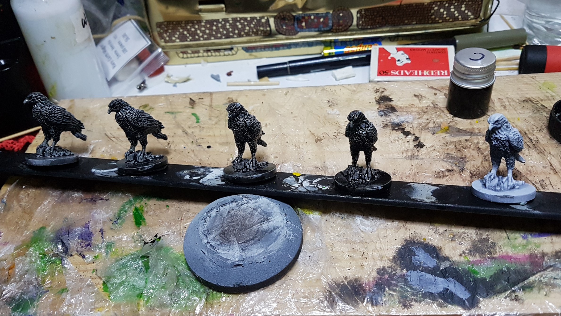
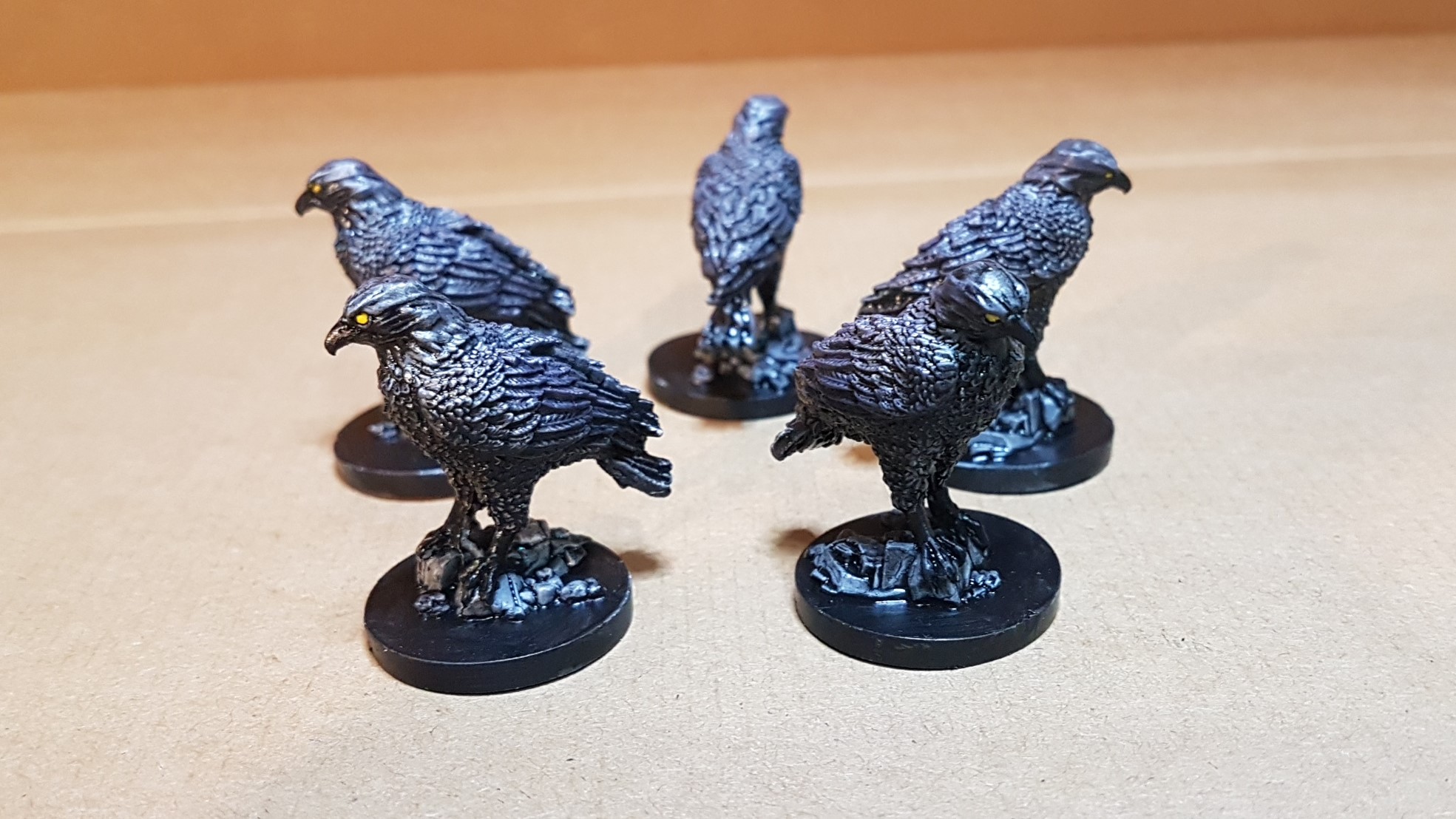
Boring Blackbirds
Pretty simple realy. a base coat of Black contrast, a second coat to the underparts and then a drybrush of 50/50 mid dark grey and violet ink. They’d probably photograph better when they get a matte coat but that will wait till later.
![Games Workshop Kick Off Grot Week For Warhammer 40,000 [Updated]](https://images.beastsofwar.com/2026/04/grot-new-40k-news-cover-600-338.jpg)